


Sea Serpent is one of those rare dark colors that carries an instant sense of shelter and quiet luxury. With a Light Reflectance Value (LRV) of 7 on a 0-to-100 scale, this shade sits firmly on the darker end of the color spectrum. In plain terms, it absorbs most of the natural light coming into a room rather than bouncing it around. Instead of feeling cold or stark, Sea Serpent wraps a space in a deep, dark slate blue supported by subtle green and gray undertones. During bright morning hours, those hidden green notes soften the blue; as the afternoon golden hour arrives, the color shifts into a classic, oceanic navy with rich gray shadow.
In a transitional living room or den, applying Sea Serpent to full-height wainscoting panels establishes a handsome anchor for the entire main floor. The dark wall surface allows crisp architectural details to stand out while creating a dramatic backdrop for lighter furnishings.

To keep a deep wall color from feeling heavy, contrast is essential around structural transitions. In this palette, Sherwin-Williams Pure White SW 7005 serves as the anchor neutral on all door casings, baseboards, and window trims. Pure White offers just enough softness to avoid looking icy, providing a clean border that frames views of colorful autumn foliage outside while defining every doorway and window frame with clear polish.

Work Directly with Torlando Hakes
Skip the color choice stress. Work directly with me as your personal Color Designer to select the perfect architectural palette for your home, and get a Complementary Color Consultation when you purchase paint through us.

When moving from a dramatic, dark main space into adjoining hallways or smaller rooms, a mid-tone bridge color helps ease the visual change. Sherwin-Williams Silver Strand SW 7057 functions as an ideal complementary shade here. Carrying soft gray-green tones, Silver Strand reflects the subtle green undertones inherent in Sea Serpent without competing for attention. Using Silver Strand on ceiling planes or adjacent corridor walls brightens secondary spaces while maintaining a continuous design story throughout the home.

For areas where you want an even deeper ground tone—such as a kitchen island, interior doors, or built-in library cabinetry—Sherwin-Williams Greenblack SW 6994 provides an ideal accent contrast. Greenblack is a near-black with deep forest undertones that tie directly back to the dark slate and green structure of Sea Serpent. When paired with polished Calacatta marble countertops and warm brushed gold hardware, a Greenblack island brings weight and structure to an open-plan kitchen.

In smaller, intimate settings like a powder room or primary suite bathroom, Sea Serpent acts as an elegant backdrop for luxurious materials. Combining Sea Serpent vanity cabinetry or wall panels with crystal-glass lighting fixtures and warm brass accents creates a balanced environment where cold stone surfaces feel warm and welcoming.

Practical Application Guidelines for Homeowners
Sea Serpent
Sherwin-Williams SW 7615
Pure White
Sherwin-Williams SW 7005
Silver Strand
Sherwin-Williams SW 7057
Greenblack
Sherwin-Williams SW 6994
To bring this dark slate palette into your own home, keep these simple painter-tested recommendations in mind:
- Selecting Wall Sheens: On main living room walls or decorative paneling, choose a matte or flat sheen to minimize surface glare and enhance the deep, velvety quality of Sea Serpent. In bathrooms or on high-touch trim, select a satin or semi-gloss finish for moisture resistance and simple cleaning.
- Material & Decor Pairings: Accentuate the slate-green undertones by pairing the paint with warm cognac leather furniture, wire-brushed natural oak floors, brushed brass lighting fixtures, and high-contrast marble tops like Calacatta or Carrara.
- Lighting Placement: Because dark colors absorb light, incorporate layered illumination—such as a central crystal-glass pendant matched with a symmetrical pair of wall sconces—to ensure warm ambient light fills every corner during late autumn evenings.
A deep slate blue like Sea Serpent creates an inviting backdrop that feels steady and comforting year-round.
Complementary Color Consultation
Planning a project? Work with Torlando Hakes directly as your personal Color Designer and get a Complementary Consultation when purchasing paint through us.
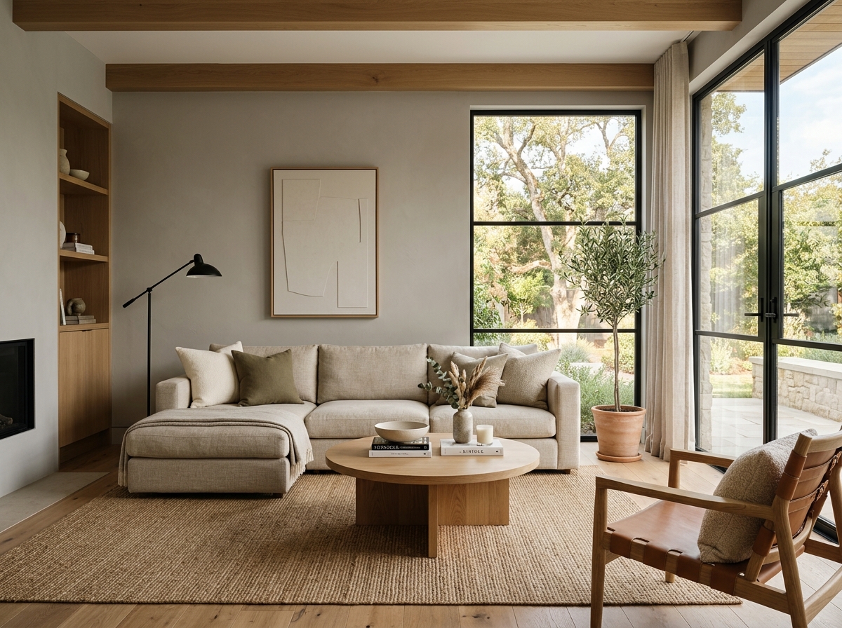 After
After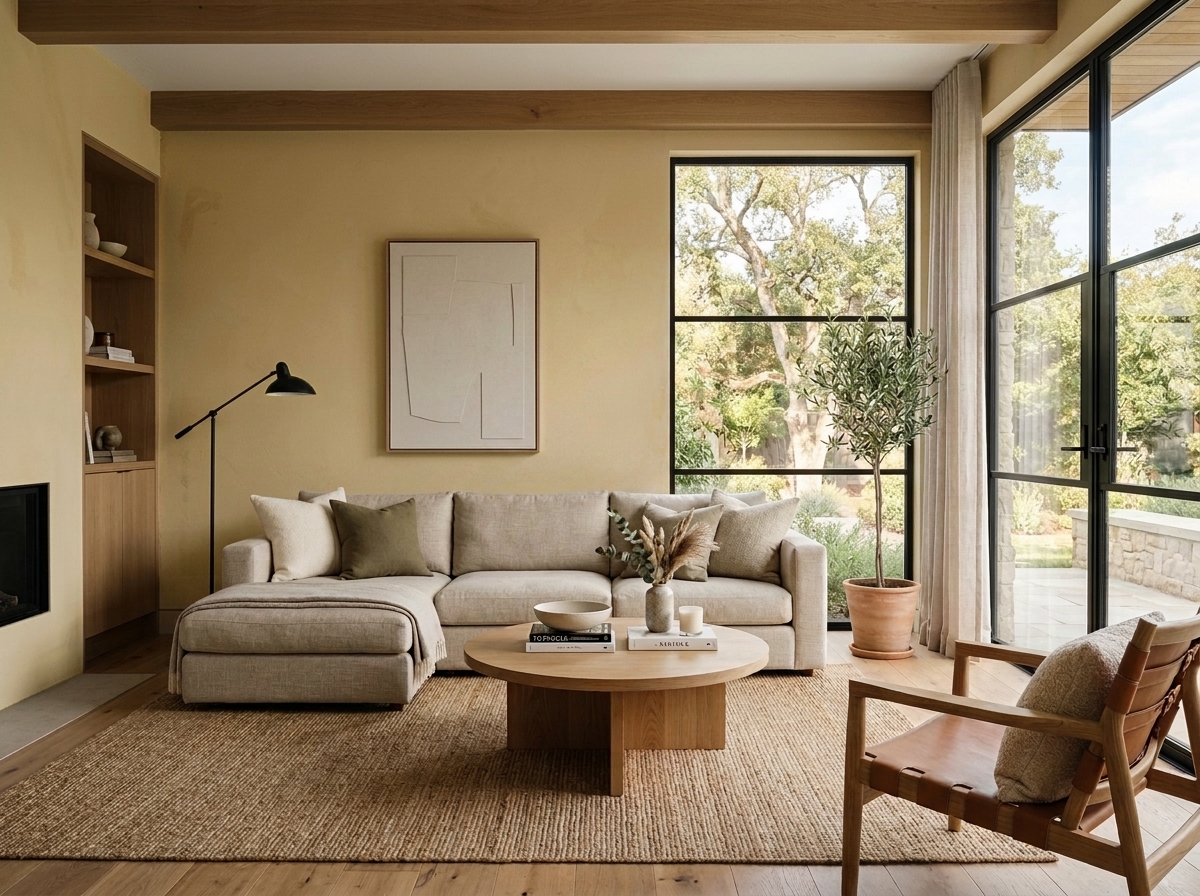 Before
Visualize Your Space with Color Studio AI
Planning a project? Skip the paint chip guesswork. Use our Color Studio AI to instantly visualize these paint colors on your own walls, or take advantage of our aligned contractor pricing matching current Sherwin-Williams retail promotions.
Book Your Upcoming Paint Project
Craftsman Painter is now scheduling premium transformations. Secure your spot and elevate your property value.
Get an EstimateHelp Others Find Professional Color Insights
Share this story directly to your networks or copy the link to share with friends.