


Pale Oak's Dynamic Presence in Natural Light
Real-paint peel-and-stick samples ship via Samplize. Craftsman Painter may earn a small commission on sample orders at no extra cost to you.
The true essence of Pale Oak (OC-20) reveals itself most dramatically under the influence of natural light, which acts as the primary determinant of its perceived color temperature. In rooms with abundant natural light, particularly those with south-facing exposure, Pale Oak leans into its warm beige-almond undertones, presenting as a soft, inviting greige. The ample sunlight amplifies its warmth, preventing it from appearing washed out while maintaining an airy feel. Conversely, in north-facing rooms, where light is cooler and often indirect, Pale Oak's subtle gray notes become more prominent. Here, it can read as a delicate, sophisticated off-white with just a hint of warmth, preventing the space from feeling cold or austere.
East-facing rooms, receiving bright, warm morning light, will showcase Pale Oak's creamier side, appearing genuinely soft and welcoming. As the day progresses and the light shifts, it will gradually transition to a more subdued greige. West-facing rooms, drenched in intense, warm afternoon light, will highlight its beige undertones, potentially making it appear a touch warmer than expected. It’s this sensitivity to natural light that makes Pale Oak a versatile yet complex color, requiring careful observation in the specific environment where it will be applied. The key is to understand that its warmth is inherent but modulated by the quality and direction of natural illumination throughout the day.
Calibrating Pale Oak: Artificial Light & Precise Testing
Beyond natural light, artificial lighting plays a significant role in how Pale Oak (OC-20) is perceived, often pulling out different facets of its warm beige-almond undertones. Incandescent bulbs, with their warmer spectrum, will naturally enhance Pale Oak's creamy, beige qualities, making a room feel cozier and more traditional. Modern LED lighting, depending on its Kelvin temperature, can either support this warmth (2700K-3000K) or introduce a cooler, more balanced perspective (3500K-4000K), allowing the gray notes to surface more distinctly. It is critical to test Pale Oak under all typical lighting conditions—daylight, evening with artificial lights, and even overcast days—to fully grasp its character in your home.
When evaluating Pale Oak, or any paint color, homeowners often make a critical error by painting swatches directly onto an existing colored wall. This approach is misleading due to the principle of simultaneous contrast, famously explored by Josef Albers. The surrounding wall color will optically influence your perception of the new swatch, causing it to appear different than it truly is. To accurately assess Pale Oak, I advise using real-paint peel-and-stick samples. These should be placed directly against your existing white trim or a large piece of white poster board. This isolation allows your eye to perceive the color's true undertones and LRV without visual interference. Move these samples around the room, observing them at different times of day and under various lighting conditions. For a deeper dive into understanding color interaction, our Color Studio offers further resources.
A Balanced Palette: Trim, Accents & Key Comparisons
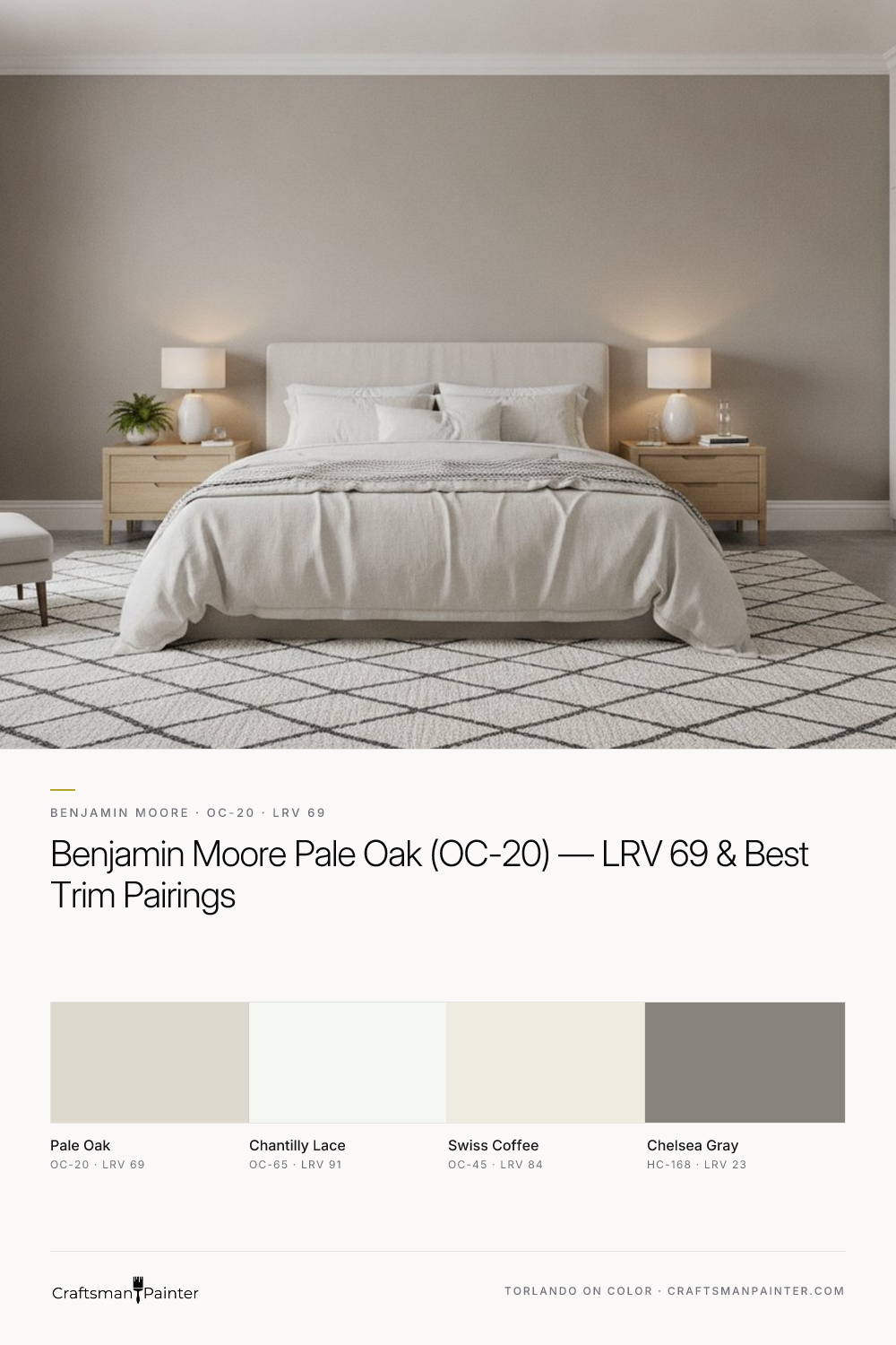
Crafting a cohesive color scheme around Benjamin Moore Pale Oak (OC-20) involves selecting complementary colors that enhance its sophisticated warmth without competing. For trim and ceilings, Benjamin Moore Chantilly Lace (OC-65, LRV 91) is an impeccable choice. Its crisp, clean white provides a sharp contrast that allows Pale Oak to truly shine, highlighting its subtle warmth and preventing it from appearing muddy. This pairing creates a refined, airy aesthetic.
For a coordinating neutral that maintains a light and open feel, Benjamin Moore Swiss Coffee (OC-45, LRV 84) works beautifully. While slightly warmer than Chantilly Lace, Swiss Coffee shares a similar soft, creamy quality that harmonizes with Pale Oak, making it suitable for adjacent rooms or as a subtle accent. When seeking a contrast accent, Benjamin Moore Chelsea Gray (HC-168, LRV 23) offers a grounding, sophisticated depth. This deep, warm gray provides a strong visual anchor, ideal for accent walls, cabinetry, or exterior shutters, allowing Pale Oak to feel even brighter and more expansive by comparison.
Homeowners often compare Pale Oak to other popular light neutrals. Benjamin Moore Balboa Mist (OC-27, LRV 67) is a close rival, often appearing slightly cooler and more gray than Pale Oak. While Balboa Mist still carries warmth, its undertones lean more towards a true greige with less beige influence, making it a better fit for those desiring a cleaner, less creamy look. Benjamin Moore Edgecomb Gray (HC-173, LRV 63) is another frequently considered shade. Edgecomb Gray is notably warmer and deeper than Pale Oak, with more pronounced beige and taupe undertones. It offers a richer, earthier feel, and will appear more saturated on the wall. If Pale Oak feels just a touch too light or too cool in your space, Edgecomb Gray might be the answer for a more substantial, grounded neutral. The choice between these three often comes down to the precise balance of beige and gray desired, and how they react to the specific lighting conditions of your home.
Application Excellence: Coatings & Preparation for a Lasting Finish
Achieving the intended aesthetic of Benjamin Moore Pale Oak (OC-20) relies as much on proper surface preparation and coating selection as it does on the color itself. For drywall, a Level 2: Standard (Occupied Home) finish is generally sufficient, ensuring seams are taped and joint compound is applied smoothly. However, for a truly premium, seamless appearance, particularly in luxury homes or on walls that will receive strong glancing light, a Level 3: Premium (Luxury Finish) preparation is advised. This involves additional skimming and sanding to achieve an exceptionally flat surface, minimizing imperfections that can be highlighted by light.
For the walls themselves, I recommend using high-quality coatings like Sherwin-Williams Cashmere Low Lustre for a soft, velvety finish that subtly diffuses light, or Sherwin-Williams Emerald Interior Matte for a highly durable, washable option that maintains a sophisticated, non-reflective appearance. In humid environments such as bathrooms and kitchens, Sherwin-Williams Duration Home provides excellent moisture resistance and durability without compromising on finish quality. For trim, doors, and cabinetry, where a harder, more resilient surface is needed, Sherwin-Williams Emerald Urethane Trim Enamel in Satin or Semi-Gloss delivers superior adhesion, block resistance, and a smooth, furniture-like finish that stands up to daily wear. The choice of sheen significantly impacts how Pale Oak's undertones are perceived, with lower sheens tending to soften the color and higher sheens making it feel crisper. For personalized guidance on your specific project, consider scheduling a 1-on-1 Color Consultation. With the right preparation and product selection, Pale Oak will deliver a timeless, elegant foundation for your home's interior for years to come.
Frequently Asked Questions
What are the primary undertones of Benjamin Moore Pale Oak (OC-20)?
Benjamin Moore Pale Oak (OC-20) possesses warm beige-almond undertones. It presents as a soft greige, balancing subtle warmth with a hint of gray, allowing it to adapt beautifully to different lighting conditions.
How does Pale Oak (OC-20) appear in rooms with different natural light exposures?
In south-facing rooms, Pale Oak leans warmer, showcasing its beige notes. In north-facing rooms, it appears cooler and more like a soft off-white with subtle gray. East-facing light brings out its creamier side, while west-facing light enhances its warmth.
What is the recommended trim color to pair with Benjamin Moore Pale Oak (OC-20)?
For trim and ceilings, Benjamin Moore Chantilly Lace (OC-65) is highly recommended. Its crisp, clean white provides a beautiful contrast that allows Pale Oak's subtle warmth to stand out, creating an elegant and airy feel.
How does Benjamin Moore Pale Oak (OC-20) compare to Balboa Mist (OC-27) and Edgecomb Gray (HC-173)?
Pale Oak is warmer and more beige than Balboa Mist, which leans slightly grayer. Compared to Edgecomb Gray, Pale Oak is lighter and less saturated, with Edgecomb Gray having more pronounced warm beige and taupe undertones for a richer look.

Can a High-Reflectance White Feel Soft Instead of Sterile? The Case for Benjamin Moore Frostine AF-5

Against Natural Stone and Cedar Trim, Benjamin Moore Stonybrook 1566 Delivers a Grounded Slate That Never Turns Baby Blue
