
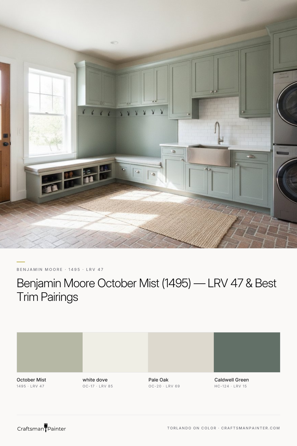


October Mist's Nuanced Character and Optimal Applications
Real-paint peel-and-stick samples ship via Samplize. Craftsman Painter may earn a small commission on sample orders at no extra cost to you.
The inherent complexity of October Mist, with its earthy olive-taupe undertones, makes it a chameleon within a space. In a room with ample natural light, particularly north-facing light which tends to be cooler and bluer, October Mist's green notes may become more pronounced, offering a fresh, botanical feel. Conversely, in south-facing rooms or those with warmer artificial lighting, the taupe elements can soften, allowing the color to appear as a sophisticated, muted gray-green. This adaptability is precisely why it works effectively in various residential settings, from living rooms and dining areas to bedrooms and home offices. It provides a sense of calm and connection to nature without being overtly colorful. When considering October Mist for a primary living space, it is crucial to observe how it interacts with the specific light conditions throughout the day. Its mid-range LRV ensures it does not wash out in bright sun nor deepen excessively in shadow, maintaining a consistent, livable presence.
Strategic Pairings and Coating Craftsmanship
To maximize the visual impact of October Mist, thoughtful coordination with other colors and materials is essential. For trim and ceilings, Benjamin Moore White Dove (OC-17) is an exemplary choice. Its soft, slightly warm white provides a crisp yet harmonious contrast, allowing October Mist to truly sing without feeling stark. White Dove’s LRV of 85 ensures sufficient brightness to delineate architectural features while complementing the earthy tones of October Mist. For adjacent rooms or as a complementary wall color, Benjamin Moore Pale Oak (OC-20) offers a sophisticated option. With an LRV of 69, Pale Oak is a light, warm greige that maintains a sense of airiness while echoing the subtle warmth within October Mist, creating a cohesive flow throughout a home. To introduce a deeper accent, Benjamin Moore Caldwell Green (HC-124), a rich, deep green with an LRV of 15, can be used on a focal wall, cabinetry, or even furniture. This provides a strong, grounding contrast that pulls out the green notes in October Mist, enhancing its organic character.
Beyond color selection, the quality of the finish and preparation is paramount. For interior walls painted with October Mist, a premium coating like Sherwin-Williams Cashmere Low Lustre or Emerald Interior Matte will deliver a smooth, even appearance that enhances the color's depth. In humid environments such as bathrooms and kitchens, Sherwin-Williams Duration Home provides superior mildew resistance and washability. For trim, doors, and cabinetry, Sherwin-Williams Emerald Urethane Trim Enamel in a Satin or Semi-Gloss sheen offers exceptional durability and a luxurious finish. Proper surface preparation is non-negotiable. For existing drywall, ensuring a Level 2: Standard (Occupied Home) preparation is often sufficient, involving basic patching and sanding. However, for a truly refined, premium result, especially on trim or newly installed drywall, aiming for Level 3: Premium (Luxury Finish) preparation, which includes extensive skim coating and sanding, will eliminate minor imperfections and allow the paint to achieve its full potential. This attention to detail ensures the color is presented impeccably.
The Critical Process of Color Selection: Beyond the Chip
Selecting the right paint color extends beyond viewing small swatches or digital representations. The phenomenon of simultaneous contrast, as illuminated by Josef Albers, dictates that the perception of a color is heavily influenced by the colors surrounding it. This means testing a paint swatch directly on an existing painted wall can be highly misleading. The current wall color will inevitably alter how you perceive the new sample, leading to inaccurate assessments. To circumvent this, I consistently advise homeowners to utilize real-paint peel-and-stick samples and isolate them against a clean, neutral white background, such as a large piece of white poster board or directly on existing white trim. This allows the true undertones and depth of October Mist to reveal themselves without interference. Observing these isolated samples in various lighting conditions throughout the day – natural daylight, overcast light, and artificial evening light – is crucial. For convenient access to these essential real-paint samples, you can explore them further at our Color Studio.
October Mist Versus Its Notable Counterparts
When evaluating October Mist, it is helpful to consider its relationship to other popular green-grays. Two common comparisons include Sherwin-Williams Evergreen Fog (SW 9130) and Clary Sage (SW 6178). Evergreen Fog, also an earthy green-gray, presents as slightly cooler and often a touch darker than October Mist, with an LRV of 30. It leans more distinctly into the green spectrum, offering a moodier, more saturated feel. While both share a similar organic appeal, October Mist's higher LRV and more pronounced taupe undertones give it a softer, more adaptable character, making it a gentler transition color in many schemes. Evergreen Fog, by contrast, commands more attention and can feel more intentional as a feature color. Sherwin-Williams Clary Sage (SW 6178) is another close relative, though it leans more definitively into a muted sage green. With an LRV of 43, it is comparable in depth but lacks the pronounced gray-taupe influence that October Mist possesses. Clary Sage feels more purely green, softer and less earthy than October Mist, making it a good choice for those who want a clear sage without the complexity of a gray-green blend. Ultimately, while these colors share a similar green-gray family, October Mist distinguishes itself with its balanced olive-taupe undertones and its mid-range LRV, providing a versatile, sophisticated choice that avoids leaning too heavily into either green or gray. Understanding these subtle distinctions is key to selecting the ideal color for your home, and for personalized guidance, a 1-on-1 Color Consultation can provide tailored insights for your specific project.

Muted Olive and Soft Gray Converge in the Quietly Complex Benjamin Moore Flora AF-470

Beyond Predictable Trim Colors: The Enduring Appeal of Benjamin Moore Buxton Blue HC-149
