


The Character of Newburyport Blue: Undertones and Light Reflection
Real-paint peel-and-stick samples ship via Samplize. Craftsman Painter may earn a small commission on sample orders at no extra cost to you.
Newburyport Blue presents itself as a classic navy, but its complexity lies in its subtle gray undertones. These undertones prevent it from appearing overtly bright or primary, instead lending it a muted, sophisticated quality. Depending on the light exposure, this gray influence can become more pronounced. In north-facing rooms, where light is cooler and indirect, Newburyport Blue can lean slightly more toward its gray side, appearing deeper and more subdued. In south-facing rooms or those with ample warm, natural light, the true navy character shines through, feeling rich and vibrant without losing its inherent depth. Artificial lighting, particularly those with warmer Kelvin temperatures, will also draw out its blue qualities.
When evaluating a color like Newburyport Blue, it is imperative to use real-paint peel-and-stick samples. The phenomenon of simultaneous contrast, a principle extensively explored by Josef Albers, dictates that our perception of a color is heavily influenced by the colors immediately surrounding it. Placing a small swatch of Newburyport Blue directly against an existing yellow wall, for instance, will cause your eye to perceive the blue as cooler or even greener than it truly is, simply due to the visual interaction. To accurately assess Newburyport Blue, isolate a large sample (at least 12x12 inches) against a clean, neutral white background, such as a large sheet of white paper or a freshly painted board with a true white like Benjamin Moore Chantilly Lace. This allows your eye to evaluate the color itself, free from distorting influences, and observe how its undertones reveal themselves across different times of day and in varying light conditions within your specific environment.
Strategic Pairings for Depth and Balance
Achieving a cohesive and balanced interior palette with a strong color like Newburyport Blue requires thoughtful coordination. The right complementary shades will enhance its depth and prevent it from feeling overwhelming.
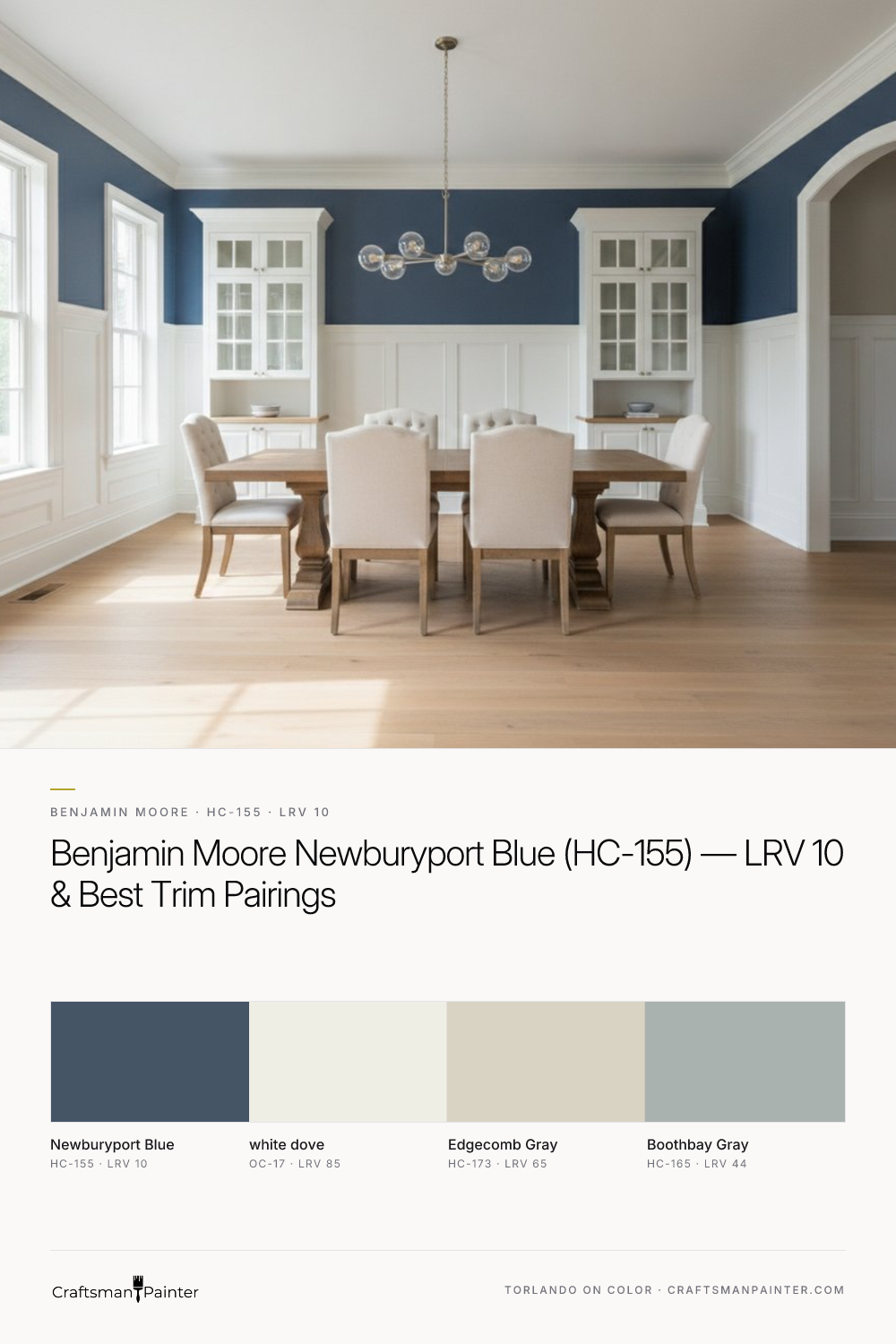
For trim and ceilings, Benjamin Moore White Dove (OC-17, LRV 85) is an exceptional choice. White Dove is a soft, warm white that avoids the starkness of a pure white. Its gentle creaminess provides a beautiful, harmonious contrast to the deep navy of Newburyport Blue, creating definition without harshness. When applying White Dove to trim, particularly in an occupied home, I recommend a minimum of Level 2: Standard drywall and wood preparation. For a truly luxurious, enduring finish on baseboards, doors, and window casings, a Level 3: Premium preparation, involving meticulous filling and sanding to a glass-smooth surface, paired with two coats of Sherwin-Williams Emerald Urethane Trim Enamel in a Satin or Semi-Gloss sheen, will yield a professional, high-performance result.
To introduce a coordinating neutral, Benjamin Moore Edgecomb Gray (HC-173, LRV 65) is a versatile option. This warm, inviting greige provides a soft counterpoint to Newburyport Blue, preventing the space from feeling too cool or monochromatic. It works beautifully in adjacent rooms or as an accent wall, creating a sense of flow and warmth. For wall applications, Sherwin-Williams Cashmere Low Lustre or Emerald Interior Matte are excellent choices, offering a sophisticated finish and good washability. In high-humidity areas like bathrooms or kitchens, Sherwin-Williams Duration Home provides superior moisture resistance.
For a subtle contrast accent, Benjamin Moore Boothbay Gray (HC-165, LRV 44) can be introduced. This mid-tone gray has a cool, blue-green undertone that resonates with the gray in Newburyport Blue, offering a layered depth without competing. It can be used on built-ins, cabinetry, or even in a powder room to create an intimate, enveloping feel. Again, for cabinetry, the durability and smooth finish of Emerald Urethane Trim Enamel are paramount.
Newburyport Blue vs. Its Closest Rivals: Hale Navy and Sherwin-Williams Naval
When considering deep navy blues, homeowners often compare Newburyport Blue to other popular shades like Benjamin Moore Hale Navy (HC-154) and Sherwin-Williams Naval (SW 6244). While all three are undeniably in the navy family, their subtle differences in undertone and saturation create distinct personalities.
Hale Navy (HC-154) is often perceived as a slightly softer, more classic navy. It has a touch more green-gray in its undertone than Newburyport Blue, which can make it feel a bit more muted and historic. Where Newburyport Blue has a distinct, clear gray foundation, Hale Navy leans a bit more into a slightly desaturated, almost colonial blue feel. Its LRV is 8.36, making it marginally darker than Newburyport Blue, but its overall impression can be less intense due to its softer undertones.
Sherwin-Williams Naval (SW 6244) typically reads as a truer, less muted navy. It has a cleaner, more straightforward blue presence, often with hints of purple in certain lights, making it feel bolder and sometimes more contemporary than either Newburyport Blue or Hale Navy. Naval's LRV is 4, indicating it is significantly darker and more absorbent of light compared to Newburyport Blue. If you desire a deep, impactful navy with minimal gray or green influence, Naval might be the stronger contender, whereas Newburyport Blue offers a more sophisticated, slightly subdued depth due to its prominent gray undertones.
Ultimately, the choice among these three depends on the specific mood you aim to create. Newburyport Blue offers a refined, slightly stately navy with a clear gray influence. Hale Navy provides a softer, more traditional blue-gray navy. Naval delivers a bolder, purer navy statement.
Application and Professional Execution
Achieving the desired aesthetic with a deep, saturated color like Newburyport Blue relies heavily on meticulous preparation and the use of appropriate coatings. On drywall, ensuring a Level 2: Standard finish is critical to avoid imperfections showing through the rich color. For a truly flawless, luxury finish, a Level 3: Premium preparation, which includes skim coating and extensive sanding, is recommended. This level of detail ensures the paint finish is as smooth and uniform as the color itself.
For homeowners seeking precise color guidance tailored to their unique space, exploring the specific nuances of Newburyport Blue and its companions is vital. Our Color Studio provides a deeper dive into its characteristics. If you require expert, personalized assistance, a 1-on-1 Color Consultation can refine your vision and ensure a cohesive palette. Remember, a deep color often requires two to three coats for full opacity and depth, especially over a lighter existing color. Investing in quality paint and professional application not only enhances the visual impact but also contributes to the longevity and performance of your chosen scheme.

Rooted in Green and Umber Undertones, Benjamin Moore Quarry Rock 1568 Brings Organic Depth to Dark Neutrals

Golden-Hour Intimacy Overhead with the Terracotta Glow of Benjamin Moore Fashion Rose 1348
