
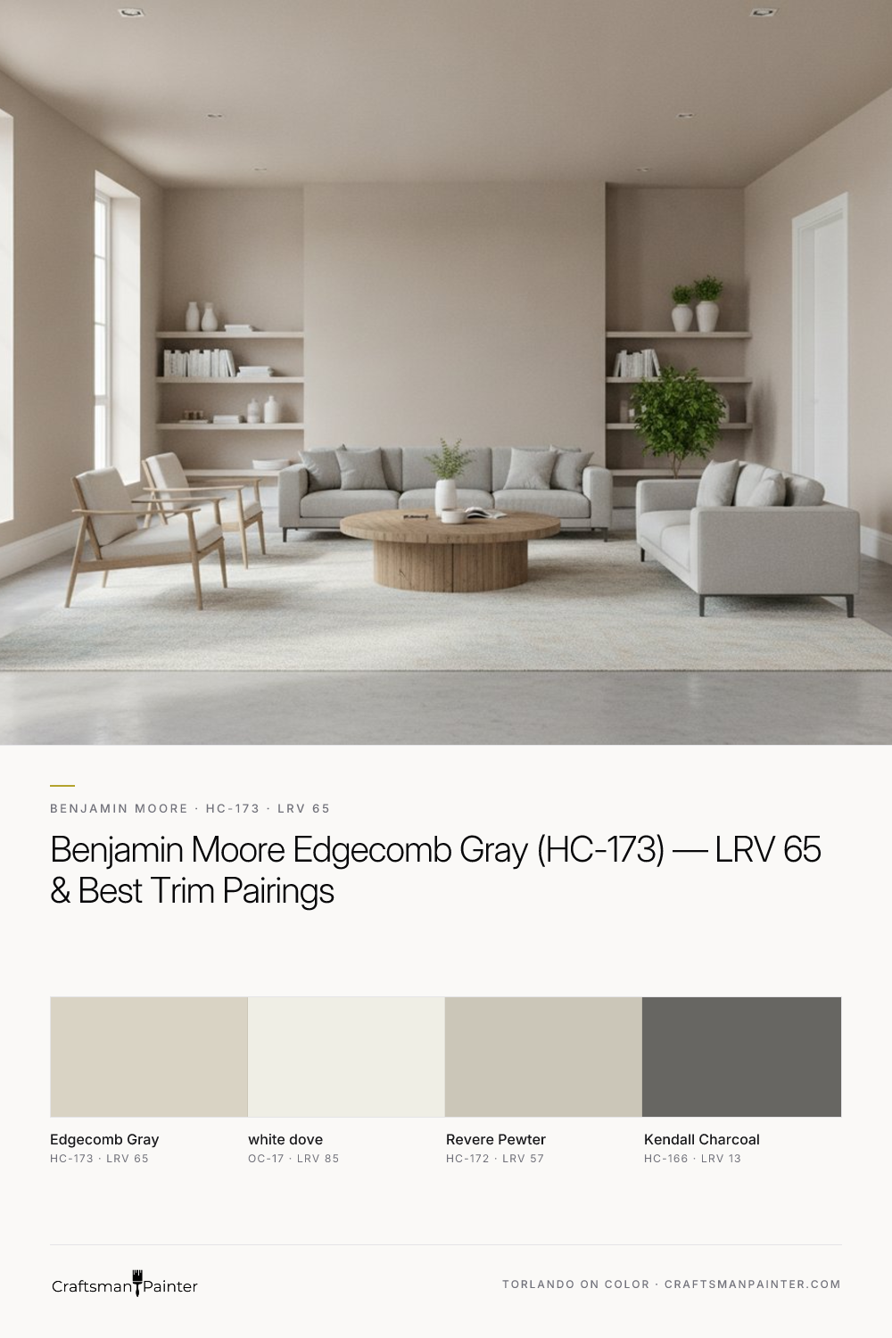


The Subtle Articulation of Edgecomb Gray's Character
Real-paint peel-and-stick samples ship via Samplize. Craftsman Painter may earn a small commission on sample orders at no extra cost to you.
At its core, Benjamin Moore Edgecomb Gray (HC-173) is a sophisticated greige, but one that leans distinctly into the warm spectrum. Its LRV of 65 places it firmly in the mid-range of light-reflecting colors, making it suitable for both well-lit and moderately lit spaces. What sets Edgecomb Gray apart is its delicate dance between gray and beige. In north-facing rooms with cooler, bluer light, the gray aspects of Edgecomb Gray become more apparent, offering a soft, muted appearance. Conversely, in south-facing rooms or those bathed in warm artificial light, its inherent beige-almond undertones emerge more prominently, creating a cozy, inviting atmosphere. It never commits fully to either gray or beige, which is its strength, allowing it to adapt gracefully to different lighting conditions and surrounding elements. This adaptability is why I often recommend it for open-concept living areas where light exposure can vary significantly throughout the day and across different zones. Its warmth is never overwhelming, providing a grounding yet airy feel that many clients desire.
Crafting Cohesive Spaces with Strategic Pairings
Selecting the right coordinating colors is crucial for Edgecomb Gray to truly shine. For trim and ceilings, my unequivocal recommendation is Benjamin Moore White Dove (OC-17). With an LRV of 85, White Dove provides a crisp yet soft contrast that enhances Edgecomb Gray's warmth without feeling stark. White Dove possesses a subtle creaminess that prevents it from appearing too cool, making it a harmonious partner. For a truly premium finish on trim, doors, and cabinetry, I specify Sherwin-Williams Emerald Urethane Trim Enamel in Satin or Semi-Gloss. This coating offers exceptional flow, leveling, and resistance to blocking, ensuring a smooth, durable surface that elevates the entire aesthetic.
For walls, particularly in high-traffic areas or where a luxury finish is desired, Sherwin-Williams Cashmere Low Lustre or Emerald Interior Matte deliver excellent results, offering a rich, uniform appearance. In humid environments like bathrooms and kitchens, Sherwin-Williams Duration Home provides superior moisture resistance and washability.
When introducing other neutrals, Benjamin Moore Revere Pewter (HC-172) serves as an excellent coordinating neutral. While Edgecomb Gray leans warmer, Revere Pewter brings a slightly cooler, more pronounced greige to the palette. This creates a subtle depth and variation without clashing, perfect for adjacent rooms or accent walls. For a deeper, grounding contrast, Benjamin Moore Kendall Charcoal (HC-166) is an ideal accent. Its rich, deep gray with a hint of green-blue undertone provides a sophisticated anchor for architectural features, cabinetry, or even an exterior accent. The careful selection of these complementary shades ensures a harmonious flow throughout the home, creating a curated environment that feels both intentional and inviting. For further exploration of Edgecomb Gray's potential in your space, visit our Color Studio.
The Nuance of Testing: Avoiding Simultaneous Contrast Pitfalls
One of the most common pitfalls homeowners encounter when selecting paint colors is testing swatches directly on an existing painted wall. This practice, while seemingly intuitive, is fundamentally flawed due to a principle known as simultaneous contrast, first articulated by Josef Albers. Your existing wall color, no matter how neutral it appears, will optically influence the perception of the new swatch placed next to it. A cool existing color can make Edgecomb Gray appear warmer than it truly is, while a warm existing color might make it look grayer. This optical illusion can lead to significant misinterpretations and costly mistakes.
To accurately assess Edgecomb Gray, or any color, I always advise clients to use large, real-paint peel-and-stick samples. These samples should then be isolated against a clean white surface, ideally your chosen trim color like Benjamin Moore White Dove. This provides a neutral backdrop, allowing your eyes to perceive the color's true undertones and how it reacts to the natural and artificial light in the room, unadulterated by competing hues. Observe the sample at different times of day and under various lighting conditions.
Proper surface preparation is just as critical as color selection. For interior walls, achieving a Level 2: Standard (Occupied Home) drywall finish is generally sufficient, ensuring seams are taped and joint compound is applied smoothly. For a truly luxurious, seamless appearance, especially with deeper colors or in high-end projects, a Level 3: Premium (Luxury Finish) preparation, involving a full skim coat and meticulous sanding, is recommended. This attention to detail in both color testing and surface readiness ensures the final result meets professional standards.
Edgecomb Gray's Closest Relatives: Revere Pewter and Pale Oak
Understanding Edgecomb Gray's position within the Benjamin Moore palette often involves comparing it to its popular relatives: Revere Pewter (HC-172) and Pale Oak (OC-20). While all three are highly regarded neutrals, their subtle differences dictate their ideal applications.
Benjamin Moore Revere Pewter (HC-172) is arguably Edgecomb Gray's most direct rival. With an LRV of 57, Revere Pewter is noticeably darker and possesses a more pronounced greige character. Its undertones lean slightly cooler, often revealing a subtle green-gray in certain lights, whereas Edgecomb Gray maintains its warm beige-almond base. Revere Pewter offers more depth and can feel more substantial on walls, making it a popular choice for spaces requiring a stronger neutral presence. If you find Edgecomb Gray a touch too light or too warm, Revere Pewter might be the answer.
On the other end of the spectrum is Benjamin Moore Pale Oak (OC-20). With an LRV of 69, Pale Oak is lighter than Edgecomb Gray and significantly warmer. It reads as a soft, creamy off-white with distinct beige and slightly pinkish-yellow undertones. Where Edgecomb Gray offers a balanced greige with warmth, Pale Oak leans much more into the "off-white" category, providing a brighter, airier feel that is undeniably warm and inviting. It's often chosen when a homeowner desires a very light, almost ethereal neutral that still avoids stark white. If Edgecomb Gray feels too saturated or too gray for your preference, Pale Oak offers a beautiful, softer alternative.
Ultimately, Edgecomb Gray sits comfortably between these two, offering a perfectly balanced warm greige that provides depth without heaviness, and warmth without excessive saturation. It is a chameleon-like color that adapts to its environment, making it a reliable and sophisticated choice for almost any room. If you're navigating these choices and need personalized guidance, consider booking a 1-on-1 Color Consultation to ensure your home's palette is perfectly tailored.
Frequently Asked Questions
What are Benjamin Moore Edgecomb Gray's undertones?
Benjamin Moore Edgecomb Gray (HC-173) possesses distinct warm beige-almond undertones. While it is a greige, these warm undertones prevent it from appearing cold or sterile, allowing it to adapt beautifully to different lighting conditions. In cooler light, its gray aspects are more apparent, while warmer light brings out its beige qualities.
How does Edgecomb Gray compare to Revere Pewter?
Edgecomb Gray (HC-173) and Revere Pewter (HC-172) are both popular Benjamin Moore greiges, but they differ in depth and undertone. Edgecomb Gray has an LRV of 65 and leans warmer with beige-almond undertones. Revere Pewter, with an LRV of 57, is darker and typically reads as a more pronounced greige, often revealing subtle green-gray undertones in certain lighting. Edgecomb Gray offers a lighter, airier warmth, while Revere Pewter provides more depth and a slightly cooler feel.
What trim color pairs best with Edgecomb Gray?
For trim and ceilings, Benjamin Moore White Dove (OC-17) is an ideal pairing for Edgecomb Gray. Its LRV of 85 offers a soft yet crisp contrast that enhances Edgecomb Gray's warmth without being stark. White Dove has a subtle creaminess that harmonizes beautifully, preventing any cool clash. For a durable, high-quality finish on trim, Sherwin-Williams Emerald Urethane Trim Enamel in Satin or Semi-Gloss is recommended.
Is Edgecomb Gray a warm or cool paint color?
Benjamin Moore Edgecomb Gray (HC-173) is definitively a warm paint color. While it is a greige, its prominent beige-almond undertones give it a comforting warmth. It avoids the coolness often associated with pure grays, making it an inviting and versatile neutral that can adapt to various light exposures, typically appearing warmer in south-facing rooms and more muted in north-facing ones.
The Off-White Paint Color Secretly Dominating High-End Columbus Kitchens

Decoding the Brilliant Alchemy of Sherwin-Williams Sea Salt in High Summer
