
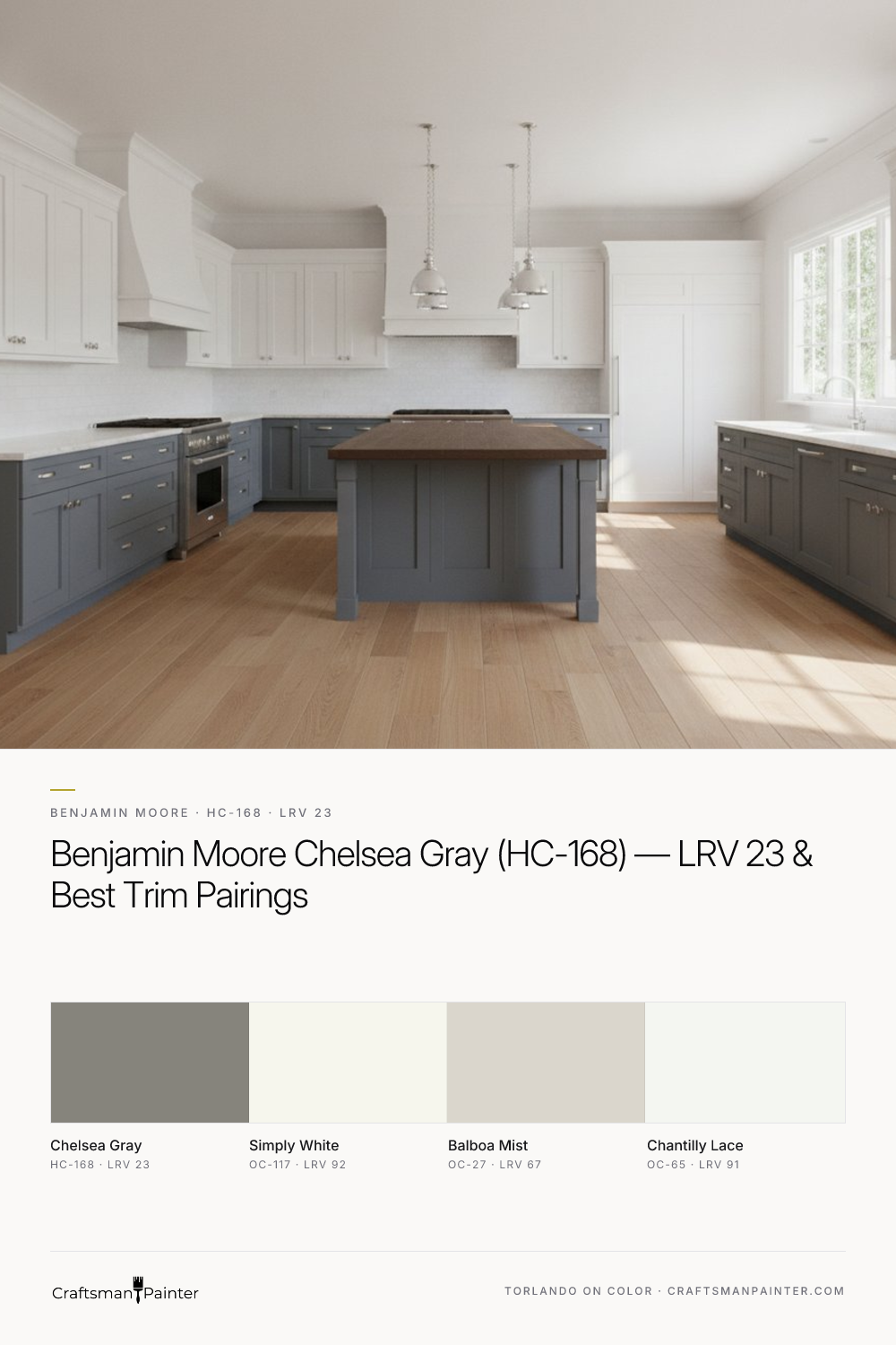


Unpacking Chelsea Gray's Complex Character
Real-paint peel-and-stick samples ship via Samplize. Craftsman Painter may earn a small commission on sample orders at no extra cost to you.
The most defining characteristic of Benjamin Moore Chelsea Gray (HC-168) is its warm beige-almond undertone. Unlike many grays that carry blue or green notes, Chelsea Gray’s subtle warmth ensures it remains inviting and comfortable. This is particularly important in rooms with cooler natural light, such as north-facing spaces, where it can counteract the blue cast and maintain its balanced appeal. In south-facing rooms or those bathed in warm artificial light, Chelsea Gray’s warmth will be more pronounced, leaning into a soft, rich greige without losing its gray identity. Its LRV of 23 means it absorbs a significant amount of light, creating an enveloping, sophisticated atmosphere. It’s a color that provides depth and presence, making it ideal for accent walls, studies, dining rooms, or even entire living areas where a dramatic yet inviting feel is desired.
When evaluating a color like Chelsea Gray, it's crucial to understand Josef Albers' principle of simultaneous contrast. Placing a new swatch directly against an existing wall color will distort your perception, as the surrounding color influences how you see the new one. To get an accurate read, always isolate your real-paint peel-and-stick samples against a neutral white background, such as a piece of poster board or directly against existing white trim. This allows the color to reveal its true character without interference, helping you discern its true undertones and how it truly behaves in your unique lighting conditions.
Harmonizing with Chelsea Gray: Trim and Companion Shades
Crafting a cohesive palette around a color as strong as Chelsea Gray requires careful consideration of its companions. For trim and ceilings, the goal is often to provide a crisp contrast that highlights Chelsea Gray's depth without competing with it. My go-to choices for this purpose are:
-
Benjamin Moore Simply White (OC-117): With an LRV of 92, Simply White is a clean, bright white with a touch of warmth. It offers a beautiful, soft contrast to Chelsea Gray, providing definition without feeling stark. This pairing is excellent for a sophisticated, classic look, allowing Chelsea Gray to truly shine on the walls while Simply White provides a gentle frame.
-
Benjamin Moore Balboa Mist (OC-27): As a coordinating neutral, Balboa Mist (LRV 67) serves as an excellent companion in adjacent spaces or for a monochromatic scheme. It’s a soft, warm greige that carries some of the same subtle beige undertones as Chelsea Gray, creating a seamless flow between rooms. This is particularly effective in open-concept homes where a gradual transition in depth is preferred over sharp contrast.
-
Benjamin Moore Chantilly Lace (OC-65): For a sharper, more contemporary contrast, Chantilly Lace (LRV 91) is a pure, unadulterated white. When paired with Chelsea Gray, it creates a more pronounced definition, ideal for modern interiors or when you want the trim to pop. I often recommend Chantilly Lace for interior doors or built-ins within a Chelsea Gray room to add a crisp architectural detail. Exploring these combinations further can be simplified by visiting the Color Studio for visual context and comparison.
Achieving a Flawless Finish: Prep and Product Specifications
Selecting the right paint color is only half the equation; the quality of the finish and the preparation work are equally critical, especially with a deeper color like Chelsea Gray which can amplify surface imperfections. For interior drywall, I always advocate for proper surface preparation. At a minimum, aim for Level 2: Standard (Occupied Home) drywall preparation, which includes patching minor imperfections, sanding, and priming. For a truly luxurious, flawless finish, particularly on walls that will receive direct light, Level 3: Premium (Luxury Finish) preparation is essential, ensuring all surfaces are smooth and uniform before any paint is applied.
When it comes to coatings, product selection makes a tangible difference. For walls, I frequently specify Sherwin-Williams Cashmere Low Lustre or Emerald Interior Matte. Cashmere offers a buttery smooth application and a rich, subtle sheen that enhances deep colors, while Emerald Interior Matte provides excellent washability and a consistently even finish. In high-humidity areas like bathrooms and kitchens, Sherwin-Williams Duration Home is my recommendation due to its superior moisture resistance and durability. For baseboards, doors, and cabinetry, Sherwin-Williams Emerald Urethane Trim Enamel in Satin or Semi-Gloss delivers a hard, durable finish that resists chipping and provides a beautiful, smooth appearance. The self-leveling properties of this product are crucial for achieving that refined look, especially on detailed millwork.
Chelsea Gray's Closest Rivals and Personalized Guidance
Understanding Chelsea Gray's character is often best achieved by comparing it to its closest rivals. Two shades frequently brought up in this context are Benjamin Moore Kendall Charcoal (HC-166) and Sherwin-Williams Gauntlet Gray (SW 7019).
Kendall Charcoal (HC-166): This is another popular dark gray, but its undertones differ significantly from Chelsea Gray. Kendall Charcoal leans into a distinct green-brown undertone, making it appear cooler and sometimes more earthy than Chelsea Gray. While Chelsea Gray maintains a consistent warm beige-almond note, Kendall Charcoal’s green can become more apparent in certain lighting conditions, particularly in natural light. If you desire a gray with less overt warmth and a subtle green influence, Kendall Charcoal might be your choice, but if you want to avoid any green, Chelsea Gray is the safer bet.
Sherwin-Williams Gauntlet Gray (SW 7019): Gauntlet Gray is a deeper, more saturated gray compared to Chelsea Gray, with a stronger brown/taupe undertone. Its LRV is lower than Chelsea Gray's, making it appear noticeably darker on the wall. While both share a warm essence, Gauntlet Gray's brown is more dominant, giving it a richer, cozier, and often more traditional feel. If you're looking for a very deep, almost charcoal gray with significant warmth and earthiness, Gauntlet Gray is a contender. However, if you prefer a sophisticated mid-to-dark gray that retains its gray identity with just a subtle warm embrace, Chelsea Gray is the more balanced option.
Navigating the nuances between similar shades like Chelsea Gray, Kendall Charcoal, and Gauntlet Gray is where professional guidance proves invaluable. If you're wrestling with these distinctions or require a tailored strategy for your home's unique lighting and existing finishes, a 1-on-1 Color Consultation can provide the clarity and confidence you need to make the right choice.

Velvety Shadows and Intimate Evening Dining Wrapped in Benjamin Moore Secret AF-710

Against Natural Stone and Cedar Trim, Benjamin Moore Stonybrook 1566 Delivers a Grounded Slate That Never Turns Baby Blue
