
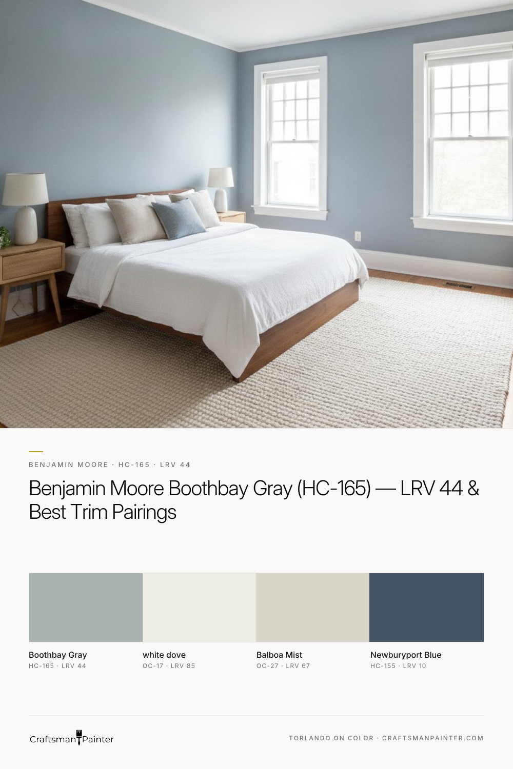


Deciphering Boothbay Gray's Coastal Character
Real-paint peel-and-stick samples ship via Samplize. Craftsman Painter may earn a small commission on sample orders at no extra cost to you.
The inherent charm of Benjamin Moore Boothbay Gray lies in its complex undertones. While it presents as a gray, the soft coastal blue-green influence is undeniable. In north-facing rooms, where light tends to be cooler and less direct, these blue-green notes will be more pronounced, leaning into its cooler identity. This can create a serene, almost contemplative atmosphere. Conversely, in south-facing rooms or spaces bathed in ample natural light, the warmer yellow or red wavelengths can temper the blue-green, allowing the gray to assert itself more fully, resulting in a balanced, sophisticated neutral. Artificial lighting, particularly incandescent or warm LED, can also soften the cool notes, while cooler LED lighting will enhance them. Understanding this interaction is crucial. When testing Boothbay Gray, avoid painting swatches directly onto an existing colored wall. This practice, often misleading due to Josef Albers' principle of simultaneous contrast, causes your eye to interpret the new color in relation to the old, distorting its true appearance. Instead, utilize large peel-and-stick samples, isolating them against a clean white backdrop, such as a piece of poster board or existing white trim. Observe the color at different times of day and under various lighting conditions to truly grasp its character in your specific environment. For further exploration of this shade and to visualize it in different settings, our Color Studio provides an excellent resource.
Curating a Harmonious Palette with Boothbay Gray
Crafting a cohesive color scheme around Boothbay Gray involves selecting complementary shades that enhance its inherent beauty without competing. For trim and ceilings, Benjamin Moore White Dove (OC-17, Hex #EFEEE5, LRV 85) is an exemplary choice. White Dove is a soft, warm white that avoids harshness, providing a gentle contrast that allows Boothbay Gray's blue-green undertones to subtly emerge without feeling stark. Its slight creaminess prevents it from appearing sterile, contributing to a welcoming ambiance. For a coordinating neutral, Benjamin Moore Balboa Mist (OC-27, Hex #DAD6CC, LRV 67) offers a beautiful partnership. Balboa Mist is a light, warm gray with barely-there greige undertones, providing a soft transition that maintains a sense of airiness while adding depth to the overall scheme. It works well in adjacent rooms or as a secondary wall color. To introduce a contrast accent, Benjamin Moore Newburyport Blue (HC-155, Hex #465566, LRV 10) is a bold, deep navy that perfectly complements Boothbay Gray's coastal leanings. Newburyport Blue can be used for accent walls, cabinetry, or even exterior elements, grounding the palette with its rich, sophisticated depth. This combination evokes a sophisticated coastal aesthetic that is both timeless and inviting.
Boothbay Gray's Closest Rivals: Beach Glass and Krypton
When considering Boothbay Gray, it is helpful to compare it to similar shades to appreciate its unique position. Benjamin Moore Beach Glass (1564) is a natural rival. While both share blue-green undertones, Beach Glass tends to lean a bit more distinctly green, often appearing slightly softer and more muted than Boothbay Gray. Beach Glass has a slightly higher LRV, meaning it reflects more light, giving it a lighter feel in a room. Boothbay Gray, with its LRV of 44, holds its gray identity more firmly, with the blue-green acting as an undertone rather than the dominant hue. The difference is subtle but significant; Beach Glass might be preferred for a slightly more overtly green-blue presence, whereas Boothbay Gray maintains a stronger gray foundation. Another close comparison is Sherwin-Williams Krypton (SW 6247). Krypton is a cool, crisp blue-gray that is notably more blue than Boothbay Gray. It carries less of the green complexity and presents as a more straightforward cool blue-gray. While both evoke a serene feeling, Krypton leans into a cooler, more contemporary aesthetic, lacking the soft coastal warmth that Boothbay Gray’s green undertone provides. Boothbay Gray offers a unique balance, sitting comfortably between the more overtly green Beach Glass and the distinctly blue Krypton, providing a sophisticated, nuanced gray with a gentle coastal whisper.
Achieving a Refined Finish: Application & Material Specifications
Beyond color selection, the quality of preparation and chosen coatings dictates the final aesthetic and longevity of your paint project. For interior walls, especially when aiming for a premium look with Boothbay Gray, proper drywall preparation is paramount. We advocate for a minimum of Level 2: Standard (Occupied Home) drywall finish, ensuring all joints and fasteners are taped and covered with joint compound, then sanded smooth. For a truly luxurious finish, particularly in homes where the highest standards are expected, Level 3: Premium (Luxury Finish) preparation, which includes an additional skim coat and thorough sanding, will yield an impeccably smooth surface that allows Boothbay Gray to perform optimally. For wall coatings, Sherwin-Williams Cashmere Low Lustre offers a smooth, buttery finish that is both elegant and forgiving, while Sherwin-Williams Emerald Interior Matte provides exceptional washability and durability, ideal for high-traffic areas. In humid environments such as bathrooms and kitchens, Sherwin-Williams Duration Home, formulated with anti-microbial properties, is the preferred choice for its superior moisture resistance. For baseboards, doors, and cabinetry, a hard, durable finish is essential. Sherwin-Williams Emerald Urethane Trim Enamel in Satin or Semi-Gloss provides excellent adhesion, flow, and leveling, creating a smooth, durable surface that withstands daily wear and tear. The choice of sheen significantly impacts how Boothbay Gray is perceived; a matte or low lustre finish will enhance its depth and softness, while an eggshell or satin will introduce a subtle sheen that can make the color feel slightly brighter. For personalized guidance on achieving these finishes in your home, consider scheduling a 1-on-1 Color Consultation with our team, where we can address your specific project needs and ensure a flawless result.

Beyond Predictable Trim Colors: The Enduring Appeal of Benjamin Moore Buxton Blue HC-149

Muted Olive and Soft Gray Converge in the Quietly Complex Benjamin Moore Flora AF-470
