


The Subtle Refinement of Beach Glass: Undertones and Light Reflection
Real-paint peel-and-stick samples ship via Samplize. Craftsman Painter may earn a small commission on sample orders at no extra cost to you.
Beach Glass (1564) is a study in nuanced color. Its LRV of 50 means it reflects about half the light that strikes it, placing it in a sweet spot for creating a sense of enclosure and comfort without making a room feel dim. In north-facing rooms, where light tends to be cooler and bluer, Beach Glass's inherent green-gray qualities can lean slightly more into its gray side, appearing a touch more subdued. Conversely, in south-facing rooms or those with abundant warm, natural light, the green will become more apparent, revealing its botanical character. The muted sage-green undertone is what truly defines this color. It's not a direct green, but rather a green that has been softened and tempered by gray, with a whisper of blue that prevents it from becoming too earthy or drab. This complexity allows it to act as a sophisticated neutral, capable of supporting a wide array of furnishings and decorative styles. It evokes a sense of tranquility and connection to nature, without being overtly 'green.' For main walls, I often recommend top-tier coatings like Sherwin-Williams Cashmere Low Lustre or Emerald Interior Matte. These products offer excellent hide and a smooth finish that enhances the subtle nature of Beach Glass, especially when applied over Level 2: Standard (Occupied Home) drywall preparation.
Pairing Beach Glass with Trim & Cabinetry: A Cohesive Approach
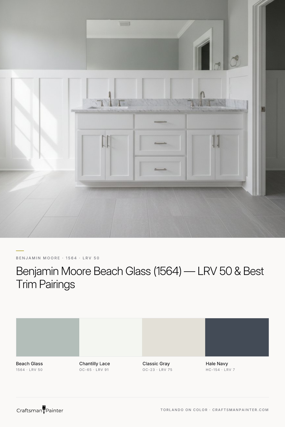
The success of any wall color is heavily dependent on its relationship with the trim and fixed elements in a room. For Benjamin Moore Beach Glass, the ideal companion for trim and ceilings is Benjamin Moore Chantilly Lace (OC-65). With an LRV of 91 and a clean, crisp white character (Hex #F4F6F1), Chantilly Lace provides a stark, yet harmonious, contrast that allows Beach Glass to truly sing. This pairing accentuates the subtle green-gray of Beach Glass, defining architectural details without introducing competing undertones. When specifying trim and cabinetry, particularly for a luxury finish, we often opt for Level 3: Premium (Luxury Finish) wood preparation, ensuring a flawlessly smooth surface. For the coating itself, Sherwin-Williams Emerald Urethane Trim Enamel in a Satin or Semi-Gloss sheen is the preferred choice. This product offers superior durability and a hard, factory-like finish that resists chipping and blocking, crucial for high-traffic areas like baseboards, doors, and especially kitchen or bathroom cabinets. The slight sheen on the trim against the flatter wall finish creates a subtle textural interplay, adding depth to the room's design. When considering Beach Glass for a kitchen, pairing it with Chantilly Lace cabinets can create an airy, fresh environment, or it can serve as a calming wall color alongside darker wood tones. For humid environments like bathrooms and kitchens, using Sherwin-Williams Duration Home for walls provides added moisture and mildew resistance, ensuring long-term performance.
Expanding the Palette: Complementary Hues and Accents
Beyond the essential trim pairing, Beach Glass is remarkably adaptable when building out a broader color palette. Benjamin Moore Classic Gray (OC-23, Hex #E3E0D7, LRV 75) serves as an excellent coordinating neutral. Its light, warm gray qualities offer a gentle contrast to Beach Glass without introducing any jarring elements. Classic Gray can be used on adjacent walls, in hallways, or for larger furniture pieces, maintaining a cohesive and serene flow throughout a home. For a bolder, more impactful contrast, Benjamin Moore Hale Navy (HC-154, Hex #434B56, LRV 7) is an exceptional choice. This deep, sophisticated navy provides a grounding anchor in a room, allowing the subtle qualities of Beach Glass to truly emerge. Hale Navy works beautifully for accent walls, built-in cabinetry, or even as a color for textiles and artwork. The combination of Beach Glass, Classic Gray, and Hale Navy creates a balanced, sophisticated scheme that feels both timeless and contemporary. This palette is especially effective in living rooms, bedrooms, or home offices where a sense of calm and collected elegance is desired. For those looking to explore how Beach Glass integrates into various room settings and lighting conditions, our Color Studio offers a visual guide to its versatility.
Distinguishing Beach Glass from its Closest Counterparts
Homeowners frequently ask about the differences between Benjamin Moore Beach Glass and popular Sherwin-Williams shades like Sea Salt (SW 6204) and Rainwashed (SW 6211). While all three inhabit a similar realm of muted blue-greens, their nuances are critical. Sherwin-Williams Sea Salt is perhaps the closest rival, often reading as a slightly lighter, more blue-leaning green-gray. Its LRV is 63, making it brighter than Beach Glass's 50. Sea Salt tends to have a more pronounced blue undertone, which can make it feel a touch cooler and more ethereal than the grounded, botanical quality of Beach Glass. Rainwashed (SW 6211), with an LRV of 59, is also lighter than Beach Glass and carries a more distinct blue-green presence. It's often perceived as a clearer, slightly more saturated blue-green than both Sea Salt and Beach Glass, which possess more gray. Beach Glass, by comparison, maintains its muted sage-green undertone with a more balanced gray component, making it feel more substantial and less overtly 'coastal' than its Sherwin-Williams counterparts. When evaluating these shades, it is crucial to understand Josef Albers' principle of simultaneous contrast. This principle dictates that colors influence each other when placed side-by-side. Testing a new paint swatch directly on an existing painted wall will inevitably skew your perception, as the old color will alter how you see the new one. To accurately assess Beach Glass, or any color, always isolate your real-paint peel-and-stick samples against a clean white background, ideally against your chosen white trim color like Chantilly Lace. This neutral separation allows the true character and undertones of the color to reveal themselves without interference. For personalized guidance on selecting the perfect shade for your home, consider a 1-on-1 Color Consultation to ensure confidence in your choices.

Can a Violet-Tinted Gray Calm the Warmth of Mid-Century Stone and Walnut? Testing Sherwin-Williams Swanky Gray (SW 6261) in an Indiana Limestone Ranch Bath Suite

Against Natural Stone and Cedar Trim, Benjamin Moore Stonybrook 1566 Delivers a Grounded Slate That Never Turns Baby Blue
