


To explore how daylight reshapes neutral palettes, let’s look at a design study of a representative Modern Prairie home in Indianapolis. During Indiana's autumn months, the low-angled, amber afternoon light streams through windows, putting soft neutral paints to the ultimate test.
That brings us to Benjamin Moore Ashwood OC-47. With a Light Reflectance Value (LRV) of 69.65, Ashwood sits in that sweet spot of paint brightness. An LRV of roughly 70 means this color reflects a high amount of light, helping rooms feel open, airy, and welcoming, while retaining just enough body to keep the walls from looking washed out or clinical.
What makes Ashwood special is its undertone. Rather than leaning into the pinkish or overly cool slate tones found in standard grays, Ashwood pairs a soft, warm gray base with a subtle organic green undertone. In morning daylight, it reads as a clean, peaceful griege with an almost mossy softness. As the late afternoon autumn sun kicks in, that green undertone absorbs the warm orange and red outdoor light, settling into a cozy, stone-like warmth.

Work Directly with Torlando Hakes
Skip the color choice stress. Work directly with me as your personal Color Designer to select the perfect architectural palette for your home, and get a Complementary Color Consultation when you purchase paint through us.

Framing the Shell with Creamy Architectural Trim
Ashwood
Benjamin Moore OC-47
White Dove
Benjamin Moore OC-17
Richmond Gray
Benjamin Moore HC-96
Essex Green
Benjamin Moore HC-188
In Prairie-style architecture, horizontal trim, built-in woodwork, and deep window casings define the flow of a room. Rather than pairing Ashwood with a stark, blinding bright white, I prefer pairing it with Benjamin Moore White Dove OC-17 on the trim, baseboards, and ceiling.
White Dove carries a gentle, creamy undertone that acts as an anchor alongside Ashwood. When applied to door casings and window grids, White Dove creates a smooth, low-contrast transition between the wood elements and the warm gray walls. It frames the vibrant autumn views outside without pulling visual focus away from the surrounding architecture.
For sheens in a living space like this, I always recommend sticking to a flat or matte finish on the walls for Ashwood. A flat finish absorbs excess glare, letting the subtle green and warm gray tones display smoothly across long drywall spans. For the White Dove trim, a satin or semi-gloss finish adds subtle sheen, making window casings easy to clean while giving the wood trim a hand-milled look.

Creating Depth Across Open Prairie Layouts
Because Modern Prairie homes prioritize open sightlines, you rarely view a single wall in isolation. As sunlight shifts from horizontal band windows across the room, paint colors naturally change shade from shadow to highlight.
To bridge open rooms and wide hallways without creating harsh color jumps, look to a deeper, earthy mid-tone like Benjamin Moore Richmond Gray HC-96. Despite its name, Richmond Gray is a rich, warm olive-tinted tan that echoes the mossy undertones of Ashwood.
Applying Richmond Gray to a cozy den, an entry vestibule, or an accent cove ceiling creates a natural stepping stone within the floor plan. When you look from a sunlit living room finished in Ashwood toward a secondary space painted in Richmond Gray, the transition feels intentional, earthy, and grounded. It connects the interior spaces to the changing autumn colors visible through leaded glass windows.

Anchoring the Palette with Deep Forest Accents
To give a subtle wall color like Ashwood a crisp, modern punch, every well-balanced home needs a strong dark anchor color. In this palette, Benjamin Moore Essex Green HC-188 serves that role perfectly.
Essex Green is a deep, near-black forest green that brings out the subtle organic undertones hidden inside Ashwood. It works remarkably well on kitchen islands, built-in bookcases, or architectural interior doors. When placed next to quarter-sawn white oak cabinets and brushed bronze hardware, Essex Green gives the subtle backdrop of Ashwood walls a clear, tailored purpose.
For cabinetry and doors painted in Essex Green, specify a durable satin enamel. This sheen highlights the rich depth of the green pigment while standing up to high-traffic touchpoints.

Bringing Ashwood into Private Spaces
While Ashwood excels in open-concept living rooms, it shines just as bright in personal sanctuaries like primary bathrooms and suites. In spaces with linear concrete tile, white oak vanities, and brushed bronze fixtures, Ashwood creates a spa-like mood that feels grounded in nature.
In smaller or enclosed rooms, the color stays remarkably stable. Because artificial lighting—such as warm 2700K linear LED coves—mirrors the low amber rays of autumn afternoon light, Ashwood maintains its soft, mossy stone character straight through the evening.

When choosing a neutral paint for your home, remember that swatches lying flat on a table will never look the same as paint applied to a full-scale wall. Paint large sample boards, lean them against your trim, and watch how the color evolves from morning light to sunset before making your final call.
Complementary Color Consultation
Planning a project? Work with Torlando Hakes directly as your personal Color Designer and get a Complementary Consultation when purchasing paint through us.
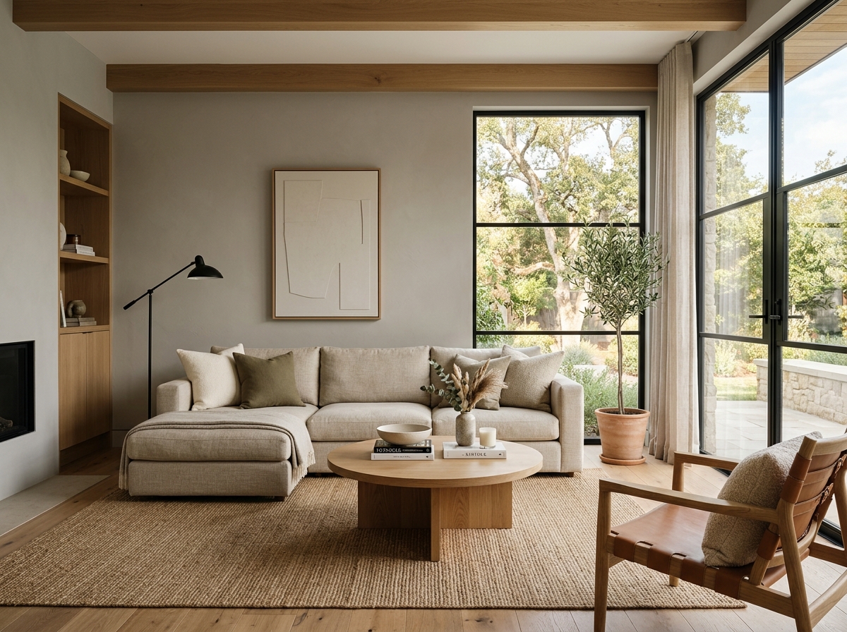 After
After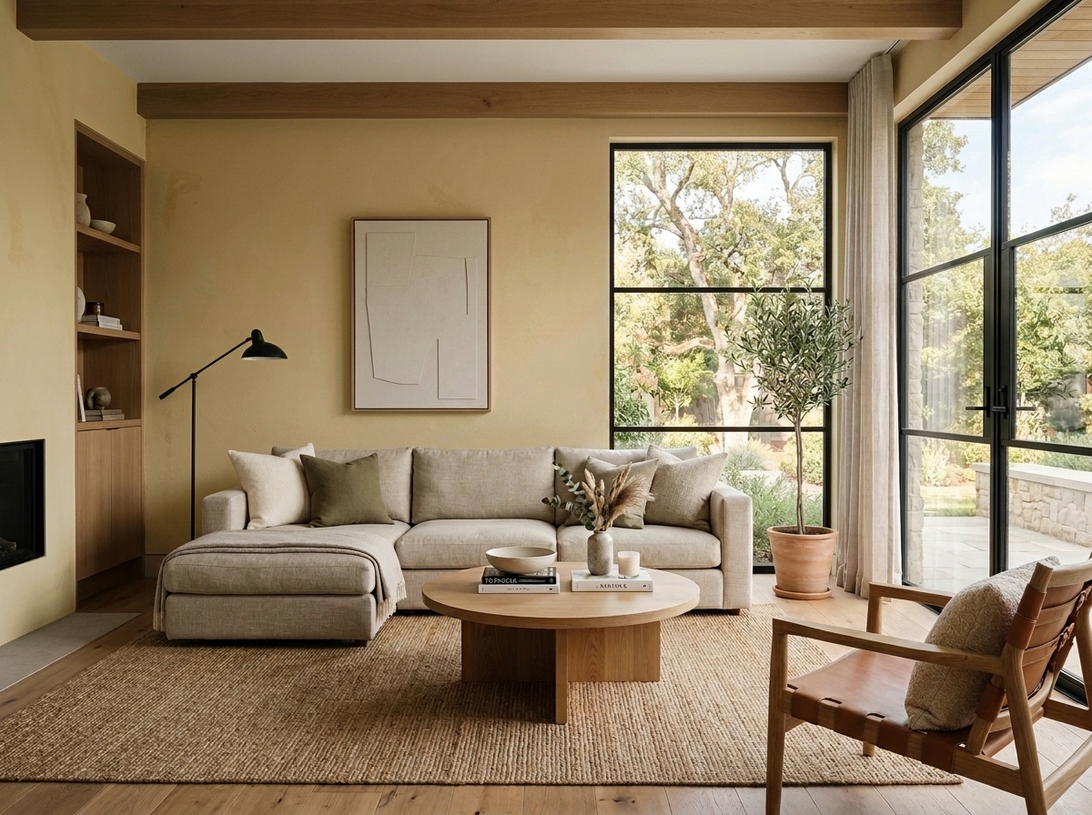 Before
Visualize Your Space with Color Studio AI
Planning a project? Skip the paint chip guesswork. Use our Color Studio AI to instantly visualize these paint colors on your own walls, or take advantage of our aligned contractor pricing matching current Sherwin-Williams retail promotions.
Book Your Upcoming Paint Project
Craftsman Painter is now scheduling premium transformations. Secure your spot and elevate your property value.
Get an EstimateHelp Others Find Professional Color Insights
Share this story directly to your networks or copy the link to share with friends.