
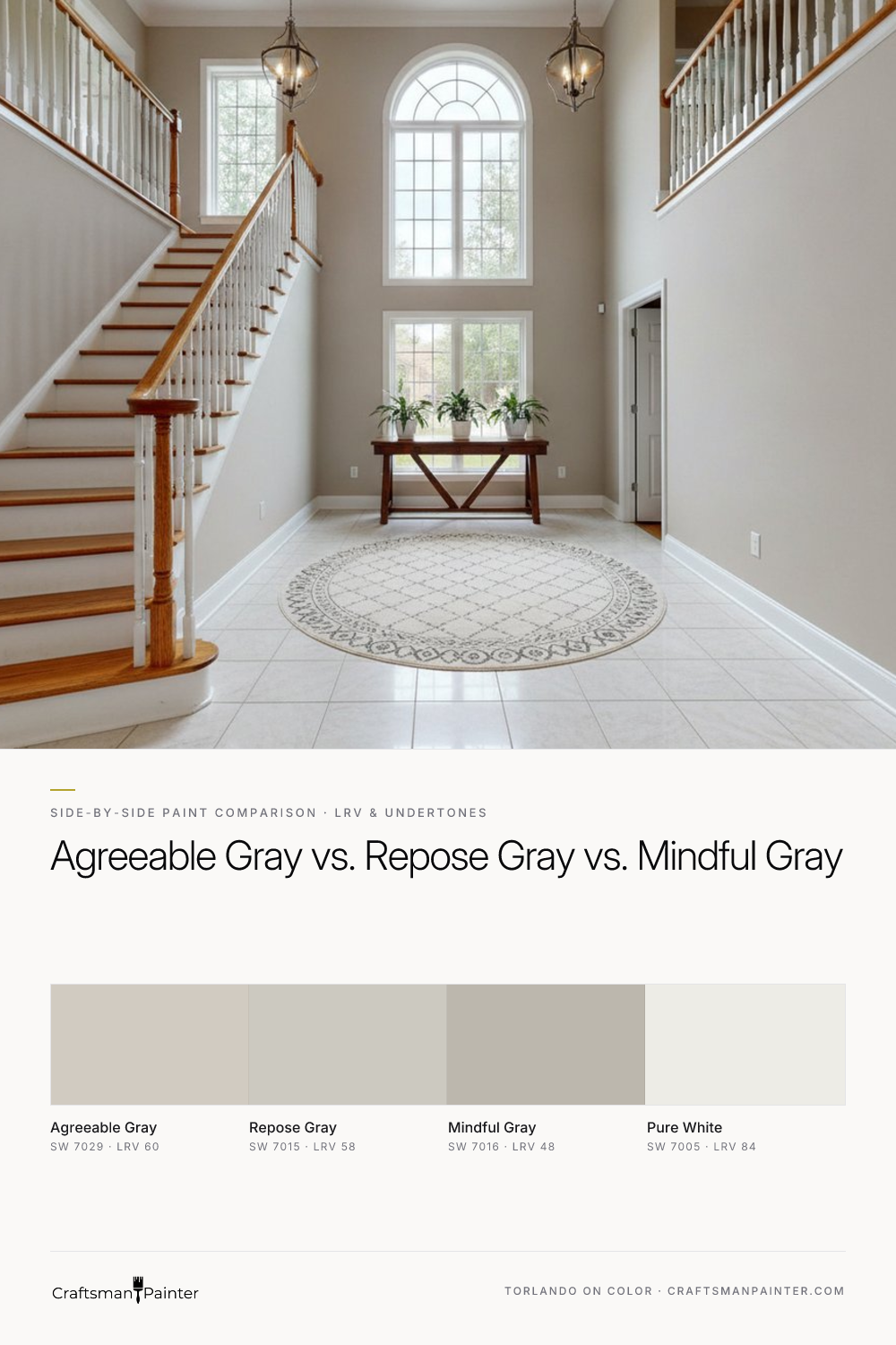
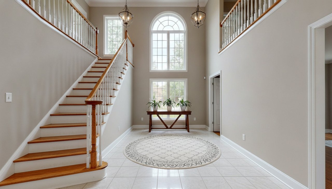

LRV & Brightness: The Full-Wall Perception Gap
Real-paint peel-and-stick samples ship via Samplize. Craftsman Painter may earn a small commission on sample orders at no extra cost to you.
Light Reflectance Value (LRV) is a critical metric, indicating the percentage of visible light a color reflects. A higher LRV means more light reflected, resulting in a brighter perception of the space. Let's compare our contenders:
- Agreeable Gray (SW 7029): LRV 60. This is a comfortable mid-range LRV, placing it firmly in the light-to-medium category. On a full wall, Agreeable Gray offers a soft, inviting brightness without feeling stark. It provides enough depth to feel substantial but remains airy.
- Repose Gray (SW 7015): LRV 58. With an LRV just two points lower than Agreeable Gray, Repose Gray is also a light-to-medium gray. The difference between 60 and 58 is subtle on paper, but in a large room, Repose Gray will present as marginally deeper and slightly less reflective than Agreeable Gray. This minor decrease in LRV can be perceived as a gentle increase in color saturation or a very slight reduction in overall brightness, depending on the available light.
- Mindful Gray (SW 7016): LRV 48. Mindful Gray represents a significant step down in LRV compared to its counterparts. An LRV of 48 positions it squarely in the medium-dark gray category. On full walls, Mindful Gray will create a noticeably more grounded and enveloping atmosphere. It absorbs more light, making spaces feel cozier and more defined. The brightness gap between Mindful Gray and the other two is substantial, meaning it requires more natural or artificial light to prevent a room from feeling dim.
Understanding these LRV differences is fundamental. If your goal is to maximize perceived brightness, Agreeable Gray or Repose Gray are stronger candidates. If you seek depth and a more pronounced color statement, Mindful Gray delivers.
Undertone Dynamics: North vs. South Light & 2700K Illumination
Undertones are the subtle colors that emerge under different lighting conditions, and they are paramount to a successful color scheme. This is where the true character of each gray reveals itself.
-
Agreeable Gray (SW 7029): Warm Beige-Almond Undertones. This color is a greige, meaning it's a blend of gray and beige. In north-facing rooms, which receive cooler, blue-biased light, Agreeable Gray's inherent warmth helps to counteract the chill, preventing the room from feeling stark. Its beige notes become more apparent, maintaining a welcoming feel. In south-facing rooms, bathed in warm, yellow-biased light, Agreeable Gray can lean more explicitly into its beige side, appearing less gray and more like a muted, warm off-white or light tan. Under 2700K evening bulbs, which emit a warm, yellowish glow, Agreeable Gray's beige undertones will be emphasized, making it feel very cozy and less overtly gray.
-
Repose Gray (SW 7015): Subtle Purple/Blue Undertones. Repose Gray is often considered a true gray, but it carries a delicate balance of cool undertones. In north-facing rooms, the cool light can draw out a very faint blue or purple cast, making the color appear crisper and more modern. This characteristic can be desirable for a clean aesthetic. In south-facing rooms, the warmer light helps to neutralize these cooler undertones, allowing Repose Gray to present as a more balanced, neutral gray. With 2700K evening bulbs, its cooler notes are typically softened, but a very subtle purple or blue hint might still be discernible, contributing to a sophisticated, understated atmosphere.
-
Mindful Gray (SW 7016): Green Undertones. Mindful Gray is a deeper gray with a distinct green undertone. In north-facing rooms, the cool light amplifies this green, making it a pronounced green-gray. This can be a sophisticated choice, especially when paired with natural materials. In south-facing rooms, the warmer light might soften the green slightly, but it remains a noticeable characteristic, preventing it from appearing as a simple neutral gray. Under 2700K evening bulbs, the green undertone is often muted but still present, contributing to a rich, earthy depth rather than a stark gray.
When testing these colors, it is crucial to avoid applying real-paint peel-and-stick samples directly onto an existing painted wall. As Josef Albers' work on simultaneous contrast demonstrates, the surrounding color will distort your perception of the sample. Always isolate your samples against a clean white background, such as Sherwin-Williams Pure White (SW 7005) trim or a large white poster board, to accurately assess their true undertones in your specific lighting conditions. For a comprehensive look at Agreeable Gray and its nuances, you can explore its profile in our Color Studio.
Harmonizing with Fixed Elements: Oak, Marble, & Cabinetry
The success of a paint color often hinges on its relationship with the fixed elements in a room. Here's how our contenders perform:
-
Warm Oak Floors:
- Agreeable Gray (SW 7029): This is often a harmonious pairing. Its warm beige-almond undertones complement the golden and orange tones in oak, creating a cohesive and inviting environment without clashing. It feels intentional and balanced.
- Repose Gray (SW 7015): Can work, but requires careful consideration. If the oak has strong yellow or orange tones, Repose Gray's cooler, subtle blue/purple undertones might create a slight tension, making the oak appear more yellow or the gray feel slightly off. It can work well with more muted or weathered oaks.
- Mindful Gray (SW 7016): The green undertone in Mindful Gray can be a sophisticated partner for warm oak. Green and red/orange (common in oak) are complementary colors, and this can create a rich, deliberate contrast that elevates the space. However, if not balanced, it could also make the oak look more pronouncedly orange. It's a bolder choice that can pay off.
-
White Marble/Quartz (Cool-Toned):
- Agreeable Gray (SW 7029): This can be a challenging pairing. If your marble or quartz has cool white and gray veining, Agreeable Gray's warm beige undertone might feel out of place or slightly yellow against the cool, crisp stone. It can work if the marble has warmer veining, but generally, it's not the first choice for cool white stone.
- Repose Gray (SW 7015): An excellent choice. Its balanced, slightly cool undertones align beautifully with the cool grays and pure whites found in most white marble and quartz countertops. It creates a cohesive, clean, and sophisticated look.
- Mindful Gray (SW 7016): Can provide a striking contrast. Its depth and green undertone can offer an elegant backdrop to pure white marble, especially if there's any subtle green-gray veining in the stone. It creates a statement while maintaining sophistication.
-
Cabinetry (White or Wood):
- White Cabinets (e.g., Sherwin-Williams Pure White SW 7005): All three can work. Agreeable Gray offers a soft, warm contrast. Repose Gray provides a crisp, modern backdrop. Mindful Gray creates a dramatic, grounded setting that makes white cabinets pop.
- Wood Cabinets (e.g., cherry, maple): Similar considerations to oak floors apply. Agreeable Gray maintains warmth. Repose Gray can offer a subtle contrast. Mindful Gray can create a rich, earthy pairing, especially with medium to darker wood tones.
Making Your Choice: Decision Rules, Sheen, & Preparation
Choosing the right gray is about alignment with your home's fixed elements, lighting, and desired atmosphere.
Decision Rules:
- Choose Agreeable Gray (SW 7029) if you desire a soft, warm neutral that leans greige, especially in spaces that need a gentle lift, or if you have existing warm elements like traditional wood furniture or earthy tones that you want to complement without introducing a stark gray.
- Choose Repose Gray (SW 7015) if you are seeking a true, balanced gray that doesn't lean too warm or too cool. It's ideal for modern aesthetics, complementing cooler fixed elements like white marble, or for creating a crisp, clean foundation that allows other decor elements to stand out.
- Choose Mindful Gray (SW 7016) if you want a deeper, more saturated gray with a clear green undertone. This color is suitable for making a bolder statement, grounding a space, or when you have natural wood tones that would benefit from the sophisticated contrast offered by its green notes.
Sheen & Coating Recommendations:
The right sheen and coating are as vital as the color itself for a lasting, professional finish:
- Walls: For a refined look on drywall, I recommend Sherwin-Williams Cashmere Low Lustre. It offers a soft, elegant finish with a subtle glow that helps diffuse light. Alternatively, Sherwin-Williams Emerald Interior Matte provides a rich, non-reflective finish that excels at hiding minor wall imperfections. Both are premium choices for general living areas.
- Humid Areas (Baths/Kitchens): In high-moisture environments, durability is paramount. Sherwin-Williams Duration Home is the appropriate choice, offering excellent moisture resistance and washability without compromising on aesthetic quality.
- Trim, Doors, & Cabinets: For these high-traffic surfaces, a hard, durable finish is essential. Sherwin-Williams Emerald Urethane Trim Enamel in Satin or Semi-Gloss provides superior resistance to chipping and scratching, ensuring a long-lasting, smooth appearance. Satin offers a softer glow, while Semi-Gloss provides more reflectivity and a slightly more formal look.
Preparation Recommendations:
Proper surface preparation is non-negotiable for a professional finish:
- Drywall: For occupied homes, Level 2: Standard (Occupied Home) drywall preparation is typically sufficient, involving light sanding, minor patching of nail holes, and cleaning. For a truly flawless, luxury finish, especially with lower sheen paints that reveal imperfections, opt for Level 3: Premium (Luxury Finish) preparation. This includes more extensive filling of imperfections, detailed sanding to achieve a very smooth, uniform surface, and often a full coat of primer.
- Wood (Trim, Doors, Cabinets): Similar principles apply. Level 2 prep involves cleaning, light sanding, and filling minor dings. Level 3 prep for wood demands filling grain (if applicable), comprehensive sanding to achieve an incredibly smooth substrate, and priming with a high-quality wood primer to ensure optimal adhesion and finish uniformity.
If you find yourself still deliberating after testing samples, a personalized perspective can be invaluable. My 1-on-1 Color Consultation service offers tailored advice to navigate these complex decisions, ensuring your final choice perfectly suits your home.

Keeping Classic Dark Wood Trim? How Sherwin-Williams Agreeable Gray SW 7029 Bridges Past and Present
The Enduring Warmth of Accessible Beige SW 7036: Why This Neutral Defines Modern Interior Painting…
