
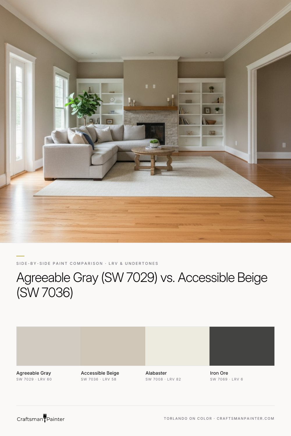


LRV and Brightness on Full Walls
Real-paint peel-and-stick samples ship via Samplize. Craftsman Painter may earn a small commission on sample orders at no extra cost to you.
Light Reflectance Value (LRV) is a crucial metric, indicating the percentage of light a color reflects. Agreeable Gray (SW 7029) boasts an LRV of 60, while Accessible Beige (SW 7036) comes in slightly lower at 58. This two-point difference might seem negligible on a small swatch, but it translates into a perceptible distinction when applied across entire walls. Agreeable Gray, with its higher LRV, will inherently feel marginally brighter and more open. It reflects a touch more light, contributing to an airier atmosphere, particularly in rooms with ample natural light or those where you desire a slightly more expansive feel. This makes it a strong contender for spaces where maximizing perceived brightness is a priority.
Accessible Beige, with its LRV of 58, offers a slightly deeper, more saturated appearance. While still very much a light neutral, it will absorb a fraction more light, resulting in a cozier, perhaps more grounded ambiance. It provides a subtle depth that can prevent a room from feeling too stark, especially in larger spaces or those with very high ceilings. When paired with a crisp white trim like Sherwin-Williams Alabaster (SW 7008, LRV 82), both colors achieve a clean, defined look, but Agreeable Gray will present a slightly stronger contrast due to its higher LRV, while Accessible Beige will offer a softer transition.
Undertone Differences Across Lighting Conditions
Understanding undertones is paramount, as they dictate how a color truly behaves in your unique environment. Agreeable Gray carries warm beige-almond undertones. In north-facing rooms, which receive cooler, indirect light, Agreeable Gray maintains its warmth but leans more distinctly into its gray aspect, appearing as a sophisticated, true greige. It resists going overtly cool or blue. In south-facing rooms, bathed in warmer, yellower light, its beige notes become more pronounced, making it feel softer and more undeniably greige, sometimes even a touch creamy. This adaptability is a significant reason for its widespread popularity.
Accessible Beige, on the other hand, features more prominent warm beige undertones. In cooler, north-facing light, it holds its warmth remarkably well, often appearing as a balanced greige that firmly leans beige without ever feeling cold. It's a reliable choice for warming up cooler rooms. However, in south-facing rooms or those with abundant warm artificial light, Accessible Beige can lean quite beige, sometimes even revealing a subtle golden cast depending on the surrounding elements and the intensity of the light. Under 2700K evening bulbs—a common warm white temperature—both colors will appear softer and more inviting. Agreeable Gray will retain its identity as a warm gray, while Accessible Beige will emphasize its beige character, potentially feeling very creamy or sandy. This is where the principle of simultaneous contrast, famously explored by Josef Albers, becomes critical: the perception of a color is always influenced by the colors adjacent to it. A color never appears the same way in isolation as it does next to your floors, furniture, or existing wall color. It is why proper sampling is non-negotiable.
Pairing with Permanent Fixtures: Floors, Countertops, and Cabinetry
The true test of a neutral lies in its ability to harmonize with your home's fixed elements. For warm oak floors, a common feature in many homes, Agreeable Gray often proves to be the superior choice. Its balanced gray component provides a sophisticated counterpoint to the orange or yellow tones often present in oak, tempering their intensity without introducing a stark contrast. The warm beige undertones in Agreeable Gray then work to ensure the room still feels inviting and cohesive. It creates a subtle tension that elevates the space. Accessible Beige can work with oak, but if the oak is particularly warm or orange, Accessible Beige's stronger beige leanings might blend too much, potentially making the room feel monochromatic in a way that lacks definition, or even amplifying the warmth to an undesirable degree. It performs best with more muted, less intensely warm oak tones.
When considering white marble or quartz countertops, both colors have merit. Agreeable Gray is an excellent choice, as its subtle warmth prevents the space from feeling sterile, allowing the clean white and gray veining of the stone to stand out crisply. It provides a contemporary yet inviting backdrop. Accessible Beige also pairs beautifully, especially if your white countertops have warmer undertones (e.g., a creamy white quartz). It will create a softer, more traditional or organic feel. If the white is very cool and stark, however, Accessible Beige might pull too yellow or creamy in contrast. For cabinetry, such as Sherwin-Williams Alabaster cabinets, both Agreeable Gray and Accessible Beige create stunning backdrops. Agreeable Gray offers a gentle, sophisticated contrast, while Accessible Beige provides a softer, more cohesive warm envelope. For stained wood cabinets, similar considerations to oak floors apply: Agreeable Gray offers balanced contrast, while Accessible Beige will lean into the existing warmth.
To add depth and sophistication, consider Sherwin-Williams Iron Ore (SW 7069, LRV 6) as an accent. This deep charcoal, almost black, color provides a powerful grounding element. It works exceptionally well on interior doors, a fireplace mantel, or a feature wall, creating a striking contrast that complements the warmth of both Agreeable Gray and Accessible Beige without competing with them. You can explore how these colors interact in the Color Studio to visualize their impact.
Decision Rules and Application Specifics
When deciding between these two exceptional neutrals, consider these clear decision rules:
Choose Agreeable Gray (SW 7029) if:
- You desire a slightly brighter, more airy feel in your space.
- Your existing fixed elements, particularly floors (like warm oak) or stone, have strong warm undertones that you wish to temper with a sophisticated gray without making the room feel cold.
- You are aiming for a modern greige that maintains a welcoming warmth.
- You prefer a slightly more pronounced contrast with crisp white trim like Alabaster.
Choose Accessible Beige (SW 7036) if:
- You prefer a cozier, slightly deeper neutral that still feels expansive.
- Your fixed elements are already quite neutral or have softer warm tones, and you want to lean into that warmth without going overtly beige or yellow.
- You want a greige that clearly favors the beige side of the spectrum, offering a softer, less contrasting look with white trim.
Crucial Testing Guidance: As mentioned, Josef Albers' work on simultaneous contrast proves that colors are never seen in isolation. Placing a new paint swatch directly on an existing painted wall will distort your perception of both colors. The existing wall color will influence how you see the new swatch, often making it appear different than it truly is. To get an accurate read, always use large, real-paint peel-and-stick samples. Isolate them against a neutral white background, such as a large piece of white poster board, or directly against existing white trim. Move these samples around the room, observing them at different times of day and under various lighting conditions, and next to all your permanent fixtures. This method provides the most reliable assessment.
Preparation and Coatings: The final appearance of your chosen color is heavily dependent on proper surface preparation and the quality of the paint product. For drywall, ensure at least Level 2: Standard (Occupied Home) preparation for a smooth finish, or opt for Level 3: Premium (Luxury Finish) for a truly flawless, high-end result. For walls, I recommend Sherwin-Williams Cashmere Low Lustre for a soft, elegant finish in living areas, or Emerald Interior Matte for superior washability and durability in high-traffic spaces. In humid environments such as bathrooms and kitchens, Sherwin-Williams Duration Home is the ideal choice due to its excellent moisture resistance and scrubbability. For baseboards, doors, and cabinetry, Sherwin-Williams Emerald Urethane Trim Enamel in Satin for a subtle sheen or Semi-Gloss for a more traditional, reflective finish offers exceptional hardness, flow, and durability. If you find yourself needing further personalized guidance, a 1-on-1 Color Consultation can provide the clarity you need to move forward with confidence.
Frequently Asked Questions
What is the main difference in undertones between Sherwin-Williams Agreeable Gray and Accessible Beige?
Agreeable Gray (SW 7029) has warm beige-almond undertones, making it a balanced greige that leans slightly more gray. Accessible Beige (SW 7036) features more prominent warm beige undertones, causing it to lean more distinctly beige, especially in warm light. This subtle difference dictates how each color interacts with existing fixtures and lighting conditions.
Which paint color, Agreeable Gray or Accessible Beige, is better for rooms with warm oak floors?
For rooms with warm oak floors, Agreeable Gray (SW 7029) is often the stronger choice. Its gray component helps to temper the orange or yellow tones in oak, providing a sophisticated contrast while its beige undertones ensure warmth. Accessible Beige (SW 7036) can work, but its stronger beige leanings might blend too much with very warm oak, potentially diminishing contrast.
How should I properly test Sherwin-Williams Agreeable Gray and Accessible Beige in my home?
To accurately test, use large, real-paint peel-and-stick samples. Do not place them directly on an existing painted wall, as this distorts color perception due to simultaneous contrast. Instead, isolate the samples against a clean white background (like white poster board or existing white trim) and move them around the room to observe them in different lighting conditions and next to your permanent fixtures.
What are the best Sherwin-Williams paint products to use with these colors for different areas of the home?
For drywall, Sherwin-Williams Cashmere Low Lustre offers an elegant finish, or Emerald Interior Matte provides superior durability. In humid areas like baths and kitchens, Duration Home is recommended for its moisture resistance. For baseboards, doors, and cabinets, Emerald Urethane Trim Enamel in Satin or Semi-Gloss provides excellent hardness and a smooth finish.

Keeping Classic Dark Wood Trim? How Sherwin-Williams Agreeable Gray SW 7029 Bridges Past and Present

The Artistic Fusion of Sherwin Williams’ Gossamer Veil and Griffin: A Palette that Speaks Volumes
