


To understand how this shade performs on the wall, let's look at its Light Reflectance Value, or LRV. On a scale from zero to one hundred, Window Pane sits at a bright 72. In everyday terms, this means the color reflects a generous amount of natural light back into the room, helping smaller or dimmer spaces feel open and airy. What keeps it from feeling stark is its complex undertone profile. Beneath that pale surface lies a cool blue-green base softened by a distinct layer of gray. That grayness acts as a natural filter, muting the color so it reads as a sophisticated, restful neutral rather than a loud aqua.
Setting the Mood in Primary Living Spaces
Window Pane
Sherwin-Williams SW 6210
Pure White
Sherwin-Williams SW 7005
Jogging Path
Sherwin-Williams SW 7638
Mount Etna
Sherwin-Williams SW 7625
To visualize how this color palette behaves in a representative Wabi-Sabi inspired home layout in Bloomington, IN, consider how the local autumn climate interacts with interior surfaces. In southern Indiana, fall brings a crisp, gentle cast from the sky, filtering through golden oak and maple leaves outside. When that soft, even, diffused autumn daylight enters a bedroom or living space, a wall painted in Window Pane takes on a remarkable depth.
In a primary bedroom sanctuary, applying this shade in a dead-flat or matte sheen over textured drywall or hand-troweled plaster is a game changer. Because matte finishes do not reflect glare, the soft gray-green pigment settles right into the natural imperfections of the wall. Paired with unbleached linen bedding, weathered wood furniture, and handmade ceramic lamps, the walls provide a cool, serene backdrop that naturally slows your heart rate at the end of the day.

Work Directly with Torlando Hakes
Skip the color choice stress. Work directly with me as your personal Color Designer to select the perfect architectural palette for your home, and get a Complementary Color Consultation when you purchase paint through us.

Framing the View with the Right White
When you are working with a nuanced, misty shade like Window Pane, your choice of trim color will make or break the room. If you pair it with a stark, bluish builder's white, the trim will look harsh and cheap. If you use a heavy, buttery cream, the yellow in the trim will make the walls look dirty by comparison.
For a crisp yet forgiving frame, I recommend pairing Window Pane with Sherwin-Williams Pure White SW 7005 on all baseboards, window casings, and interior doors. Pure White has just the smallest drop of warmth in its base, which keeps it from feeling sterile while still offering enough clean contrast to make the pale blue-green walls pop. Use a satin or semi-gloss finish on your woodwork. The subtle sheen on the trim creates a lovely tactile contrast against flat walls, and it makes wiping down dusty baseboards infinitely easier.

Reading the Undertones Across Adjoining Spaces
Light is never static, and neither is a paint color with this much personality. In the steady, diffused daylight of an Indiana autumn afternoon, you will see the soothing blue-green notes of Window Pane come forward, mimicking the coolness of frosted glass. Later in the evening, when you switch on warm ambient table lamps, that gray undertone steps up, quieting the blue so the room feels cozy rather than chilly.
Because homes do not exist as isolated boxes, you have to consider how your eye travels from one room to the next. If you have an open doorway leading from a Window Pane living room into a hallway or entry, transitioning into Sherwin-Williams Jogging Path SW 7638 creates an effortless flow. Jogging Path is a grounded, warm greige with a hint of earthy khaki. Because it shares a muted gray quality with Window Pane, the two colors converse naturally across a room corner, bridging the cool coastal airiness of the main room with the earthy warmth of rough stone tiles and salvaged timber.

Grounding the Palette with Deep Cabinetry Accents
A palette made entirely of pale, airy tones can sometimes feel like it is floating away. To anchor a space painted in Window Pane, you need a heavyweight counterpoint—something that acts like cast iron or dark slate in the room's design.
This is where Sherwin-Williams Mount Etna SW 7625 shines. It is a deep, moody slate blue-gray with rich charcoal undertones. Applying Mount Etna in a durable satin finish on kitchen base cabinets, a central island, or a living room built-in bookcase instantly grounds the pale walls. Because both colors share that cool blue-gray DNA, they never clash. Instead, the dark cabinetry pulls the subtle gray notes out of Window Pane, making the walls look custom-mixed for the room. Dress the dark cabinets with unlacquered brass hardware or raw wooden pulls, and top the counters with honed soapstone or matte concrete for a lived-in, tactile kitchen.

The Natural Spa Effect in Bathrooms
It is almost impossible to talk about a pale blue-green without mentioning bathrooms, where this shade naturally excels. However, instead of leaning into clichés like seashell decor, treating a bathroom with rustic simplicity elevates Window Pane into a high-end spa tone.
In a bathroom layout with rough plaster walls painted in a moisture-resistant matte bath paint, Window Pane keeps the atmosphere fresh and clean. Pair it with a freestanding raw wood vanity painted in Mount Etna or left in its weathered natural state, and use Pure White on the window trim to keep the light bouncing cleanly around the mirror. The cool undertone of the wall paint plays beautifully off warm brass faucets, rough-hewn stone vessel sinks, and stacks of waffle-weave linen towels, turning a daily routine into a quiet ritual.

When you respect the cool, misty nature of Window Pane and surround it with honest, warm textures like raw wood, stone, and creamy whites, you get a home that feels calm, collected, and effortlessly livable in any season.
Complementary Color Consultation
Planning a project? Work with Torlando Hakes directly as your personal Color Designer and get a Complementary Consultation when purchasing paint through us.
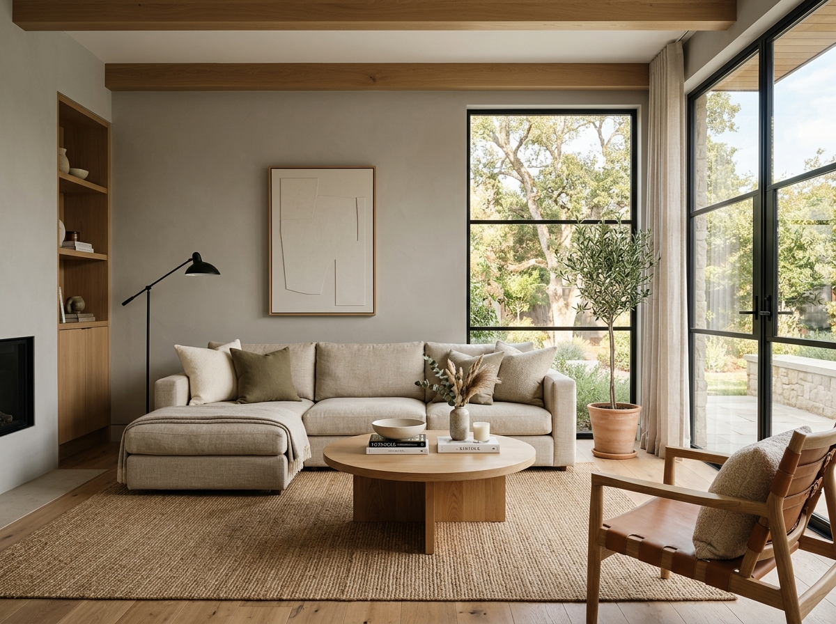 After
After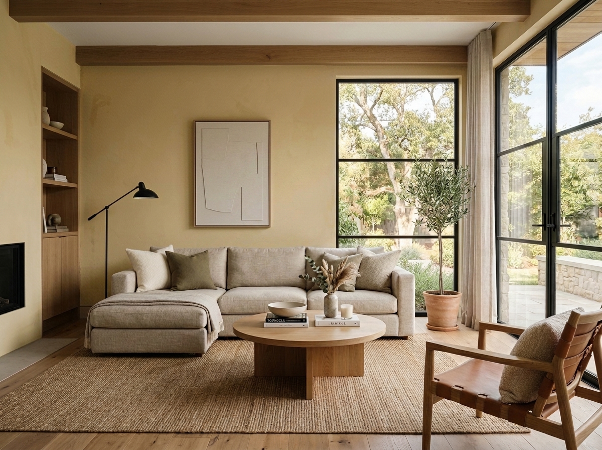 Before
Visualize Your Space with Color Studio AI
Planning a project? Skip the paint chip guesswork. Use our Color Studio AI to instantly visualize these paint colors on your own walls, or take advantage of our aligned contractor pricing matching current Sherwin-Williams retail promotions.
Book Your Upcoming Paint Project
Craftsman Painter is now scheduling premium transformations. Secure your spot and elevate your property value.
Get an EstimateHelp Others Find Professional Color Insights
Share this story directly to your networks or copy the link to share with friends.