


Rosebud is a dusty, grounded pink boasting a Light Reflectance Value (LRV) of 48. Sitting right near the middle of the light reflectance scale, this color possesses enough depth to hold its identity in a wash of bright light without darkening a room. But the real magic of Rosebud lies in its undertones. It carries a distinct, dusty lavender footprint.
Let's consider a design study of a typical modern architectural layout here in the Cleveland, OH region during the peak of summer. The dry, warm air is paired with vibrant, high-overhead bright summer sunlight filtering down through the trees. Because green and pink sit opposite each other on the color wheel, the lush green summer foliage visible through the windows casts a subtle green reflection into the home. That natural green light pulls those cool, dusky lavender notes to the surface of Rosebud, balancing out the warmth of the pink and creating an incredibly sophisticated, muted wall color.

The Essential Japandi Coordinating Palette
To maximize the architectural impact of a heavily pigmented mid-tone like Rosebud, the surrounding coatings must bridge the gap between warm organic textures and stark contrasts. In this Japandi-inspired palette, we emphasize blonde natural oak, raw matte ceramics, and slender black metal elements, relying on three specific colors to build the spatial harmony.
Book Your Upcoming Paint Project
Craftsman Painter is now scheduling premium transformations. Secure your spot and elevate your property value.
Get an Estimate- Tier 1 (Trim/Anchor Neutral): Sherwin-Williams Pure White SW 7005 This is an exceptionally versatile white with a subtle drop of black pigment that keeps it from turning sterile. Apply this in a durable satin or semi-gloss finish on all baseboards, window casings, and doors, and use a dead-flat sheen for the ceilings to establish a crisp, anchoring boundary for the pink walls.
- Tier 2 (Mid-Tone Bridge): Sherwin-Williams Morris Room Grey SW 0037 A warm, earthy, stony neutral. When mapping out an open floor plan, apply Morris Room Grey in a premium matte finish to adjacent hallways or connecting open-concept living spaces. It acts as a visual palette cleanser, absorbing the bright summer light and providing a smooth transition away from the primary Rosebud rooms.
- Tier 3 (Contrast/Accent): Benjamin Moore Deep Caviar 2130-20 A rich, complex black-brown. Use this in a hardwearing urethane enamel (satin finish) on specific architectural anchors like kitchen cabinetry, a bathroom vanity, or a pantry door. It grounds the lighter organic elements of the space and mimics the visual weight of the slender black metal fixtures common in Japandi design.

Structuring the Space with Trim and Architecture
When analyzing a space, I always look at how the paint coatings meet at the architectural joints. The relationship between your wall color and your trim color dictates the perceived quality of the entire room. Pairing SW Rosebud against SW Pure White yields an incredibly sharp, tailored aesthetic.
The muted lavender-pink walls absorb the vibrant overhead sunlight, while the crisp, low-sheen satin of the Pure White trim reflects light outward along the floor line. By framing large, bright windows with Pure White casings, we allow the lush green summer foliage outside to act as living art against the dusty pink walls, creating a seamless connection between the interior envelope and the Cleveland climate outside.

Grounding the Design with Deep Contrast
A room rendered entirely in mid-tones and whites runs the risk of feeling untethered. To respect the Japandi aesthetic—which leans heavily on organic simplicity and quiet spaces—we introduce Benjamin Moore Deep Caviar.
Visualize a bank of flat-panel cabinetry painted in this deep, resonant black-brown. The richness of Deep Caviar anchors the sightline, allowing the softer textures of textured neutral linen and blonde natural oak floors to breathe. As the warm afternoon light shifts across the room, the deep cabinetry absorbs the brightness, ensuring the Rosebud walls maintain their delicate, dusky presence without overwhelming the eye.

Quiet Moments in the Vanity Space
Moving into a bathroom space provides an excellent opportunity to see how Rosebud behaves under varied lighting conditions. In a smaller footprint, you want to utilize a premium moisture-resistant matte or low-lustre coating. The matte finish diffuses ambient light, preventing glare and softening the walls to look almost like textured plaster.
When paired with a floating wood counter and raw matte ceramics, the dusty pink walls generate an atmosphere of profound calm. The subtle lavender undertones prevent the space from feeling overly warm or stuffy, even during a humid Midwestern summer afternoon.

Paint chemistry behaves differently depending on the surface it coats and the light it catches. Before committing to Rosebud, paint a large sample board and stand it vertically against your wall. Watch how the dusty lavender tones react as the high summer sun arcs across the sky and shadows lengthen. Mastering a color palette requires observing how pigment lives in your specific environment—never skip the sampling phase.
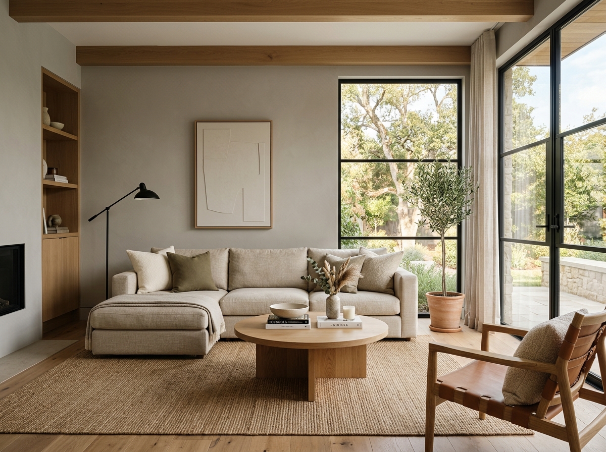 After
After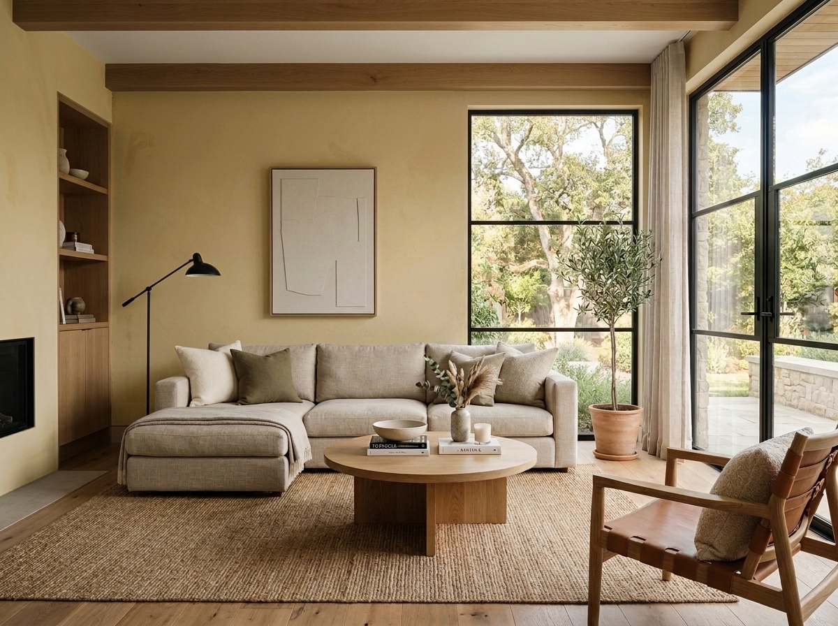 Before
Visualize Your Space with Color Studio AI
Planning a project? Skip the paint chip guesswork. Use our Color Studio AI to instantly visualize these paint colors on your own walls, or take advantage of our aligned contractor pricing matching current Sherwin-Williams retail promotions.
Help Others Find Professional Color Insights
Share this story directly to your networks or copy the link to share with friends.