


With a Light Reflectance Value (LRV) of 76, Opaline sits firmly on the lighter end of the scale. In everyday terms, an LRV of 76 means this paint bounces a generous amount of natural light back into the room, keeping deep floor plans feeling open and awake without the harsh glare of a stark gallery white. Its true personality lies in its undertones: a delicate blend of pale blue-green calmed down by a steady dose of cool gray. Because that gray base keeps the aqua notes in check, Opaline reads like clean, frosted glass against warm architectural materials.
To visualize how this color palette behaves in a representative urban industrial loft layout in Fishers, Indiana, let's explore a design study that balances raw warehouse textures with refined, livable paint choices.
Softening Heavy Textures in the Bedroom Sanctuary
Opaline
Sherwin-Williams SW 6189
Pure White
Sherwin-Williams SW 7005
Mount Saint Anne
Benjamin Moore 1565
Anchors Aweigh
Sherwin-Williams SW 9179
When you are working with exposed concrete pillars, distressed red-brown brick, and rough-sawn lumber floors, a bedroom can quickly feel too heavy or dark. Applying Sherwin-Williams Opaline SW 6189 to the primary drywall surfaces immediately lightens the visual weight of those industrial elements. Because red brick and blue-green sit across from each other on the color wheel, the pale green-gray notes in Opaline naturally cool down the fiery warmth of the masonry, creating a balanced, restful environment for sleep.
See Opaline on Your Own Walls in 15 Seconds
Sherwin-Williams SW 6189 • LRV 76 • #DCDFD7
For a primary bedroom like this, I always recommend a matte or flat finish on the walls. Loft spaces often have expansive drywall runs that catch wide angles of daylight, and a matte sheen hides minor surface imperfections while giving Opaline a velvety, plaster-like depth. To keep the room grounded and warm, pair these cool walls with camel wool throws, saddle leather accents, and unlacquered brass bedside lamps.

Framing the View with the Right Trim White
A nuanced pastel-gray like Opaline needs a deliberate trim color to help it look intentional. If your trim is too yellow or creamy, it will make the blue-green undertones in the wall look dingy; if your trim is too stark and icy, the room can feel overly clinical.
In this design study, Sherwin-Williams Pure White (SW 7005) serves as the trim, baseboard, and interior door casing color. Pure White has just enough softness to keep it from feeling sterile alongside reclaimed wood, yet it is crisp enough to create a clean, noticeable border against Opaline's LRV of 76. I specify a satin or semi-gloss finish for Pure White on baseboards and casings. The subtle sheen increase against the matte walls highlights the clean lines of the millwork and makes the baseboards easy to wipe down, especially where they meet rough-sawn timber floors and dark iron window grids.

How Autumn Light in Fishers Shapes the Undertones
Natural light in Fishers shifts noticeably once October arrives. As the sun drops lower in the southern sky and filters through turning oak and maple trees, the daylight entering our homes becomes soft, even, and diffused. In a loft with tall factory windows, this gentle autumn light brings out the best in Sherwin-Williams Opaline.
Without harsh summer glare washing out the walls, you can clearly see the quiet gray-green character of the paint during the day. In the corners of the room where two drywall surfaces meet, the color settles into a soothing, misty sea-glass tone without casting heavy shadows.
As you move from the main living area into an adjoining hallway or open study nook, creating a smooth visual transition is essential in an open-concept layout. To bridge the airy living room with deeper parts of the loft, Benjamin Moore Mount Saint Anne (1565) is a natural partner. Mount Saint Anne shares the same dusty blue-green DNA as Opaline, but in a richer mid-tone weight. Painting a recessed hallway or an adjacent home office wall in Mount Saint Anne gives the eye a sense of depth as you look across the floor plan, connecting the spaces without a jarring color shift.

Grounding the Kitchen with Deep Navy Cabinetry
Open loft layouts often mean the kitchen sits right in the main line of sight from the living room. When your surrounding walls are painted in a light, breezy shade like Opaline, the kitchen cabinetry needs substantial visual weight to anchor the room and stand up to exposed brick and dark metal lighting fixtures.
Here, Sherwin-Williams Anchors Aweigh (SW 9179) provides that exact counterbalance on the kitchen cabinets and island base. Anchors Aweigh is a rich, deep navy that echoes the dark iron factory window grids while pulling out the cool blue notes hiding inside Opaline. Using a durable urethane enamel in a satin finish on the cabinetry gives this dark navy a smooth, furniture-grade look that resists fingerprints and kitchen wear. Topped with honed concrete or white quartz counters and paired with warm brass pulls, the dark cabinetry keeps the light walls feeling sophisticated and grounded.

Carrying the Palette into a Loft Bathroom
In smaller, enclosed spaces like a bathroom or powder room, Opaline's high light reflectance really goes to work. Without large factory windows to flood the space, a bathroom relies on wall color to keep from feeling boxed in.
Applying Sherwin-Williams Opaline in a moisture-resistant eggshell or satin finish on the bathroom walls keeps the space bright and fresh, while giving a subtle nod to traditional spa tones without feeling cliché. Tying in a freestanding vanity painted in Sherwin-Williams Anchors Aweigh with Sherwin-Williams Pure White trim pulls the entire loft's color story together into a cohesive, thoughtful design.

When you pair a light, misty green-gray with the honest textures of brick, timber, and iron, you get a home that feels both architecturally bold and effortlessly calm every single day.
Complementary Color Consultation
Planning a project? Work with Torlando Hakes directly as your personal Color Designer and get a Complementary Consultation when purchasing paint through us.
Opaline (SW 6189) — Key Questions Answered
What is the LRV and undertone of Sherwin-Williams Opaline (SW 6189)?
Sherwin-Williams Opaline (SW 6189) has a Light Reflectance Value (LRV) of 76 and hex code #DCDFD7. Always evaluate it under both north-facing and warm afternoon light before final application.
What trim and coordinating colors pair best with Opaline?
Our recommended architectural pairings for Opaline include Pure White (SW 7005), Mount Saint Anne (1565), Anchors Aweigh (SW 9179) to balance wall depth, trim contrast, and adjoining room transitions.
How can I test Opaline on my own walls before painting?
You can upload a photo of your room to Craftsman Painter's Color Studio AI to preview Opaline on your walls immediately, or schedule an on-site or video consultation with our team.
Getting Opaline Right Under Your Home's Light
Join 1,650+ homeowners, designers, and architects receiving our curated dispatches every 10 days (1st, 11th & 21st) on field stories, LRV, undertones, and trim pairings.
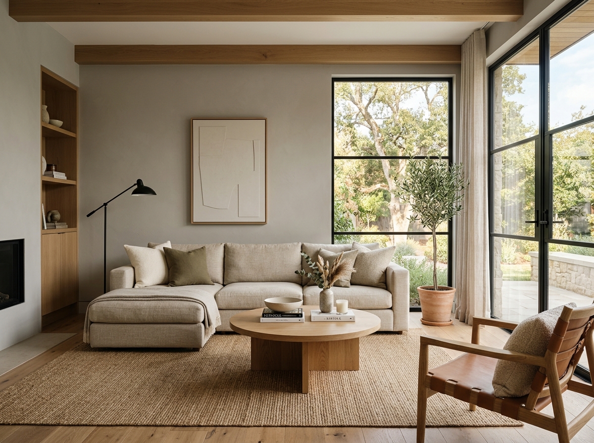 After
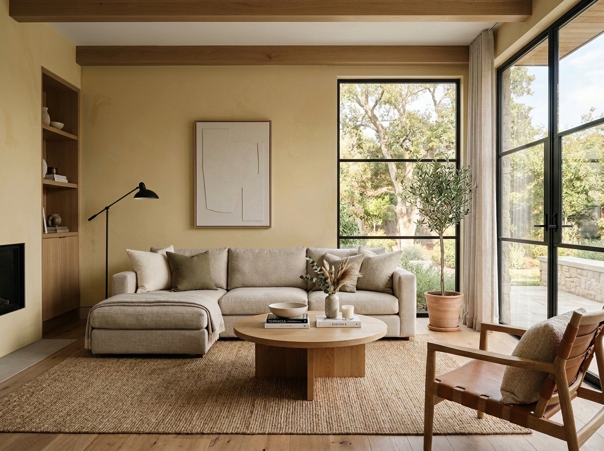 Before
Visualize Your Space with Color Studio AI
Planning a project? Skip the paint chip guesswork. Use our Color Studio AI to instantly visualize these paint colors on your own walls, or take advantage of our aligned contractor pricing matching current Sherwin-Williams retail promotions.
Book Your Upcoming Paint Project
Craftsman Painter is now scheduling premium transformations. Reserve an on-site consultation or instant video walkthrough.
Get an Estimate →Related Color & Design Studies

Why Sherwin-Williams Languid Blue SW 6226 Creates the Quietest Atmosphere in Summer Sunlight
The Muddy, Magnificent Paint Color Designers Keep Secretly Hoarding to Tame the Brutal Bloomington Sun

Why Sherwin-Williams North Star SW 6246 Delivers the Cool Crisp Air of a High-Summer Day
Help Others Find Professional Color Insights
Share this story directly to your networks or copy the link to share with friends.