


To understand how this shade behaves on your walls, we first have to look at its Light Reflectance Value, or LRV. With an LRV of 13, Intense Teal sits comfortably in the deeper, moodier end of the color spectrum. In practical terms, this means the paint absorbs the vast majority of light hitting its surface rather than bouncing it around the room. Instead of washing out under strong daylight, it holds its ground, wrapping a space in a deeply saturated hue that feels rich, deliberate, and grounded.
Its undertones are where the magic really lies. Intense Teal lives right on the edge between deep oceanic blue and jewel-toned green. In direct, warm afternoon sunlight, those green undertones come forward, reminiscent of dense forest foliage. As the sun sets and warm lamp light takes over, the blue takes command, deepening into a velvety midnight shade.

To see how this color functions in a spatial context, let's explore a design study of a open-concept industrial loft layout in Indianapolis. In spaces defined by raw, high-contrast building materials—like exposed red-brown brick, dark iron window grids, and concrete pillars—a deep paint choice acts as an anchor. It creates visual balance against heavy architectural elements without feeling out of place.

Work Directly with Torlando Hakes
Skip the color choice stress. Work directly with me as your personal Color Designer to select the perfect architectural palette for your home, and get a Complementary Color Consultation when you purchase paint through us.
When applying a paint color as bold as Intense Teal, the trim work around it requires special attention. To keep the deep blue-green from feeling heavy or enclosed, I rely on a clean, crisp neutral like Sherwin-Williams Pure White SW 7005 for baseboards, window casings, and door frames. Pure White has just enough subtle warmth to prevent it from looking harsh or icy, providing an unmistakable frame that lets the main wall color pop cleanly against raw brickwork.

In an open floor plan, you rarely want to wrap every single wall in a color this saturated. The key to making a dark accent color work seamlessly is creating a gentle transition into neighboring zones. By bringing in a versatile mid-tone greige like Sherwin-Williams Useful Gray SW 7028 on adjacent walls and corridors, you give the eye a place to rest. Useful Gray serves as a soft, warm bridge between the dark teal accent walls and the raw concrete structural pillars, ensuring the open layout feels connected rather than fragmented.

To round out the palette and build true depth, introduce a grounded dark accent on custom cabinetry or interior doors. Sherwin-Williams Black Bean SW 6006 is a deeply luxurious black-brown that pairs brilliantly with the teal tone. When applied to a kitchen island base or a solid wood pantry door, Black Bean mirrors the dark metal ironwork found in industrial lighting and factory-style window frames, anchoring the room's lower visual plane.

When bringing Intense Teal into your own home, context and finish dictate everything. Here is how to get the professional finish right on the first try:
- Best Room Applications: Intense Teal shines brightest as a focal accent wall in a sunlit living space, a cozy library or home office, a primary bedroom behind a natural wood headboard, or a dramatic powder room.
- Selecting the Right Sheen: Always opt for a Matte or Flat finish on main walls. Low-sheen finishes hide drywall imperfections and absorb glare, allowing the teal pigment to look velvety and smooth. For trim, baseboards, and cabinetry, step up to a Satin or Semi-Gloss finish in Pure White or Black Bean for durability and easy cleaning.
- Material Pairings: This color loves warmth and texture. Pair it with cognac leather furniture, rough-sawn oak flooring, warm brass hardware, and matte black industrial light fixtures to bring out its full character.

Selecting a high-impact color isn't about following a temporary trend; it's about choosing a shade that responds beautifully to the changing light in your everyday space throughout the year.
Complementary Color Consultation
Planning a project? Work with Torlando Hakes directly as your personal Color Designer and get a Complementary Consultation when purchasing paint through us.
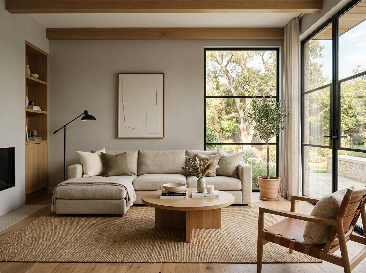 After
After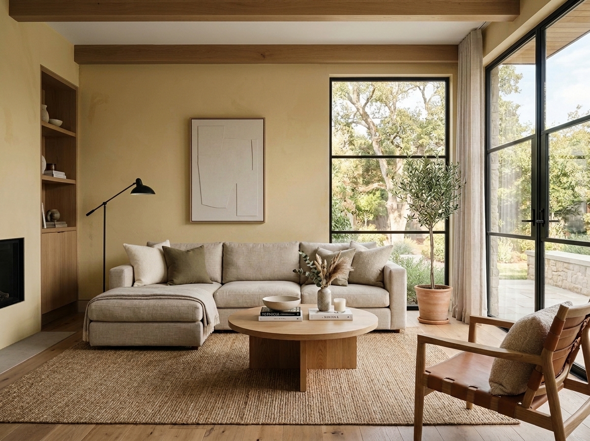 Before
Visualize Your Space with Color Studio AI
Planning a project? Skip the paint chip guesswork. Use our Color Studio AI to instantly visualize these paint colors on your own walls, or take advantage of our aligned contractor pricing matching current Sherwin-Williams retail promotions.
Book Your Upcoming Paint Project
Craftsman Painter is now scheduling premium transformations. Secure your spot and elevate your property value.
Get an EstimateHelp Others Find Professional Color Insights
Share this story directly to your networks or copy the link to share with friends.