


With a Light Reflectance Value (LRV) of 11, Honed Soapstone sits squarely in the dark charcoal family. It absorbs a massive amount of light, yet it never reads as a flat, lifeless black. Instead, it carries sophisticated cool green and slate undertones. To fully understand this color, we have to look at how it behaves under specific geographic and seasonal conditions. In a conceptual design study centered around an Atlanta, GA home during the peak of summer, high-overhead bright sunlight dominates the exposure. As dry warm air settles over the region, vibrant bright natural lighting pushes through the windows. Rather than washing out, Honed Soapstone’s cool green undertones rise to the surface, engaging in a direct dialogue with the lush green summer foliage visible outside.
The Structural Palette: Anchoring Honed Soapstone
Honed Soapstone
Sherwin-Williams SW 9126
Pure White
Sherwin-Williams SW 7005
Useful Gray
Sherwin-Williams SW 7050
Dark Night
Sherwin-Williams SW 6237
To utilize a color as heavy and complex as Honed Soapstone, the surrounding coatings must provide strict architectural boundaries. Relying on an isolated shade is a mistake; you need a precise system of contrast and bridging tones. Here is the exact coordinating palette required to harmonize this dark slate charcoal:
-
Sherwin-Williams Pure White SW 7005 (Tier 1: Trim/Anchor Neutral): A brilliant, slightly warm white that prevents high-contrast pairings from feeling clinical. Apply this in a durable satin or semi-gloss finish to all heavy trim, traditional baseboards, deep arched window casings, and interior doors to frame the charcoal walls with sharp, unbroken lines.
 Color Consultation
Work Directly with Torlando Hakes
Skip the color choice stress. Work directly with me as your personal Color Designer to select the perfect architectural palette for your home, and get a Complementary Color Consultation when you purchase paint through us.
-
Sherwin-Williams Useful Gray SW 7050 (Tier 2: Mid-Tone Bridge): A highly versatile greige with subtle yellow-green undertones. Use this in a flat or matte finish on expansive secondary walls and transitional hallways. It serves as the crucial visual bridge, connecting the deep drama of Honed Soapstone to the stark clarity of Pure White.
-
Sherwin-Williams Dark Night SW 6237 (Tier 3: Contrast/Accent): A saturated, moody teal-navy. Apply this deep jewel tone to isolated architectural features—such as a heavily milled kitchen island base, a built-in library cabinet, or a distinct pantry door. The navy-teal pigment pulls the slate and green undertones out of the Honed Soapstone, creating a deeply layered, sophisticated color story.

A Design Study: Spanish Mediterranean Meets Southern Summer
To visualize how these pigments perform practically, let's explore a design study of a hypothetical Spanish Mediterranean home in the heart of Atlanta. This architectural style relies heavily on specific textures: hand-applied white stucco, dark exposed oak structural ceiling beams, wrought-iron details, and neutral gray flagstones.
When you apply Honed Soapstone to the primary living room walls in an eggshell finish, the paint interacts beautifully with the heavy timbers. The dark oak ceiling beams harmonize with the slate undertones, grounding the space. Spanish Mediterranean design often features deep arched window recesses, which naturally filter the intense summer sun. The light stretches across the room, casting long shadows across the flagstones. Where the direct sunlight hits the Honed Soapstone, the cool green pigment flashes brilliantly; in the shaded corners, the color retreats into a dense, velvety charcoal.


Crafting Intentional Transitions
Moving through this hypothetical layout, the transition from heavy charcoal to lighter, breathable spaces requires a precise hand. This is where Sherwin-Williams Useful Gray proves its worth. If you coat a connecting hallway or an adjacent dining space in Useful Gray, you allow the eye to rest. The subtle warmth of the mid-tone gray reflects the dry warm air and vibrant light of the summer season, carrying the natural warmth of the gray flagstone floors up onto the walls.
The trim work remains critical here. A continuous application of Pure White on all baseboards and window casings creates a unified skeletal structure for the home. Even as you pass from a dark Honed Soapstone study into a bright Useful Gray kitchen, the unbroken lines of Pure White trim ensure the architectural geometry remains intact.

Accents and Functional Cabinetry
When we look at functional millwork, incorporating our Tier 3 accent color adds incredible depth. Applying Sherwin-Williams Dark Night to a central kitchen island or a significant piece of built-in cabinetry introduces a highly saturated pop of teal-navy.
Because Honed Soapstone leans into slate and green, and Dark Night leans into deep blue and green, the two colors share an underlying cooling effect. Against the rugged backdrop of wrought-iron hardware and white stucco walls, the Dark Night cabinetry becomes a focal point that feels entirely native to the Spanish Mediterranean aesthetic. It plays beautifully off the high-overhead natural light, exhibiting a rich sheen that contrasts against the flatter finishes of the surrounding plaster walls.

If you want a space to feel heavy, grounded, and structurally permanent, stop relying on pure blacks or generic grays. Specify a charcoal with a distinct, readable undertone. Put Honed Soapstone on the walls, frame it with Pure White, and let the summer light do the heavy lifting.
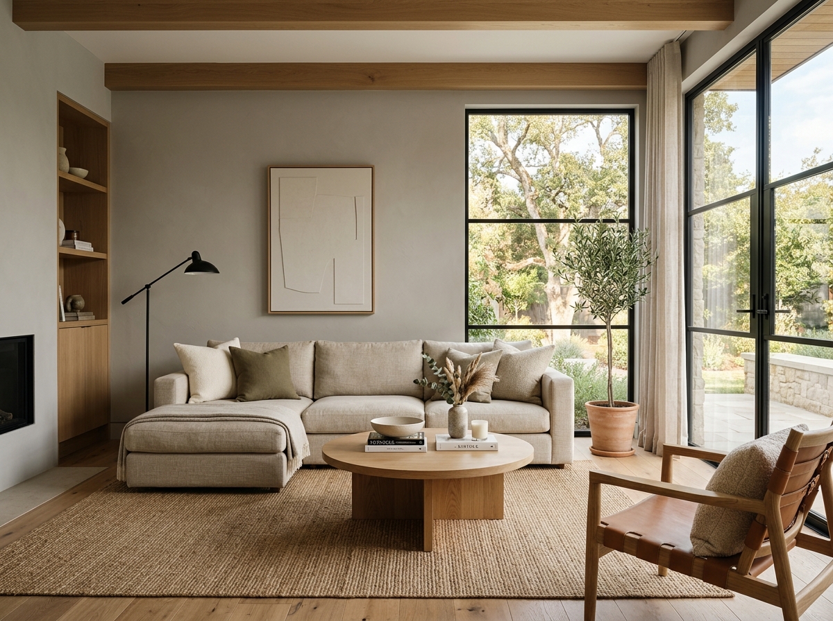 After
After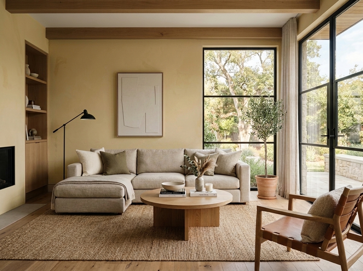 Before
Visualize Your Space with Color Studio AI
Planning a project? Skip the paint chip guesswork. Use our Color Studio AI to instantly visualize these paint colors on your own walls, or take advantage of our aligned contractor pricing matching current Sherwin-Williams retail promotions.
Book Your Upcoming Paint Project
Craftsman Painter is now scheduling premium transformations. Secure your spot and elevate your property value.
Get an EstimateHelp Others Find Professional Color Insights
Share this story directly to your networks or copy the link to share with friends.