


Sitting right in the middle of the light scale with a Light Reflectance Value (LRV) of 56, this shade strikes a very practical balance. For those new to LRV, the scale runs from 0 (pure black) to 100 (pure white), measuring how much light a color bounces back into a room. At 56, Flexible Gray has enough body and depth to stand out against white trim, yet it remains bright enough to keep open-concept living areas feeling airy and welcoming when the days grow shorter.
The Mauve Undertone That Warms Up Raw Materials
Flexible Gray
Sherwin-Williams SW 6010
Pure White
Sherwin-Williams SW 7005
Desert Twilight
Benjamin Moore 2137-40
Jasper
Sherwin-Williams SW 6216
To visualize how this color palette behaves in a representative urban industrial loft layout in Columbus, IN, picture a converted warehouse space with tall factory windows looking out onto turning autumn leaves. In Southern Indiana, October and November bring a soft, diffused daylight that filters through the tree canopy without the harsh glare of mid-summer.
In this gentle, even light, you immediately see what makes Sherwin-Williams Flexible Gray SW 6010 work so well. While it reads at first glance as a calm, mid-tone cool gray, its secret lies in a distinct purple and mauve undertone. That subtle hint of plum keeps the gray from feeling sterile. Instead, it bridges the gap between cool industrial concrete and the warm, earthy tones of distressed red-brown brick and rough-sawn wood floors.
See Flexible Gray on Your Own Walls in 15 Seconds
Sherwin-Williams SW 6010 • LRV 56 • #B1A3A1
In a primary bedroom sanctuary, this subtle warmth makes a massive difference. Applying Flexible Gray in a matte or flat finish hides minor surface imperfections on tall drywall expanses while lending a velvety softness to the room. Paired with linen bedding, charcoal wool throws, and dark metal wall sconces, the color wraps the sleeping area in a quiet, grounded calm that shifts gracefully from cool morning light to the warm glow of bedside lamps in the evening.

Crisp Trim Work and Architectural Framing
When working with a gray that carries purple and mauve undertones, your choice of white trim is critical. If you pair Flexible Gray with a stark, bluish-white, the walls can look overly purple by comparison; if your white is too yellow, the trim will look dingy and aged.
To get that clean, tailored edge, I recommend pairing it with Sherwin-Williams Pure White (SW 7005) in a satin or semi-gloss sheen. Pure White has just the smallest drop of warmth to keep it from feeling clinical, yet it stays crisp enough to let the sophisticated gray-mauve wall color take center stage. Using a satin finish on your baseboards, door casings, and window moldings creates a subtle sheen difference against flat walls, catching the soft autumn daylight and highlighting the clean lines of your carpentry.

How Flexible Gray Reads Across Open Corners
One of the best ways to evaluate a paint color is to watch how it behaves where two walls meet. In a loft layout with large factory-style windows, light enters broadly and evenly across the floor plan. Because Flexible Gray has an LRV of 56, it responds dynamically to the angle of the light without creating harsh contrasts.
On the wall directly receiving the diffused autumn sun, the cool gray notes come forward, giving the surface a crisp, stone-like appearance. On the adjacent wall turned slightly away from the windows, the subtle mauve and purple undertones settle in, adding depth and preventing the shadow side of the room from looking muddy or lifeless.
When planning transitions into adjoining hallways, mudrooms, or an open dining zone, you need a bridge color that respects this tonal shift. Benjamin Moore Desert Twilight (2137-40) is an exceptional companion for neighbouring walls or recessed architectural niches. It shares a grounded, earthy gray sensibility that plays nicely alongside the mauve notes of Flexible Gray, allowing your eye to travel from one space to the next without an abrupt visual stop.

Grounding the Palette with Deep Accent Cabinetry
Loft spaces and open-concept homes benefit greatly from a heavy, anchoring shade on lower cabinetry, kitchen islands, or interior doors. Because Flexible Gray and Pure White keep the upper half of the room feeling light and open, introducing a rich, dark accent grounds the furniture layout and ties in dark iron window grids and industrial light fixtures.
For kitchen islands, built-in bar cabinetry, or a statement pantry door, Sherwin-Williams Jasper (SW 6216) provides a striking counterbalance. Jasper is a deep, brooding forest green that reads nearly black in low light. Why does a dark green work so well here? On the color wheel, green sits opposite red-purple. The subtle mauve undertone in Flexible Gray naturally complements the deep pine and charcoal richness of Jasper. Topped with soapstone or butcher block counters and accented with unlacquered brass hardware, cabinetry painted in a durable satin or semi-gloss finish of Jasper gives the kitchen an established, custom-crafted presence.

Bringing the Look into the Bathroom
Smaller spaces like guest bathrooms or powder rooms are often where homeowners hesitate to use cooler grays, worried that vanity lighting will cast an unflattering tone. However, when you balance Sherwin-Williams Flexible Gray SW 6010 on the walls with the warm textures of reclaimed wood or aged brass, the mauve undertones actually lend a very flattering, warm cast to the room.
In a bathroom setting, I always advise stepping up to a moisture-resistant matte or satin finish on the walls to handle humidity while keeping glare to a minimum. Carrying Sherwin-Williams Jasper onto the vanity cabinet anchors the sink area against the solid floor, while Sherwin-Williams Pure White on the trim and ceiling keeps the space feeling crisp, clean, and cohesive with the rest of the home.

Choosing a gray with character comes down to respecting its undertones and pairing it with materials that let it shine; when you give Flexible Gray plenty of warm wood, brick, and deep forest green accents, it delivers a calm, tailored backdrop that feels settled in every season.
Complementary Color Consultation
Planning a project? Work with Torlando Hakes directly as your personal Color Designer and get a Complementary Consultation when purchasing paint through us.
Flexible Gray (SW 6010) — Key Questions Answered
What is the LRV and undertone of Sherwin-Williams Flexible Gray (SW 6010)?
Sherwin-Williams Flexible Gray (SW 6010) has a Light Reflectance Value (LRV) of 56 and hex code #B1A3A1. Always evaluate it under both north-facing and warm afternoon light before final application.
What trim and coordinating colors pair best with Flexible Gray?
Our recommended architectural pairings for Flexible Gray include Pure White (SW 7005), Desert Twilight (2137-40), Jasper (SW 6216) to balance wall depth, trim contrast, and adjoining room transitions.
How can I test Flexible Gray on my own walls before painting?
You can upload a photo of your room to Craftsman Painter's Color Studio AI to preview Flexible Gray on your walls immediately, or schedule an on-site or video consultation with our team.
Getting Flexible Gray Right Under Your Home's Light
Join 1,650+ homeowners, designers, and architects receiving our curated dispatches every 10 days (1st, 11th & 21st) on field stories, LRV, undertones, and trim pairings.
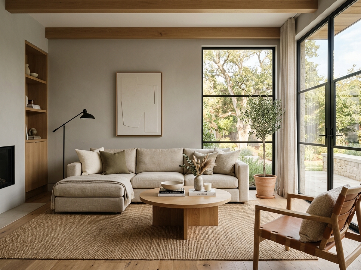 After
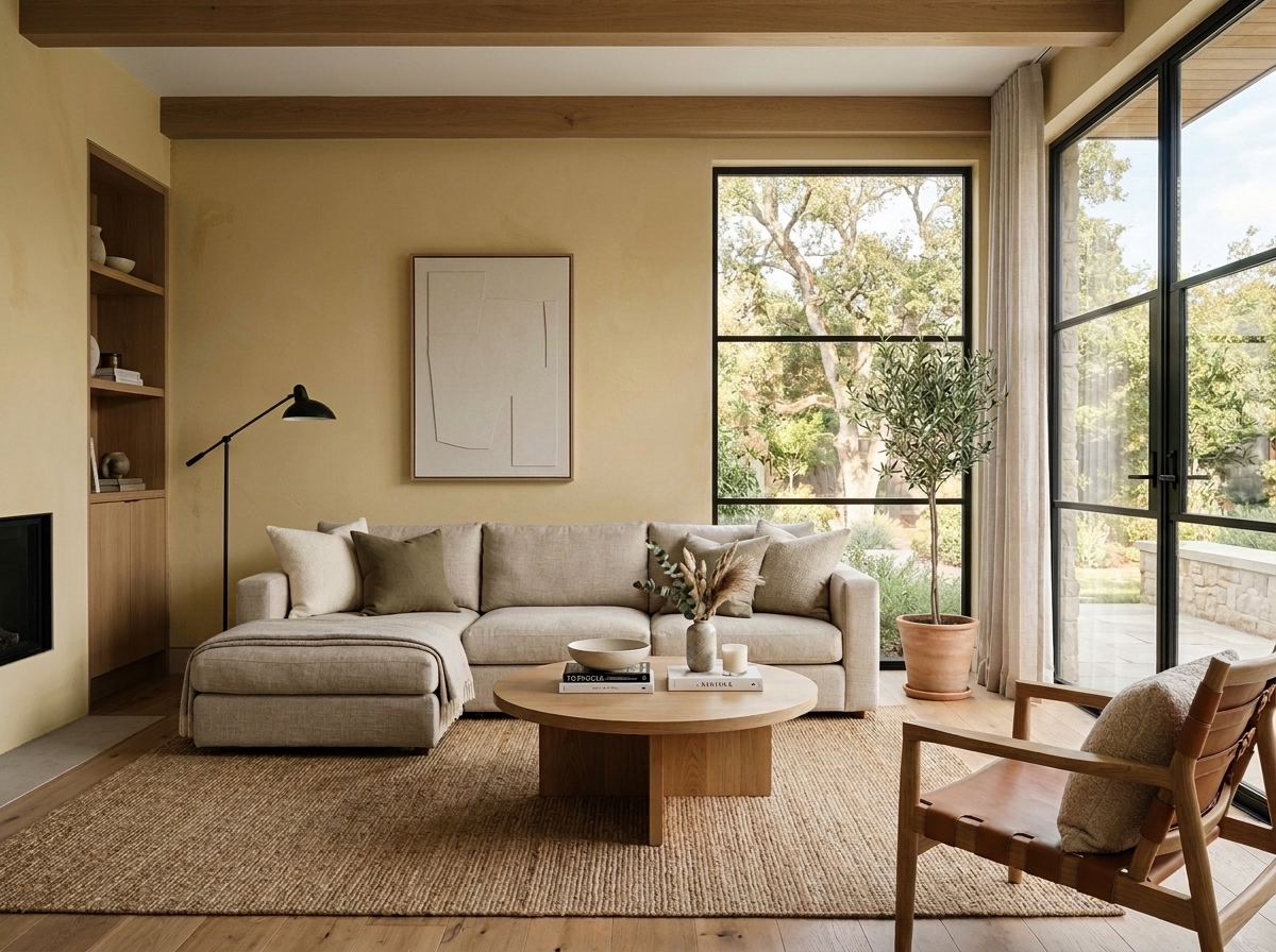 Before
Visualize Your Space with Color Studio AI
Planning a project? Skip the paint chip guesswork. Use our Color Studio AI to instantly visualize these paint colors on your own walls, or take advantage of our aligned contractor pricing matching current Sherwin-Williams retail promotions.
Book Your Upcoming Paint Project
Craftsman Painter is now scheduling premium transformations. Reserve an on-site consultation or instant video walkthrough.
Get an Estimate →Related Color & Design Studies

Why Sherwin-Williams Languid Blue SW 6226 Creates the Quietest Atmosphere in Summer Sunlight
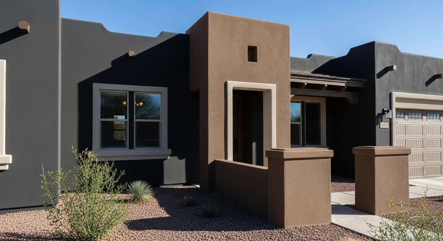
The Muddy, Magnificent Paint Color Designers Keep Secretly Hoarding to Tame the Brutal Bloomington Sun

Why Sherwin-Williams North Star SW 6246 Delivers the Cool Crisp Air of a High-Summer Day
Help Others Find Professional Color Insights
Share this story directly to your networks or copy the link to share with friends.