


Sherwin-Williams Darkroom SW 7083 is one of those rare dark shades that comes alive when the seasons turn. With a Light Reflectance Value (LRV) of 5, it sits squarely in the dark, moody category, absorbing roughly 95% of the light that hits it. In plain terms, this means it will not bounce bright light around a room like a classic off-white or gray. Instead, it creates an intimate, enveloping atmosphere that feels like a cozy retreat.
What sets Darkroom apart from a standard black or charcoal is its complex undertone mix. It is fundamentally a warm, grounded black, but under close inspection, you will notice distinct hints of rich aubergine purple and deep bronze. In low morning light, it reads as a handsome, deep espresso-black. But as the golden afternoon sun streams through a window, those hidden plum and bronze notes wake up, softening the walls and giving the room a velvety texture. To explore how this hue behaves in a representative mid-century space in Columbus, we have to look closely at how wood, metal, and light interact across the room.

In mid-century architecture, dark walls work best when paired with rich natural materials like walnut, teak, and brushed brass. When applying Darkroom on a focal wall or wrapping an entire den, the deep purple and bronze undertones act as a natural bridge to warm wood grains. Instead of creating a harsh, stark contrast, the paint invites the natural grain of walnut paneling to stand out gracefully.
See Darkroom on Your Own Walls in 15 Seconds
Sherwin-Williams SW 7083 • LRV 5 • #443E40
To keep a space painted in Darkroom from feeling overly dark, structural framing is essential. This is where your bright neutral selection comes into play. By framing Darkroom with Sherwin-Williams Pure White SW 7005 on door casings, window frames, and baseboards, you instantly create clean architectural boundaries. Pure White is a soft, warm white that lacks harsh blue notes, making it the ideal partner for a moody shade. The crisp, clean line where the white trim meets the deep walls acts like a passe-partout frame around a painting, making the wall color feel intentional and refined rather than heavy.

As daylight shifts throughout the day, dark colors can sometimes absorb too much energy if neighboring spaces are not handled correctly. A classic mistake homeowners make with LRV 5 colors is running them right into bright, stark white hallways, which creates an abrupt, jarring transition. A far better strategy is to use a thoughtful mid-tone shade in adjacent open spaces to ease the eye from dark to light.
Sherwin-Williams Felted Wool SW 9171 serves as a wonderful mid-tone companion in this scenario. It is a warm greige with subtle earthy undertones that balance the intense depth of Darkroom. When painted on hallway walls or an adjoining entryway visible from the main living room, Felted Wool catches the ambient natural light and creates a gentle stepping stone. As the sun moves lower on the horizon, the warmth in Felted Wool echoes the bronze undertones hiding inside Darkroom, keeping the transition between rooms smooth and harmonious.

To elevate the palette further and bring a touch of unexpected character to mid-century millwork, consider layering in a muted accent color. Built-in sideboards, kitchen islands, or architectural room dividers present a great opportunity to introduce contrast without disrupting the warm, organic mood of the space.
Sherwin-Williams Still Water SW 6223 is an ideal accent color here. It is a deep, moody teal-blue with subtle slate undertones that provides a cool contrast to the warm aubergine notes of Darkroom. When applied to built-in cabinetry against a Darkroom backdrop or an adjacent accent wall, Still Water creates a rich, layered look that feels grounded and high-end. The cool blue-green tones pull out the subtle bronze warmth in Darkroom, allowing both colors to enhance each other without fighting for attention.

In smaller spaces like powder rooms, home offices, or cozy reading corners, Darkroom truly shines when given a complete monochrome application. Painting both the walls and the ceiling in a flat sheen creates a seamless, cocoon-like effect that visually blurs room corners. In a compact powder room, pairing Darkroom walls with a warm walnut vanity, brushed brass fixtures, and crisp Pure White trim creates a dramatic, boutique-hotel feel that punches far above its square footage.

When specifying paint finishes for a deep color like Darkroom, sheen selection is critical. For living room walls, bedrooms, and dens, stick with a matte or flat finish. A flat sheen absorbs light smoothly, eliminating harsh glare from lamps and windows while letting those subtle plum and bronze undertones show off their rich, velvety character. For high-touch trim, baseboards, and interior doors, choose a satin or semi-gloss finish in Pure White to make cleaning easy and provide a tactile contrast against the matte walls.
Sherwin-Williams Darkroom SW 7083 proves that deep, dark paint doesn't have to feel stark or cold; when grounded by warm wood tones and balanced with thoughtful coordinating shades, it creates a cozy, highly sophisticated backdrop that comes alive with the changing seasons.
Complementary Color Consultation
Planning a project? Work with Torlando Hakes directly as your personal Color Designer and get a Complementary Consultation when purchasing paint through us.
Darkroom (SW 7083) — Key Questions Answered
What is the LRV and undertone of Sherwin-Williams Darkroom (SW 7083)?
Sherwin-Williams Darkroom (SW 7083) has a Light Reflectance Value (LRV) of 5 and hex code #443E40. Always evaluate it under both north-facing and warm afternoon light before final application.
What trim and coordinating colors pair best with Darkroom?
Our recommended architectural pairings for Darkroom include Pure White (SW 7005), Felted Wool (SW 9171), Still Water (SW 6223) to balance wall depth, trim contrast, and adjoining room transitions.
How can I test Darkroom on my own walls before painting?
You can upload a photo of your room to Craftsman Painter's Color Studio AI to preview Darkroom on your walls immediately, or schedule an on-site or video consultation with our team.
Getting Darkroom Right Under Your Home's Light
Join 1,650+ homeowners, designers, and architects receiving our curated dispatches every 10 days (1st, 11th & 21st) on field stories, LRV, undertones, and trim pairings.
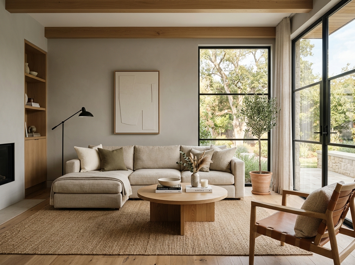 After
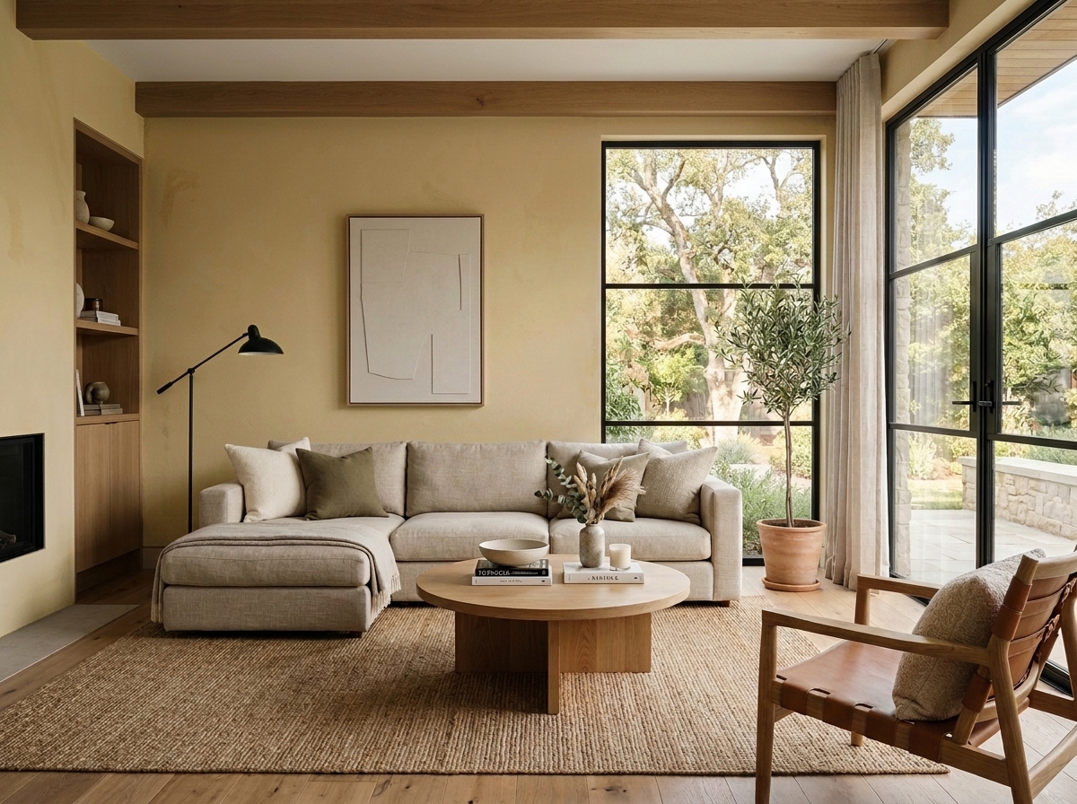 Before
Visualize Your Space with Color Studio AI
Planning a project? Skip the paint chip guesswork. Use our Color Studio AI to instantly visualize these paint colors on your own walls, or take advantage of our aligned contractor pricing matching current Sherwin-Williams retail promotions.
Book Your Upcoming Paint Project
Craftsman Painter is now scheduling premium transformations. Reserve an on-site consultation or instant video walkthrough.
Get an Estimate →Related Color & Design Studies

The Case for Quiet Gray-Blues: Why Designers Return to Sherwin-Williams Languid Blue SW 6226
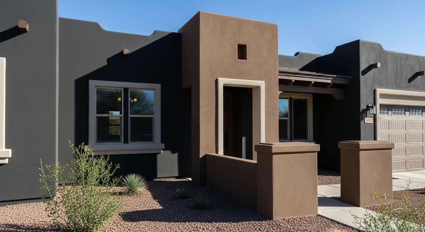
The Muddy, Magnificent Paint Color Designers Keep Secretly Hoarding to Tame the Brutal Bloomington Sun

When Golden Daylight Needs a Cool Counterweight, Could Sherwin-Williams North Star SW 6246 Be the Answer?
Help Others Find Professional Color Insights
Share this story directly to your networks or copy the link to share with friends.