


To visualize how this color palette behaves in a representative mid-century home in Bloomington, imagine a space where clean 1950s architectural lines meet the soft amber hues of Midwestern fall. Cultured Pearl sits at a Light Reflectance Value (LRV) of 75. In simple homeowner terms, LRV measures how much light a paint reflects on a scale from 0 (pure black) to 100 (pure white). At 75, Cultured Pearl reflects enough natural daylight to keep a room bright and open, but it carries just enough weight to avoid feeling like a plain, chalky rental white. Its underlying personality stems from a delicate pink-beige core, giving off-white walls a silky, subtle blush rather than a stark, clinical backdrop.

When applied across expansive living spaces with rich walnut wall panels and low-profile furniture, Cultured Pearl comes alive. During late afternoon, as direct shafts of amber daylight hit the wall, the pink-beige undertones soften into a creamy, organic glow. It cradles natural timber tones exceptionally well, enhancing the reddish-brown grain of teak and walnut rather than fighting against them.
To keep a soft wall color like Cultured Pearl crisp and intentional, architectural details require a clean frame. I recommend painting baseboards, window casings, and door frames in Sherwin-Williams Pure White SW 7005. Pure White is a remarkably balanced, neutral trim color with just a touch of warmth. It prevents the trim from looking like cold fluorescent white while creating an unbroken, tailored boundary around Cultured Pearl walls. The contrast is gentle yet defined, keeping window frames looking sharp against the golden outdoor scenery.

Work Directly with Torlando Hakes
Skip the color choice stress. Work directly with me as your personal Color Designer to select the perfect architectural palette for your home, and get a Complementary Color Consultation when you purchase paint through us.

Color in a home is never static; it changes as you walk from the sun-drenched center of a room into shadowy corners and hallways. In transitional zones or feature walls, pairing Cultured Pearl with a mid-tone bridge color anchors the floor plan. Sherwin-Williams Shiitake SW 9173 acts as an ideal visual counterweight. Shiitake is a warm, sandy stone color that pulls out the earthier beige qualities of Cultured Pearl. When used on built-in walnut shelving backdrops or in adjoining hallways, it absorbs ambient shadows gracefully, bringing a sense of cozy weight to quiet nooks.

For a high-impact focal point that injects sophistication into a mid-century layout, contrast is essential. Instead of defaulting to basic charcoal or black, consider a rich, deep accent like Benjamin Moore Caponata AF-685. Caponata is a luxurious, dark chocolate shade infused with heavy eggplant and plum undertones. When painted on kitchen cabinetry, a kitchen island, or an entryway door, it immediately pulls out the delicate blush notes hidden within Cultured Pearl walls. Brushed brass hardware installed on Caponata-painted doors creates an incredible tactile pairing against warm wood floors.

Getting the finish right is just as important as choosing the right paint numbers. For Cultured Pearl on main living room or bedroom walls, specify a flat or matte sheen. A flat finish absorbs excess directional sunlight, allowing the soft pink-beige tones to look velvety and smooth across long drywall spans without highlighting minor wall imperfections. For trim, doors, and baseboards in Pure White, opt for a satin or semi-gloss finish to ensure durability and easy cleaning against daily foot traffic.

When specifying furniture and decor alongside this palette, stick to natural textures that celebrate organic geometries. Molded plywood chairs, warm cognac leather seating, and woven textiles create an effortless dialogue with Cultured Pearl's ambient warmth. By balancing lightweight off-whites with rich, grounded earth tones, you create an inviting atmosphere that feels tailored, timeless, and completely attuned to the natural light of the season.
Complementary Color Consultation
Planning a project? Work with Torlando Hakes directly as your personal Color Designer and get a Complementary Consultation when purchasing paint through us.
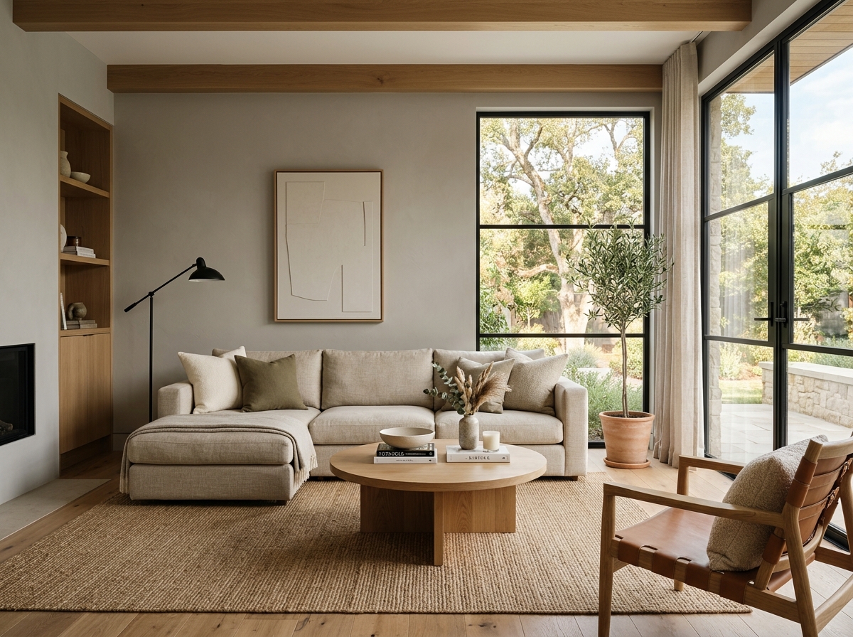 After
After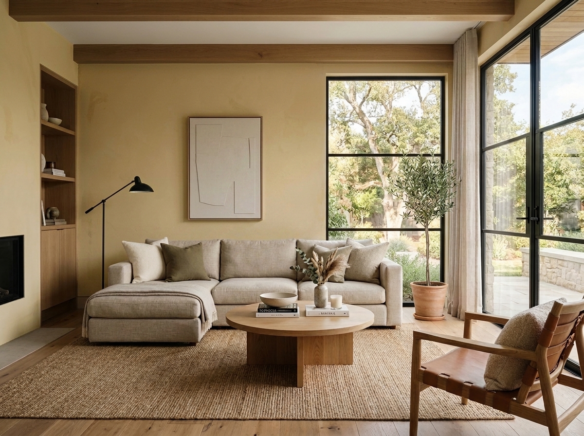 Before
Visualize Your Space with Color Studio AI
Planning a project? Skip the paint chip guesswork. Use our Color Studio AI to instantly visualize these paint colors on your own walls, or take advantage of our aligned contractor pricing matching current Sherwin-Williams retail promotions.
Book Your Upcoming Paint Project
Craftsman Painter is now scheduling premium transformations. Secure your spot and elevate your property value.
Get an EstimateHelp Others Find Professional Color Insights
Share this story directly to your networks or copy the link to share with friends.