


That is precisely why Sherwin-Williams Balmy SW 6512 deserves a close look if you are considering bringing color into your main living spaces.
Balmy sits at a Light Reflectance Value (LRV) of 65. In plain English, light reflectance is measured on a scale from 0 (absolute black, which absorbs all light) to 100 (pure white, which reflects everything). At 65, Balmy is comfortably bright. It bounces plenty of natural sunlight around a room so the space feels open and elevated, yet it carries enough color weight to hold its own against direct sun without fading into an off-white.
What makes Balmy truly special is its undertone structure. At its core, it is a crisp, clean sky blue, but it carries a deliberate violet-lavender undertone. Under the high overhead daylight of summer, this subtle purple bias balances out the warm yellow cast of direct sunlight. Instead of turning muddy or greenish, the wall stays cool, clear, and immensely peaceful.

Work Directly with Torlando Hakes
Skip the color choice stress. Work directly with me as your personal Color Designer to select the perfect architectural palette for your home, and get a Complementary Color Consultation when you purchase paint through us.

To make a light blue like Balmy work in a contemporary layout, you need to anchor it with the right supporting trim and neutral shades. A bright, true white on your baseboards, window casings, and ceiling keeps the blue looking intentional and crisp.
Sherwin-Williams Pure White SW 7005 is my top recommendation for this role. Pure White has just a tiny drop of warmth added to its base, which prevents it from feeling clinical or cold. When painted on window trim, door frames, or exposed structural columns directly adjacent to Balmy walls, it creates a sharp, tailored line that highlights your home's architecture.

To visualize how this color palette behaves in a representative mid-century modern home in Bloomington, Indiana, during the summer months, we have to look at how open-concept floor plans move light from room to room. When you have floor-to-ceiling glass pouring warm afternoon daylight onto polished concrete floors, painting every wall in blue can occasionally make a home feel floating or disconnected from the ground.
You need a mid-tone taupe to bridge the gap between sky and floor.
Sherwin-Williams Loggia SW 7506 serves as this perfect grounding element. Loggia is a warm greige-taupe with soft oatmeal undertones. By applying Loggia on transitional hallway walls, adjoining dining areas, or spatial partitions, you introduce an earthy warmth that balances Balmy's refreshing atmosphere. It grounds the cool daylight, creating a smooth visual journey as you walk from a bright living room into interior hallways.

When it comes to adding depth and drama to this setup, avoid soft grays or standard navy blues for your cabinetry and doors. Instead, look toward deep, moody hues that tap into Balmy’s violet undertones.
Benjamin Moore Night Shade 2116-10 is a magnificent choice for an accent color here. Night Shade is a dark, complex brown-black with rich plum and violet undertones. When used on a kitchen island base, built-in media shelving, or interior doors, it pulls out the subtle lavender complexity resting inside Balmy. It gives the room a striking focal point without feeling heavy or aggressive.

Because Balmy lives happily in the mid-to-high brightness range, it excels in spaces designed for relaxation and focus. Bedrooms, primary bathrooms, home offices, and sunrooms are natural fits for this color.
In a primary bathroom study, for instance, Balmy brings a spa-like calm that pairs effortlessly with warm natural stone, light oak vanities, and matte black or brushed metal plumbing fixtures. When natural light filters through frosted glass or high clerestory windows, the subtle violet tone softens the space, making early morning light feel gentle and inviting.

When specifying paint finishes for this palette, keep your wall sheens low. A matte or flat finish on Balmy SW 6512 walls absorbs excess glare from large summer windows, allowing the subtle lavender undertones to bloom naturally without distraction. For doors and trim painted in Pure White SW 7005, choose a satin or semi-gloss finish to provide durability and a subtle sheen contrast against the matte blue walls.
Pairing your walls with the right interior materials will complete the look. Balmy loves warm, natural elements: warm cognac leather, wire-brushed light oak, raw concrete, and oxidized brass accessories create a rich, tactile contrast against its smooth sky-blue quality.
By balancing Balmy’s breezy personality with earthy taupes like Loggia and grounding dark accents like Night Shade, you create a space that feels open, refined, and beautifully tuned to summer light.
Complementary Color Consultation
Planning a project? Work with Torlando Hakes directly as your personal Color Designer and get a Complementary Consultation when purchasing paint through us.
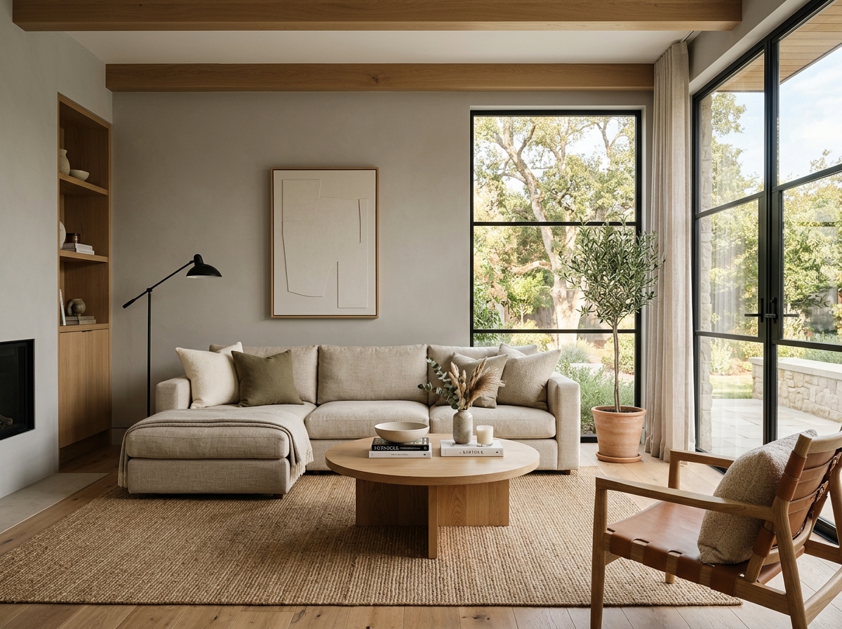 After
After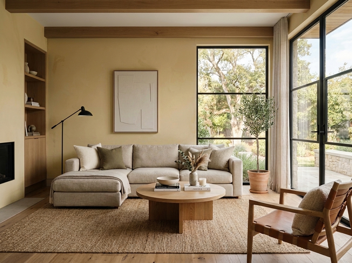 Before
Visualize Your Space with Color Studio AI
Planning a project? Skip the paint chip guesswork. Use our Color Studio AI to instantly visualize these paint colors on your own walls, or take advantage of our aligned contractor pricing matching current Sherwin-Williams retail promotions.
Book Your Upcoming Paint Project
Craftsman Painter is now scheduling premium transformations. Secure your spot and elevate your property value.
Get an EstimateHelp Others Find Professional Color Insights
Share this story directly to your networks or copy the link to share with friends.