


Designing a mudroom—the primary gateway between a humid exterior and the climate-controlled core of a home—requires precise visual calibration. You need a paint color that absorbs incoming glare and grounds the eye the second you walk through the door. I consistently recommend Benjamin Moore Crushed Berries for this exact architectural job.
Absorbing the Lowcountry Light
The immediate physical sensation of entering a Charleston home from the sweltering heat is a sudden drop in temperature. The color palette of an entryway transition should mirror that shift in intensity. We see a massive amount of white and pale sea-glass tones in Southern coastal mudrooms, and those highly reflective surfaces bounce exterior glare aggressively across the walls.
Crushed Berries operates differently. It is a deeply saturated, heavy mauve-red with a substantial dose of brown and purple in its base. It absorbs the harsh afternoon sun. Instead of reflecting light, this color pulls it in, softening the edges of the room and giving the eyes a place to rest after dealing with the bright Southern sky.

Work Directly with Torlando Hakes
Skip the color choice stress. Work directly with me as your personal Color Designer to select the perfect architectural palette for your home, and get a Complementary Color Consultation when you purchase paint through us.
The Architecture of a Transition
This specific pigment creates a visual airlock. Crushed Berries carries enough depth to hold its own against heavy millwork, stacked cubbies, and architectural molding, yet it remains distinctly warm and inviting.
Under the low angle of morning light, the red undertones become pronounced, radiating warmth. As the sun moves overhead and shadows lengthen in the afternoon, the purple and brown undertones take over. The paint darkens significantly. This dynamic shift creates a rich, shaded enclosure that visually separates the busy outdoors from the calm interior living spaces.

Establishing Sharp Trim Relationships
Coordinating with a heavy, saturated tone requires intentional contrast. You need crisp, sharp delineation to keep a rich berry color from feeling muddy or overly dark in a smaller utility space.
I pair Crushed Berries with Benjamin Moore Chantilly Lace on the surrounding baseboards, ceiling, and adjacent door casings. Chantilly Lace carries virtually zero warm or cool undertones. It offers a highly reflective, stark boundary that frames the deep berry tones like a gallery mat. This high-contrast relationship emphasizes the structural lines of the mudroom cabinetry and gives the eye a clean architectural boundary.

Mapping the Sightlines
Visual relationships extend far beyond the mudroom itself. As a transitional gateway, the colors you see while looking out of the space carry the same weight as the colors within it.
A deep, heavy tone like Crushed Berries acts as a visual funnel. Standing in a dark, saturated mudroom and looking through a doorway into a brighter adjacent kitchen or hallway alters your perception of the entire house.

If you paint that adjacent hallway a soft, warm neutral like Benjamin Moore White Dove, the interior of the home feels infinitely more expansive and luminous by comparison. The deep, dark walls of the mudroom push the lighter interior rooms forward. You are manipulating the sightlines, using an intense color at the threshold to make the rest of the house feel brighter, larger, and entirely intentional.
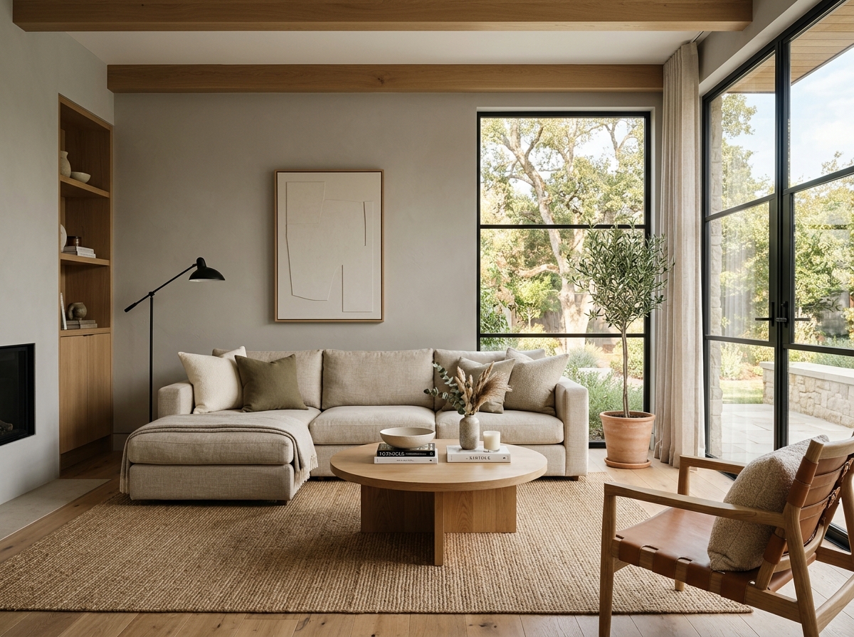 After
After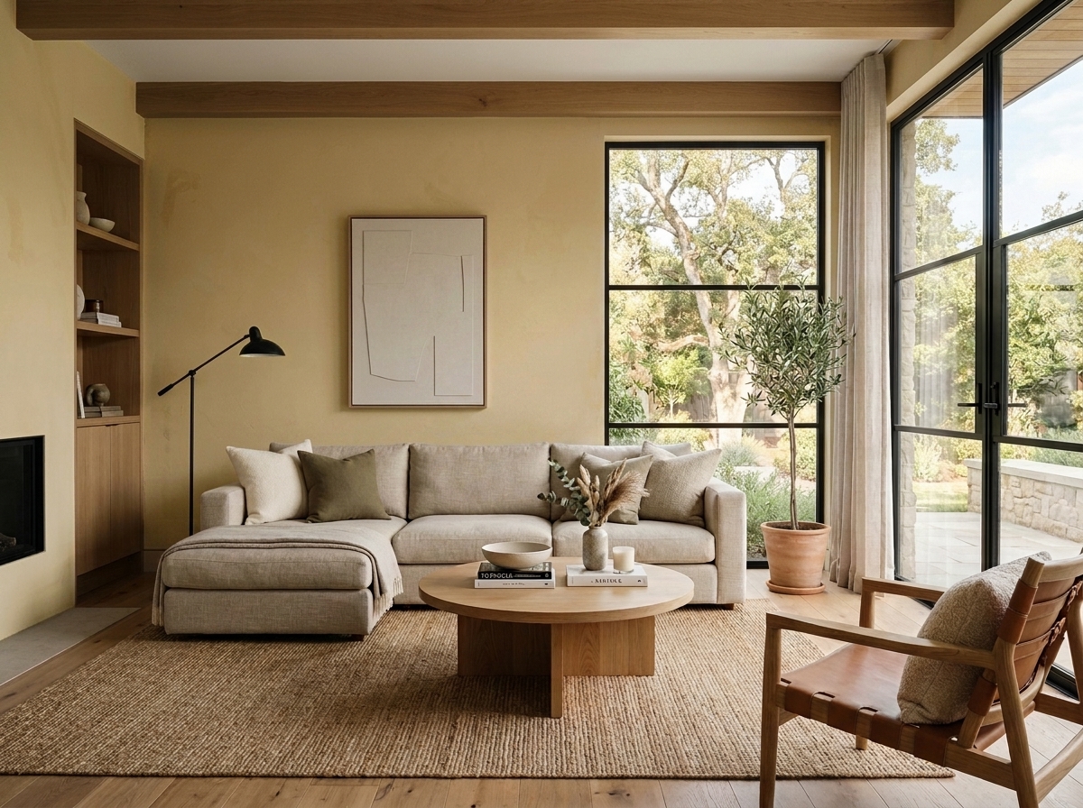 Before
Visualize Your Space with Color Studio AI
Planning a project? Skip the paint chip guesswork. Use our Color Studio AI to instantly visualize these paint colors on your own walls, or take advantage of our aligned contractor pricing matching current Sherwin-Williams retail promotions.
Book Your Upcoming Paint Project
Craftsman Painter is now scheduling premium transformations. Secure your spot and elevate your property value.
Get an EstimateHelp Others Find Professional Color Insights
Share this story directly to your networks or copy the link to share with friends.