


High Tea is a complex, organic mid-to-dark tone that bridges the gap between earthy olive green and weathered gray. To understand how it behaves on the wall, it helps to look at its Light Reflectance Value, or LRV, which sits at 21. In everyday terms, LRV measures how much light a paint color bounces back into a room on a scale from zero to one hundred. At 21, High Tea is a moody, enveloping shade that absorbs a good deal of light rather than reflecting it around the space. Instead of making a room feel cavernous or dark, however, its warm herbal foundation wraps the walls in a rich, tailored coat.
To visualize how this color palette behaves in a representative urban industrial loft in downtown Bloomington, let's explore a design study of a space featuring raw warehouse architectural details like distressed red-brown brick, exposed concrete pillars, and reclaimed rough-sawn lumber. In an open-concept layout or a primary bedroom sanctuary, those hard industrial surfaces can easily feel cold during late autumn and early winter. Applying Sherwin-Williams High Tea in a flat or matte finish on the primary focal walls softens the transition between the rugged masonry and the living area. In a bedroom or cozy den, it creates a quiet, restful backdrop that pairs effortlessly with cognac leather, natural linen bedding, and aged brass sconces.

Balancing Deep Olive Walls with Crisp Millwork
High Tea
Sherwin-Williams SW 6159
Alabaster
Sherwin-Williams SW 7008
Universal Khaki
Sherwin-Williams SW 6150
Iron Ore
Sherwin-Williams SW 7069
When working with a saturated, earthy shade that has an LRV of 21, the surrounding trim and architectural moldings do the heavy lifting to keep the room feeling structured and intentional. If you pair High Tea with a stark, icy gallery white, the contrast can feel too harsh and clinical, especially against warm rustic wood and brick.
See High Tea on Your Own Walls in 15 Seconds
Sherwin-Williams SW 6159 • LRV 21 • #7E6F59
Instead, I recommend pairing High Tea with Sherwin-Williams Alabaster (SW 7008) on your baseboards, window casings, and solid interior doors. Alabaster has just enough soft, creamy warmth to feel natural next to High Tea's olive-gray undertones without ever looking yellow. Using a durable satin or semi-gloss finish on the trim gives the millwork a subtle luster that catches the evening light, creating a clean, tailored border between the deep herbal walls and the rough-sawn wood floors.

How Undertones Shift from Late-Autumn Daylight to Evening Hosting
One of the reasons designers return to High Tea so often is the way it handles the transition from afternoon sun to evening lighting. In Bloomington, late-autumn skies often cast a cool, pewter daylight through the windows before giving way to a brief, low-angle golden hour. During the day, when soft natural light filters through factory-style windows, the subtle gray undertones in High Tea step forward. It reads as a sophisticated, muted sage-olive that feels calm and grounded.
Once the sun goes down at 5:00 PM and you flip on your dining chandelier or recessed sconces, the room's atmosphere changes completely. Under warm 2700K evening bulbs, the gray notes recede and the rich, earthen olive green comes alive. If you are hosting a holiday dinner, this shade makes a dining room or adjoining living space feel remarkably intimate. To connect rooms in an open loft without painting every single wall dark green, you can transition into hallways and adjoining foyers using Sherwin-Williams Universal Khaki (SW 6150). Universal Khaki shares that same grounded, earthy DNA as High Tea, acting as a warm, lighter companion that keeps the sightlines flowing smoothly from the entry into the main gathering spaces.

Grounding Kitchen Cabinetry and Built-Ins for the Holidays
Late autumn is peak season for kitchen updates and cabinet refinishing. When homeowners start planning holiday meals, dated oak or chipped painted cabinets under warm pendant lights become impossible to ignore. If you have High Tea on the walls in an adjacent dining or living area, you have a fantastic opportunity to anchor your kitchen cabinetry or a central island with a deep, dramatic charcoal.
Rather than choosing a harsh jet black, pair this palette with Sherwin-Williams Iron Ore (SW 7069) on lower cabinets, a kitchen island, or dining room built-ins. Iron Ore is a soft, charcoal black with subtle warm depths that echo the dark iron window grids and industrial pendant fixtures found in loft architecture. Applied in a professional urethane enamel satin finish, Iron Ore gives older cabinetry a furniture-grade appearance that hides everyday scuffs and looks extraordinary next to High Tea walls, exposed brick, and warm brass hardware.

Carrying the Palette into Smaller Spaces
You don't have to reserve rich, earthy colors exclusively for large living rooms or expansive loft walls. Bringing this combination into a guest bathroom or powder room right off the main entertaining area is one of the easiest ways to elevate your home before guests arrive.
In a bathroom vignette, painting the walls in High Tea and grounding the vanity cabinet in Iron Ore creates a cohesive, high-end look that ties right back to the main living spaces. With crisp Alabaster trim and warm sconce lighting flanking the mirror, the olive-gray tones flatter skin tones and turn a simple utilitarian room into a memorable part of your home's design.

When you want a wall color that holds its composure in cool Indiana daylight and turns rich and welcoming under the amber glow of holiday evening lighting, Sherwin-Williams High Tea delivers timeless depth without ever feeling heavy.
Complementary Color Consultation
Planning a project? Work with Torlando Hakes directly as your personal Color Designer and get a Complementary Consultation when purchasing paint through us.
High Tea (SW 6159) — Key Questions Answered
What is the LRV and undertone of Sherwin-Williams High Tea (SW 6159)?
Sherwin-Williams High Tea (SW 6159) has a Light Reflectance Value (LRV) of 21 and hex code #7E6F59. Always evaluate it under both north-facing and warm afternoon light before final application.
What trim and coordinating colors pair best with High Tea?
Our recommended architectural pairings for High Tea include Alabaster (SW 7008), Universal Khaki (SW 6150), Iron Ore (SW 7069) to balance wall depth, trim contrast, and adjoining room transitions.
How can I test High Tea on my own walls before painting?
You can upload a photo of your room to Craftsman Painter's Color Studio AI to preview High Tea on your walls immediately, or schedule an on-site or video consultation with our team.
Getting High Tea Right Under Your Home's Light
Join 1,650+ homeowners, designers, and architects receiving our curated dispatches every 10 days (1st, 11th & 21st) on field stories, LRV, undertones, and trim pairings.
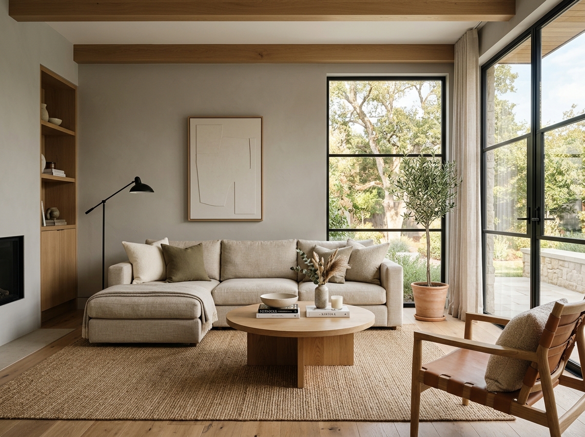 After
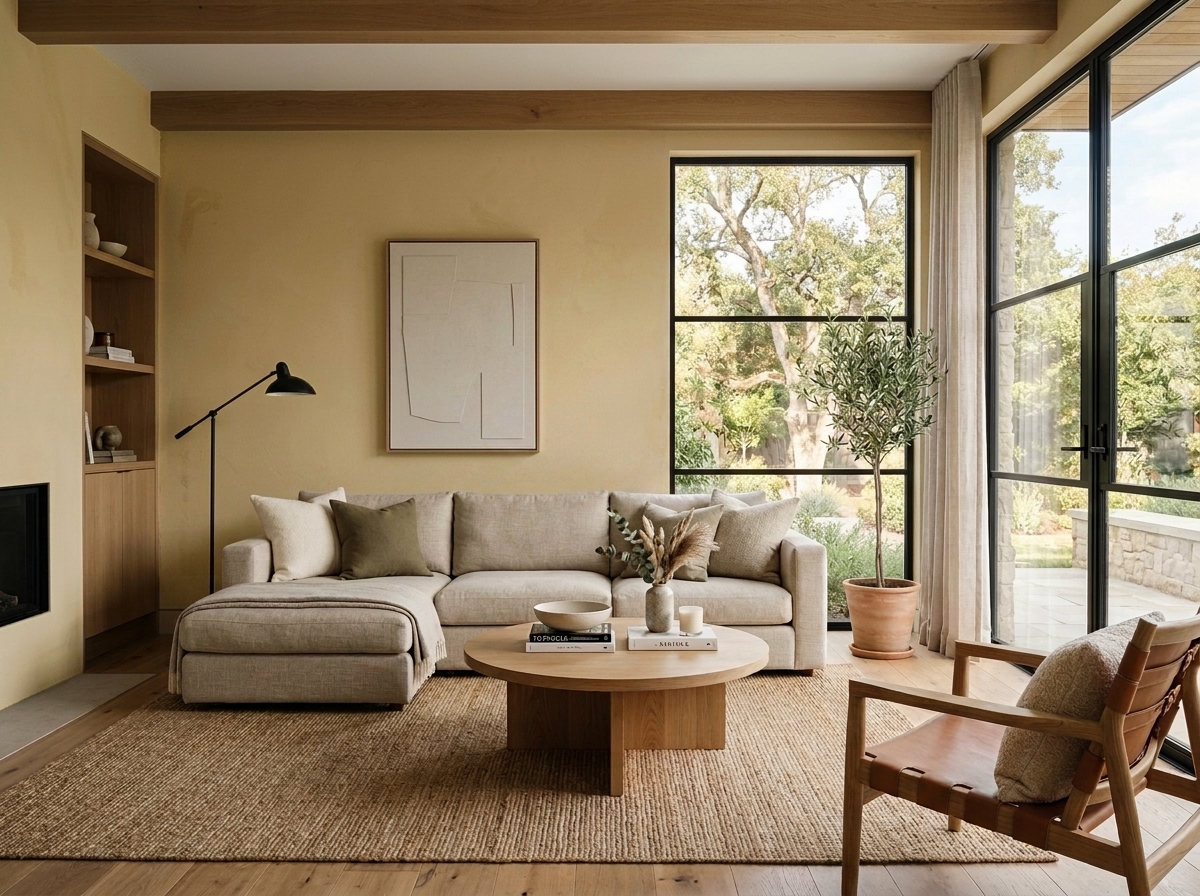 Before
Visualize Your Space with Color Studio AI
Planning a project? Skip the paint chip guesswork. Use our Color Studio AI to instantly visualize these paint colors on your own walls, or take advantage of our aligned contractor pricing matching current Sherwin-Williams retail promotions.
Book Your Upcoming Paint Project
Craftsman Painter is now scheduling premium transformations. Reserve an on-site consultation or instant video walkthrough.
Get an Estimate →Related Color & Design Studies

The Case for Quiet Gray-Blues: Why Designers Return to Sherwin-Williams Languid Blue SW 6226
The Muddy, Magnificent Paint Color Designers Keep Secretly Hoarding to Tame the Brutal Bloomington Sun

When Golden Daylight Needs a Cool Counterweight, Could Sherwin-Williams North Star SW 6246 Be the Answer?
Help Others Find Professional Color Insights
Share this story directly to your networks or copy the link to share with friends.