

I spend my life studying how color behaves in the real world, and I can tell you that Phoenix requires a completely different architectural color vocabulary. The light here is bleached, aggressive, and relentlessly warm. To fight it is a fool's errand. You have to absorb it, lean into it, and ground the space.
That brings us to the unsung hero of the desert kitchen: Sherwin-Williams Classic Sand (SW 0056).
This isn't a trendy taupe or a washed-out beige. It is a historic, grounded, architectural color with immense structural weight. When applied to the cabinetry and walls of a kitchen’s operational center, Classic Sand completely redefines the visual relationships of the room. It stops fighting the desert and starts participating in it.
Book Your Upcoming Paint Project
Craftsman Painter is now scheduling premium transformations. Secure your spot and elevate your property value.
Get an EstimateThe Architecture of Desert Light
In the kitchen, visual ergonomics matter just as much as physical ergonomics. When you are standing at the prep island, mincing garlic or rolling out dough, your eyes are constantly adjusting between the surface of the counter, the vertical plane of the cabinetry, and the ambient light of the room.
Bright whites create extreme visual fatigue in this climate. They bounce the aggressive Arizona UV rays relentlessly. Classic Sand operates on a different frequency. It possesses a perfectly calibrated Light Reflectance Value that swallows just enough of that harsh glare while maintaining a luminous, breathable atmosphere.
Notice how it behaves as a backdrop. Because Classic Sand has a muted, earthen undertone rather than a fleshy or yellow one, it acts as a visual anchor. It gives your eye a place to rest. The operational center transitions from a sterile laboratory into a grounded culinary workshop.
Navigating the Sun's Arc
The true test of a paint color is how it mutates as the earth spins. A kitchen in Phoenix is a theater of shifting light, and Classic Sand performs brilliantly across all acts.
In the early morning, when the light is cooler and indirect, the color reads almost like dry limestone. It’s quiet, crisp, and incredibly sophisticated. It plays beautifully against the hard edges of stainless steel appliances or a honed stone backsplash, bringing warmth to materials that can otherwise feel brutally industrial.
But high noon is where the magic happens. As the sun peaks and the ambient light in the room shifts to a blinding, bleached white, Classic Sand holds its pigment. It doesn’t wash out into a dirty off-white. It retains its identity as a distinct, deliberate hue.
By late afternoon, as the sun drops toward the White Tank Mountains and the light turns to liquid gold, the color undergoes its final mutation. It absorbs the red and orange wavelengths of the dying sun, glowing with an ember-like intensity. It creates a seamless visual relationship between the interior of your home and the baked earth of the landscape outside.
The Coordinates of Harmony
You cannot use a color with this much earthen weight and frame it with the wrong trim. If you pair Classic Sand with a stark, blue-toned white on your baseboards or ceilings, you will instantly create a muddy, discordant mess. The visual relationship will fracture.

To maintain the integrity of the space, you must rely on complementary coordinates that share its warm, organic DNA. For ceilings, trim, and architectural transitions, Sherwin-Williams Alabaster (SW 7008) is the absolute gold standard here. Alabaster has just enough creamy depth to bridge the gap gracefully, providing contrast without causing a violent temperature clash.
If you are designing a two-toned operational center—perhaps grounding the primary prep island while keeping the perimeter cabinets in Classic Sand—you need a color that mimics the deep, heavy shadows of the desert. Sherwin-Williams Urbane Bronze (SW 7048) is the perfect counterweight. It is a massive, stony brown-gray that pulls the entire scheme together, anchoring the culinary workspace to the floor.
Ultimately, color is not just decoration. It is an architectural material. In a climate as extreme and visually demanding as Phoenix, you need materials that work with the environment, not against it. Classic Sand doesn't just coat your cabinets; it recalibrates the entire visual frequency of your kitchen, turning the hardest-working space in your home into a place where you actually want to linger.
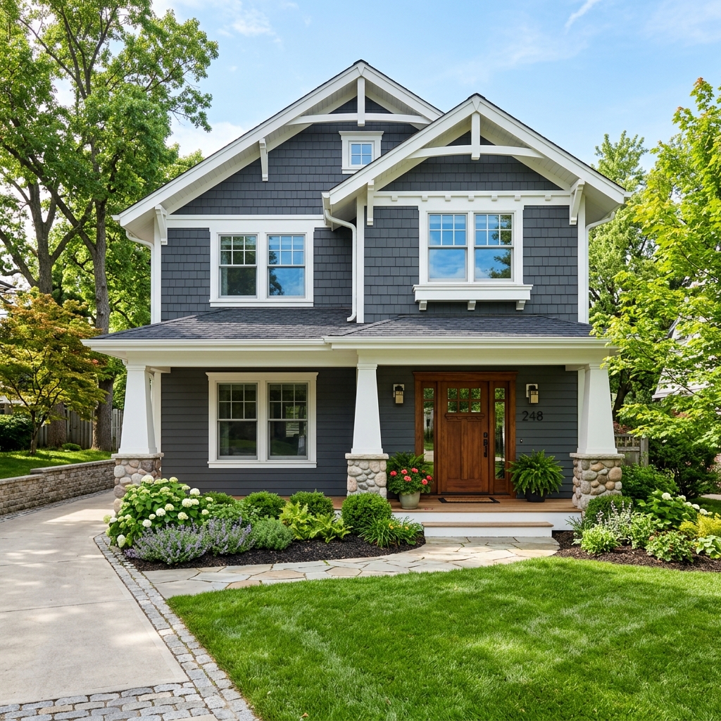 After
After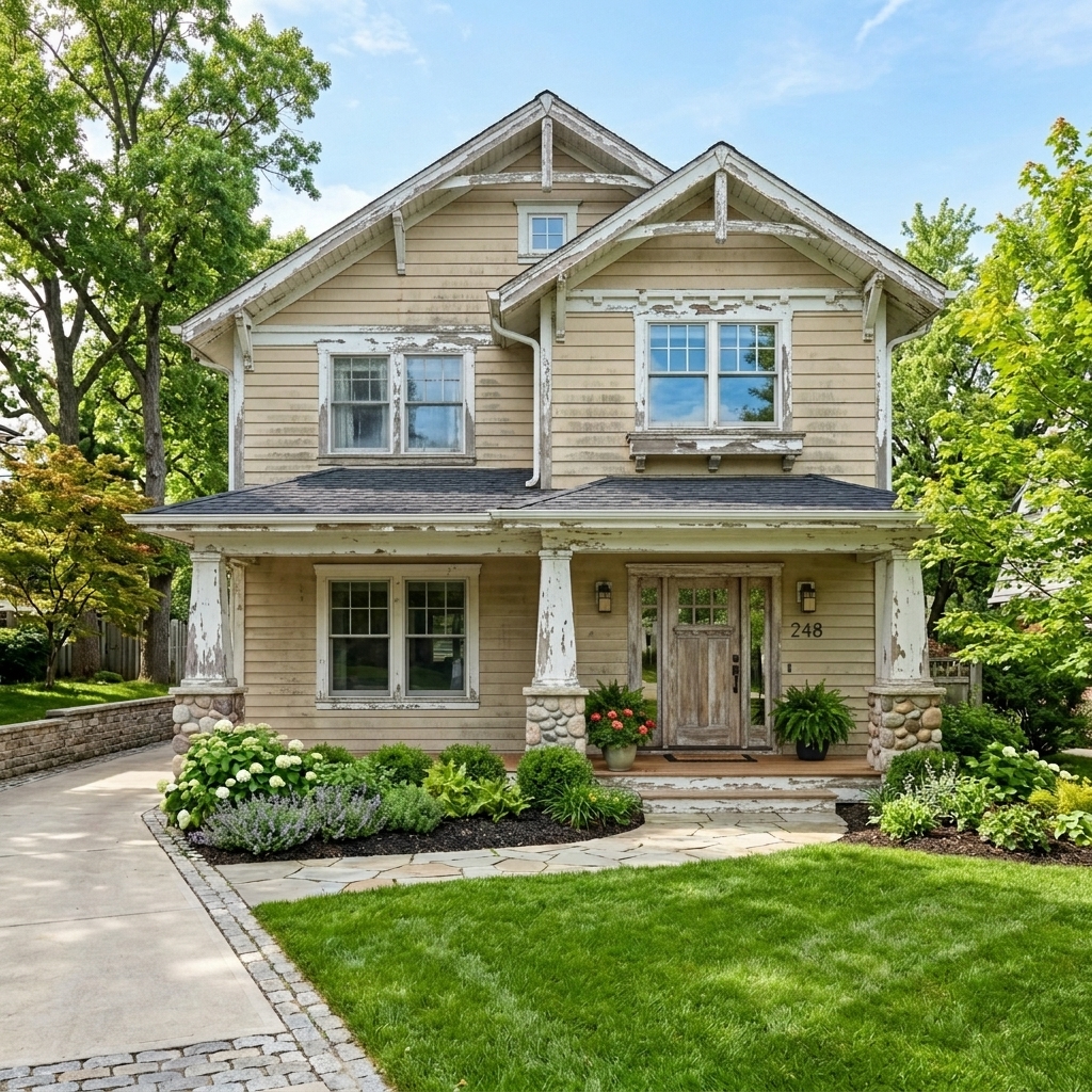 Before
Visualize Your Space with Color Studio AI
Planning a project? Skip the paint chip guesswork. Use our Color Studio AI to instantly visualize these paint colors on your own walls, or take advantage of our aligned contractor pricing matching current Sherwin-Williams retail promotions.
Help Others Find Professional Color Insights
Share this story directly to your networks, or download the clean Markdown and images to publish on Substack or Medium.