


To understand how Tate Olive works, we have to look at how it responds to illumination. With a Light Reflectance Value (LRV) of 23.36 on a scale from 0 to 100, this is a medium-dark color that absorbs light rather than bouncing it freely around the room. Instead of making a space feel small, however, that lower reflectivity creates a cozy, enveloping atmosphere. The color magic lies in its balanced undertones: a foundation of traditional olive green balanced by warm yellow and a faint, stabilizing gray note. That touch of gray keeps the green from looking harsh or artificially bright, while the yellow allows it to glow when bathed in natural sunlight.

Building the Architectural Palette
Tate Olive
Benjamin Moore HC-112
White Dove
Benjamin Moore OC-17
Manchester Tan
Benjamin Moore HC-81
Wrought Iron
Benjamin Moore 2124-10
A strong green needs thoughtful surrounding colors to establish rhythm throughout a floor plan. Rather than painting every wall in one heavy tone, I always design a visual transition between rooms using supporting neutrals that share the same warm undertones.
For window casings, doors, and baseboards, Benjamin Moore White Dove (OC-17) is an ideal match. White Dove is a legendary warm white with a soft luminous quality that prevents high-contrast trim from looking like painter's tape against the walls. When applied to structural moldings next to Tate Olive, White Dove softens the perimeter of the room, creating a subtle, framed look that feels relaxed rather than rigid.

Work Directly with Torlando Hakes
Skip the color choice stress. Work directly with me as your personal Color Designer to select the perfect architectural palette for your home, and get a Complementary Color Consultation when you purchase paint through us.
To connect spaces—such as moving from a rich olive living area into a hallway or dining room—Benjamin Moore Manchester Tan (HC-81) serves as an effortless mid-tone bridge. Manchester Tan is a warm, sandy neutral with a hint of limestone undertone. It carries enough weight to stand on its own without washing out, offering a smooth visual breath between deeper saturated walls.

How Light Alters Tate Olive Across the Day
In the crisp atmospheric conditions of a Midwest autumn, natural light changes dramatically from morning to evening. Watching how Tate Olive adapts across these lighting shifts reveals its true complexity.
During the cool hours of early morning, the gray undertones in Tate Olive take the lead, giving the room a muted, restful, almost stone-like appearance. As the sun moves lower in the afternoon sky, low-angle golden light enters through North- or East-facing windows, awakening the warm yellow undertones in the paint. The wall surface appears to soften, revealing rich bronze notes that pair beautifully with natural blonde oak flooring and raw matte ceramics. By nightfall, under warm lamp lighting, the color settles into a moody, sophisticated dark olive that makes living spaces feel sheltered and intimate.

Grounding the Palette with Structural Contrast
To keep an organic Japandi aesthetic from feeling overly soft or floaty, every interior design study needs a strong structural element. That is where Benjamin Moore Wrought Iron (2124-10) completes the picture.
Wrought Iron is a deep charcoal gray that sits just shy of pure black. When used on built-in cabinetry, modern kitchen islands, or interior door panels, it grounds the surrounding greens and tans. The crispness of Wrought Iron gives slender black metal floor lamps, minimalist hardware, and architectural window frames an intentional anchor point. Against a wall of Tate Olive, a accent painted in Wrought Iron creates a sophisticated, tailor-made focal point.

Room Applications and Sheen Selection
When planning where to use Tate Olive in your home, consider spaces where quiet focus and comfort are top priorities. It functions exceptionally well on all four walls of a cozy home library, a primary bedroom suite, or a primary bathroom designed around natural stone textures.
For paint sheens, I recommend specifying a matte or flat finish on the main wall surfaces. A matte finish absorbs light, accentuating the velvet-like depth of the olive pigment while minimizing any wall imperfections. For trim, door casings, and baseboards in White Dove, choose a satin or semi-gloss finish to provide durability and a subtle reflective distinction against the matte walls. Cabinetry finished in Wrought Iron looks best in a durable satin sheen that highlights fine joinery while resisting everyday touch marks.

By pairing Benjamin Moore Tate Olive with warm neutrals, architectural charcoals, and natural wood textures, you create a home environment that feels both grounded and modern through every season.
Complementary Color Consultation
Planning a project? Work with Torlando Hakes directly as your personal Color Designer and get a Complementary Consultation when purchasing paint through us.
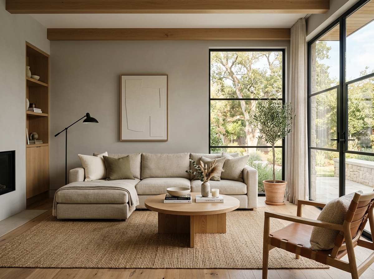 After
After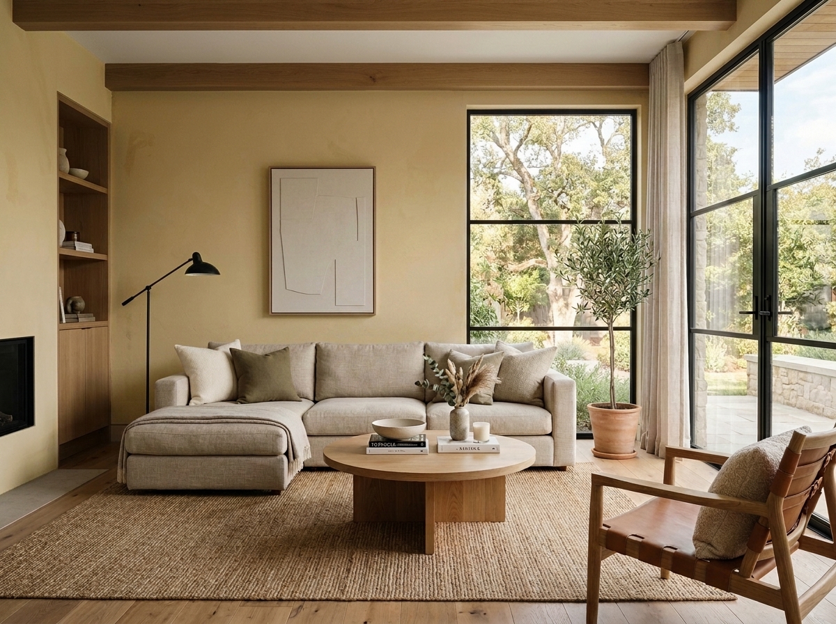 Before
Visualize Your Space with Color Studio AI
Planning a project? Skip the paint chip guesswork. Use our Color Studio AI to instantly visualize these paint colors on your own walls, or take advantage of our aligned contractor pricing matching current Sherwin-Williams retail promotions.
Book Your Upcoming Paint Project
Craftsman Painter is now scheduling premium transformations. Secure your spot and elevate your property value.
Get an EstimateHelp Others Find Professional Color Insights
Share this story directly to your networks or copy the link to share with friends.