


What keeps Randolph Gray from feeling flat or overly industrial are its distinct undertones. Beneath that deep charcoal surface lies a cool blue-violet foundation. If you are thinking about using this color in a primary bedroom or a quiet study, understanding how that undertone behaves is essential. To visualize how this shade performs in a representative Wabi-Sabi inspired home in Cleveland, OH, consider how it interacts with raw, natural materials. Against rough plaster, linen bedding, and unstained salvaged timber, the cool blue-violet base acts as a sophisticated counterpoint to warm, earthy textures, keeping the room feeling balanced and calm.

Framing the Darkness with Crisp Architectural Trim
Randolph Gray
Benjamin Moore CW-85
Chantilly Lace
Benjamin Moore OC-65
Pashmina
Benjamin Moore AF-100
Carter Plum
Benjamin Moore CW-355
When you put a color with an LRV of 7.34 on your walls, your trim and moldings suddenly have a very important job to do. If you pair a cool, blue-violet charcoal with a creamy, yellow-toned white, the trim can end up looking dingy or dated by comparison. To give Randolph Gray a clean, intentional boundary, I recommend pairing it with Benjamin Moore Chantilly Lace OC-65 on your window casings, doors, and baseboards.
Chantilly Lace is one of the cleanest, purest whites available, free of heavy warm or cool undertones that might clash with the subtle violet cast in the walls. For the best visual separation, apply Randolph Gray in a flat or ultra-matte sheen on the walls to soak up the light and hide minor surface imperfections, then switch to a satin or semi-gloss finish for Chantilly Lace on the trim. That slight contrast in sheen catches the light along the architectural lines of the room, giving the dark walls a crisp frame that feels tailored even in a relaxed, natural setting.

Work Directly with Torlando Hakes
Skip the color choice stress. Work directly with me as your personal Color Designer to select the perfect architectural palette for your home, and get a Complementary Color Consultation when you purchase paint through us.

How Cleveland's Autumn Light Shapes the Undertones
Geography and season play a massive role in how we perceive dark paint colors. Here in Cleveland, autumn brings a very specific quality of light off Lake Erie—it is often soft, overcast, and evenly diffused, filtering through yellowing and rust-colored foliage outside. In this gentle, shadowless autumn daylight, Randolph Gray shows its true complexity. Without harsh, direct sunbeams washing out the wall, the deep charcoal base steps forward, and you can clearly read that cool blue-violet undertone across the surface.
As afternoon fades into evening and you switch on warm incandescent or 2700K LED table lamps, the blue-violet notes recede, and the walls settle into a rich, velvety slate that feels incredibly cozy. Because this color is so assertive, you also need to think about how it transitions into adjoining hallways or open-concept living areas. Jumping straight from a dark charcoal room into a bright white hallway can feel jarring. To bridge that gap in a typical home layout, I like to use Benjamin Moore Pashmina AF-100 in the connecting spaces. Pashmina is a grounded, warm greige that softens the transition, picking up on the earthy elements of stone flooring or natural wood furniture while keeping the overall sightlines of the house cohesive.

Layering Moody Accents in Cabinetry and Built-Ins
One of the biggest mistakes homeowners make with dark wall colors is assuming every accent piece in the room needs to be light to compensate. In reality, leaning into a tonal, moody palette often yields a much more relaxing room. When planning a kitchen island, a butler's pantry, or living room built-ins within a home featuring Randolph Gray, Benjamin Moore Carter Plum CW-355 makes an exceptional accent partner.
Because Randolph Gray already carries a subtle violet undertone, introducing Carter Plum—a deep, muted aubergine-brown—on cabinetry or interior doors feels completely natural. It pulls that hidden undertone out of the gray and gives it a deliberate role in the design. In a kitchen or dining nook with unpainted wood counters and handmade ceramic dishware, cabinets painted in a durable satin finish of Carter Plum add warmth and depth without fighting the charcoal walls for attention.

Designing Intimate Small Spaces and Powder Rooms
If you love the richness of Randolph Gray and its coordinating palette but aren't ready to commit to dark walls in a main living room, a bathroom or powder room is the ideal place to start. Small spaces with limited natural light actually benefit from low-LRV colors because you aren't fighting a losing battle to make a dim room look sunny. Instead, you lean into the shade to create a quiet, spa-like retreat.

In a bathroom setting, pairing Randolph Gray walls with a vanity painted in Carter Plum or framed by Chantilly Lace trim turns an everyday functional spot into a standout feature of the home. Keep your hardware and fixtures in unlacquered brass, aged bronze, or matte black, and bring in plenty of rough-hewn textures like waffle-weave linen towels and natural stone counter surfaces to keep the cool charcoal feeling warm and lived-in.
When you respect the cool undertones of Randolph Gray and give it the right supporting cast of clean whites, warm mid-tones, and organic textures, you end up with a space that feels grounded and timeless in every season.
Complementary Color Consultation
Planning a project? Work with Torlando Hakes directly as your personal Color Designer and get a Complementary Consultation when purchasing paint through us.
Randolph Gray (CW-85) — Key Questions Answered
What is the LRV and undertone of Benjamin Moore Randolph Gray (CW-85)?
Benjamin Moore Randolph Gray (CW-85) has a Light Reflectance Value (LRV) of 7.34 and hex code #58584E. Always evaluate it under both north-facing and warm afternoon light before final application.
What trim and coordinating colors pair best with Randolph Gray?
Our recommended architectural pairings for Randolph Gray include Chantilly Lace (OC-65), Pashmina (AF-100), Carter Plum (CW-355) to balance wall depth, trim contrast, and adjoining room transitions.
How can I test Randolph Gray on my own walls before painting?
You can upload a photo of your room to Craftsman Painter's Color Studio AI to preview Randolph Gray on your walls immediately, or schedule an on-site or video consultation with our team.
Getting Randolph Gray Right Under Your Home's Light
Join 1,300+ homeowners, designers, and architects receiving our curated 1st & 15th dispatches on LRV, undertones, trim pairings, and substrate chemistry.
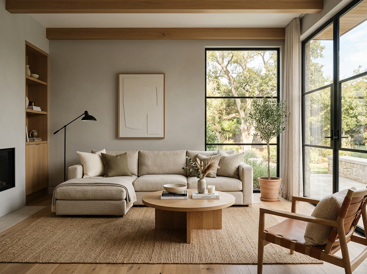 After
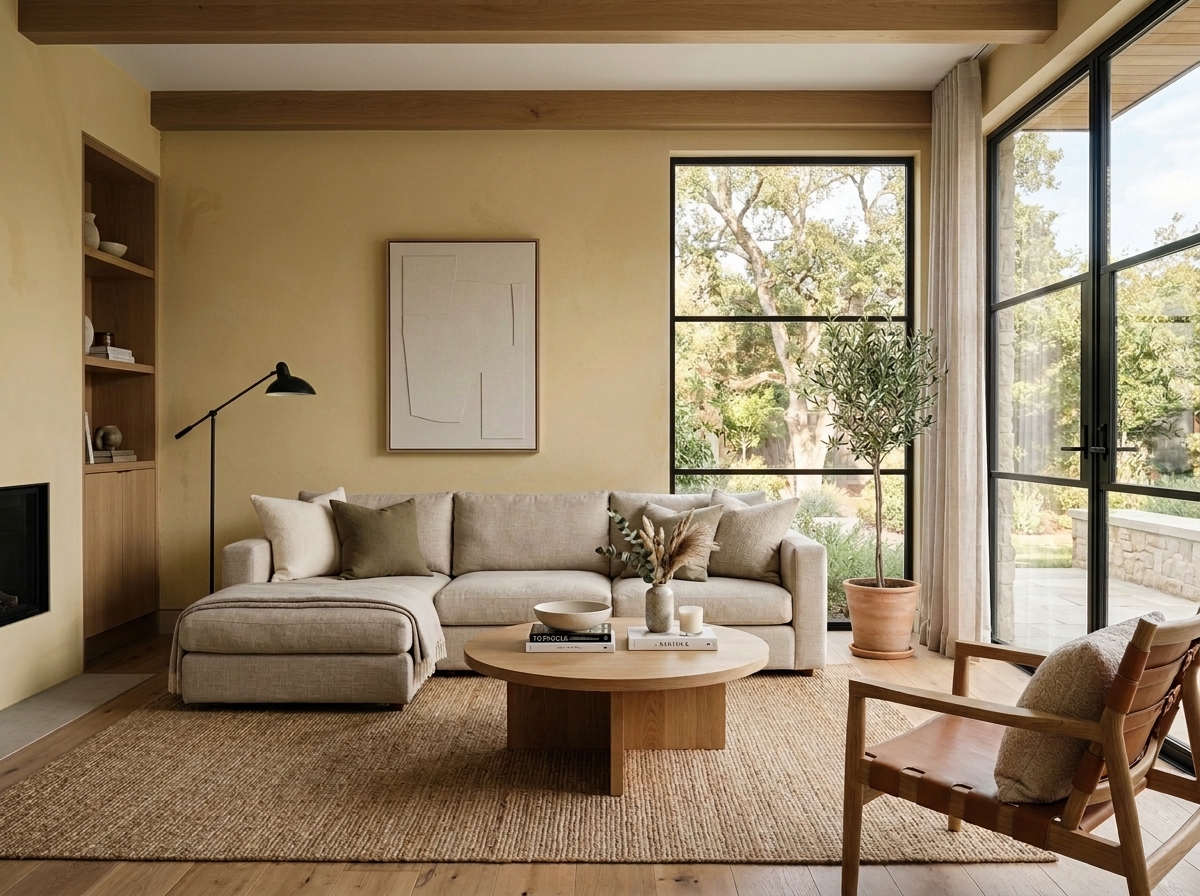 Before
Visualize Your Space with Color Studio AI
Planning a project? Skip the paint chip guesswork. Use our Color Studio AI to instantly visualize these paint colors on your own walls, or take advantage of our aligned contractor pricing matching current Sherwin-Williams retail promotions.
Book Your Upcoming Paint Project
Craftsman Painter is now scheduling premium transformations. Reserve an on-site consultation or instant video walkthrough.
Get an Estimate →Related Color & Design Studies

Why Sherwin-Williams Languid Blue SW 6226 Creates the Quietest Atmosphere in Summer Sunlight
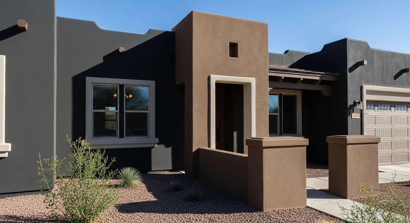
The Muddy, Magnificent Paint Color Designers Keep Secretly Hoarding to Tame the Brutal Phoenix Sun

Why Sherwin-Williams North Star SW 6246 Delivers the Cool Crisp Air of a High-Summer Day
Help Others Find Professional Color Insights
Share this story directly to your networks or copy the link to share with friends.