


With a Light Reflectance Value (LRV) of 11.64, Bucktrout Brown sits firmly on the deeper end of the scale. In plain everyday terms, LRV measures how much light a paint color bounces back into a room on a scale from zero to one hundred. At 11.64, this color absorbs far more light than it reflects. Rather than fighting for brightness, it uses that depth to wrap a space in warmth. What sets it apart from standard dark browns is its unmistakable golden-brown undertone, which keeps the color feeling lively and inviting even when the sun goes down.
Grounding Modern Architecture and Bedroom Sanctuaries
Bucktrout Brown
Benjamin Moore CW-180
White Dove
Benjamin Moore OC-17
October Mist
Benjamin Moore 1495
Gentleman's Gray
Benjamin Moore 2062-20
To visualize how this color palette behaves in a representative Case Study Modern home in Cleveland, OH, consider a layout defined by exposed steel beams, polished concrete floor slabs, and expansive floor-to-ceiling glass walls. Steel and concrete can easily feel cold and industrial, especially as the Midwest weather cools down. Wrapping a primary bedroom wall in Bucktrout Brown instantly warms up those sleek surfaces, creating a quiet sanctuary that feels substantial and comforting without losing its crisp modern edge.

When working with a color this deep in a bedroom or den, sheen selection makes all the difference. I always recommend a high-quality matte or flat finish for the walls. Because dark colors hold so much pigment, higher sheens like eggshell or satin can reflect light unevenly across large drywall surfaces, highlighting every tiny roller mark or drywall joint. A matte finish gives Bucktrout Brown a velvety, suede-like appearance that softens the hard lines of steel and glass.

Work Directly with Torlando Hakes
Skip the color choice stress. Work directly with me as your personal Color Designer to select the perfect architectural palette for your home, and get a Complementary Color Consultation when you purchase paint through us.
Crisp Framing and Trim Pairings
Dark walls need a clear boundary to look intentional, especially in homes where traditional heavy crown molding is swapped for sleek minimalist profiles or slim window reveals. Pairing Bucktrout Brown with a stark, icy white creates a jarring contrast that makes the brown look heavy and the white look sterile. Instead, you want a soft, creamy white that shares a tiny hint of warmth.
Benjamin Moore White Dove (OC-17) is my go-to choice for baseboards, door casings, and ceiling planes alongside Bucktrout Brown. White Dove has just enough softness to bridge the gap between the rich golden-brown walls and the cooler gray tones of polished concrete floors. Apply White Dove in a satin or semi-gloss sheen on your trim and doors; the subtle gloss provides a clean, wipeable surface and creates a subtle sheen contrast against the matte brown walls.

Reading the Golden Undertones in Cleveland’s Autumn Light
Natural light in Cleveland during the autumn months has a very specific character. As the sun sits lower in the sky and filters through turning oak and maple leaves, the daylight becomes soft, even, and slightly diffused. In a house with floor-to-ceiling glass facades, this seasonal light pulls the best qualities out of Bucktrout Brown.
During the bright midday hours, you will clearly see those warm golden-brown undertones coming to the surface, giving the walls a rich, toasted amber glow that pairs naturally with warm leather furniture, natural oak tables, and unlacquered brass hardware. When the gray Lake Erie clouds roll in—or when you switch on minimal recessed lighting in the evening—the golden notes settle down, leaving you with a steady, earth-toned espresso that never turns murky or black.

Flowing Into Adjoining Spaces and Accent Cabinetry
If you are using Bucktrout Brown as a feature wall in an open-concept living area or wrapping an entire study in it, you need a gentle transition color for the adjoining hallways and kitchen spaces. Moving straight from a dark brown room into an all-white living area can feel abrupt. To create an effortless flow through the floorplan, look to Benjamin Moore October Mist (1495). This soft, botanical sage green acts as a natural bridge, echoing the organic feel of the autumn foliage outside the glass walls while keeping the main circulation spaces light and airy.
For built-in shelving, kitchen islands, or interior accent doors within sight of your Bucktrout Brown walls, bringing in a deep, moody counterpoint elevates the entire palette. Benjamin Moore Gentleman's Gray (2062-20)—which is actually a blackened, teal-leaning navy rather than a true gray—provides a sophisticated contrast against the warm golden-brown tones.

When painting kitchen cabinetry, a bar built-in, or a heavy interior door in Gentleman's Gray, step up to a durable cabinet-grade urethane alkyd enamel in a satin finish. The cool, Ink-blue depth of Gentleman's Gray plays off the golden warmth of Bucktrout Brown the same way raw steel beams play off warm walnut wood—each color makes the other look richer and more deliberate.
Bringing Warmth to Smaller Architectural Corners
Don't overlook deep colors like Bucktrout Brown for smaller, utility-focused spaces like a powder room or a master bathroom vanity area. In a bathroom featuring anodized aluminum fixtures, concrete countertops, and large-format tile, a brown wall behind the vanity removes the clinical chill and makes the space feel like a high-end spa.

In a bathroom environment, trade the matte finish for a high-performance bath and spa matte paint that resists moisture and mildew, ensuring you keep that velvety, non-reflective look without sacrificing durability. Pair it with crisp white towels in the tone of White Dove and warm brass or brushed aluminum plumbing fixtures to tie the whole house together.
When you respect its depth and pair it with soft whites, organic greens, and rich navy accents, Benjamin Moore Bucktrout Brown proves that dark brown can be one of the cleanest, most modern tools in your design kit.
Complementary Color Consultation
Planning a project? Work with Torlando Hakes directly as your personal Color Designer and get a Complementary Consultation when purchasing paint through us.
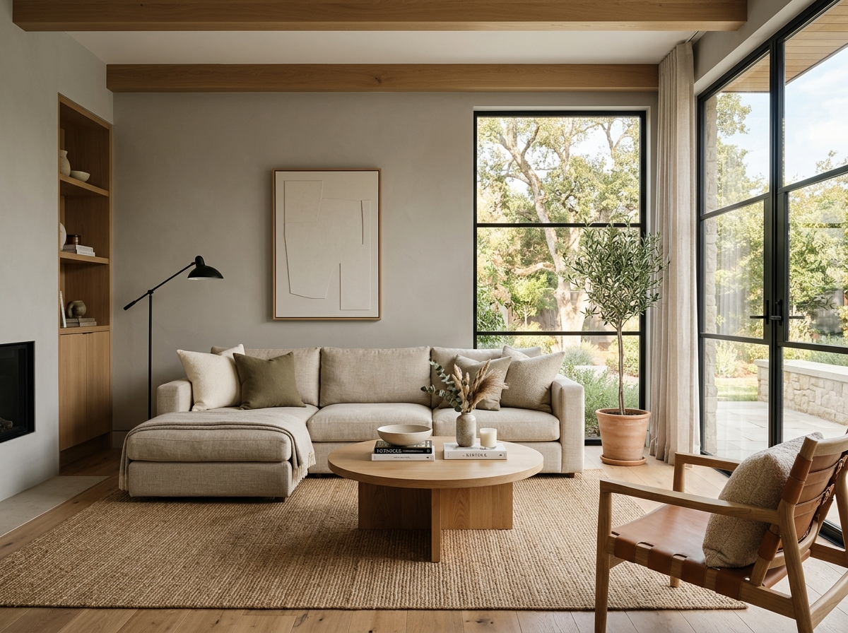 After
After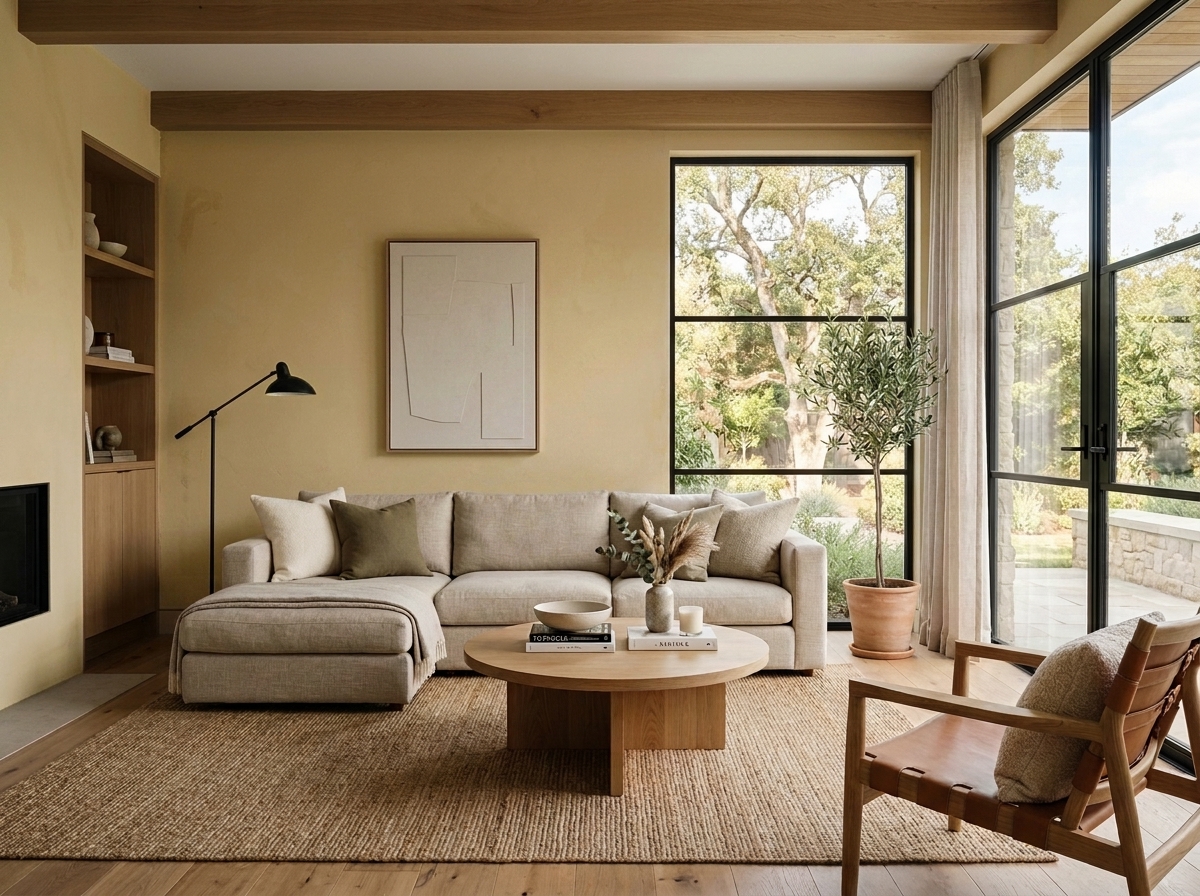 Before
Visualize Your Space with Color Studio AI
Planning a project? Skip the paint chip guesswork. Use our Color Studio AI to instantly visualize these paint colors on your own walls, or take advantage of our aligned contractor pricing matching current Sherwin-Williams retail promotions.
Book Your Upcoming Paint Project
Craftsman Painter is now scheduling premium transformations. Secure your spot and elevate your property value.
Get an EstimateHelp Others Find Professional Color Insights
Share this story directly to your networks or copy the link to share with friends.