


Chrome Green is a heavyweight historical shade with a Light Reflectance Value (LRV) of 5.32. On the 0-to-100 scale, that puts it firmly at the dark end of the spectrum—it absorbs nearly ninety-five percent of the light that hits it. What keeps it from feeling like a black hole in a commercial dining room is its complex undertone structure. Beneath the deep forest surface sits a distinct blue-gray mineral quality. It avoids the yellow-green warmth that can make dark olive walls look swampy next to plated food, and it steers clear of the icy harshness of pure navy.
In the visualization below of a boutique restaurant and cafe dining room, you can see how Chrome Green anchors the wainscoted walls and upper plaster. To keep the low reflectance from feeling heavy during daytime service, the coffered acoustic ceiling bays and architectural crown moldings are finished in Benjamin Moore White Dove (OC-17). White Dove has just enough creamy softness to keep the transition between the dark green walls and the ceiling from looking razor-sharp or sterile. It bounces overhead light evenly across the room, giving guests a sense of airiness above while the dark green perimeter pulls the tables into an intimate, focused envelope.
Framing the Bar and Host Stand for All-Day Shifts
Chrome Green
Benjamin Moore HC-189
White Dove
Benjamin Moore OC-17
Alexandria Beige
Benjamin Moore HC-77
Soot
Benjamin Moore 2129-20
The true test of a dark commercial color happens in November and December here in Indiana, when low-angle afternoon sun cuts across storefront glass at three o'clock and disappears Completely by five-thirty. A restaurant that serves both lunch and dinner has to navigate that abrupt shift without losing its rhythm. In the afternoon, the blue-gray undertone in Chrome Green surfaces just enough to look crisp and tailored against natural daylight. Once the sun drops and the room relies entirely on warm, 2700K hospitality sconces and brass pendants, the forest green core steps forward, wrapping the room in a quiet, velvety warmth.
See Chrome Green on Your Own Walls in 15 Seconds
Benjamin Moore HC-189 • LRV 5.32 • #0B412E
For the people working behind the bar or managing the host stand, that low LRV is a quiet relief. High-glare environments cause real visual fatigue over a long double shift. By putting Chrome Green on the custom millwork bar back and wine storage shelving in a durable satin enamel, you eliminate harsh reflections bouncing off glassware and bottles.
To give the bar zone its own visual gravity within the room, this next color rendering pairs the Chrome Green shelving with a statement bar front and lower cabinetry painted in Benjamin Moore Soot (2129-20). Soot is a deep, blue-black charcoal that shares Chrome Green’s cool mineral DNA. Because both colors sit near the bottom of the LRV scale, the shift between the green upper millwork and the near-black lower bar reads as a subtle architectural shadow rather than a jarring color block. Fluted white oak inset panels and warm aged brass foot rails break up the dark surfaces, giving guests a tactile place to rest their eyes—and their elbows.

How Materials and Tabletops Behave Against Chrome Green
When you put a color with an LRV of 5.32 on dining room walls, every material placed in front of it jumps into sharper focus. This is one of the smartest reasons to use a deep, blue-gray forest green in a culinary space: it acts as a natural contrast engine for warm organic textures and the colors of food and wine.
Look at how the materials interact in the storefront seating vignette below. Custom banquettes upholstered in saddle-tan and cognac leather look richer and more saturated when backed by Chrome Green wainscoting because orange-toned leather sits directly across the color wheel from blue-green. Honed white marble bistro tables pick up the soft off-white notes of the White Dove window casings, giving plates and glassware a bright, clean stage even when the perimeter walls are dark.
From an acoustic standpoint, visually dark spaces actually trick the brain into perceiving a room as quieter. When you combine that psychological effect with an acoustic matte-painted ceiling and upholstered seating, guests naturally lower their voices to match the intimacy of the room. Dwell time goes up—people order that second espresso or stay for dessert when they aren't fighting visual and auditory clutter.

Balancing the Back-of-House Pass and Intimate Alcoves
A cohesive restaurant design needs a bridge color—a shade that connects the dramatic main dining room to secondary dining alcoves, private tasting rooms, or the arched pass-through windows where servers pick up plates. If you carry a dark 5.32 LRV green into every back corridor and service transition, the building can start to feel boxed in.
In the rendering below, looking through the arched pass-through window and into the adjoining dining alcove, we brought in Benjamin Moore Alexandria Beige (HC-77). Alexandria Beige is a grounded, warm taupe-beige with enough gray in its base to keep it from looking yellow or peachy under 2700K bulbs. Set against Chrome Green, it provides a calm, mid-tone earthen balance. For staff moving constantly between the bright, high-energy kitchen line and the dim intimacy of the main dining floor, this warm neutral transition zone lets their eyes adjust smoothly without the shock of stepping from stark white tile into deep forest green.

Specifying Sheen for High-Traffic Commercial Millwork
Getting the color right on paper is only half the battle in a restaurant; the sheen schedule determines how the space holds up to chair backs, coat sleeves, and daily wipe-downs. On upper plaster walls above the chair rail, a scrubbable commercial matte finish allows Chrome Green to look velvety and deep, hiding minor drywall imperfections under grazing sconce light.
On the lower wainscoted walls, banquettes, and the custom wine storage built-ins shown in the detail study below, stepping up to a satin enamel gives the dark pigment a slight luster. That subtle sheen catches the amber glow of brass fixtures and gives the blue-gray undertones a tailored, furniture-grade polish while protecting the woodwork from constant foot traffic.

When you step back and look at how Benjamin Moore Chrome Green works across an entire hospitality floor plan, its staying power makes complete sense. It respects the architecture, flatters natural wood and stone, keeps staff comfortable through changing light conditions, and gives guests a genuine reason to slow down and enjoy their meal.
Complementary Color Consultation
Planning a project? Work with Torlando Hakes directly as your personal Color Designer and get a Complementary Consultation when purchasing paint through us.
Chrome Green (HC-189) — Key Questions Answered
What is the LRV and undertone of Benjamin Moore Chrome Green (HC-189)?
Benjamin Moore Chrome Green (HC-189) has a Light Reflectance Value (LRV) of 5.32 and hex code #0B412E. Always evaluate it under both north-facing and warm afternoon light before final application.
What trim and coordinating colors pair best with Chrome Green?
Our recommended architectural pairings for Chrome Green include White Dove (OC-17), Alexandria Beige (HC-77), Soot (2129-20) to balance wall depth, trim contrast, and adjoining room transitions.
How can I test Chrome Green on my own walls before painting?
You can upload a photo of your room to Craftsman Painter's Color Studio AI to preview Chrome Green on your walls immediately, or schedule an on-site or video consultation with our team.
Getting Chrome Green Right Under Your Home's Light
Join 1,650+ homeowners, designers, and architects receiving our curated dispatches every 10 days (1st, 11th & 21st) on field stories, LRV, undertones, and trim pairings.
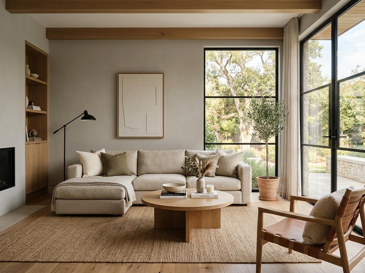 After
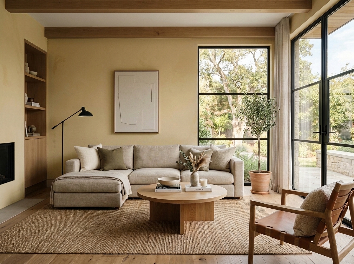 Before
Visualize Your Space with Color Studio AI
Planning a project? Skip the paint chip guesswork. Use our Color Studio AI to instantly visualize these paint colors on your own walls, or take advantage of our aligned contractor pricing matching current Sherwin-Williams retail promotions.
Book Your Upcoming Paint Project
Craftsman Painter is now scheduling premium transformations. Reserve an on-site consultation or instant video walkthrough.
Get an Estimate →Related Color & Design Studies

The Case for Quiet Gray-Blues: Why Designers Return to Sherwin-Williams Languid Blue SW 6226
The Muddy, Magnificent Paint Color Designers Keep Secretly Hoarding to Tame the Brutal Bloomington Sun

When Golden Daylight Needs a Cool Counterweight, Could Sherwin-Williams North Star SW 6246 Be the Answer?
Help Others Find Professional Color Insights
Share this story directly to your networks or copy the link to share with friends.