



While it is broadly classified as a warm gray, examining the actual tint formula reveals a complex, earthy green undertone. This underlying green is what dictates its true behavior on the wall, especially during the height of summer. In a climate characterized by dry, warm air and vibrant, bright natural lighting, Revere Pewter actively responds to the exterior landscape. When high-overhead bright summer sunlight blasts through the glass, accompanied by the reflection of lush green summer foliage, those muddy green undertones rise to the surface, creating an incredibly dynamic finish that changes by the hour.
The Complete Coordinating Palette for Revere Pewter
Revere Pewter HC-172
Benjamin Moore
White Dove
Benjamin Moore OC-17
October Mist
Benjamin Moore 1495
Dark Olive
Benjamin Moore 2140-30
To engineer a cohesive architectural flow, you need a palette that respects the muddiness of Revere Pewter without muddying the entire room. Here is the exact tier system I specify to create structural harmony:
- Tier 1 (Trim/Anchor Neutral): Benjamin Moore White Dove OC-17
- Application: Apply in a durable satin or semi-gloss finish on baseboards, window casings, door frames, and crown molding. Its creamy, slightly shaded profile provides a crisp but soft boundary that prevents the Revere Pewter walls from looking dingy.
- Tier 2 (Mid-Tone Bridge): Benjamin Moore October Mist 1495
- Application: Specify an eggshell or satin finish on interior passage doors, broad beadboard wainscoting, or a secondary furniture piece. This silvery-green shade acts as a bridge, intentionally pulling the green undertones out of the warm gray walls to create an organic flow.
- Tier 3 (Contrast/Accent): Benjamin Moore Dark Olive 2140-30
- Application: Use a satin finish on a primary architectural focal point—like a custom built-in bookcase, a fireplace mantel, or kitchen island cabinetry. This deep, earthy hue grounds the airy lightness of the overall palette and adds necessary visual weight to the space.

A Design Study: Biophilic Scandinavian Living in Atlanta
Let's explore a design study of how this palette behaves in a typical modern home in Atlanta, GA, relying heavily on a Biophilic Scandinavian (Hygge) aesthetic. This style is deeply rooted in nature-first principles, relying on raw textures, organic plant life, and an appreciation for how natural light filters through a space.

Work Directly with Torlando Hakes
Skip the color choice stress. Work directly with me as your personal Color Designer to select the perfect architectural palette for your home, and get a Complementary Color Consultation when you purchase paint through us.
When applied in a premium matte finish, Revere Pewter absorbs the vibrant summer light reflecting off natural blonde birch wood flooring. A matte sheen eliminates harsh glare, allowing the color to read as a soft, velvety backdrop. As the intense Southern sun peaks at midday, the sheer volume of bright light from large windows illuminates the room, while the lush foliage outside emphasizes the paint's earthy green base.

Precision in Millwork and Framing
A color this complex requires strict boundaries to maintain its architectural integrity. Coating the baseboards and window mullions in White Dove OC-17 establishes a necessary crispness. The slight warmth in White Dove harmonizes with Revere Pewter's earthy nature, whereas a stark, blue-based white would create a jarring, clinical clash.

Grounding the Space with Accents
To build upon the Biophilic Scandinavian mood, we introduce our mid-tones and dark accents. Coating a central fireplace mantel in Dark Olive 2140-30 establishes a firm visual anchor in the room. This deep, muddy green-brown speaks directly to the subtle green notes hidden in the Revere Pewter walls. Using October Mist 1495 on interior doors creates a gentle, silvery-green stepping stone between the light walls and the heavy, grounding accents.

The Interplay of Light and Texture
Coatings never exist in a vacuum; they must react to the tactile elements placed in front of them. The Biophilic Hygge approach brings in heavily textured natural cork panels, which act as warm acoustic dampeners against the Revere Pewter drywall. Potted ferns and towering fiddle-leaf figs are fundamental to this design, their vibrant organic greens making the wall color feel deeply intentional and rooted in nature.
As evening approaches, the lighting mood of the home shifts dramatically. The high-overhead bright summer sunlight fades, replaced by warm, fireplace-like dim ambient lighting. Under the soft scatter of candle-glow effects and low-kelvin bulbs, the green recedes, and Revere Pewter deepens into a rich, cozy clay tone. Heavy woven wool blankets and soft sheepskin layers draped over birch armchairs catch this warm ambient light, creating shadows that highlight the matte finish of the walls.

Specifying Revere Pewter requires an understanding of how light manipulates pigment. By maintaining strict control over your trim pairings, keeping your wall sheens flat or matte, and leaning heavily into organic, textural materials, you allow the paint to perform exactly as engineered. Let the architecture provide the structure, and let the summer light do the heavy lifting.
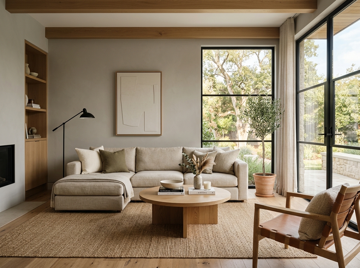 After
After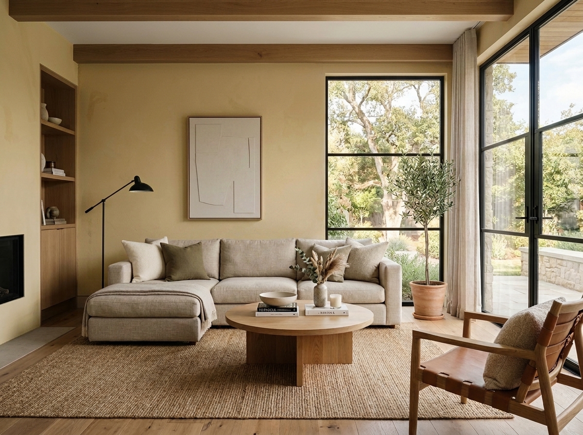 Before
Visualize Your Space with Color Studio AI
Planning a project? Skip the paint chip guesswork. Use our Color Studio AI to instantly visualize these paint colors on your own walls, or take advantage of our aligned contractor pricing matching current Sherwin-Williams retail promotions.
Book Your Upcoming Paint Project
Craftsman Painter is now scheduling premium transformations. Secure your spot and elevate your property value.
Get an EstimateHelp Others Find Professional Color Insights
Share this story directly to your networks or copy the link to share with friends.