

I frequently advise clients designing their kitchen operational centers—the heavy-lifting prep zones where cutting boards, ranges, sinks, and storage converge—to ground these spaces with colors that carry genuine architectural weight. You need a paint that can handle intense daily use while maintaining absolute visual elegance. Enter Sherwin-Williams Honed Soapstone (SW 9126).
Grounding the Prep Zone
Let's look at light absorption. The kitchen operational center is an active, chaotic environment. You need a color that visually anchors the lower cabinets and islands, establishing a heavy architectural base.
Honed Soapstone has a Light Reflectance Value (LRV) of roughly 12. It absorbs light aggressively. In a bright, sun-drenched kitchen, this dark, earthy charcoal prevents the room from feeling washed out or blinding. It takes the harsh afternoon glare and converts it into a soft, velvety depth. The color pulls your eye downward, anchoring the space exactly where the physical labor happens.
Book Your Upcoming Paint Project
Craftsman Painter is now scheduling premium transformations. Secure your spot and elevate your property value.
Get an EstimateManaging the Forest Canopy Effect
Atlanta is famously built under a dense urban forest. The natural light filtering through those massive tree canopies carries a distinct green cast. If you paint a kitchen stark white or a cool, sterile gray, that reflected green light makes the space look sickly and institutional.
Honed Soapstone thrives in this specific climate. It carries heavy olive and brown undertones beneath its charcoal surface. When the canopy-filtered light hits these cabinets, the color accepts those green wavelengths perfectly. The paint reads as a rich, organic slate rather than a muddy, accidental tint. It works with the environment rather than fighting it.

Establishing the Visual Hierarchy
I always study how a dark color interacts with the surrounding trim and upper architecture. You want to pull the eye downward to the working surface while keeping the ceiling feeling expansive.
I pair Honed Soapstone lower cabinets with Sherwin-Williams Greek Villa (SW 7551) on the walls, upper cabinets, and ceiling. Greek Villa brings a subtle, creamy warmth that offsets the heavy light absorption of the dark lowers. The sharp contrast creates a clear visual boundary. The prep zone feels heavy, permanent, and utilitarian, while the upper sightlines remain completely open and airy.

Textural Pairings and Hardware
Color interactions depend entirely on surrounding textures. The finish and the neighboring materials change how the eye perceives the paint. For an operational kitchen centered on heavy use, I recommend pairing this specific dark green-grey with raw, living materials.
Unlacquered brass cup pulls or heavy bronze latches pop aggressively against the dark background. The metallic sheen reflects the light that the paint absorbs, creating a necessary visual balance. Add a honed marble or a thick walnut butcher block countertop to the prep station, and the color immediately locks into a grounded, historical aesthetic. The matte surface of the soapstone-colored paint visually recedes, allowing the textures of the wood and metal to step forward.

Defining the Culinary Workspace
We use color to build psychological boundaries in an open floor plan. The culinary prep hearth requires immense functionality. Painting this specific zone in Honed Soapstone distinctly separates it from the adjacent dining areas and casual seating spaces.
The deep charcoal-green establishes the prep area as a serious workspace. It hides scuffs, withstands the visual clutter of countertop appliances, and maintains a clean, architectural dignity even in the middle of heavy cooking. You create a room that looks highly intentional, effortlessly bridging the gap between raw culinary function and high-end design.

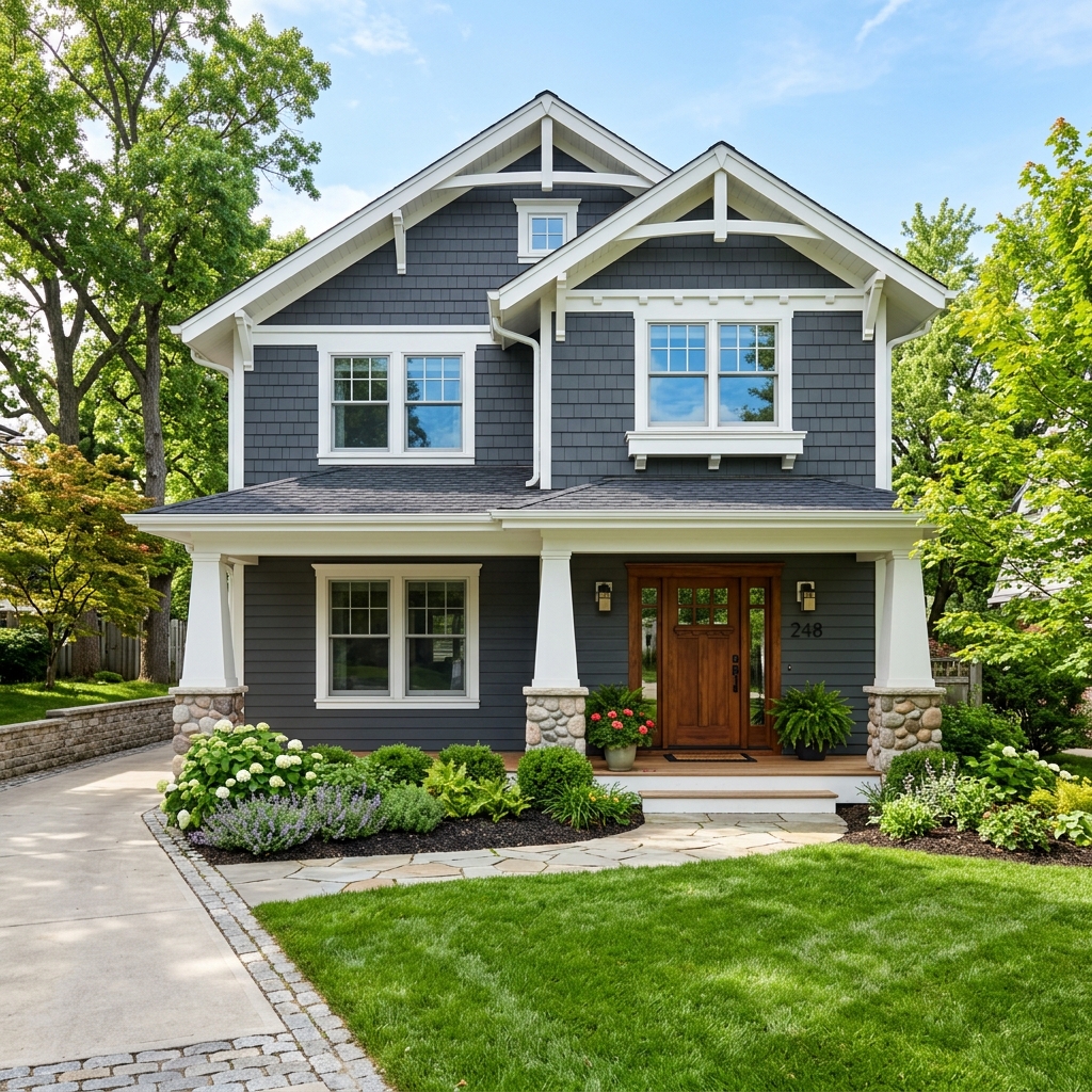 After
After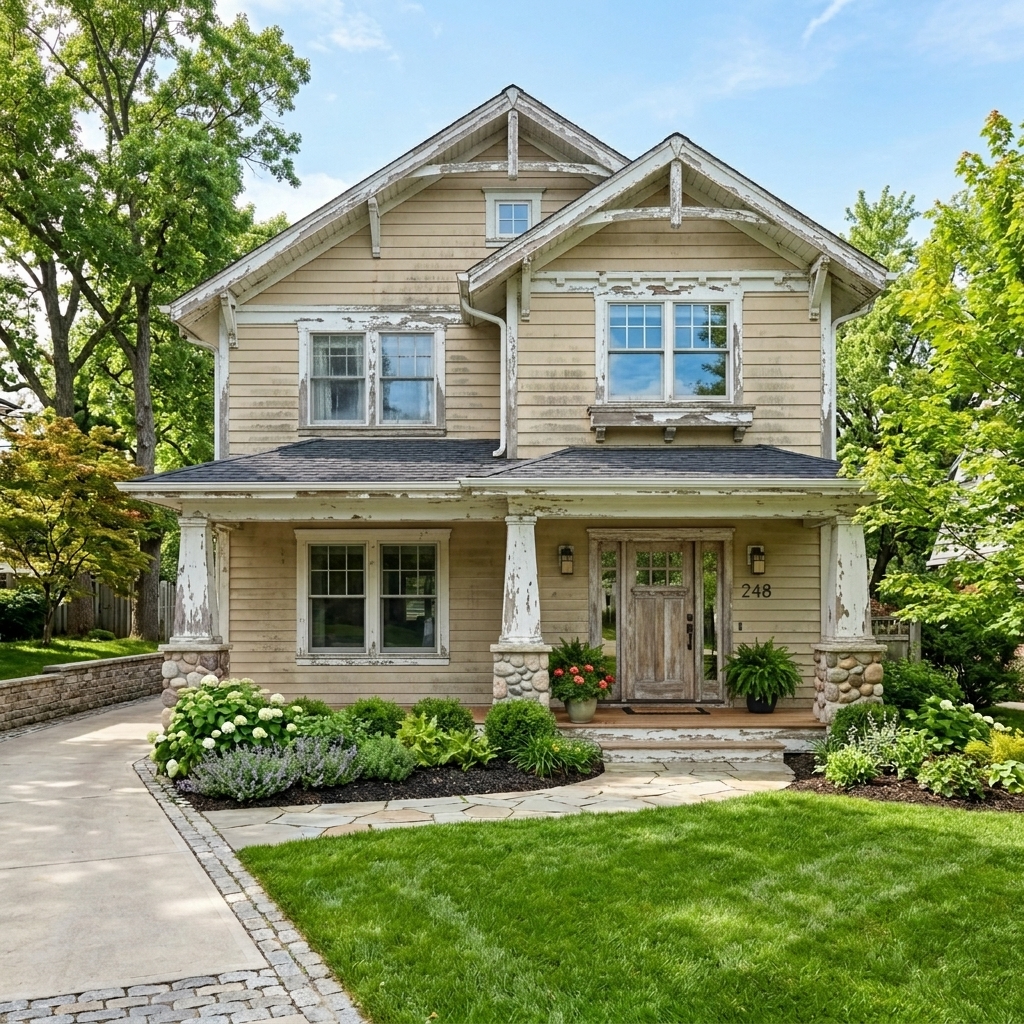 Before
Visualize Your Space with Color Studio AI
Planning a project? Skip the paint chip guesswork. Use our Color Studio AI to instantly visualize these paint colors on your own walls, or take advantage of our aligned contractor pricing matching current Sherwin-Williams retail promotions.
Help Others Find Professional Color Insights
Share this story directly to your networks, or download the clean Markdown and images to publish on Substack or Medium.