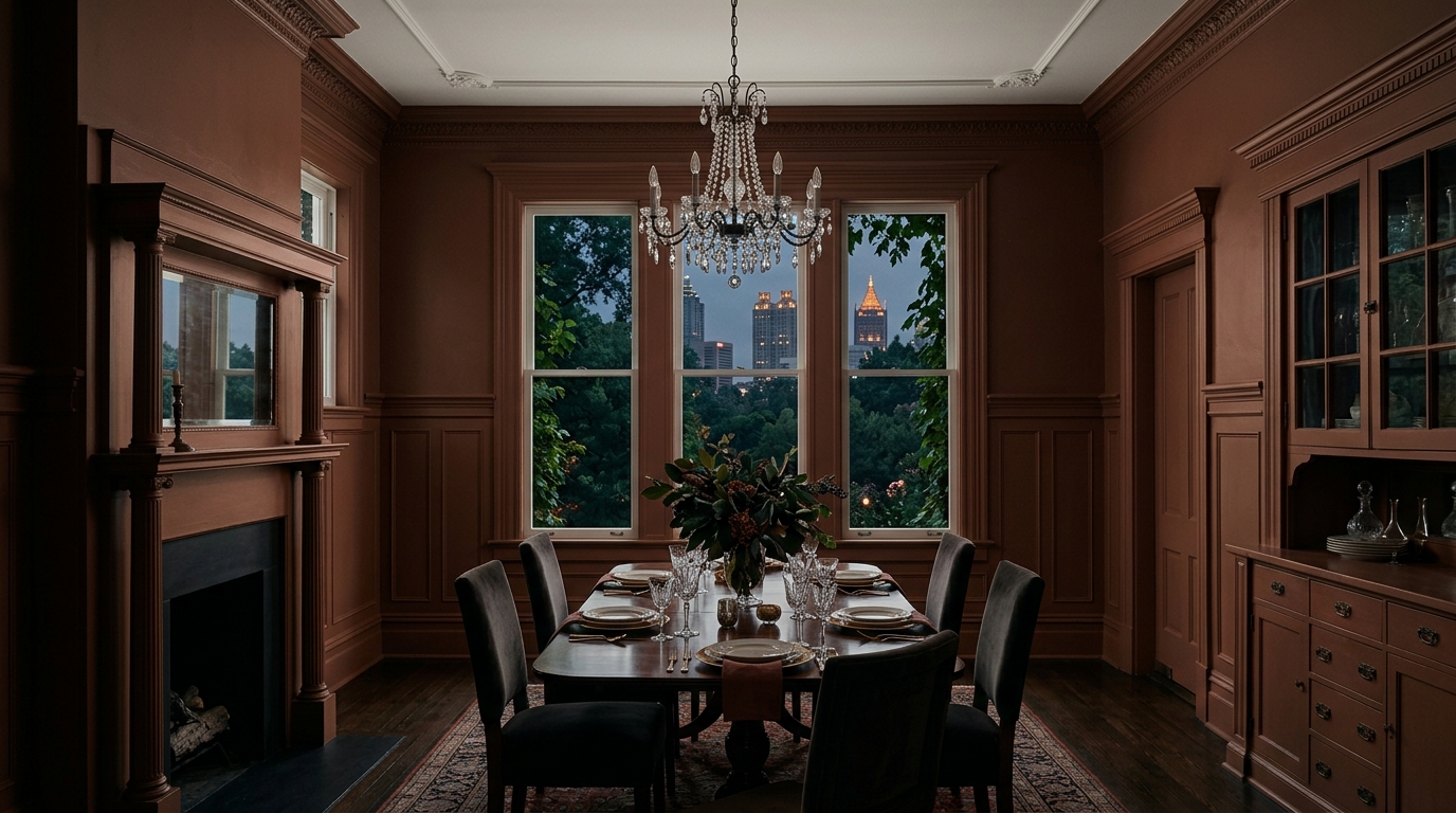

The dining room is not a laboratory. It is a theater for nourishment, conversation, and the slow bleed of evening twilight into artificial glow. It requires gravitas. It requires a color with enough visual mass to hold the room down.
Enter Sherwin-Williams Über Umber (SW 9107).
This is not a polite, mass-market neutral. It is a deep, subterranean brown, laced with baked clay and rusted iron. It is an unapologetic embrace of shadow. Understanding how this specific pigment operates within the unique environmental constraints of the American South is a masterclass in light absorption and spatial manipulation.
Book Your Upcoming Paint Project
Craftsman Painter is now scheduling premium transformations. Secure your spot and elevate your property value.
Get an EstimateThe Physics of Canopy Light and Heavy Pigment
Color is never static; it is an active negotiation with the light it receives. Atlanta’s infamous "city in a forest" topography means natural daylight is constantly refracted through green foliage. This specific lighting condition murders delicate, cool-toned grays and sterile whites, turning them sickly.
Über Umber thrives here because it operates on the opposite end of the spectrum. Sitting with a Light Reflectance Value (LRV) of 15, it acts as a visual sponge. It does not attempt to bounce Atlanta’s green-tinted afternoon light back into the room. Instead, its heavily oxidized, red-yellow undertones neutralize the green completely. The walls absorb the scattered daylight, creating an envelope that feels deeply rooted, organic, and intentionally shaded from the blistering Southern heat outside.
When applied in a dead-flat or matte finish, the color loses any superficial glare. The walls cease to feel like drywall barriers and begin to resemble suede, damp earth, or crushed velvet. The architecture recedes, and the people seated at the table become the focal point of the space.
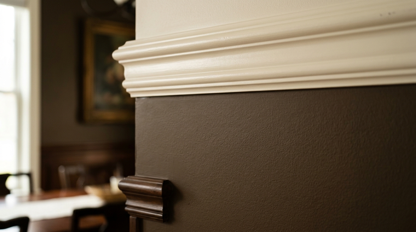
The Architecture of Trim and Visual Coordinates
A color this dense demands absolute precision in its complementary relationships. Slapping a brilliant, un-tinted white on the trim and crown molding against Über Umber is a fatal error. High contrast fractures the visual field, creating harsh, jagged lines that trap the eye and ruin the intimacy of the dining space.
The transition between wall and woodwork must be a gentle step, not a cliff.
Sherwin-Williams Shoji White (SW 7042) or Natural Choice (SW 7011) are the mandatory coordinates here. These are complex, creamy off-whites with enough limestone and beige in their DNA to bridge the gap gracefully. By applying Shoji White in a satin finish to the baseboards, wainscoting, and window casings, a subtle visual hierarchy is established. The satin sheen catches the ambient light, outlining the architectural bones of the room with a soft luminescence, while the dead-flat umber walls recede endlessly backward.
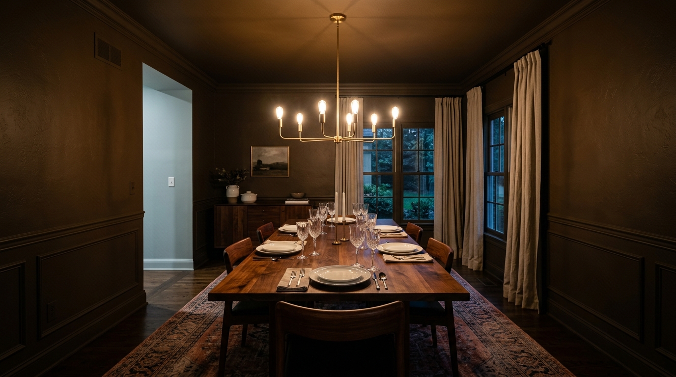
For the ceiling, conventional stark white ceiling paint will hover above the room like a sterile, oppressive cloud. The ceiling must relate to the walls. Tying the room together requires a custom mix: an ultra-flat blend of Shoji White cut with exactly ten percent of the Über Umber pigment, creating a warm, parchment-like canopy that lowers the visual height of the room and forces the energy downward onto the dining table.
Artificial Illumination and the Evening Glow
Dining rooms truly come alive after the sun sets, entirely dependent on the specific temperatures of artificial lighting. The true mastery of SW 9107 reveals itself under the influence of incandescent bulbs or high-quality 2700K LED fixtures.
Cool light flattens dark colors, rendering them bruised and muddy. Warm light ignites them. When hit with warm, directional light from an overhead chandelier or wall sconces, Über Umber drops its daytime stoicism and begins to glow from within. The rusted, baked-terracotta undertones buried in the brown rise to the surface.
Shadows pool heavily in the corners of the room, effectively blurring the boundaries of the architecture. The physical dimensions of the space become ambiguous. Because the deep walls reflect so little light, the illuminated center of the dining table—the food, the glassware, the faces of guests—achieves a cinematic, almost painterly brilliance.
Material Relationships and Grounding the Space
Paint does not exist in a vacuum. It must negotiate with the physical textures brought into the room. Über Umber is an earthy, grounding force, and it demands materials with equal integrity.
It forms a brilliant, high-tension relationship with highly reflective, organic materials. Unlacquered brass hardware, polished silver, and crystal stemware cut through the heavy, matte darkness of the walls like lightning. Wood tones must be chosen with care; pale, ashy blond woods will look washed out and weak against the umber. Instead, rich, saturated woods like oiled American walnut, aged mahogany, or heavily grained white oak provide the necessary visual weight to anchor the floor plan.
Embracing heavy, brooding color in a Southern dining room is an act of design rebellion against the sterile, hyper-bright spaces that dominate modern catalogs. It requires a fundamental understanding of how light, pigment, and texture interact to manipulate human psychology. By choosing a color that absorbs, rather than reflects, the dining room transforms from a mere architectural box into a profound, intimate vessel for the evening.