


Benjamin Moore Prentis Cream (CW-100) is a historic Colonial Williamsburg pigment that handles this architectural brief with remarkable composure. Carrying a Light Reflectance Value (LRV) of 74.4, it sits firmly in the high-light-return range without crossing into the blinding glare of a pure gallery white. Its undertones lean distinctly into warm yellow and soft cream, giving scrubbable satin walls a mellow, sunlit density that pairs naturally with white oak millwork and aggregate stone floors.
In this design study of a biophilic medical, dental, and wellness clinic, notice how Prentis Cream softens the curved drywall corners and establishes an immediate sense of calm across the main arrival space, framed by crisp architectural trim in Benjamin Moore Chantilly Lace (OC-65).
Calibrating the Reception Focal Point and Patient Arrival
The check-in desk is where patient anxiety usually peaks, whether someone is arriving for a dental procedure, a physical therapy evaluation, or a medical consultation. When designing the sightlines for a reception zone, the contrast between the vertical wall plane and the cabinetry needs to feel grounded and deliberate. If the backdrop is too stark, the desk looks institutional; if the entire room is monotone beige, the space loses its sense of professional precision.
See Prentis Cream on Your Own Walls in 15 Seconds
Benjamin Moore CW-100 • LRV 74.4 • #E8E1CC
Prentis Cream acts as an inviting, luminous canvas behind white oak slats and brushed bronze signage. Because its warm yellow-cream undertone shares the golden warmth present in natural white oak, the transition from painted drywall to timber millwork feels cohesive rather than abrupt. To anchor the check-in desk itself, bringing in a deep, botanical green gives the eye a steady focal point. In the color rendering below, the reception desk base and backdrop millwork are finished in Benjamin Moore Lafayette Green (HC-135), a rich, shaded forest tone that grounds the pale cream walls and echoes the dark foliage of indoor ficus and olive trees.

Late-Autumn Light, Glare Control, and the Waiting Lounge
Here in Fishers and across Central Indiana, late autumn and early winter bring low-angle afternoon sunlight that fades well before the five o'clock appointments wrap up. A storefront or ground-floor clinic has to manage two completely different lighting environments in a single afternoon: cool, slanting November daylight at 2:00 PM, and warm artificial cove and sconce lighting by 4:30 PM.
With an LRV of 74.4, Prentis Cream reflects nearly three-quarters of the light that hits it, keeping the waiting lounge bright and open even on overcast winter days. Yet because of its cream and yellow pigment base, it filters out the blue-grey cast of winter sky light. When the sun drops and the interior transitions to warm architectural lighting, Prentis Cream doesn't turn muddy or dingy the way gray-undertoned off-whites often do. Instead, it holds a steady, candlelit warmth that complements upholstered lounge seating and luxury vinyl plank or terrazzo flooring. Looking at the visualization of the storefront seating zone below, you can see how that low-angle late-autumn light grazes the satin finish without creating harsh specular hotspots.

Visual Ergonomics for Clinical Staff in Consultation Suites
While patient comfort drives the front-of-house aesthetic, clinic directors and practice owners know that the back-of-house and consultation suites must serve the people working inside them all day. Hygienists, nurses, physicians, and wellness practitioners spend eight to ten hours reading charts, examining patients, and staring at high-resolution monitors. High-glare white walls cause subtle, cumulative eye fatigue over a long week, while overly dark walls can make small consultation rooms feel cramped during winter months.
Stepping from the main reception corridor into a private consultation or treatment suite is an ideal opportunity to introduce a restorative mid-tone bridge color alongside Prentis Cream. In this rendering of a consultation room, Prentis Cream remains on the main architectural walls to preserve high light reflectance and accurate skin-tone rendering, while the sleek commercial consultation and sterilization cabinetry is finished in Benjamin Moore Saybrook Sage (HC-114). Saybrook Sage brings a muted, herbal grey-green into the workspace, giving clinical staff a soft, low-glare resting point for their eyes while maintaining a clean, hygienic aesthetic.

Material Tactility and Commercial Durability
A paint color in a commercial healthcare environment only succeeds if the physical coating and the surrounding materials work together under daily wear. Prentis Cream thrives when specified in a high-durability, scrubbable satin or commercial eggshell sheen on vertical drywall, paired with a scuff-resistant satin enamel on built-in storage and trim. That subtle surface sheen gives the cream pigment just enough depth to highlight curved drywall corners and recessed corridor lighting without looking plasticky.
In the detail study below, notice how the four elements of this palette lock into the physical materials of the clinic: Chantilly Lace sharpens the architectural profiles, Prentis Cream warms the expansive wall planes, Saybrook Sage calms the working cabinetry, and Lafayette Green anchors the structural built-ins against natural white oak and brushed bronze hardware.

When you design a clinical environment around tactile natural materials and a warm, light-reflective neutral like Prentis Cream, the architecture does the heavy lifting of putting people at ease the moment they step through the door.
Complementary Color Consultation
Planning a project? Work with Torlando Hakes directly as your personal Color Designer and get a Complementary Consultation when purchasing paint through us.
Prentis Cream (CW-100) — Key Questions Answered
What is the LRV and undertone of Benjamin Moore Prentis Cream (CW-100)?
Benjamin Moore Prentis Cream (CW-100) has a Light Reflectance Value (LRV) of 74.4 and hex code #E8E1CC. Always evaluate it under both north-facing and warm afternoon light before final application.
What trim and coordinating colors pair best with Prentis Cream?
Our recommended architectural pairings for Prentis Cream include Chantilly Lace (OC-65), Saybrook Sage (HC-114), Lafayette Green (HC-135) to balance wall depth, trim contrast, and adjoining room transitions.
How can I test Prentis Cream on my own walls before painting?
You can upload a photo of your room to Craftsman Painter's Color Studio AI to preview Prentis Cream on your walls immediately, or schedule an on-site or video consultation with our team.
Getting Prentis Cream Right Under Your Home's Light
Join 1,650+ homeowners, designers, and architects receiving our curated dispatches every 10 days (1st, 11th & 21st) on field stories, LRV, undertones, and trim pairings.
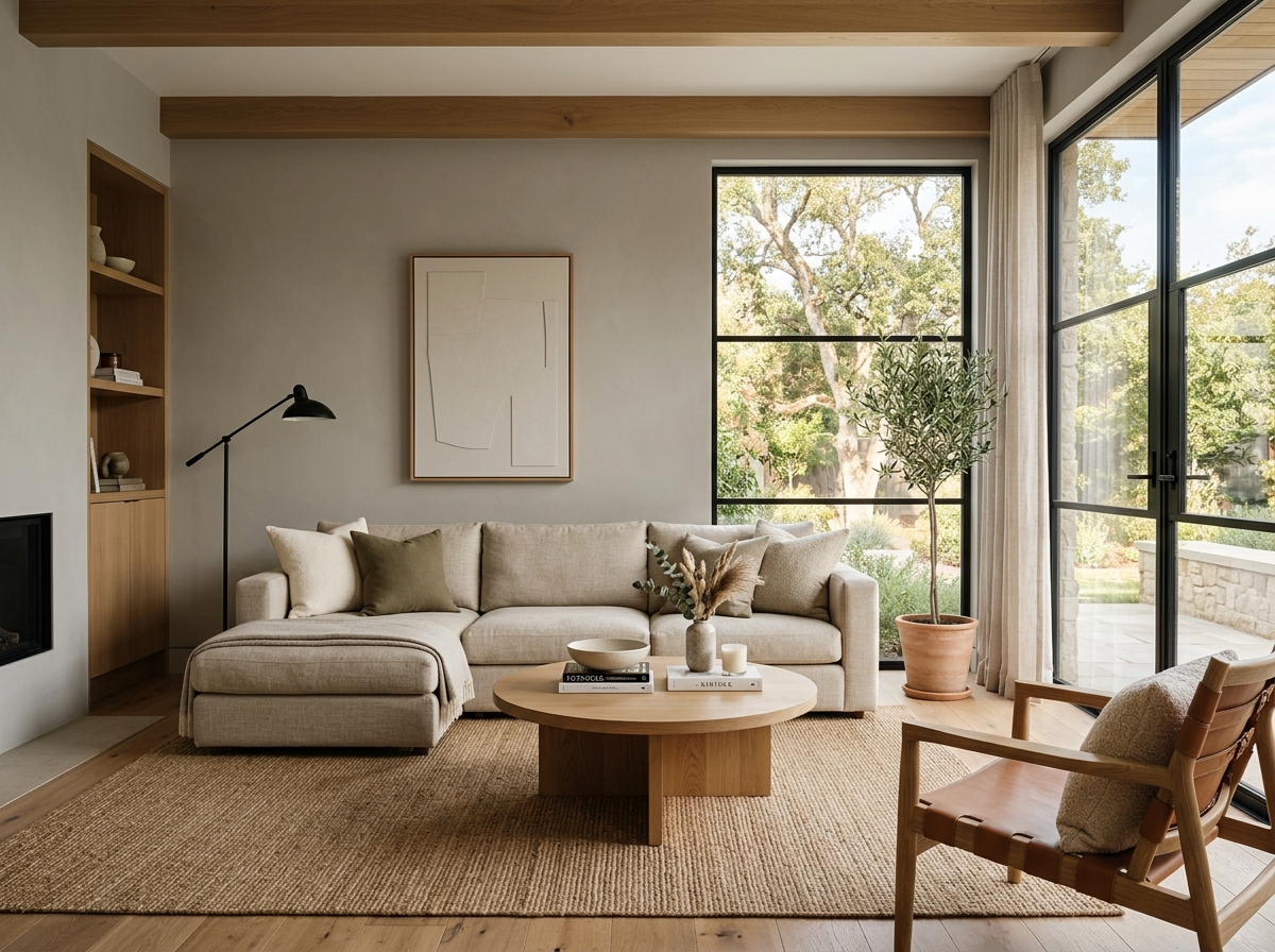 After
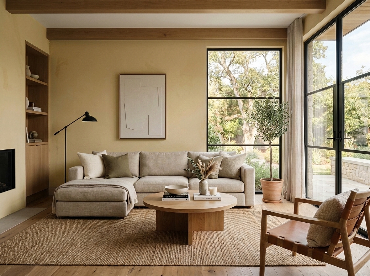 Before
Visualize Your Space with Color Studio AI
Planning a project? Skip the paint chip guesswork. Use our Color Studio AI to instantly visualize these paint colors on your own walls, or take advantage of our aligned contractor pricing matching current Sherwin-Williams retail promotions.
Book Your Upcoming Paint Project
Craftsman Painter is now scheduling premium transformations. Reserve an on-site consultation or instant video walkthrough.
Get an Estimate →Related Color & Design Studies

The Case for Quiet Gray-Blues: Why Designers Return to Sherwin-Williams Languid Blue SW 6226
The Muddy, Magnificent Paint Color Designers Keep Secretly Hoarding to Tame the Brutal Bloomington Sun

When Golden Daylight Needs a Cool Counterweight, Could Sherwin-Williams North Star SW 6246 Be the Answer?
Help Others Find Professional Color Insights
Share this story directly to your networks or copy the link to share with friends.