
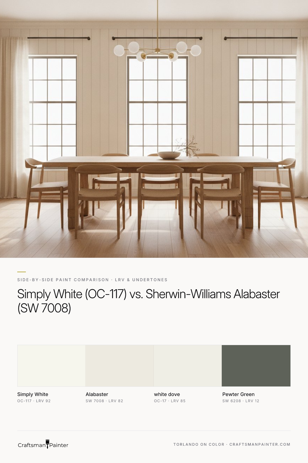


LRV and Brightness: Understanding the Full Wall Impact
Light Reflectance Value (LRV) is a critical metric, indicating how much light a color reflects. Benjamin Moore Simply White boasts an LRV of 92, placing it among the brightest whites available. This high LRV means Simply White is highly reflective, bouncing back a significant amount of light and contributing to a very bright, airy, and expansive feel on full walls. It reads as a crisp, clean white that still carries a gentle warmth, preventing it from feeling stark or cold.
Sherwin-Williams Alabaster, with an LRV of 82, is a considerably softer white. The 10-point difference in LRV between Simply White and Alabaster is perceptible. On a full wall, Alabaster will absorb more light, resulting in a slightly more grounded, enveloping warmth. It feels less like a blank slate and more like a soft, comforting backdrop. While still undeniably a white, it possesses a creamy depth that Simply White's higher reflectivity does not. For context, Benjamin Moore White Dove (OC-17) sits in between with an LRV of 85, offering a balanced warmth that is neither as bright as Simply White nor as soft as Alabaster. The choice between Simply White and Alabaster often comes down to whether you prioritize maximum brightness and crispness or a softer, more subdued warmth.
Real-paint peel-and-stick samples ship via Samplize. Craftsman Painter may earn a small commission on sample orders at no extra cost to you.
Undertone Nuances: North, South, and 2700K Evening Light
The true character of a warm white is revealed in its undertones and how they interact with different light exposures. Benjamin Moore Simply White carries a subtle warm yellow-green undertone. This undertone is what gives it its characteristic fresh, clean warmth. Sherwin-Williams Alabaster, on the other hand, leans into a softer, creamier, slightly beige-yellow undertone.
In north-facing rooms, where natural light is cooler and often appears blue-gray, both whites will maintain their warmth, but differently. Simply White's yellow-green might appear slightly more pronounced, reading as a very clean, almost fresh yellow-white. Alabaster's creamy warmth will be a welcome antidote to the cool light, preventing the room from feeling stark and instead creating a cozy, inviting atmosphere. Its beige-yellow undertone will soften the cool light effectively.
In south-facing rooms, which are bathed in abundant, warm natural light, the yellow undertones in both colors will be amplified. Simply White can appear very bright, almost leaning into a clearer, more discernible yellow, especially if the light is intense. Alabaster will truly shine here, basking in the warm light and appearing as a gorgeously soft, rich cream without becoming overly yellow or dingy. Its depth is well-suited to handle strong daylight.
When illuminated by 2700K evening bulbs, which cast a warm, yellowish glow, both Simply White and Alabaster will appear warmer. Simply White's yellow-green undertone will shift more decidedly towards yellow, potentially losing some of its initial crispness. Alabaster will maintain its comforting, creamy glow, becoming even more inviting and soft. The key takeaway is that artificial warm light will enhance the inherent warmth of both colors.
When evaluating these colors, it is paramount to understand Josef Albers' principle of simultaneous contrast. Testing paint swatches directly on an existing painted wall can be misleading because your eye perceives the new color in relation to the old, influencing its apparent hue. To accurately assess a color, homeowners should use large, real-paint peel-and-stick samples (at least 12x12 inches) and isolate them against a clean white background, such as existing white trim or a large white poster board. This allows your eye to perceive the true undertones without interference from surrounding colors.
Pairing with Finishes: Oak, Marble, and Cabinetry
The success of a white paint often hinges on its harmony with the fixed elements in a room.
Warm Oak Floors: This is a common challenge. Simply White's yellow-green undertone, while fresh, can sometimes clash with or amplify the strong yellow and orange tones in warm oak, creating a visual tension that some find jarring. It requires careful testing. Alabaster, with its creamy, slightly beige-yellow undertone, is often a more harmonious pairing with warm oak. It complements the natural warmth of the wood without competing, fostering a cohesive and cozy aesthetic. Benjamin Moore White Dove also works well here, providing a balanced warmth that sits comfortably with oak.
White Marble/Quartz: For surfaces with cooler, grayer veining, the choice becomes more delicate. Simply White can provide a clean, crisp contrast, but its yellow-green might subtly pull green against very cool, stark white marble, or conversely, make the marble appear slightly grayer. Alabaster's distinct warmth can sometimes feel slightly off against very cool marble, potentially making the marble look less bright or the wall appear too yellow. However, if your marble or quartz has subtle warm veins, Alabaster can be a beautiful complement. For very cool, bright white marble, a more neutral white, or even a very subtly cool white, might be a better choice than either Simply White or Alabaster to avoid visual conflict.
Cabinetry: When selecting a white for cabinetry, consistency is often key. If your walls are Simply White, using the same color on cabinets creates a seamless, modern, and very bright kitchen. If your walls are Alabaster, Alabaster cabinets will yield a softer, more traditional, or farmhouse-inspired kitchen. For a sophisticated contrast, consider an accent color like Sherwin-Williams Pewter Green (SW 6208) on a kitchen island or lower cabinets. This deep, muted green provides a beautiful, earthy counterpoint to either Simply White or Alabaster, grounding the space and adding visual interest. For more color insights, explore the Color Studio.
The Deciding Factors: Sheen, Prep, and Your Home's Unique Story
Making the final decision between Simply White and Alabaster requires considering your desired aesthetic and your home's unique conditions.
Choose Simply White if: You desire maximum brightness and a very clean, crisp white. Your space benefits from an expansive, airy feel, perhaps in rooms with less natural light that need a lift. You appreciate a subtle, fresh yellow-green warmth that feels modern and invigorating.
Choose Alabaster if: You seek a softer, cozier, more grounded warm white. Your space, particularly north-facing rooms, benefits from a gentle, enveloping warmth. You have warm wood tones, like oak, that you wish to complement harmoniously, creating a cohesive, inviting atmosphere. Alabaster lends itself well to more traditional or transitional styles.
Sheen Recommendations: For walls, I recommend Sherwin-Williams Cashmere Low Lustre for its velvety appearance and excellent flow, or Emerald Interior Matte for its superior durability and washability, especially in high-traffic areas. For humid environments like bathrooms and kitchens, Sherwin-Williams Duration Home in a Satin or Semi-Gloss sheen provides the necessary moisture resistance. For trim, doors, and cabinetry, Sherwin-Williams Emerald Urethane Trim Enamel in Satin offers a sophisticated, subtle sheen, while Semi-Gloss provides a classic, easy-to-clean finish.
Preparation Guidance: The quality of the finish is directly tied to the preparation. For walls, achieving a truly premium finish requires Level 3: Premium (Luxury Finish) drywall preparation, ensuring a perfectly smooth, blemish-free surface. For standard occupied homes, Level 2: Standard (Occupied Home) prep, addressing minor imperfections, is typically sufficient. For wood surfaces like trim and cabinets, meticulous cleaning, sanding, and the application of appropriate primers are non-negotiable. For existing painted surfaces, a light scuff-sanding and a high-quality bonding primer are crucial. New wood requires multiple coats of primer with sanding between coats to achieve a glass-smooth, durable finish. Every home presents its own challenges and opportunities, and a personalized approach ensures the best outcome. For tailored advice, consider a 1-on-1 Color Consultation.
Frequently Asked Questions
Is Benjamin Moore Simply White too yellow?
Benjamin Moore Simply White (OC-117) has a subtle yellow-green undertone, which gives it a clean, fresh warmth. In certain lighting, especially strong south-facing light or with warm artificial bulbs, this yellow can become more apparent. However, it rarely reads as overtly 'yellow' but rather as a very bright, warm white that avoids being stark.
Does Sherwin-Williams Alabaster look dingy in low light?
Sherwin-Williams Alabaster (SW 7008) is a softer, creamier white with a beige-yellow undertone. In rooms with very low natural light, it maintains its warmth but can appear more muted and less bright than a higher LRV white. It typically does not look 'dingy' but rather provides a comforting, grounded feel, especially when paired with appropriate lighting and other warm elements.
Can I use Simply White and Alabaster in the same house?
Yes, you can use Simply White and Alabaster in the same house, but strategic placement is key. Simply White is excellent for areas requiring maximum brightness and a crisp feel, while Alabaster works well in spaces where a softer, cozier warmth is desired. Ensure there is a clear transition point, such as a hallway or doorway, to prevent the undertones from clashing where they meet.
What trim color works best with Alabaster walls?
For Sherwin-Williams Alabaster (SW 7008) walls, the most cohesive choice for trim is often Alabaster itself, in a higher sheen like Satin or Semi-Gloss. This creates a seamless, soft look. Alternatively, if you desire a slightly cleaner contrast, Benjamin Moore White Dove (OC-17) can work, as its LRV of 85 offers a subtle lift while still harmonizing with Alabaster's warmth.

Sherwin-Williams Whitetail: A Warm White Paint for Inviting Interiors
The Accidental Pink: A Color Story on Finding the Perfect White
