
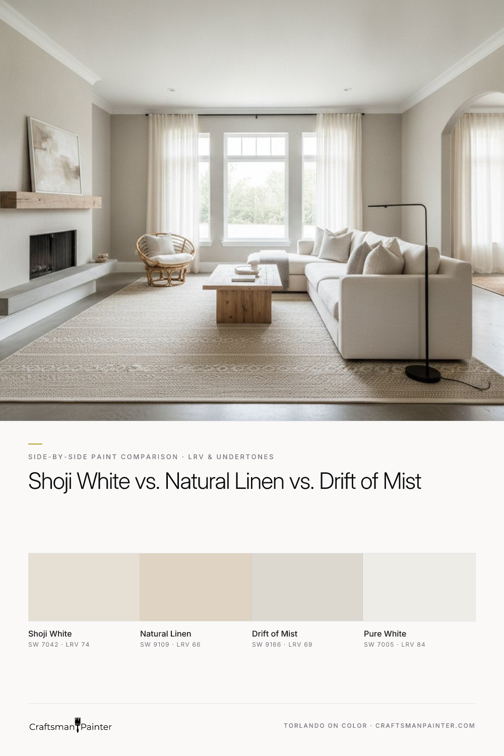


LRV and Brightness on Full Walls
Real-paint peel-and-stick samples ship via Samplize. Craftsman Painter may earn a small commission on sample orders at no extra cost to you.
The Light Reflectance Value (LRV) is a critical metric, indicating the percentage of visible light a color reflects. A higher LRV signifies more light reflection, making a space feel brighter and more expansive. Conversely, a lower LRV suggests a color will absorb more light, creating a perceived depth or coziness.
Sherwin-Williams Shoji White (SW 7042) leads this trio with an LRV of 74. On a full wall, Shoji White presents as a soft, creamy off-white. It possesses sufficient pigment to avoid feeling stark like a true white, yet it reflects ample light to maintain a bright, airy atmosphere. This makes it an excellent choice for spaces where maximizing natural light is a priority, or for rooms that tend to be naturally darker.
Drift of Mist (SW 9166) sits in the middle with an LRV of 69. This slightly lower LRV means it will appear a touch more saturated than Shoji White, offering a discernible body of color without feeling heavy. It provides a balanced brightness, making it versatile across various room sizes and light conditions. It’s a sophisticated off-white that doesn't lean too heavily into cream or gray, maintaining a pleasant neutrality.
Natural Linen (SW 9109) has the lowest LRV of the three at 66. This shade will appear noticeably deeper and more substantial on a full wall compared to its counterparts. It's a true soft beige, designed to create an enveloping warmth rather than maximum brightness. When used in a room, Natural Linen will contribute to a cozier, more grounded feel, providing a distinct color presence that is still undeniably neutral and inviting.
Unpacking Undertones: North, South, and 2700K Lighting
Understanding how undertones shift under different lighting conditions is paramount. This is where the true character of a paint color is revealed, and where careful sampling becomes non-negotiable.
Shoji White (SW 7042) carries a soft warm cream-yellow undertone. In a north-facing room, where light is cooler and often appears blue-gray, Shoji White’s creaminess helps to counteract this coolness, preventing the space from feeling cold. It will lean more into its yellow notes, presenting as a comforting, gentle off-white. In a south-facing room, bathed in warm, direct sunlight, its creamy yellow undertone is enhanced, making it appear even softer and more overtly warm, almost a delicate ivory. Under 2700K evening bulbs, which emit a warm, yellowish light, Shoji White's inherent creaminess is amplified, creating a very cozy and inviting ambiance.
Drift of Mist (SW 9166) is a nuanced off-white with subtle warm gray undertones, sometimes revealing a very faint hint of green-gray. In a north-facing room, its gray notes can become slightly more apparent, lending it a sophisticated, muted character without feeling stark. In a south-facing room, the warmth of the light softens these gray undertones, allowing it to read as a very clean, balanced off-white that avoids being either too warm or too cool. Under 2700K bulbs, Drift of Mist maintains its neutrality well, avoiding any starkness and sometimes pulling a very faint, elegant taupe without leaning overtly warm.
Natural Linen (SW 9109) is a deeper beige with a clear warm, almost gold-tan undertone. In a north-facing room, it can appear as a sophisticated, muted beige, providing warmth without feeling overly saturated. In a south-facing room, the abundant warm light significantly enhances its golden-tan qualities, making it feel richer and more pronounced. Under 2700K bulbs, Natural Linen's warmth is intensified, creating a deeply cozy and enveloping atmosphere, perfect for spaces designed for relaxation.
When evaluating these colors, it is crucial to understand Josef Albers' principle of simultaneous contrast. Testing paint swatches directly on an existing painted wall, especially one with a strong or contrasting color, will inevitably distort your perception of the new color's true undertones. The surrounding color will trick your eye. Instead, isolate real-paint peel-and-stick samples against a clean white background, such as a large white board or directly against existing white trim like Sherwin-Williams Pure White (SW 7005). This allows you to perceive the color in isolation, revealing its inherent qualities.
Pairing with Fixed Elements: Floors, Counters, and Cabinetry
The success of a paint color often hinges on its relationship with the permanent elements in a room.
Warm Oak Floors: For homes with warm oak floors, Shoji White is an excellent choice. Its soft cream-yellow undertone harmonizes beautifully with the warmth of oak, preventing the floors from appearing too orange or dated. It provides a gentle contrast that feels cohesive. Natural Linen can also work, particularly if the goal is a deeply enveloping, monochromatic warm scheme, but it risks blending too much with the oak, potentially lacking definition. Drift of Mist offers a refined balance. Its subtle gray-green undertone provides a sophisticated contrast that tempers the oak's warmth without clashing, offering a fresh perspective.
White Marble/Quartz (Cool-Toned): When dealing with cool-toned white marble or quartz countertops, Drift of Mist is often the safest and most versatile option. Its subtle gray undertones allow it to complement cool whites without pulling too stark or too warm, creating a harmonious, understated backdrop. Shoji White can also be very effective, introducing a soft warmth that contrasts elegantly with the cool surfaces, preventing the space from feeling sterile. Natural Linen might feel too warm against stark white or cool gray marble, creating a distinct separation rather than seamless integration.
Cabinetry (White, Natural Wood, Painted):
- White Cabinets (e.g., Pure White SW 7005): All three can be successful. Shoji White creates a soft, creamy, and highly harmonious look. Drift of Mist offers a slightly more contemporary and subtle contrast, allowing the cabinets to stand out gently. Natural Linen provides a cozy, traditional feel, especially in a kitchen or dining area.
- Natural Wood Cabinets: Similar to oak floors, Shoji White and Drift of Mist offer excellent balance and contrast. Shoji White for a lighter, brighter feel; Drift of Mist for a slightly more grounded, contemporary look.
- Painted Cabinets (e.g., grays or greens): Drift of Mist is highly versatile here, capable of complementing a wide range of cabinet colors due to its balanced neutrality. Shoji White adds a soft, inviting warmth that can soften bolder cabinet choices. Natural Linen would be a bolder, warmer contrast, best suited for specific design intentions aiming for a rich, layered warmth.
Decision Rules & Coating Recommendations
Choosing the correct shade comes down to the specific atmosphere you aim to cultivate and the existing elements in your home.
-
Choose Shoji White (SW 7042) when your priority is maximum perceived brightness coupled with a soft, creamy warmth. It is ideal for north-facing rooms needing a lift, or south-facing rooms where a gentle, inviting off-white glow is desired. It creates a soft backdrop that is neither stark white nor overtly beige. Explore more about this color in our Color Studio.
-
Choose Natural Linen (SW 9109) when a deeper, cozy, and enveloping warmth is the primary goal. It is suitable for living rooms, bedrooms, or studies where an intimate, traditional, or European-inspired feel is desired. It pairs exceptionally well with natural wood tones, antique furnishings, and richer fabrics.
-
Choose Drift of Mist (SW 9166) for a versatile, understated neutral that leans neither too warm nor too cool. It is an excellent choice for open-concept spaces or when you need a color that can skillfully balance various fixed elements with differing undertones. It is the chameleon of this group, adapting beautifully to different lighting conditions and surrounding colors.
Coating & Prep Guidance:
For optimal results, proper surface preparation and the right coating are essential. For drywall in occupied homes, I generally recommend Level 2: Standard (Occupied Home) drywall preparation, ensuring surfaces are clean, smooth, and primed. For coatings, Sherwin-Williams Cashmere Low Lustre offers a smooth, luxurious finish that minimizes imperfections. For a more durable and premium finish, especially in high-traffic areas or for clients desiring a truly immaculate surface, Level 3: Premium (Luxury Finish) prep is advised, and Sherwin-Williams Emerald Interior Matte is an excellent choice for its superior washability and rich appearance.
In humid areas such as bathrooms and kitchens, Sherwin-Williams Duration Home is recommended for its enhanced moisture resistance and durability. For trim, doors, and cabinets, Sherwin-Williams Emerald Urethane Trim Enamel in Satin provides a subtle, elegant sheen, while Semi-Gloss offers a more traditional, reflective finish. For these applications, particularly on wood, Level 3 prep involving thorough cleaning, sanding, and appropriate priming is critical to achieve a lasting, high-quality result.
Navigating these subtle distinctions can be challenging, even for experienced homeowners. For personalized guidance tailored to your specific home and lighting conditions, a 1-on-1 Color Consultation can provide the clarity and confidence you need to make the right choice the first time.
Frequently Asked Questions
What is the primary difference between Sherwin-Williams Shoji White, Natural Linen, and Drift of Mist?
The main differences lie in their Light Reflectance Value (LRV) and underlying undertones. Shoji White (LRV 74) is the brightest, with a soft cream-yellow undertone. Drift of Mist (LRV 69) is a balanced off-white with subtle warm gray undertones. Natural Linen (LRV 66) is the deepest, a true soft beige with a pronounced gold-tan undertone, offering the most warmth and depth.
Which of these Sherwin-Williams paints is best for a warm, neutral living room?
For a warm, neutral living room, Shoji White provides a soft, inviting glow without being overtly colorful, making it feel bright and airy. Natural Linen creates a deeper, cozier, and more enveloping warmth, ideal for a traditional or intimate feel. Drift of Mist offers a balanced, sophisticated neutral that adapts well, providing warmth without leaning too heavily into cream or beige, suitable for a refined contemporary space.
How do Shoji White, Natural Linen, and Drift of Mist appear in north-facing vs. south-facing rooms?
In north-facing rooms (cooler light), Shoji White's creaminess helps warm the space, Drift of Mist's gray notes become slightly more apparent but remain neutral, and Natural Linen reads as a sophisticated, muted beige. In south-facing rooms (warmer light), Shoji White appears softer and more overtly warm, Drift of Mist softens to a clean balanced off-white, and Natural Linen's golden-tan qualities are significantly enhanced, appearing richer.
What trim color pairs best with Shoji White, Natural Linen, or Drift of Mist?
For all three colors, Sherwin-Williams Pure White (SW 7005, LRV 84) is an excellent coordinating trim color. Its clean, crisp white provides a fresh contrast without competing with the wall color's undertones, allowing the wall color to truly shine. For a softer, more integrated look, Shoji White can also be paired with itself in a different sheen.

Stop Painting Indiana Kitchens Bright White and Use This Earthy Cream Instead
The Accidental Pink: A Color Story on Finding the Perfect White
