
I’m Torlando. Long before I was consulting on high-end residential color theory, I was cutting my teeth at IU’s Eskenazi School of Art, Architecture + Design, learning how humans psychologically interact with the spaces they inhabit. And if there is one color I keep coming back to for the specific, moody, ever-shifting environment of Southern Indiana, it’s Sherwin Williams Repose Gray (SW 7015).
Let’s cut through the Pinterest noise and talk about why this color actually works in Bloomington, IN homes.
The Anatomy of Repose Gray: Undertones and Truth
To understand Repose Gray, you have to understand what it isn’t. It isn’t that sterile, icy blue-gray that dominated the house-flipping market a decade ago and makes a living room feel like a dentist’s waiting room.
Book Your Upcoming Paint Project
Craftsman Painter is now scheduling premium transformations. Secure your spot and elevate your property value.
Get an EstimateColor theory dictates that every neutral has a backbone, a hidden DNA that dictates how it behaves. Repose Gray sits at a Light Reflectance Value (LRV) of 58. It absorbs just enough light to feel grounded, but reflects enough to keep a room breathing.
But the real magic is in its undertones. Repose carries a distinct, warm taupe-brown base with the absolute faintest, almost imperceptible whisper of violet. That drop of warmth is its saving grace. It gives the paint a sophisticated, earthy quality that bridges the gap between cool modernism and traditional comfort. It doesn't scream at you; it listens to the room.
Midwest Lighting: How Bloomington’s Sky Changes Everything
Any color consultant worth their salt will tell you that paint is entirely at the mercy of the sky. In Bloomington, our light is a moody, unpredictable bastard. We get blindingly bright, humid summers, intensely golden autumns, and long, flat, overcast winters.
If you put a cool gray on your walls in January, your house will feel like a Siberian gulag. Repose Gray, however, is a chameleon.
In a South-facing room flooded with afternoon sun, the taupe undertones rise to the surface. It warms up, feeling expansive and inviting. But in a North-facing room—where the light is notoriously cool and diffused—that same paint holds its ground. It reads as a true, sophisticated gray without plunging into a depressing, icy blue. It respects the Midwest light, rolling with the punches of the shifting seasons.
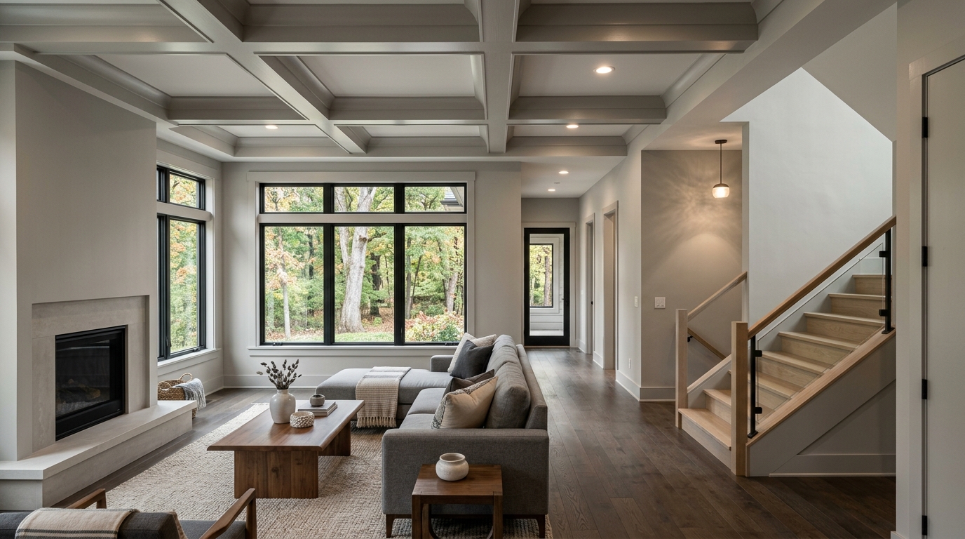
Architectural Harmony: From Elm Heights to East Side Modern
A color doesn't exist in a vacuum; it has to play nice with the bones of a house. This is where Repose Gray earns its keep in Bloomington’s high-end residential market.
Take a walk through Elm Heights or over by Bryan Park. You’re dealing with historic homes, original red oak floors, chunky trim, and Indiana limestone fireplaces. Stark white makes these elements look jarring and dated. Heavy beige makes them look muddy. Repose Gray offsets the heavy, warm tones of older wood, cooling down the orange hues of historic floors while harmonizing beautifully with the natural, organic texture of local limestone.
Conversely, if you’re working with a sleek, custom new build out on the East Side, Repose gives modern, clean lines a sense of soul and gravity. It pairs effortlessly with unlacquered brass hardware, honed Carrara marble countertops, and dark, dramatic accent walls like SW Iron Ore. It’s the ultimate supporting actor.
When to Use It—and When to Walk Away
I’ll shoot you straight. Repose Gray is incredibly versatile, but it isn’t a magic bullet. No color is.
You use SW 7015 when you want to unify an open-concept floor plan. You use it when you need to transition from a brightly lit kitchen into a shadowed hallway without the color flashing wild undertones. It is the perfect foundational canvas for an art collector or someone who wants their furniture and textiles to do the heavy lifting.
But you walk away from it if your home is heavily shaded by ancient sycamores and lacks adequate artificial lighting, as an LRV of 58 can feel a bit heavy in a genuinely dark room. In those cases, you might need to pivot to something with more reflective kick.
The Bottom Line for Your Home
Choosing the right paint isn't about following a trend; it's about curating a backdrop for your life. It’s about how the walls make you feel when you pour your first cup of coffee on a gray Tuesday morning.
Sherwin Williams Repose Gray (SW 7015) isn't just a safe bet—it is a deeply intentional, architecturally sound choice for Bloomington, IN homes. It possesses the gravitas, the warmth, and the flexibility to honor both the light outside your windows and the life happening within them.
Treat your walls with some respect. Choose a color that knows what it's doing.