
I’ve seen enough clinical, blue-leaning whites in million-dollar estates to make my stomach turn. There is no hiding behind white paint. It is the naked truth of your drywall, your lighting, and your architecture.
During my time at the Eskenazi School of Art, Architecture + Design, I learned that color isn't just a visual experience; it’s a structural element. It has weight. It has psychology. And if you live in Indianapolis, you need a white paint that knows how to survive the brutal realities of Midwestern lighting.
Enter Sherwin Williams Pure White (SW 7005). It’s not flashy. It doesn't scream for attention. But in the high-end residential spaces of Indianapolis, it is the undisputed, hardworking champion of the color wheel. Here is exactly why.
Book Your Upcoming Paint Project
Craftsman Painter is now scheduling premium transformations. Secure your spot and elevate your property value.
Get an EstimateThe Anatomy of SW 7005: Undertones and Architectural Weight
To understand a color, you have to dissect its DNA. Pure White has a Light Reflectance Value (LRV) of 84. In the paint world, 100 is absolute, blinding white, and 0 is the pitch black of a collapsed star. At 84, Pure White is undeniably bright, but it has the good sense to stop before it burns your retinas.
The magic is in the mix. Sherwin Williams tempers this color with a microscopic drop of black to soften it, and a barely perceptible kiss of yellow to warm it up.
That yellow undertone is crucial. It prevents the paint from feeling like a sterile operating room. It gives the color a quiet, rugged sophistication. It respects the architecture of a space rather than fighting it, laying down a soft, luminous foundation that allows your furniture, art, and millwork to do the heavy lifting.
Fighting the Hoosier Sky: Pure White in Indianapolis Lighting
Let’s talk about context. Indianapolis is not Los Angeles. We do not have endless days of razor-sharp, golden coastal sunlight.
Here in Indiana, we deal with bipolar ambient light. We have those thick, humid summer afternoons, and we have those long, punishingly gray winters where the sky looks like a sheet of wet aluminum. Your paint has to perform in both extremes.
This is where Pure White earns its keep. In a north-facing room in Carmel, where the light is cool and indirect, that subtle yellow undertone keeps the space from feeling like a meat locker. In a south-facing sunroom in Broad Ripple, the black undertone acts as an anchor, preventing the midday sun from turning the walls into a glaring, radioactive mess.
It adapts. It survives. It creates environmental harmony regardless of what the Hoosier sky is doing outside.
Where Pure White Triumphs (and Where It Fails)
I don't believe in universal solutions. A paint color is only as good as its application.
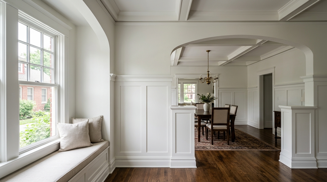
Where it triumphs: Pure White is the ultimate trim and ceiling color. Period. If you are restoring a historic Tudor in Meridian-Kessler or updating a Chatham Arch Victorian, wrapping your baseboards, crown molding, and wainscoting in SW 7005 is a masterstroke. It creates a crisp, tailored framing device for whatever wall color you choose, without the icy contrast of a stark builder-grade white.
It is also phenomenal on kitchen cabinets. It delivers that high-end, bespoke modern farmhouse look without making your kitchen feel unapproachable.
Where it fails: Do not put Pure White on an exterior stucco wall with zero tree canopy in direct southern exposure. The sun will wash out those delicate undertones, and the architectural weight will evaporate. Exterior whites require a lower LRV to hold their ground against the sun. Inside, however, Pure White rules the roost.
Spatial Harmony: Pairing SW 7005 in High-End Interiors
Color theory is about relationships. A beautiful white means nothing if it doesn't play well with its neighbors.
Because of its grounded, neutral-warm posture, Pure White acts as the perfect diplomat. It pairs beautifully with the rich, muddy greens and deep charcoals we are seeing in high-end Indianapolis interiors. Put it next to Sherwin Williams Pewter Green or Iron Ore, and the transition is seamless.
It also respects natural materials. If you have original white oak floors, exposed brick, or rich walnut built-ins, Pure White bridges the gap between the organic textures and the modern desire for a clean, bright space.
The Verdict
Choosing a paint color shouldn't be an afterthought. It is a fundamental architectural decision that dictates how you feel the moment you walk through your front door.
Sherwin Williams Pure White (SW 7005) isn't just a safe choice for an Indianapolis home; it is an intensely observant one. It understands our lighting, respects our architecture, and provides a sophisticated canvas for a life well-lived.
Skip the sterile whites. Respect the craft of color. Go with Pure White, and let your home breathe the way it was meant to.