
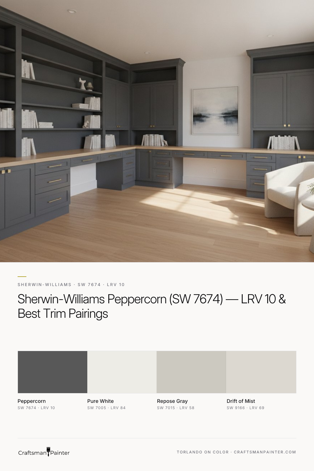


Before evaluating any deep color like Peppercorn, proper sampling is crucial. Many homeowners tape small swatches directly onto existing colored walls, which is misleading due to Josef Albers' principle of simultaneous contrast. Our perception of a color is heavily influenced by its surroundings. A deep gray like Peppercorn will appear different against beige compared to white. To accurately assess it, use real-paint peel-and-stick samples. Place these against a pure white background—ideally white poster board or existing white trim. This isolation allows the eye to perceive the color’s true character and undertones without interference. Observe the sample throughout the day under varying light conditions.
Peppercorn's Depth in Social Spaces: Living Rooms & Dining Areas
Real-paint peel-and-stick samples ship via Samplize. Craftsman Painter may earn a small commission on sample orders at no extra cost to you.
In living and dining areas, Peppercorn excels at creating refined intimacy. Its low LRV makes a large room feel cozier or adds dramatic flair to an accent wall. Used on all four walls, it transforms a space into a sophisticated cocoon, especially effective with ample natural light. For these spaces, I often specify Sherwin-Williams Cashmere Low Lustre, offering a smooth finish that enhances depth and provides excellent washability. Pairing Peppercorn with Sherwin-Williams Pure White (SW 7005) on trim and ceilings provides crisp, architectural contrast. This classic combination highlights millwork. Peppercorn serves as an ideal backdrop for vibrant artwork or rich wood tones. For broader palettes, it pairs effectively with lighter grays like Sherwin-Williams Repose Gray (SW 7015) in adjacent open-concept areas, maintaining cohesive flow. Embrace Peppercorn's inherent drama to ground your design.
A Refined Retreat: Peppercorn in Bedrooms and Home Offices
Peppercorn's calm and sophistication make it an exceptional choice for private sanctuaries like bedrooms and home offices. In a bedroom, it fosters tranquility and deep rest, especially when paired with soft textures and warm lighting. It provides a stable foundation for bedding and decor, allowing lighter textiles or metallic accents to shine. For these areas, Sherwin-Williams Emerald Interior Matte is excellent; its superior hide and luxurious matte finish absorb light beautifully, enhancing Peppercorn’s velvety appearance. For a home office, Peppercorn offers a backdrop that encourages focus and minimizes visual distraction, providing a serious, professional feel. Integrating Sherwin-Williams Pure White (SW 7005) on built-in shelving or desk units offers crisp contrast. When preparing walls for such a deep color, Level 3: Premium drywall preparation is advisable. This involves meticulous sanding and priming to ensure a perfectly smooth surface, as deep colors unforgivingly highlight imperfections. Explore further color applications in our Color Studio.
High-Performance Style: Peppercorn for Kitchens, Baths, and Cabinetry
Peppercorn's versatility extends powerfully into functional spaces like kitchens and bathrooms. As a cabinet color, it offers a contemporary alternative to classic white or lighter grays, providing a dramatic anchor that works well with both light and dark countertops. Its clean neutral base harmonizes with a wide range of natural stone or engineered quartz. For kitchen cabinetry, doors, and baseboards, Sherwin-Williams Emerald Urethane Trim Enamel in Satin or Semi-Gloss delivers exceptional durability and a smooth, furniture-like finish. In bathrooms, Peppercorn can create a spa-like ambiance, particularly when paired with white fixtures and natural wood. For bathroom walls and ceilings, Sherwin-Williams Duration Home, with its advanced moisture-resistant properties, is my go-to. Its ability to resist mildew and stand up to frequent cleaning makes it ideal for high-humidity areas. For wood preparation, a Level 2: Standard prep focusing on thorough cleaning, degreasing, sanding, and spot priming is typically sufficient for proper adhesion. Consider Sherwin-Williams Drift of Mist (SW 9166) on a ceiling or adjacent wall in a small bath to introduce lighter contrast without losing sophistication.
Navigating Deep Grays: Peppercorn vs. Iron Ore & Kendall Charcoal, Plus Trim Pairings
Understanding the subtle nuances between deep grays is critical. Sherwin-Williams Peppercorn (SW 7674) is often compared to Sherwin-Williams Iron Ore (SW 7069) and Benjamin Moore Kendall Charcoal (HC-166). While all three are deep, impactful grays, their undertones set them apart. Peppercorn is a very clean, neutral gray, rarely shifting warm or cool. Iron Ore (SW 7069), LRV 6, is slightly darker with a discernible soft green undertone, making it feel earthier. If seeking a deep gray with a subtle natural leaning, Iron Ore might work, but consider its interaction with fixed elements. Benjamin Moore Kendall Charcoal (HC-166), LRV 14.6, is noticeably lighter than Peppercorn. It carries a distinct green-yellow undertone, making it appear warmer and more muted. Kendall Charcoal often reads as "earthy." If a true, unadulterated deep gray is the goal, Peppercorn is the clear front-runner. For trim and ceiling pairings, Sherwin-Williams Pure White (SW 7005) is the quintessential partner. Its bright, crisp nature provides necessary contrast, making Peppercorn truly pop, emphasizing depth and sophistication. This visual separation is fundamental to good interior design, enhancing architectural details and providing a finished look. For complex color decisions or undertone struggles, a 1-on-1 Color Consultation can provide tailored, expert guidance, ensuring your selections create a cohesive and beautiful home.
Frequently Asked Questions
What are Sherwin-Williams Peppercorn's undertones?
Peppercorn (SW 7674) is a clean, neutral charcoal gray with minimal chromatic undertones. It rarely shifts warm or cool, maintaining its true gray character without noticeable blue, green, or purple casts.
What is the LRV of Sherwin-Williams Peppercorn?
Sherwin-Williams Peppercorn (SW 7674) has an LRV (Light Reflectance Value) of 10. This low LRV indicates it absorbs a significant amount of light, creating an enveloping, deep, and sophisticated effect in a space.
How does Sherwin-Williams Peppercorn compare to Iron Ore or Benjamin Moore Kendall Charcoal?
Peppercorn (SW 7674) is a cleaner, more neutral deep gray than its rivals. Iron Ore (SW 7069) is slightly darker (LRV 6) and carries a soft green undertone. Benjamin Moore Kendall Charcoal (HC-166) is lighter (LRV 14.6) and often presents with a distinct green-yellow undertone, making it appear warmer and sometimes earthier.
What trim color pairs best with Sherwin-Williams Peppercorn?
The quintessential trim pairing for Sherwin-Williams Peppercorn (SW 7674) is Sherwin-Williams Pure White (SW 7005). Its bright, crisp nature provides the necessary contrast to make Peppercorn truly pop, emphasizing the depth and sophistication of the wall color and enhancing architectural details.

Smokey Azurite SW 7615: The Blue That’ll Stop Your Scroll Dead in Its Tracks

Raw Salvaged Wood and Weathered Plaster Find a Grounded Counterpart in Sherwin-Williams Attitude Gray (SW 7060)
