


The Influence of Light on Naval's Depth
Real-paint peel-and-stick samples ship via Samplize. Craftsman Painter may earn a small commission on sample orders at no extra cost to you.
Understanding how light interacts with Sherwin-Williams Naval is paramount to its successful application. Due to its LRV of 4, Naval's appearance can shift significantly depending on the quantity and quality of natural and artificial light present. In rooms with ample natural light, especially from south-facing windows, Naval reveals its cool architectural slate-blue undertones more distinctly. The blue becomes more apparent, offering a rich, nautical depth without feeling overwhelming. East-facing rooms, receiving morning light, will showcase Naval with a crisp, clear blue quality, while west-facing rooms in the afternoon will see it warm slightly under the golden hour glow, though its inherent coolness remains. North-facing rooms, with their cooler, consistent light, will deepen Naval, sometimes making it appear almost black, yet still retaining its blue identity. This chameleon-like quality is a strength, allowing it to adapt to various moods throughout the day.
Artificial lighting also plays a critical role. Warm LED lighting (2700K-3000K) can soften Naval's coolness, making it feel more inviting, particularly in living rooms or bedrooms. Cooler lighting (4000K-5000K) will emphasize its slate-blue aspects, making it appear crisper, which can be beneficial in kitchens or home offices where clarity is desired. When selecting fixtures, consider adjustable lighting or dimmers to control the intensity and mood, allowing Naval to transition from a vibrant blue to a near-black depth as needed. Proper lighting design ensures Naval is always presented in its best light, enhancing its inherent sophistication rather than diminishing it.
Unpacking Naval's Cool Slate-Blue Undertones and Versatility
Naval's primary undertone is a cool architectural slate-blue. This is not a purple-blue or a green-blue; it is a clean, serious blue with a subtle grey influence that keeps it grounded and refined. This undertone is what prevents Naval from feeling overly vibrant or juvenile, instead lending it a mature, classic quality. Its depth makes it an excellent choice for creating a focal point, whether on an accent wall in a living room, a powder room, or for cabinetry in a kitchen or laundry space. For homeowners considering Naval for a full room, particularly in a bedroom or dining room, it creates an immersive, cocoon-like effect that feels both grand and intimate.
When evaluating Naval for your home, the method of testing is crucial. I consistently advise clients to avoid the common pitfall of painting a swatch directly onto an existing colored wall. This practice is misleading due to Josef Albers' principle of simultaneous contrast, where the surrounding color will distort your perception of the new shade. Instead, acquire real-paint peel-and-stick samples. Apply these samples to large white poster boards, then move them around the room at different times of day, observing them against existing white trim or a large piece of white paper. This isolation allows you to perceive Naval's true color and undertones without interference, providing an accurate assessment of how it will perform in your unique lighting conditions. For further exploration of how Naval might fit into your home, you can visit our Color Studio.
Crafting a Cohesive Palette: Trim, Neutrals & Accents for Naval
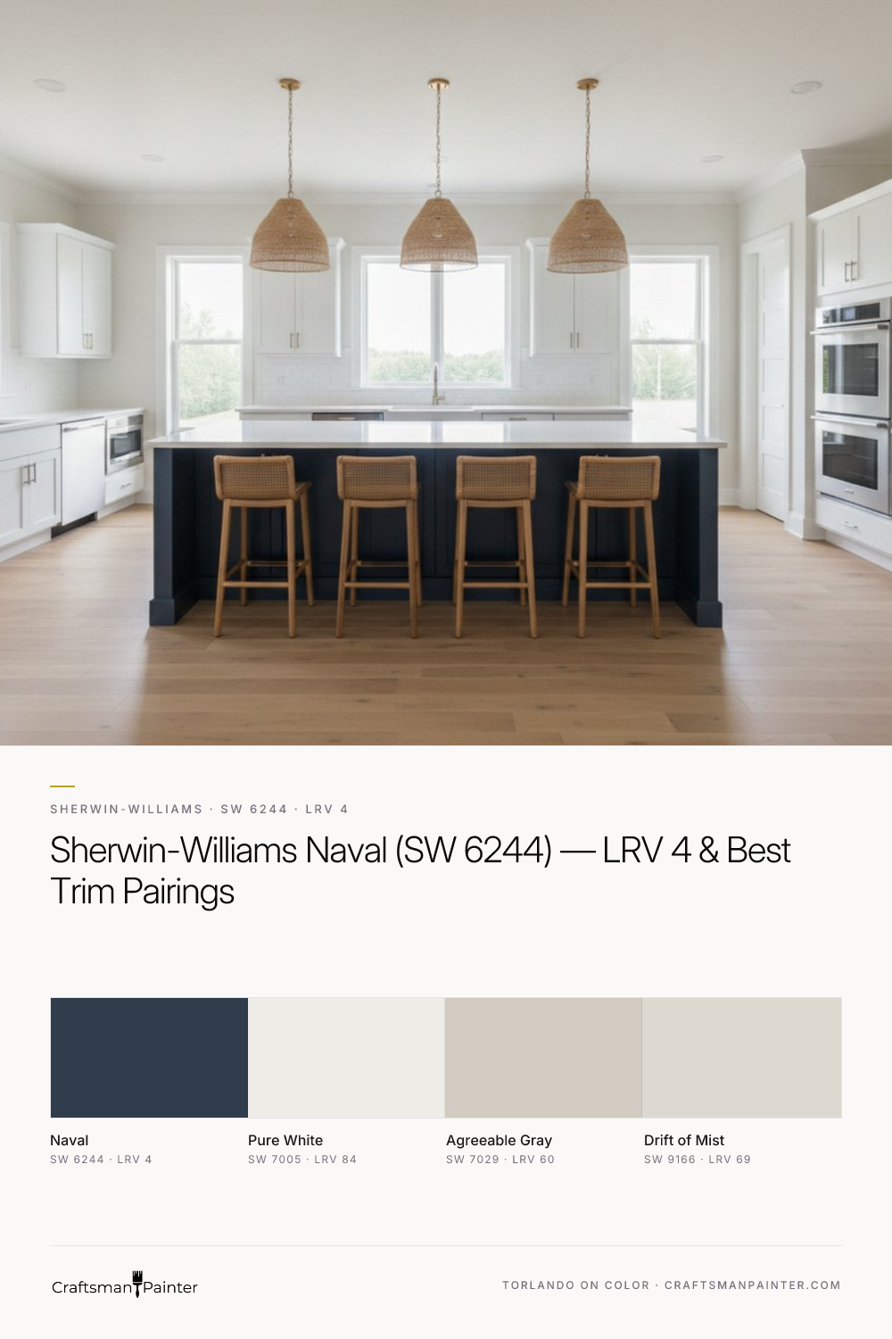
Pairing Naval with the right coordinating colors and ensuring proper surface preparation and coating selection are critical for a polished outcome. For trim and ceilings, Sherwin-Williams Pure White (SW 7005, LRV 84) is an impeccable choice. Its crisp, clean nature provides a stark, yet harmonious contrast to Naval's depth, allowing the blue to truly pop. This classic pairing creates a sophisticated framework for any room. For the highest quality finish on baseboards, doors, and cabinetry, Sherwin-Williams Emerald Urethane Trim Enamel in Satin or Semi-Gloss is my recommendation. Its exceptional hardness and flow ensure a smooth, durable surface that stands up to daily wear.
As a coordinating neutral, Sherwin-Williams Agreeable Gray (SW 7029, LRV 60) works beautifully. Its warm greige undertones provide a gentle balance to Naval's coolness, preventing the overall scheme from feeling too cold. Agreeable Gray can be used on adjacent walls or in connecting spaces, offering a soft transition. For a contrasting accent, Sherwin-Williams Drift of Mist (SW 9166, LRV 69) introduces a lighter, airy element. This soft, warm off-white can be used on ceilings in rooms with Naval walls, or as an accent in textiles and decor, providing a subtle lift without competing with the main color.
When preparing surfaces for Naval, particularly on drywall, a Level 2: Standard (Occupied Home) preparation is typically sufficient for good results, involving basic patching and sanding. However, for a truly luxurious finish, especially in new construction or significant renovations, Level 3: Premium (Luxury Finish) drywall preparation is recommended. This involves a more extensive skim coat and sanding to ensure an impeccably smooth surface, which is crucial for deep, rich colors like Naval that tend to highlight imperfections. For wall coatings, Sherwin-Williams Cashmere Low Lustre offers a smooth, refined appearance, while Emerald Interior Matte provides a premium, scrubbable finish ideal for high-traffic areas. In humid environments like bathrooms or kitchens, Sherwin-Williams Duration Home is the superior choice for its moisture resistance and durability.
Naval's Closest Rivals: A Comparative Look at Deep Blues
When considering Sherwin-Williams Naval, it is helpful to understand how it compares to other popular deep blues on the market, particularly Benjamin Moore Hale Navy (HC-154) and Farrow & Ball Hague Blue (No. 30). Each of these colors offers a distinct personality, despite their shared deep blue category.
Benjamin Moore Hale Navy (HC-154) is often perceived as a slightly softer, more muted deep blue than Naval. While also rich and sophisticated, Hale Navy tends to carry a touch more gray and a subtle hint of green, which can give it a slightly warmer feel in certain lights. Its LRV is 8.0, making it noticeably lighter than Naval's LRV 4. This higher LRV means Hale Navy will generally appear less intense and reveal its blue character more readily in lower light conditions than Naval, which can verge on near-black. If you are seeking a deep blue that feels a bit more approachable and less dominant, Hale Navy might be a consideration. However, if you desire true depth and a more pronounced cool, architectural blue presence, Naval maintains its edge.
Farrow & Ball Hague Blue (No. 30) presents a different character entirely. It is known for its strong green undertones, which give it a much moodier, more complex, and often more traditional feel than Naval. Hague Blue's green cast makes it feel distinctly different, leaning towards a very dark teal in some lighting. Its LRV is also very low, similar to Naval, ensuring a profound depth. While both Naval and Hague Blue are powerful, enveloping colors, Hague Blue's unique green-blue quality places it in a different aesthetic category. Naval, with its cleaner, cooler slate-blue undertone, offers a more straightforward, crisp deep blue that feels inherently modern yet timeless.
In summary, while these three deep blues share a common intensity, Naval stands out for its pure, cool architectural slate-blue undertone, offering a sophisticated depth that is less muted than Hale Navy and distinctly less green than Hague Blue. For homeowners seeking a true, commanding deep blue with a refined coolness, Sherwin-Williams Naval remains an exceptional choice. If you require personalized guidance in navigating these nuances for your specific project, a 1-on-1 Color Consultation can provide clarity and confidence.

Dive into the Deep End: Decorating with Sherwin-Williams Cascades SW 7623

Moscow Midnight: An Ode to Elegance, Intrigue, and Culture
