


To visualize how this color behaves in a representative Craftsman-style home in Cleveland, we have to look past simple paint swatches and examine how shade and texture interact. Eventide carries a Light Reflectance Value (LRV) of 27. On a practical scale from 0 (pure black) to 100 (pure white), a score of 27 places Eventide squarely in the darker mid-tone category. It is a deep, moody blue-gray that absorbs harsh glare while giving a room a grounded, weathered presence. Rather than bouncing light wildly around the space, it gathers light into its soft, cool slate undertones, creating an intimate backdrop that feels thoughtful and complete.
When applying Eventide across a main living area or a cozy den visual study, the undertones come alive through contrast. In the bright, direct sun of an October afternoon, the blue notes stand out with a crisp, slate-like clarity. But as evening sets in and soft warm lamps take over, the gray undertones take charge, wrapping the room in a quiet, storm-cloud atmosphere. To keep a shade this grounded from feeling heavy, you need the right trim to structure the space.
I always recommend framing a color with this much depth using Sherwin-Williams Pure White SW 7005 on the window casings, baseboards, and door frames. Pure White has just enough warmth to avoid looking stark, yet it remains clean enough to outline Eventide cleanly. When these two colors meet along seamless moldings, the crisp white trim snaps the cool slate blue walls into sharp focus, keeping the architecture structured without interrupting the organic flow of the room.

Work Directly with Torlando Hakes
Skip the color choice stress. Work directly with me as your personal Color Designer to select the perfect architectural palette for your home, and get a Complementary Color Consultation when you purchase paint through us.
One of the greatest advantages of working with Eventide in a Wabi-Sabi-inspired home design is its appreciation for natural imperfection. If you apply it over a textured wall—like a subtle hand-applied plaster or a matte wood paneling—the low-angle autumn light catches the uneven peaks and leaves the shallow grooves in shadow.
To bridge the gap between cool slate walls and natural earth tones, consider bringing Sherwin-Williams Sandbar SW 7547 into adjoining hallways or as a plaster tone on an adjacent accent wall. Sandbar is a warm, sandy stone tone that balances Eventide's cool blue weight. Placing these two colors side-by-side feels like standing on a rugged shoreline where deep water meets weathered sand, smoothing the transition from a dark room into a lighter connecting space.
For homeowners looking to add an extra layer of visual mystery, consider introducing a second dark accent in built-in cabinetry, kitchen islands, or solid interior doors. Benjamin Moore Black Forest Green 2039-10 works exceptionally well alongside Eventide. This deep, blackened evergreen brings a dark forest grounding that makes cool slate blue look intentional and layered. When painted on an island or built-in bookcase next to Eventide walls, Black Forest Green creates a natural palette inspired by autumn pine forests and twilight skies.

When choosing paint finishes for this palette, keep your wall surfaces in a flat or velvet matte sheen. A flat sheen softens deep blue-grays, letting the true color show without shiny reflections getting in the way. For trim, doors, and cabinetry, step up to a durable satin or semi-gloss finish to protect high-touch surfaces and add subtle shine against matte walls.
Sherwin-Williams Eventide SW 9643 proves that moody blue-grays do not have to feel cold or severe. By pairing it with warm natural woods, organic stone textures, and a crisp neutral frame, you can build a space that feels deeply rooted, calm, and effortlessly weathered.
Complementary Color Consultation
Planning a project? Work with Torlando Hakes directly as your personal Color Designer and get a Complementary Consultation when purchasing paint through us.
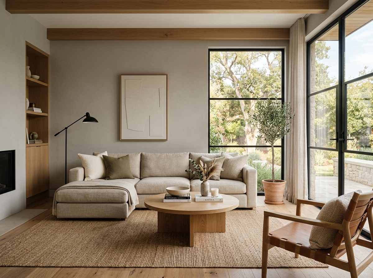 After
After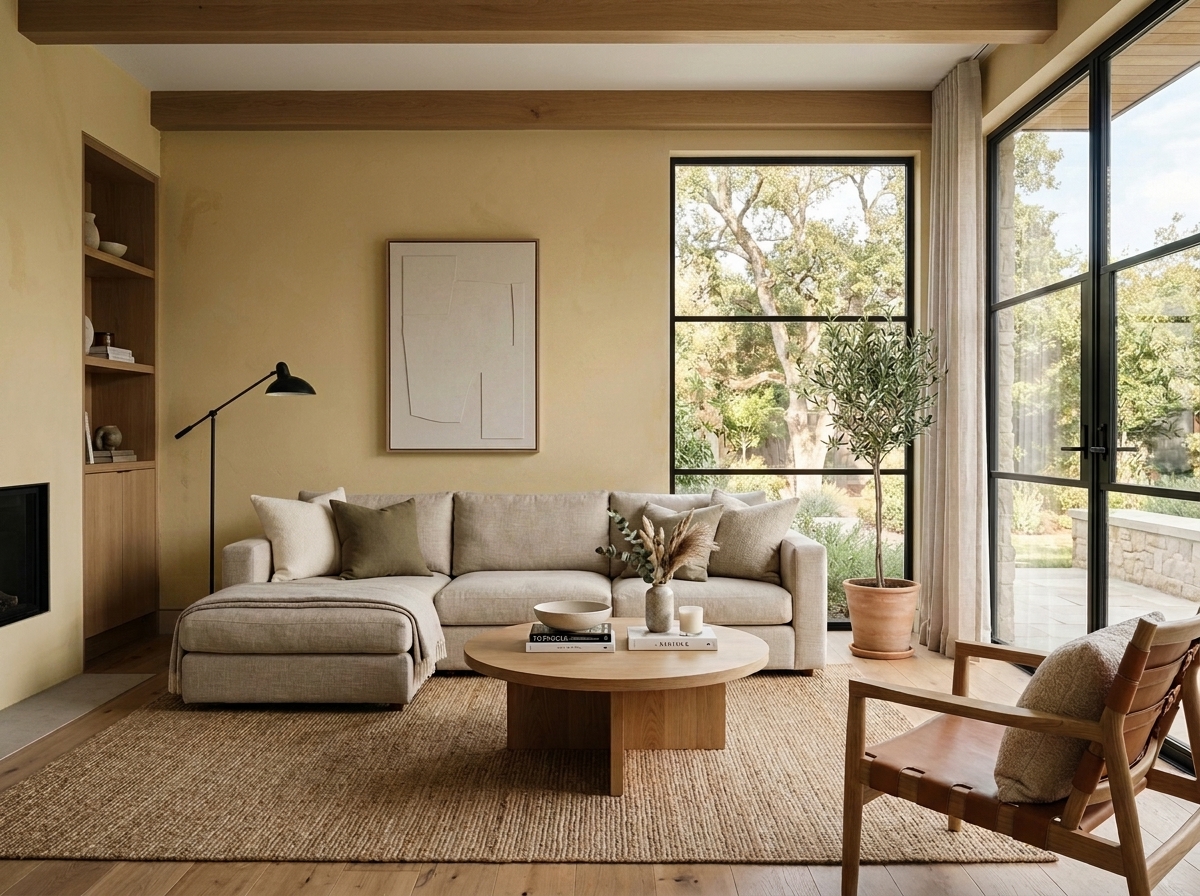 Before
Visualize Your Space with Color Studio AI
Planning a project? Skip the paint chip guesswork. Use our Color Studio AI to instantly visualize these paint colors on your own walls, or take advantage of our aligned contractor pricing matching current Sherwin-Williams retail promotions.
Book Your Upcoming Paint Project
Craftsman Painter is now scheduling premium transformations. Secure your spot and elevate your property value.
Get an EstimateHelp Others Find Professional Color Insights
Share this story directly to your networks or copy the link to share with friends.