
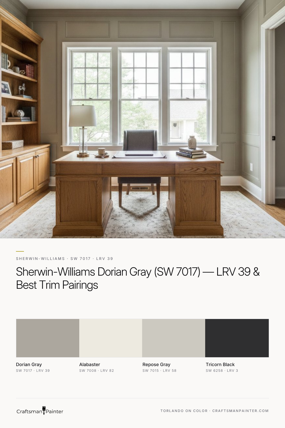


Unpacking Dorian Gray's Warm Beige-Almond Undertone
Real-paint peel-and-stick samples ship via Samplize. Craftsman Painter may earn a small commission on sample orders at no extra cost to you.
The perception of Dorian Gray's undertone is heavily influenced by its environment. In rooms with ample natural light, particularly from a south-facing window, the warm beige-almond notes will be more pronounced, presenting as a soft, earthy greige. In north-facing rooms or spaces with cooler artificial lighting, the gray aspects may appear slightly more dominant, yet the underlying warmth prevents it from ever feeling truly cold. This chameleon-like quality is a hallmark of complex neutrals. When evaluating Dorian Gray, or any color, it is vital to test it correctly. Many homeowners make the mistake of taping a small paint swatch directly onto an existing painted wall. This method is misleading due to Josef Albers' principle of simultaneous contrast, where adjacent colors alter each other's perception. The existing wall color will influence how you see Dorian Gray, making it appear different than it would on its own. Instead, I always advise clients to obtain a real-paint peel-and-stick sample and place it against a clean white background, such as a piece of white poster board or directly against your existing white trim. Observe it at different times of day and under various lighting conditions.
For walls painted with Dorian Gray, I typically specify Sherwin-Williams Cashmere Low Lustre or Emerald Interior Matte. Both coatings offer excellent hide and a refined finish. Cashmere provides a smooth, buttery application, while Emerald Interior delivers superior washability and durability, ideal for active households. Proper surface preparation is paramount for achieving the intended depth and clarity of Dorian Gray. For occupied homes, Level 2: Standard drywall preparation is usually sufficient, ensuring smooth, tape-free seams and uniform texture. For a truly luxurious finish, especially in new construction or full renovations, I recommend Level 3: Premium preparation, which involves additional skim coating and sanding to achieve a glass-smooth surface, allowing the paint to perform optimally.
Cultivating Serene Living Spaces and Kitchens
Dorian Gray excels in main living areas, such as living rooms, dining rooms, and open-concept spaces, where its warmth creates an inviting atmosphere without overwhelming the eye. Its mid-tone LRV of 39 provides enough contrast against white trim to define architectural details, yet it is light enough to maintain an airy feel. For trim and ceilings, Sherwin-Williams Alabaster (SW 7008, LRV 82) is an impeccable pairing. Alabaster is a soft, creamy white that harmonizes beautifully with Dorian Gray's warm undertones, avoiding any stark contrast that a colder white might introduce. The combination feels cohesive and timeless. For cabinetry in a kitchen, Dorian Gray can be a sophisticated alternative to traditional white or stark gray. When applied to cabinets, I recommend Sherwin-Williams Emerald Urethane Trim Enamel in a Satin finish for its exceptional hardness, flow, and leveling properties, ensuring a smooth, furniture-like appearance that stands up to daily use. The same product in a Semi-Gloss finish is ideal for baseboards, doors, and window casings, providing a subtle sheen that highlights the architectural lines.
In a kitchen, pairing Dorian Gray walls or cabinets with natural wood tones, brushed nickel hardware, and perhaps a tile backsplash featuring subtle grays and creams can create a truly upscale environment. For those looking to explore how Dorian Gray might look in their space, our Color Studio offers digital visualization tools to help you envision the possibilities.
Beyond the Main Living: Bedrooms, Baths, and Exterior Considerations
Moving into more private spaces, Dorian Gray brings a calming influence to bedrooms, creating a restful backdrop. In a primary suite, consider pairing it with Sherwin-Williams Repose Gray (SW 7015, LRV 58) on an accent wall or for complementary bedding and textiles. Repose Gray, a slightly lighter greige with a subtle hint of green-blue, provides a gentle contrast that keeps the palette sophisticated. For a bolder accent, Sherwin-Williams Tricorn Black (SW 6258, LRV 3) can be introduced through picture frames, light fixtures, or furniture, providing a sharp, modern counterpoint to Dorian Gray's softness.
In bathrooms and laundry rooms, where humidity is a factor, I specify Sherwin-Williams Duration Home Interior Acrylic Latex. This coating offers excellent moisture resistance and a durable, washable finish, crucial for these high-traffic, high-moisture areas. Dorian Gray can create a spa-like retreat in a bathroom, especially when combined with white fixtures and natural stone elements. On exteriors, Dorian Gray performs admirably. Its LRV of 39 allows it to hold its own against strong natural light, preventing it from washing out. The warm undertones keep it from appearing flat or overly cool on a home's façade. Paired with Alabaster trim and perhaps Tricorn Black for window sashes or a front door, it creates a classic, inviting curb appeal.
For homeowners who find themselves overwhelmed by the sheer volume of color choices, or who need specific guidance tailored to their home's unique lighting and architectural features, a 1-on-1 Color Consultation can provide clarity and confidence in their selections.
Navigating the Gray Spectrum: Dorian Gray vs. Its Closest Rivals
When considering Dorian Gray, it is natural to compare it to other popular greiges in the Sherwin-Williams family. Two common rivals are Mindful Gray (SW 7016) and Gauntlet Gray (SW 7019).
Mindful Gray (SW 7016, LRV 48): Mindful Gray is a lighter greige than Dorian Gray, with an LRV of 48. While it shares some of Dorian Gray's warmth, Mindful Gray typically leans a bit more into the gray side, with subtle green undertones that can emerge in certain lighting conditions. It feels airier and less saturated than Dorian Gray. If you desire a slightly brighter space with a touch more gray, Mindful Gray might be a better fit. Dorian Gray, with its lower LRV and more pronounced beige-almond undertone, offers a deeper, more grounded presence.
Gauntlet Gray (SW 7019, LRV 17): Gauntlet Gray is significantly darker and more saturated than Dorian Gray, with an LRV of 17. It is a true charcoal gray with strong brown undertones, giving it a rich, earthy depth. While Dorian Gray is a mid-tone greige, Gauntlet Gray is a deep, dramatic color often used for accent walls, exteriors, or cabinetry where a bold statement is desired. If Dorian Gray offers a gentle warmth, Gauntlet Gray delivers a robust, sophisticated intensity. The choice between them depends entirely on the desired mood and impact; Dorian Gray is a primary wall color for warmth, while Gauntlet Gray serves as a powerful accent or a main color for a truly moody space.
Dorian Gray remains a top choice for its balanced warmth, versatility, and ability to create sophisticated, inviting interiors and exteriors. Its unique beige-almond undertone sets it apart, offering a timeless appeal that adapts gracefully to various design styles and lighting conditions. Choosing the right paint color is a significant decision, and understanding the nuances of shades like Dorian Gray ensures a result that you will appreciate for years to come.
Frequently Asked Questions
What are Sherwin-Williams Dorian Gray's undertones and how do they appear?
Sherwin-Williams Dorian Gray (SW 7017) features distinct warm beige-almond undertones. These undertones prevent the color from appearing cold or sterile, instead lending it a soft, earthy warmth. In bright, south-facing light, the beige-almond notes are more pronounced, presenting as a true greige. In cooler, north-facing light or with artificial illumination, the gray aspects may seem more dominant, but the inherent warmth always remains, ensuring it never reads as a stark, cold gray.
What trim color pairs best with Sherwin-Williams Dorian Gray?
For trim and ceilings, Sherwin-Williams Alabaster (SW 7008, LRV 82) is an excellent pairing with Dorian Gray. Alabaster is a soft, creamy white that harmonizes beautifully with Dorian Gray's warm beige-almond undertones. This combination creates a cohesive and timeless look, providing enough contrast to highlight architectural details without appearing stark or cold, which can happen with a brighter, cooler white.
Is Sherwin-Williams Dorian Gray a good choice for exteriors?
Yes, Sherwin-Williams Dorian Gray (SW 7017) is a very suitable choice for exteriors. Its LRV of 39 provides sufficient depth to hold its own against strong natural light, preventing it from washing out on a home's façade. The warm beige-almond undertones keep the color from appearing flat or overly cool outdoors, contributing to inviting curb appeal. It pairs well with Alabaster trim and Tricorn Black accents for a classic exterior palette.
How does Sherwin-Williams Dorian Gray compare to Mindful Gray and Gauntlet Gray?
Dorian Gray (SW 7017, LRV 39) is a mid-tone greige with prominent warm beige-almond undertones. Mindful Gray (SW 7016, LRV 48) is lighter and leans more into gray with subtle green undertones, offering an airier feel. Gauntlet Gray (SW 7019, LRV 17) is significantly darker, a deep charcoal with strong brown undertones, used for dramatic accents or moody spaces. Dorian Gray provides a balanced, warm depth, while Mindful Gray is brighter, and Gauntlet Gray is a much bolder, darker statement.

Warm Gray and Muted Green Converge in the Quiet Depth of Sherwin-Williams Ellsworth (SW 7650)

Softened Green by Sherwin Williams (SW 6177)
