


Decoding Creamy's Undertones and Light Reflectance
Real-paint peel-and-stick samples ship via Samplize. Craftsman Painter may earn a small commission on sample orders at no extra cost to you.
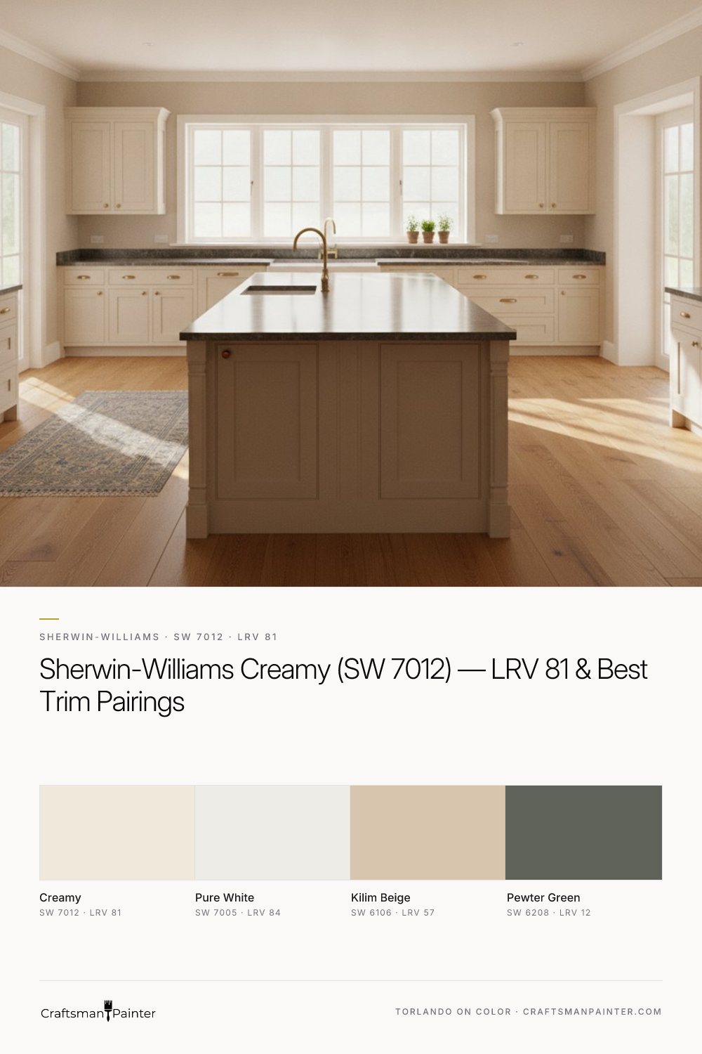
Sherwin-Williams Creamy (SW 7012) possesses soft, warm cream-yellow undertones. These aren't overtly yellow, but rather a gentle suggestion that prevents the color from leaning sterile or cold. This warmth is what defines Creamy's character, making it a favorite for creating cozy, inviting spaces. Its Light Reflectance Value (LRV) is 81. For context, LRV measures the percentage of light a color reflects; 0 is absolute black, and 100 is pure white. An LRV of 81 means Creamy is highly reflective, contributing significantly to a brighter, more expansive feel in a room. In north-facing rooms, where natural light tends to be cooler and grayer, Creamy's warm undertones can counteract this coolness, preventing the space from feeling dim or stark. In south-facing rooms, bathed in warm, direct sunlight, Creamy will appear even softer and more golden. East-facing rooms, receiving morning sun, will see Creamy's warmth highlighted, while west-facing rooms will experience its full creaminess in the afternoon.
When evaluating Creamy, or any paint color, the phenomenon of simultaneous contrast, as described by Josef Albers, is paramount. This principle explains how colors influence each other when placed side-by-side. If you test a swatch of Creamy directly on an existing painted wall, the underlying wall color will distort your perception of Creamy, making it appear different from its true self. To accurately assess Creamy, always isolate real-paint peel-and-stick samples against a neutral white background, such as a large white poster board or directly on existing white trim. This allows you to see the color in its pure form, unadulterated by surrounding hues, and to observe how it truly shifts with your home's unique lighting throughout the day.
Crafting a Cohesive Palette: Trim, Accents, and Flow
Building a harmonious color scheme around Sherwin-Williams Creamy involves selecting complementary hues that enhance its inherent warmth without competing with it. For trim and ceilings, my consistent recommendation is Sherwin-Williams Pure White (SW 7005). With an LRV of 84, Pure White is a clean, bright white with just enough warmth to prevent it from feeling stark against Creamy. It provides a crisp definition that allows Creamy to shine, creating a subtle, sophisticated contrast. For trim work—baseboards, door frames, and window casings—I advise using Sherwin-Williams Emerald Urethane Trim Enamel in Satin for a soft sheen that is durable and easy to clean, or Semi-Gloss for a more traditional, higher-contrast look. Ceilings typically benefit from Pure White in a flat finish, which helps to hide imperfections and recede visually.
Extending the palette, Sherwin-Williams Kilim Beige (SW 6106, LRV 57) serves as an excellent coordinating neutral. Its deeper, earthy beige tones offer a grounding counterpoint to Creamy, suitable for adjacent rooms, accent walls, or even furniture. Kilim Beige shares Creamy's warm foundation, ensuring a seamless flow between spaces. For a striking contrast, Sherwin-Williams Pewter Green (SW 6208, LRV 12) introduces a sophisticated, muted green with gray undertones. This deep, rich hue can be transformative on a kitchen island, built-in cabinetry, or an accent wall, providing a natural, calming depth that beautifully complements Creamy's softness. When applying these colors to drywall, especially in living areas, Sherwin-Williams Cashmere Low Lustre offers a smooth, rich appearance, while Emerald Interior Matte provides superior durability and washability for high-traffic zones. For bathrooms and kitchens, where humidity is a factor, Sherwin-Williams Duration Home is a reliable choice for its moisture resistance and resilience. For a deeper dive into how these colors interact, explore the Color Studio.
Creamy's Closest Rivals: Alabaster vs. Dover White
When homeowners consider an off-white with warm undertones, Sherwin-Williams Creamy often enters a conversation with two other popular contenders: Alabaster (SW 7008) and Dover White (SW 6385). While all three share a warm, inviting quality, their nuances are significant. Sherwin-Williams Alabaster (SW 7008) is often perceived as a softer, more muted off-white compared to Creamy. It has a subtle creaminess, but its yellow undertone is less pronounced, leaning more towards a quiet, almost greige-like warmth in certain lights. Alabaster offers a gentler touch, making it ideal for spaces where a very understated warmth is desired, or in rooms with abundant natural light where a stronger yellow cast might become too dominant. It's a popular choice for exteriors for this reason, as it reads as a clean, soft white without being stark.
In contrast, Sherwin-Williams Dover White (SW 6385) presents a more assertive yellow undertone than Creamy. It has a higher chroma, meaning its color intensity is stronger. Dover White reads as a richer, more saturated cream, often evoking a more traditional or historic feel. If you're looking for a distinct creamy warmth that is clearly discernible, Dover White might be your preference. However, its stronger yellow can be more sensitive to light conditions, potentially appearing too yellow in very bright, south-facing rooms. Creamy sits comfortably between these two: warmer and more visibly creamy than Alabaster, but less saturated and overtly yellow than Dover White. The best way to differentiate is to sample all three in your specific environment, observing how each interacts with your lighting and existing furnishings throughout the day.
Application Excellence: Ensuring Creamy's Best Presentation
The final appearance of Sherwin-Williams Creamy, or any sophisticated off-white, is profoundly influenced by the quality of surface preparation and the coatings used. For typical residential repaints, I recommend a minimum of Level 2: Standard (Occupied Home) drywall preparation. This involves filling nail holes and minor dings, light sanding to smooth patched areas, and spot priming. However, for a truly refined finish, especially in a luxury setting or on new drywall, Level 3: Premium (Luxury Finish) preparation is advisable. This entails more extensive skimming of drywall imperfections, multiple rounds of sanding to achieve a glass-smooth surface, and a full coat of high-quality primer. Off-whites like Creamy are particularly unforgiving; they will reveal every imperfection on an inadequately prepared wall. The subtle warmth of Creamy can highlight texture discrepancies, so a smooth substrate is paramount.
For general wall surfaces, Sherwin-Williams Cashmere Low Lustre provides a velvety, smooth finish that enhances Creamy's soft appearance. For areas demanding higher durability and ease of cleaning, such as hallways or children's rooms, Emerald Interior Matte is an excellent choice, offering premium performance without sacrificing aesthetics. In moisture-prone areas like bathrooms and kitchens, Sherwin-Williams Duration Home offers superior mildew resistance and washability. For all trim, doors, and cabinetry, Sherwin-Williams Emerald Urethane Trim Enamel in Satin or Semi-Gloss is the professional standard. Its exceptional flow and leveling properties result in a hard, furniture-like finish that resists chipping and yellowing over time, ensuring your Pure White trim stays crisp against Creamy walls. Investing in professional application and proper preparation ensures that Creamy delivers its full potential, providing a lasting, beautiful foundation for your home. If you're struggling to visualize these nuances, a 1-on-1 Color Consultation can provide tailored guidance for your specific project needs.
Frequently Asked Questions
What are the undertones of Sherwin-Williams Creamy?
Sherwin-Williams Creamy (SW 7012) features soft, warm cream-yellow undertones. These undertones give it a gentle, inviting warmth that distinguishes it from cooler whites, making it a popular choice for cozy and welcoming spaces.
What LRV is Sherwin-Williams Creamy, and what does that mean for my space?
Sherwin-Williams Creamy has an LRV (Light Reflectance Value) of 81. This high LRV indicates that Creamy reflects a significant amount of light, helping to brighten a room and make it feel more spacious. It performs well in various lighting conditions, bringing warmth to cooler, north-facing rooms and appearing soft and golden in sunnier exposures.
What trim color pairs best with Sherwin-Williams Creamy?
For trim and ceilings, Sherwin-Williams Pure White (SW 7005) is an ideal pairing with Creamy. Pure White has a subtle warmth that complements Creamy without clashing, providing a clean, crisp definition. For trim, consider Sherwin-Williams Emerald Urethane Trim Enamel in Satin or Semi-Gloss for durability.
How does Sherwin-Williams Creamy compare to Alabaster and Dover White?
Sherwin-Williams Creamy is warmer and more visibly creamy than Alabaster (SW 7008), which has a softer, more muted yellow undertone. Compared to Dover White (SW 6385), Creamy is less saturated and less overtly yellow; Dover White presents a more assertive, richer yellow undertone. Creamy offers a balanced warmth between these two popular off-whites.

Sherwin-Williams Whitetail: A Warm White Paint for Inviting Interiors

The Restrained Warmth and Subtle Cream Undertones of Sherwin-Williams Muslin SW 6133
