
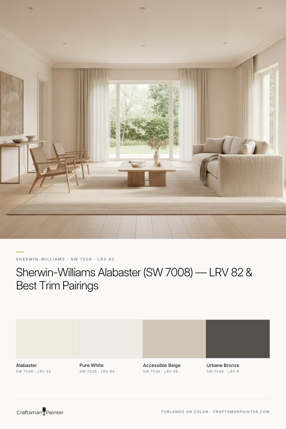


Alabaster's Character Under Dynamic Light Conditions
Real-paint peel-and-stick samples ship via Samplize. Craftsman Painter may earn a small commission on sample orders at no extra cost to you.
Understanding how Alabaster behaves in different lighting is fundamental to appreciating its value. With an LRV (Light Reflectance Value) of 82, Alabaster is highly reflective, contributing significantly to a brighter interior without the starkness sometimes associated with purer whites. Its soft warm cream-yellow undertones are the key to its adaptability. In rooms with abundant natural light, particularly south-facing rooms, Alabaster appears as a luminous, soft white, its warmth gently surfacing to prevent any coldness. The cream-yellow hint is subtle, never overwhelming, ensuring the space feels inviting rather than saturated.
North-facing rooms, which typically receive cooler, bluer light, benefit immensely from Alabaster. Here, its inherent warmth counteracts the cool cast, preventing the walls from feeling drab or gray. The cream-yellow undertones become a quiet comfort, ensuring the room remains cozy and bright. In east-facing rooms, which receive bright, warm light in the morning and cooler light later in the day, Alabaster transitions gracefully. It will appear slightly warmer in the morning glow and then settle into a softer, more balanced off-white as the day progresses. West-facing rooms, with their intense afternoon sun, will see Alabaster at its warmest, though its high LRV prevents it from ever feeling heavy or saturated. Artificial lighting, especially warmer LED bulbs (2700K-3000K), will enhance Alabaster's creamy undertones, while cooler bulbs (4000K+) will temper them, allowing the color to appear closer to a pure, soft white.
When evaluating Alabaster, it is crucial to use real-paint peel-and-stick samples. Taping small paper swatches directly onto an existing painted wall is misleading due to Josef Albers' principle of simultaneous contrast. The surrounding color will trick your eye, altering your perception of the new shade. Instead, isolate your Alabaster sample against a clean white background, such as a large piece of white poster board, and move it around the room at different times of day. This method provides the most accurate read of the color in your specific environment.
Pairing Alabaster with Complementary Hues
Selecting the right coordinating colors is essential to fully realize Alabaster's potential. For trim and ceilings, Sherwin-Williams Pure White (SW 7005, Hex #EDECE6, LRV 84) is an impeccable choice. Pure White is a clean, crisp white with virtually no discernible undertones, making it an ideal partner for Alabaster. When paired, Pure White provides a subtle yet distinct contrast, allowing Alabaster's soft warmth to truly shine on the walls without competing. This creates a sophisticated, cohesive look that feels fresh and expansive. For ceilings, Pure White in a flat finish helps to visually lift the space, while for trim, doors, and baseboards, I recommend Sherwin-Williams Emerald Urethane Trim Enamel in Satin or Semi-Gloss for its exceptional flow, leveling, and lasting durability. For optimal finish quality on wood trim, ensuring Level 2: Standard (Occupied Home) or Level 3: Premium (Luxury Finish) preparation is crucial, addressing imperfections before coating.
For a coordinating neutral, Sherwin-Williams Accessible Beige (SW 7036, Hex #D1C7B8, LRV 58) offers a beautiful balance. Accessible Beige is a warm greige that complements Alabaster's creamy undertones without clashing. It introduces depth and visual interest, working well in adjacent rooms or as an accent color for cabinetry or built-ins. This pairing creates a harmonious flow, establishing a palette that is both inviting and grounded. For a striking contrast accent, Sherwin-Williams Urbane Bronze (SW 7048, Hex #54504A, LRV 8) is a powerful choice. This deep, rich brown with gray undertones provides a sophisticated counterpoint to Alabaster's lightness. Consider Urbane Bronze for accent walls, exterior trim, or statement doors to introduce architectural definition and a sense of gravitas. The interplay between Alabaster's soft luminosity and Urbane Bronze's deep grounding creates a dynamic yet elegant aesthetic.
Understanding Alabaster's Nuance: Comparing with Rivals
To truly appreciate Alabaster, it helps to compare it directly with its closest rivals. Two frequently considered alternatives are Sherwin-Williams Pure White (SW 7005) and Sherwin-Williams Greek Villa (SW 7551). As discussed, Pure White is a cleaner, brighter white with an LRV of 84. It lacks the soft cream-yellow undertones of Alabaster, making it feel crisper and less warm. While it can work as a wall color for those seeking a purer white, it often serves best as a trim color to Alabaster, providing that subtle, clean contrast. If you're looking for a wall color with some warmth but want to minimize any perceived yellow, Pure White could be a consideration, but understand it will feel less soft and inviting than Alabaster.
Greek Villa (SW 7551), on the other hand, shares Alabaster's warm off-white category but with a subtle difference. Greek Villa often presents with a touch more yellow or beige in its undertone, making it appear slightly richer or creamier than Alabaster in certain lighting conditions. While both are excellent warm off-whites, Alabaster tends to be the more balanced and versatile of the two, leaning into its soft cream-yellow without becoming overtly yellow or beige. Greek Villa can sometimes read as a touch heavier or more saturated than Alabaster's ethereal quality. When deciding between these, sampling them side-by-side in your space is non-negotiable. Observe how each color responds to your unique lighting throughout the day. For a deeper dive into how Alabaster might work in your home, explore our Color Studio.
Practical Applications and Coating Specifications for Alabaster
Alabaster's versatility makes it an outstanding choice for nearly any room in the home. In living rooms and bedrooms, it creates a serene and expansive atmosphere, serving as an ideal backdrop for furnishings and art. For kitchens and bathrooms, its soft warmth is both inviting and clean. On exteriors, Alabaster provides a classic, timeless look that feels welcoming and refined, pairing beautifully with natural stone, brick, or darker trim accents like Urbane Bronze.
When specifying coatings, the right product ensures both the aesthetic and the performance you expect. For interior walls in low-traffic areas, Sherwin-Williams Cashmere Low Lustre offers a smooth, refined finish that enhances Alabaster's soft appearance. For higher-traffic areas, or where washability is paramount, Sherwin-Williams Emerald Interior Matte provides superior durability and scrubbability without compromising the sophisticated look. In humid environments like bathrooms and kitchens, Sherwin-Williams Duration Home is the preferred choice for its excellent moisture resistance and long-lasting finish. For all surfaces, proper preparation is key. This means ensuring Level 2: Standard (Occupied Home) drywall preparation for a smooth, consistent surface, or Level 3: Premium (Luxury Finish) for a truly flawless, glass-like finish on walls and trim. These preparation levels address imperfections, ensuring the final coating of Alabaster looks its absolute best.
For doors, cabinets, and all interior trim, Sherwin-Williams Emerald Urethane Trim Enamel in Satin or Semi-Gloss provides a hard, durable finish that stands up to daily wear while maintaining Alabaster's elegant appeal. Its excellent adhesion and resistance to blocking make it a top-tier choice for these high-touch surfaces. If you're grappling with specific color challenges or need guidance on integrating Alabaster into your home's unique design, consider a 1-on-1 Color Consultation. Alabaster is more than just a paint color; it's an investment in a timeless, comfortable, and elegant home environment that will provide lasting satisfaction.
Frequently Asked Questions
What are the undertones of Sherwin-Williams Alabaster (SW 7008)?
Sherwin-Williams Alabaster (SW 7008) features soft warm cream-yellow undertones. These subtle hints provide a gentle warmth that prevents the color from appearing stark, making it feel inviting and versatile without being overtly yellow.
Is Sherwin-Williams Alabaster (SW 7008) too yellow?
No, Alabaster is generally not considered 'too yellow.' While it possesses soft warm cream-yellow undertones, its high LRV of 82 ensures it reads as a luminous, soft off-white. The warmth is subtle, providing comfort without making the color appear saturated or overtly yellow in most lighting conditions.
What is the best trim color to pair with Sherwin-Williams Alabaster (SW 7008)?
The ideal trim color to pair with Alabaster (SW 7008) is Sherwin-Williams Pure White (SW 7005). Pure White is a clean, crisp white with minimal undertones, offering a subtle yet distinct contrast that allows Alabaster's soft warmth to truly shine on the walls.
How does Sherwin-Williams Alabaster (SW 7008) compare to Greek Villa (SW 7551)?
Both Alabaster (SW 7008) and Greek Villa (SW 7551) are popular warm off-whites. However, Greek Villa often carries a slightly stronger yellow or beige undertone, making it appear a touch richer or creamier. Alabaster tends to be more balanced and ethereal, with its soft cream-yellow undertones feeling less saturated, making it a highly versatile choice.

Sherwin-Williams Whitetail: A Warm White Paint for Inviting Interiors
The Accidental Pink: A Color Story on Finding the Perfect White
