
I’m Torlando. I’m a Color Consultant, and long before I was dissecting the psychological weight of pigment in high-end residential spaces, I was cutting my teeth at the Eskenazi School of Art, Architecture + Design. I learned early on that color isn’t just a swatch you grab at the hardware store while buying furnace filters. It is the architectural weather of your home.
And if you live in Indianapolis, you know our actual weather is unapologetically demanding. The light here changes from the humid, golden lushness of a July afternoon to the flat, aluminum-pan gray of a long February. You need a paint that can survive both without losing its soul. Enter Sherwin Williams Accessible Beige (SW 7036).
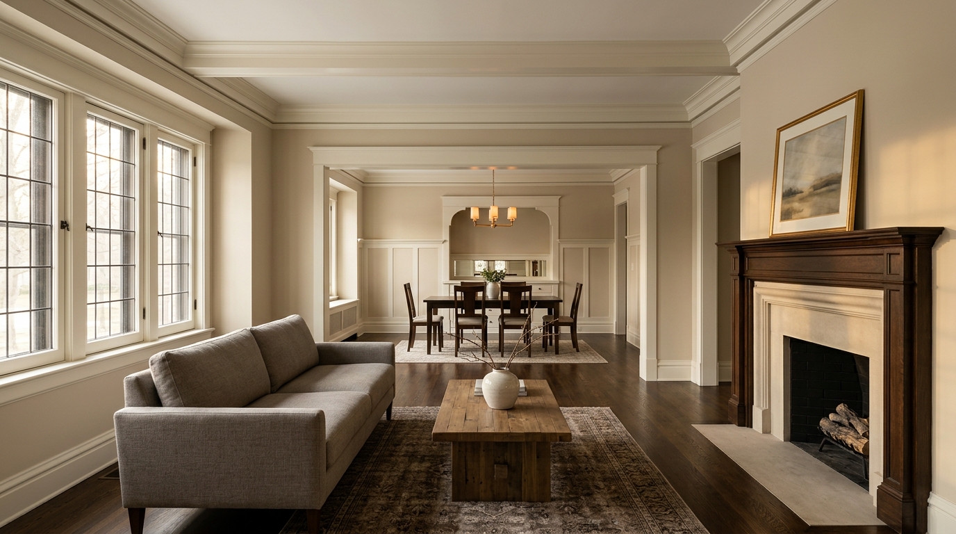
The Anatomy of SW 7036: Undertones and Architectural Weight
Forget the word "beige." Say it and people immediately picture the flat, fleshy, builder-grade nightmare of a 1990s subdivision. Accessible Beige is a different beast entirely. It’s what we in the trade call a "greige," but one that leans unapologetically into the warmth of taupe.
Book Your Upcoming Paint Project
Craftsman Painter is now scheduling premium transformations. Secure your spot and elevate your property value.
Get an EstimateIt has a Light Reflectance Value (LRV) of 58. That means it bounces around enough light to keep a room from feeling like a cigar lounge, but it has enough depth to hold its ground against heavy architectural elements. It possesses a subtle, earthy green undertone. It’s this hidden green that prevents the paint from turning pink or peach when the evening sun hits it. It’s honest. It’s grounded.
Surviving the Indianapolis Sky: Light and Offset
If you are painting a home in Central Indiana, you are battling the sky. Lighting offsets are everything. In a North-facing room in Broad Ripple, the natural light is cool, indirect, and often blue-tinted. A stark white here will look like an icebox. Accessible Beige steps in and acts as a thermal blanket, neutralizing the chill and warming the room without screaming for attention.
In a South-facing room in a sprawling Carmel estate, where the light is generous and warm, SW 7036 relaxes. It leans back, showing off its gray spine. It never gets washed out. It behaves like a seasoned traveler—comfortable in any room, adapting to the local customs of the light, but never losing its fundamental identity.
Harmony in the Heartland: Pairing with Trim and Textures
Color theory isn't just about the wall; it’s about the conversation the wall is having with the rest of the room. Accessible Beige doesn't want to work alone. It craves natural materials.
If you have the original, quarter-sawn oak floors of a historic Indianapolis home, or the wide-plank European white oak of a modern build, this paint sings. The earthy undertones lock in with the natural grain of the wood.
For trim, don't insult this color with a cheap, blinding white. It requires a sophisticated counterpart. Sherwin Williams Alabaster (SW 7008) or Pure White (SW 7005) provides a crisp, tailored edge that frames Accessible Beige like a bespoke suit. The contrast isn't violent; it's a polite, firm handshake.
Neighborhood Context: From Meridian-Kessler to Zionsville
I’ve walked through century-old Tudor revivals in Meridian-Kessler where the millwork is heavy and the history is palpable. Slapping a trendy, stark white on those plaster walls is a crime against architecture. Accessible Beige respects the bones of those historic homes. It feels like it’s always been there, quietly supporting the heavy masonry and leaded glass.
Yet, take it up to a new, modern-transitional build in Zionsville, and it instantly feels fresh. Paired with matte black hardware, raw iron fixtures, and a honed marble countertop, SW 7036 provides a rich, tactile backdrop that prevents the modern finishes from feeling overly clinical.
The Verdict from an Eskenazi Grad
There is a reason Sherwin Williams Accessible Beige remains a titan in high-end residential design. It works. It doesn’t rely on gimmicks or fleeting Pinterest trends. It relies on solid, undeniable color theory.
For Indianapolis homes, it is the ultimate utilitarian luxury. It’s a color that respects the Midwest light, honors the architectural materials it surrounds, and provides a deeply psychological comfort to the people living inside. It is, quite simply, the perfect warm neutral.
When you’re ready to stop guessing and start treating your home’s palette with the respect it deserves, let’s talk. Color is a science, an art, and a deeply local affair. Let's get it right.