
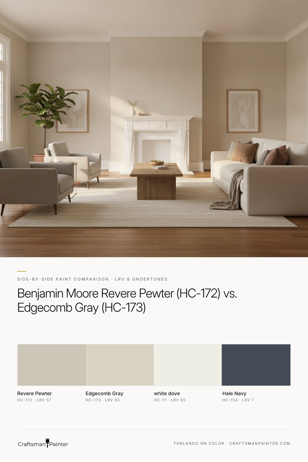


LRV & Brightness Gap on Full Walls
Real-paint peel-and-stick samples ship via Samplize. Craftsman Painter may earn a small commission on sample orders at no extra cost to you.
The Light Reflectance Value (LRV) is a crucial metric, indicating how much light a color reflects. Revere Pewter (HC-172) has an LRV of 57, positioning it as a mid-tone color. This means it has a noticeable depth that can ground a space without making it feel heavy. When applied to full walls, Revere Pewter provides a substantial presence, offering a comfortable, enveloping feel. It holds its own in larger rooms and can make a statement while remaining neutral. The depth of Revere Pewter allows it to create a subtle contrast with crisp white trim like Benjamin Moore White Dove (OC-17, LRV 85), lending an air of classic elegance.
In contrast, Edgecomb Gray (HC-173) boasts an LRV of 65. This eight-point difference in LRV is significant on full walls. Edgecomb Gray is notably lighter and brighter than Revere Pewter. It reflects more light, making rooms feel more expansive and airy. For spaces where maximizing perceived light and openness is a priority, Edgecomb Gray often excels. It offers a softer backdrop, allowing other elements in the room, such as furniture or artwork, to take center stage. While still a greige, its higher LRV pushes it closer to the lighter end of the spectrum, providing a gentle warmth that is less pronounced than Revere Pewter's depth.
Undertone Differences in North-Facing vs. South-Facing Rooms and 2700K Evening Bulbs
Undertones are where these two colors truly diverge, and understanding them is paramount, especially when considering different exposures and artificial lighting. Revere Pewter's primary undertone is a warm beige-almond. In a north-facing room, which typically receives cooler, indirect light, Revere Pewter’s inherent warmth helps to counteract the cool cast, preventing the color from appearing too cold or gray. The beige-almond undertone remains present, offering a soft, inviting quality. In south-facing rooms, bathed in warm, direct sunlight, Revere Pewter’s warmth is amplified, leaning more into its beige side, creating a cozy and sun-drenched atmosphere.
Edgecomb Gray, while also a warm greige, carries a more subtle, almost elusive green-yellow undertone. In north-facing rooms, this can sometimes be perceived as a very faint, cool gray with a touch of green, though it generally maintains its warmth better than a true cool gray. In south-facing rooms, the warm light tends to soften any hint of green and brings out its creamy, lighter beige qualities. It feels fresh and bright. When illuminated by 2700K evening bulbs, both colors will appear warmer, as these bulbs emit a soft, yellowish light. Revere Pewter will deepen into a richer, more pronounced warm beige. Edgecomb Gray will also warm up, appearing as a creamy, inviting off-white greige, but its overall lightness will prevent it from achieving the same depth as Revere Pewter.
Which Shade Wins Against Warm Oak Floors, White Marble/Quartz, or Cabinetry
When coordinating with existing fixed elements, the choice between Revere Pewter and Edgecomb Gray becomes clearer.
Warm Oak Floors: Revere Pewter (HC-172) often performs exceptionally well with warm oak floors. Its warm beige-almond undertone harmonizes beautifully with the golden and red tones in oak, providing a sophisticated, grounded contrast. The depth of Revere Pewter prevents the walls from washing out against the floor, creating a balanced and cohesive look. For a more traditional or transitional aesthetic, Revere Pewter with oak floors and Benjamin Moore White Dove (OC-17) trim is a timeless combination.
Edgecomb Gray (HC-173) can also work with warm oak floors, but with more careful consideration. Its lighter nature means less contrast, which can sometimes make the walls appear too similar to the floor if the oak is particularly light. The subtle green-yellow undertone in Edgecomb Gray, while usually imperceptible, might occasionally pull forward slightly against certain oak tones, so testing large samples is crucial. If the goal is a lighter, airier feel where the floors are a feature, Edgecomb Gray can provide a gentle, complementary backdrop.
White Marble/Quartz Countertops & Backsplashes: Here, Edgecomb Gray (HC-173) often has a slight advantage. Its higher LRV and softer character allow it to pair seamlessly with the crispness of white marble or quartz. It provides just enough warmth and contrast without competing with the pristine quality of these surfaces, contributing to a clean, contemporary aesthetic. The lightness of Edgecomb Gray ensures that the white elements remain the focal point.
Revere Pewter (HC-172) can also work with white marble/quartz, especially if a stronger contrast is desired. It creates a more defined boundary between the wall and the white surfaces, offering a bolder, more traditional or dramatic look. However, ensure the depth of Revere Pewter does not overwhelm the space, particularly in smaller kitchens or bathrooms where the white surfaces are a dominant feature. For a deeper accent in a room with white marble, consider Benjamin Moore Hale Navy (HC-154) on an island or lower cabinetry.
Cabinetry: The choice depends heavily on the cabinet color. For white cabinets (e.g., White Dove), both Revere Pewter and Edgecomb Gray provide excellent backdrops. Edgecomb Gray offers a softer, more integrated look, letting the white cabinets shine. Revere Pewter creates a more pronounced contrast, highlighting the cabinetry with its greater depth. For painted wood cabinets, such as a medium-toned gray or a warm green, Revere Pewter can offer a solid, grounding complement, while Edgecomb Gray might provide a lighter, more refreshing balance.
Clear Decision Rules for Picking the Winner + Sheen/Prep Recommendations
Choose Revere Pewter (HC-172) if:
- You desire a color with noticeable depth and a grounded presence.
- Your space benefits from a warm, beige-almond undertone to counteract cool light or enhance existing warmth.
- You have warm oak floors and want a harmonious, yet contrasting wall color.
- You prefer a more traditional or transitional aesthetic with a touch more visual weight.
- You appreciate a color that feels substantial and inviting without being dark.
For a deeper dive into this versatile shade, visit our Color Studio.
Choose Edgecomb Gray (HC-173) if:
- You prioritize lightness and an airy feel, making a room appear more expansive.
- You want a softer, more subtle greige that leans towards creamy off-white in bright light.
- You are pairing with crisp white marble, quartz, or cabinetry and want a gentle, complementary backdrop.
- Your aesthetic leans more contemporary or minimalist, where less visual weight is desired.
- You seek a versatile neutral that recedes gracefully, allowing other design elements to stand out.
Sheen and Coating Recommendations:
For general walls in living areas, bedrooms, and dining rooms, I recommend a flat or low lustre finish. Sherwin-Williams Cashmere Low Lustre offers a smooth, rich appearance, or Emerald Interior Matte provides excellent washability and durability. In high-traffic areas, kitchens, or bathrooms, where moisture and cleaning are more frequent, Sherwin-Williams Duration Home in a Matte or Satin finish is a robust choice. For baseboards, doors, and cabinetry, a durable enamel is essential. Sherwin-Williams Emerald Urethane Trim Enamel in Satin or Semi-Gloss provides a hard, smooth finish that withstands wear and tear.
Preparation Guidance:
Proper surface preparation is non-negotiable for a professional finish. For most occupied homes, Level 2: Standard preparation involves patching minor imperfections, light sanding, and cleaning. For a truly luxurious finish, especially on trim, doors, and cabinetry, Level 3: Premium preparation is warranted. This includes thorough sanding to achieve a glass-smooth surface, filling all nail holes and minor dings, precise caulking, and applying a high-quality primer before the finish coats. This meticulous attention to detail ensures that your chosen color, whether Revere Pewter or Edgecomb Gray, looks its absolute best for years to come. If you find yourself navigating these complex color decisions, a 1-on-1 Color Consultation can provide clarity and confidence.
Frequently Asked Questions
Is Revere Pewter too dark for a small room?
Revere Pewter (LRV 57) has a moderate depth. In a small room with ample natural light, it can create a cozy and sophisticated atmosphere. However, in a small room with limited light, it may feel heavier. Consider Edgecomb Gray (LRV 65) for a lighter alternative in such cases, or ensure good artificial lighting.
Does Edgecomb Gray look yellow or green?
Edgecomb Gray has subtle green-yellow undertones, which are usually very muted. In certain lighting, particularly cooler, indirect light from a north-facing window, these undertones can sometimes be detected. However, it generally presents as a warm, soft greige, especially in warmer light or with 2700K bulbs, where its creamy qualities emerge.
What trim color pairs best with Revere Pewter and Edgecomb Gray?
For both Revere Pewter and Edgecomb Gray, Benjamin Moore White Dove (OC-17, LRV 85) is an excellent choice for trim. Its soft, warm white provides a clean contrast that complements the warmth of both greiges without feeling stark. Other warm whites like Benjamin Moore Simply White (OC-117) can also work well.
How do I test Revere Pewter and Edgecomb Gray samples effectively?
To test effectively, purchase large, real-paint peel-and-stick samples. Do not place them directly on an existing painted wall, as the surrounding color will distort your perception. Instead, place the samples against existing white trim, or on a large white poster board, and observe them at different times of day and night in your specific lighting conditions.
The Enduring Warmth of Accessible Beige SW 7036: Why This Neutral Defines Modern Interior Painting…

Mastering the Magic of White Walls and Daring Trim
