


At the center of this study is Sherwin-Williams Cheerful SW 6903. With a Light Reflectance Value (LRV) of 76, Cheerful sits high on the bounce scale. In practical homeowner terms, an LRV of 76 means this shade bounces a huge amount of natural daylight around a room rather than soaking it up. It doesn't rely on heavy dark pigments to create mood. Instead, its true undertone is a clean, sunny yellow infused with enough organic warmth to keep it from feeling sharp, icy, or green.

When working with a high-energy shade like Cheerful, your architectural trim color acts as the anchor that holds the entire room together. I always recommend avoiding creamy or yellow-tinted whites here, because an ivory trim against a bright yellow wall will just look dingy and muddy. For this palette, Sherwin-Williams High Reflective White SW 7757 is the perfect fit. High Reflective White is a pure, unpigmented white with virtually no undertones. Applied to window casings, door frames, and deep baseboards, it creates a crisp visual frame around Cheerful walls, making the yellow pop while giving the room a sharp, clean structural framework.

Light direction changes yellow more than almost any other paint hue. In Cleveland's autumn climate, as the afternoon sun drops lower in the sky, the light passes through a thicker layer of atmosphere, filtering out cooler blue waves and flooding rooms with deep amber tones. When this low-angle golden light strikes Cheerful, the paint responds by deepening into a rich, butterscotch-tinted gold. Across room corners where shadows fall, the shade remains clean and legible without turning grey or murky, proving how stable its underlying yellow pigments really are.

Work Directly with Torlando Hakes
Skip the color choice stress. Work directly with me as your personal Color Designer to select the perfect architectural palette for your home, and get a Complementary Color Consultation when you purchase paint through us.

To keep a sunny yellow scheme from feeling one-dimensional, you need grounding counter-weights in your secondary materials and accent colors. Rather than adding more warm tones, introducing a earthy green creates a soothing, natural bridge. Benjamin Moore Fernwood Green 2145-40 functions beautifully on adjoining walls, open shelving, or transition corridors. This muted, leaf-inspired green captures the feeling of late-season foliage, balancing Cheerful's sunlit energy with a calming, organic presence.
For deep contrast, look to Sherwin-Williams Inkwell SW 6992. Inkwell is an extraordinarily rich black with slight navy-charcoal undertones. Applied to kitchen islands, low built-in credenzas, or dark bronze metal accent trim, Inkwell grounds the space. It acts like an anchor on the floor plane, giving your eye a solid place to rest beneath the weightless glow of Cheerful walls.

If you are planning to bring Cheerful into your own home, sheen selection is critical. Because of its high 76 LRV, shiny sheens like satin or semi-gloss on full walls can cause unwanted glare under direct sunlight. Stick to a matte or flat finish for your wall surfaces; the velvet-like texture absorbs excess light glints while letting the color glow evenly. Reserve semi-gloss strictly for your Sherwin-Williams High Reflective White trim and door casings to make cleaning easy and create a high-contrast texture difference.
This palette works exceptionally well in spaces designed for morning gather—like a breakfast nook, a sunlit kitchen, or a cozy home library with horizontal built-ins. Even in smaller spaces like a powder room, pairing Cheerful on the upper walls with an Inkwell vanity and High Reflective White trim creates a memorable, boutique-hotel experience for guests.

Bringing a bold, happy shade into your home isn't about covering every square inch in bright paint—it's about how that shade converses with natural light, structural trim, and grounding dark accents throughout the day.
Complementary Color Consultation
Planning a project? Work with Torlando Hakes directly as your personal Color Designer and get a Complementary Consultation when purchasing paint through us.
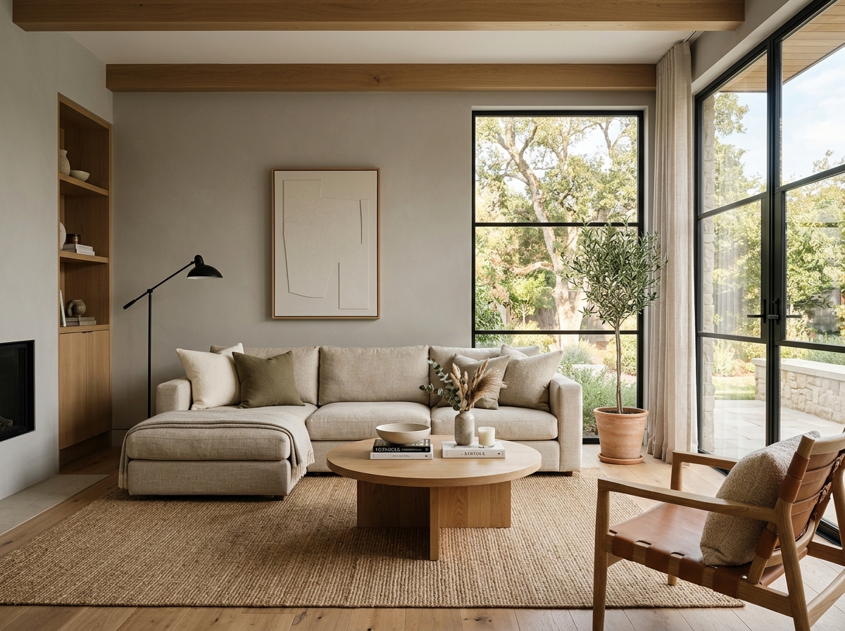 After
After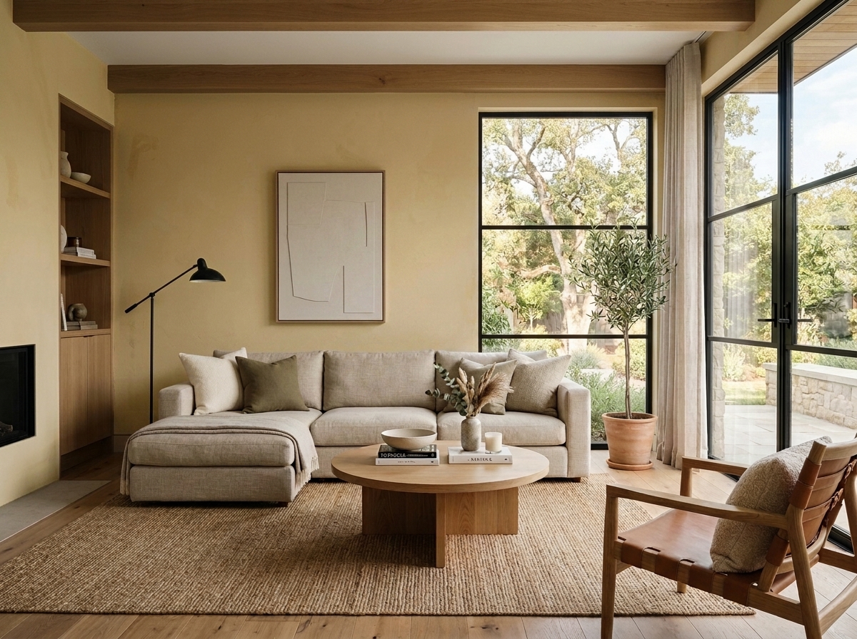 Before
Visualize Your Space with Color Studio AI
Planning a project? Skip the paint chip guesswork. Use our Color Studio AI to instantly visualize these paint colors on your own walls, or take advantage of our aligned contractor pricing matching current Sherwin-Williams retail promotions.
Book Your Upcoming Paint Project
Craftsman Painter is now scheduling premium transformations. Secure your spot and elevate your property value.
Get an EstimateHelp Others Find Professional Color Insights
Share this story directly to your networks or copy the link to share with friends.