


In regional light conditions like those found across Southern Indiana during July and August, the high position of the sun combined with intense green canopy foliage outdoors creates a specific chromatic challenge indoors. Natural light bouncing through multi-pane factory windows carries an abundance of yellow-green reflected light. On a cool-toned paint surface, this produces a discordant, muddy cast. Basque Green, however, embraces those exact wave-frequencies. Its innate warm olive undertones harmonize instantly with summer foliage light, establishing a stable, quiet baseline in vast, sun-drenched volumes.
Architectural Coordinating Palette: SW Basque Green SW 6426
Basque Green
Sherwin-Williams SW 6426
Alabaster
Sherwin-Williams SW 7008
Manchester Tan
Benjamin Moore HC-81
Carnelian
Sherwin-Williams SW 7580
To maintain structural clarity and avoid an overly dark or heavy room feel, Basque Green requires a calculated balancing act of undertones and light reflectance levels across adjacent surfaces:
- Tier 1 (Trim & Anchor Neutral): Sherwin-Williams Alabaster SW 7008
- Application: Apply to window casings, door frames, baseboards, and wood structural headers. With an LRV of 82, Alabaster provides a soft, organic off-white contrast that lacks the chalky harshness of a pure bright white, creating a crisp boundary against deep green walls and raw masonry.
- Tier 2 (Mid-Tone Bridge): Benjamin Moore Manchester Tan HC-81
- Application: Use on transitional drywall fields, adjoining hallways, or expansive ceiling bays bounded by steel I-beams. Sitting at an LRV of 58, this refined limestone-hued tan connects the red-orange tones of distressed brick with the warm yellow-green undertones of Basque Green.
- Tier 3 (Contrast & Accent): Sherwin-Williams Carnelian SW 7580
- Application: Apply strictly to steel-framed industrial cabinetry, kitchen islands, vanity bases, or heavy interior metal doors. Carnelian is a saturated, muted plum-violet with an LRV of 6. When placed near Basque Green, it establishes a complementary color pairing (red-violet against warm olive) that adds instant visual tension without relying on high-chroma primary shades.

Spatial Case Study: The Urban Industrial Loft
Consider a typical adaptive-reuse loft conversion in Bloomington, Indiana—a space defined by soaring ceilings, structural steel I-beams, exposed ceiling ductwork, dark iron factory window grids, and weathered red-brown brick. In expansive, high-volume rooms of this nature, light spreads unevenly. The areas immediately adjacent to large factory windows are bathed in intense summer sun, while internal alcoves and deeply recessed walls fall into dramatic shadow.

Work Directly with Torlando Hakes
Skip the color choice stress. Work directly with me as your personal Color Designer to select the perfect architectural palette for your home, and get a Complementary Color Consultation when you purchase paint through us.
When we apply Basque Green in a flat or matte sheen across broad drywall planes in this layout, the paint performs like a light sink. On walls directly opposite south- or west-facing windows, the high pigment mass absorbs direct rays, preventing the aggressive glare that typically plagues large industrial spaces. In shadowed corners, the yellow-brown undertones prevent the color from feeling cold or subterranean, keeping the atmosphere dense, rich, and intentionally framed.

By pairing Basque Green with trim finished in Sherwin-Williams Alabaster SW 7008, the heavy olive tone is bounded by clean visual lines. A satin or semi-gloss finish on the Alabaster trim reflects direct sunlight along window perimeters and door openings, creating a sharp, intentional frame that emphasizes the architectural geometry of the space.
Natural Light Shifts and Surface Sheens
The magic of an earthy, low-LRV hue like Basque Green lies in its dynamic response to shifting sun angles throughout the day. Under direct, warm late-afternoon sun, the gold and yellow pigments near the surface activate, softening the room's perimeter into a mossy, organic tone. Under morning light or cloud cover, the darker iron-oxide pigments dominate, drawing the wall back into a quiet forest shadow.

From a applicator's perspective, coating selection is critical when dealing with dark olive pigments:
- Drywall Surfaces: Stick strictly to flat or matte sheens (such as Sherwin-Williams Emerald Interior Matte). High-pigment olive tones display lap marks and roller texture easily under cross-lighting if applied in higher sheens. A matte finish eliminates specular reflection, letting the true undertone absorb and diffuse incoming light uniformly.
- Structural Iron, Trim, and Cabinetry: Utilize a durable acrylic-urethane semi-gloss or satin enamel. When painting heavy steel-framed industrial cabinetry, applying Sherwin-Williams Carnelian SW 7580 in a satin finish creates a rich sheen contrast against flat Basque Green walls.

In open-plan industrial configurations, Benjamin Moore Manchester Tan HC-81 acts as the perfect mid-tone bridge. Painted onto surrounding secondary walls or drywall soffits wrapping around exposed ceiling ductwork, it breaks up the visual weight of dark green surfaces and raw masonry. The light, stone-like warmth of Manchester Tan softens the stark transition between raw brick and dark paint, allowing Basque Green to function as an intentional anchor rather than an overwhelming backdrop.

When specifying Sherwin-Williams Basque Green SW 6426, remember that deep olive paints do not require soft light to shine—they require structured light, rich physical textures, and intentional contrast to reveal their true architectural weight.
Complementary Color Consultation
Planning a project? Work with Torlando Hakes directly as your personal Color Designer and get a Complementary Consultation when purchasing paint through us.
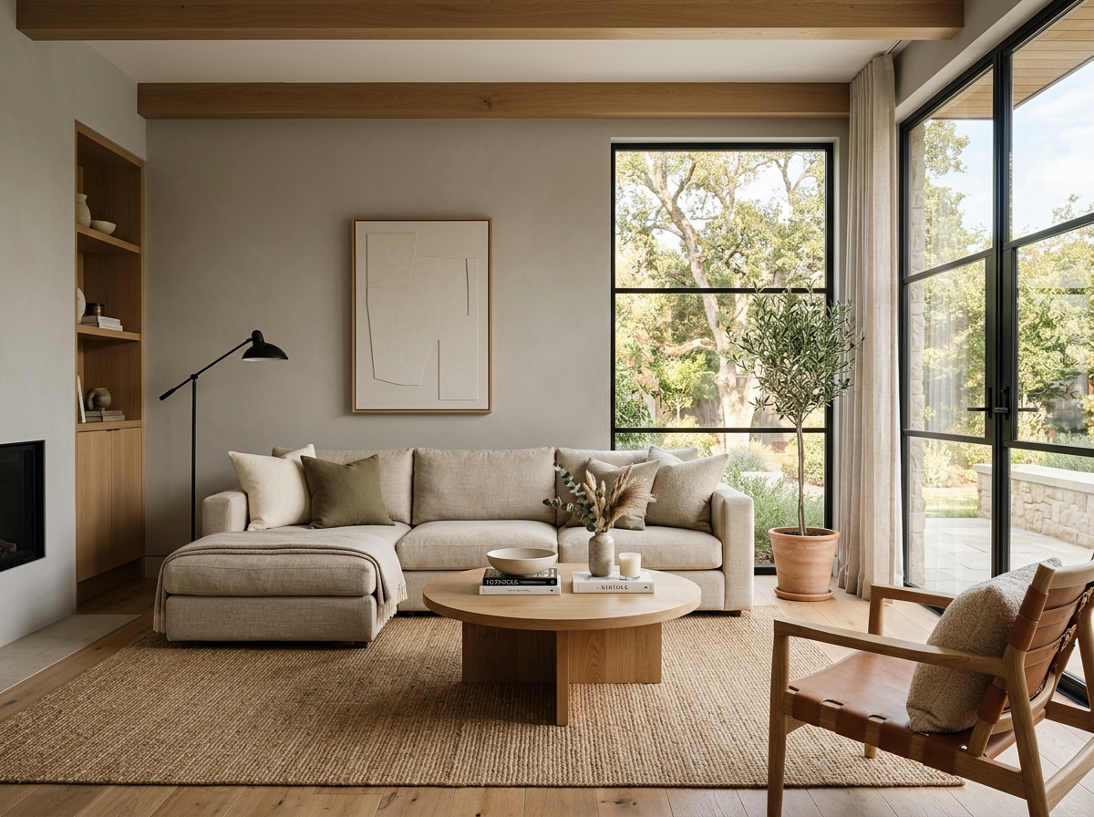 After
After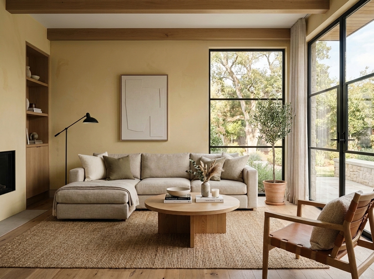 Before
Visualize Your Space with Color Studio AI
Planning a project? Skip the paint chip guesswork. Use our Color Studio AI to instantly visualize these paint colors on your own walls, or take advantage of our aligned contractor pricing matching current Sherwin-Williams retail promotions.
Book Your Upcoming Paint Project
Craftsman Painter is now scheduling premium transformations. Secure your spot and elevate your property value.
Get an EstimateHelp Others Find Professional Color Insights
Share this story directly to your networks or copy the link to share with friends.