

The Space & Craftsman's Brief
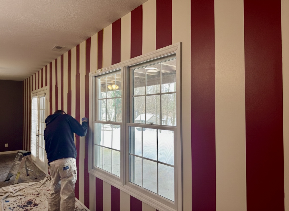
Spend any time in Bloomington, Indiana, and you understand that basketball and college athletics are woven into the local architecture. We partnered with Dwella Homes on this Central Indiana basement project, which was headed straight for the Airbnb market. The brief was to create the "Cig-Natty" room—a dedicated game room and lounge celebrating Indiana University's football and basketball heritage, specifically paying homage to the iconic Hoosier candy-striped warmup pants.
Walkout basements present a classic spatial challenge: one long wall is flooded with natural light from double windows and French doors, while the opposite side of the room retreats into deep shadow beneath a standard eight-foot ceiling. To give the space energy without making it feel cramped, our craftsman Jose took on a highly technical layout. Laying down dead-straight, uniform vertical stripes across an expansive wall interrupted by window casings, door frames, and ceiling vents demands absolute mathematical patience.
Looking at the room as Jose pulls the tape, you can see how the verticality immediately stretches the wall height. Instead of a sprawling, uninterrupted drywall surface, the rhythm of the stripes breaks up the mass around the window frames and French doors, giving the eye a structured path to follow from the baseboard right up to the ceiling line.

Work Directly with Torlando Hakes
Skip the color choice stress. Work directly with me as your personal Color Designer to select the perfect architectural palette for your home, and get a Complementary Color Consultation when you purchase paint through us.
Color Theory & Spatial Harmony
High-contrast patterns in a basement can easily go wrong if you misjudge the color temperature. If you pair a true, primary red with a stark, blue-undertone builders white, the optical vibration under artificial light becomes jarring. For a game room where guests will spend hours hanging out, you need longevity and warmth.
We built this stripe palette around a deep, blue-shaded crimson paired with a softened, creamy off-white. Look closely at the exterior light coming through those double windows: that is flat, cool, winter light reflecting off snow in the backyard. Cool northern or winter light strips warmth out of interior walls. Because our cream stripe carries a subtle yellow-warm undertone, it holds its ground against that chilly exterior glare instead of turning gray.
Inside the room, warmer 3000K overhead bulbs cast a golden hue across the upper third of the wall. Under this interior lighting, the cream reads rich and inviting, while the deep crimson absorbs just enough light to feel weighty and substantial rather than neon. That contrast between high Light Reflectance Value (LRV) in the cream bands and low LRV in the crimson bands creates crisp architectural geometry without overwhelming the visual field.
Coordinating Palettes
When one long wall carries this much visual weight, the surrounding surfaces have to act as a counterbalance. If every wall in this basement were bright white, the striped feature wall would feel disconnected from the rest of the room.
- The Far Accent Wall: Look down the length of the room past the French doors. That adjoining wall is painted in a deep, muted espresso-charcoal. Dark, low-LRV colors recede visually, pushing the boundary of the room backward and grounding the high energy of the candy stripes.
- Window & Door Trim: The window casings, mullions, and French door frames are finished in a clean, neutral white that matches the cream base of the stripes. Keeping the trim within the same temperature family prevents the windows from chopping up the vertical flow of the pattern.
- Ceiling & Flooring: A flat, warm off-white ceiling prevents harsh overhead glare from bouncing back down onto the glossy stripes, while the mid-tone speckled carpet absorbs ambient sound and anchors the lower plane of the room.
Craftsman Field Notes
Executing crisp two-tone stripes over lightly textured drywall is where professional prep separates itself from amateur weekend projects. If you simply stick standard masking tape to a wall and roll dark red paint over it, capillary action will pull the dark pigment right under the tape edge, leaving you with a jagged, fuzzy line.
Here is how we handle precision striping in the field:
- The Base Coat & Cure Time: The entire wall is first rolled out in the lighter cream color and allowed to cure properly. Fresh uncured paint will peel right off the drywall paper if you apply tape too soon.
- Laser Layout & Taping: Every vertical line is shot with a self-leveling laser level—never measured solely off the corners of the room, as residential framing is rarely plumb. We use delicate-surface, polymer-treated painter's tape that reacts with water to form a micro-barrier.
- Sealing the Tape Edge: Before a drop of crimson hits the wall, we brush or roll the base cream color right over the edge of the tape where the red will go. If any paint bleeds under the tape, it is the invisible base color. That dries into a gasket-tight seal.
- Tinted Primer & Multiple Coats: Deep reds and crimsons use a clear tint base, meaning they have notoriously low hide and require more coats than standard neutrals. Applying the crimson with a high-density microfiber roller cover in an eggshell or satin sheen ensures uniform saturation without heavy orange-peel stipple, and allows for easy wipe-downs in a high-traffic Airbnb environment.
- Pulling Tape on the Wet Edge: As you see Jose doing by the window, the tape comes off at a 45-degree angle before the final coat fully skins over and bridges the gap between the wall and the tape. This leaves a razor-sharp architectural edge from floor to ceiling.
Complementary Color Consultation
Planning a project? Work with Torlando Hakes directly as your personal Color Designer and get a Complementary Consultation when purchasing paint through us.
Get Our 10-Day Architectural Color & Lighting Studies
Join 1,650+ homeowners, designers, and architects receiving our curated dispatches every 10 days (1st, 11th & 21st) on field stories, LRV, undertones, and trim pairings.
 After
 Before
Visualize Your Space with Color Studio AI
Planning a project? Skip the paint chip guesswork. Use our Color Studio AI to instantly visualize these paint colors on your own walls, or take advantage of our aligned contractor pricing matching current Sherwin-Williams retail promotions.
Book Your Upcoming Paint Project
Craftsman Painter is now scheduling premium transformations. Reserve an on-site consultation or instant video walkthrough.
Get an Estimate →Related Color & Design Studies

Why Sherwin-Williams Languid Blue SW 6226 Creates the Quietest Atmosphere in Summer Sunlight
The Muddy, Magnificent Paint Color Designers Keep Secretly Hoarding to Tame the Brutal Bloomington Sun

Why Sherwin-Williams North Star SW 6246 Delivers the Cool Crisp Air of a High-Summer Day
Help Others Find Professional Color Insights
Share this story directly to your networks or copy the link to share with friends.