
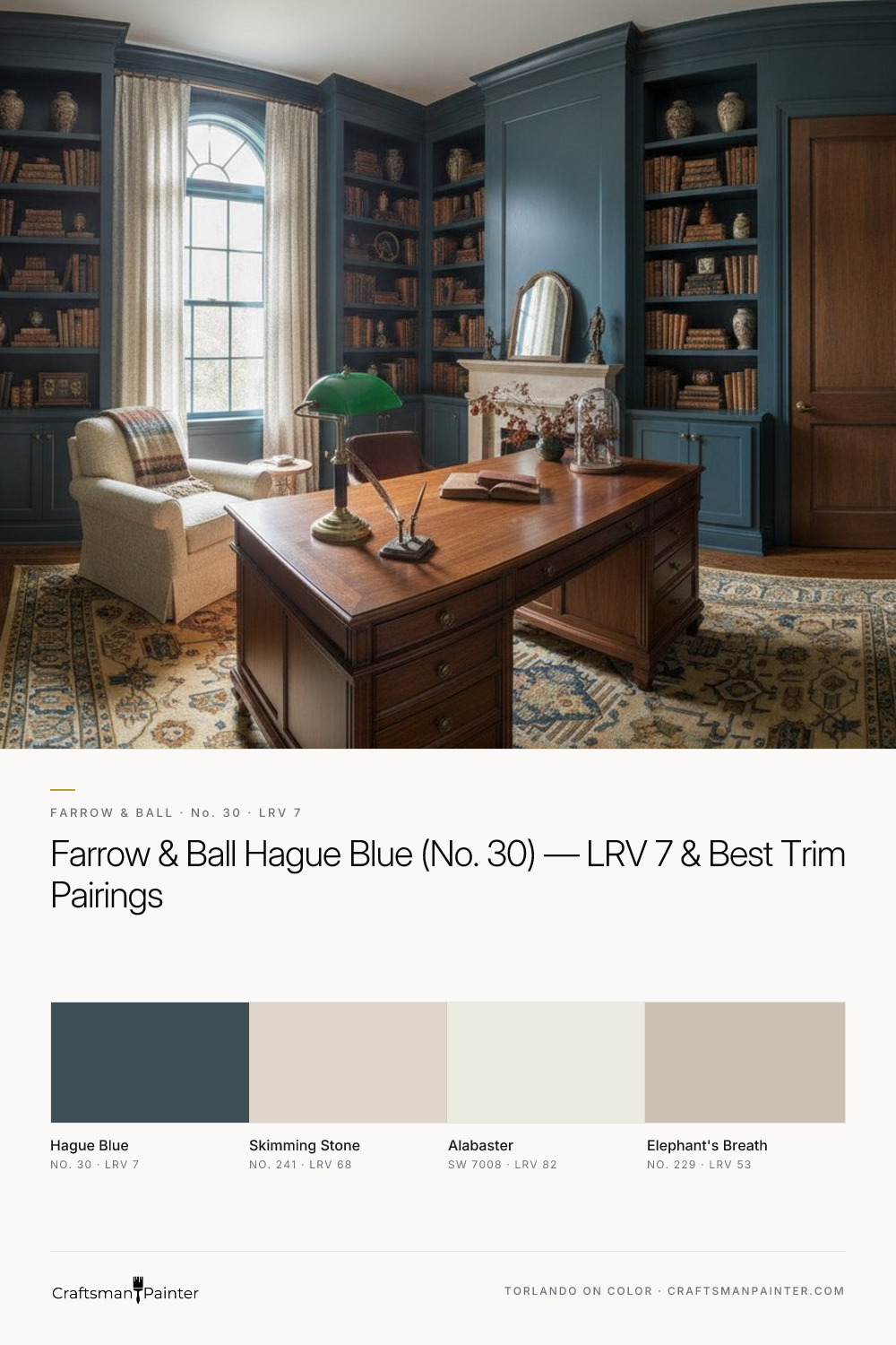


Decoding Hague Blue's Coastal Depth: Undertones & LRV 7
Real-paint peel-and-stick samples ship via Samplize. Craftsman Painter may earn a small commission on sample orders at no extra cost to you.
The true character of Farrow & Ball Hague Blue lies in its subtle, yet impactful, soft coastal blue-green undertones. Unlike a straightforward navy, Hague Blue carries a whisper of the sea and sky, a nuanced complexity that prevents it from feeling stark or one-dimensional. This isn't a bright, airy blue, nor is it a somber, purely formal one. Instead, it possesses an inherent richness, a depth that can shift depending on the light. In bright, natural light, the green notes become more apparent, lending it a sophisticated, almost teal-like quality. In dimmer settings or artificial light, it retreats to a deeper, more traditional blue, though never losing its distinctive warmth.
Its Light Reflectance Value (LRV) of 7 is a critical factor to consider. An LRV of 7 means Hague Blue absorbs a significant amount of light, reflecting only 7% back into the room. This low LRV is precisely what gives it its profound depth and drama. It will make a room feel more enclosed and intimate, which can be a desirable effect in spaces like studies, dining rooms, or powder rooms. However, in rooms with minimal natural light, this low LRV can make the space feel smaller and darker than intended if not balanced with appropriate lighting and lighter coordinating elements. Understanding these undertones and its light-absorbing nature is the first step in harnessing Hague Blue's full potential, rather than being surprised by its chameleon-like qualities once applied.
Essential Prep & Coatings for a Flawless Hague Blue Finish
Achieving the full depth and richness of a color like Hague Blue demands meticulous surface preparation. For drywall, this means aiming for at least a Level 2: Standard finish, ensuring seams are smooth and fasteners are adequately covered. For a truly luxurious result, particularly in areas with direct light, a Level 3: Premium finish where the entire surface is skim-coated will prevent any imperfections from telegraphing through the deep pigment. On existing wood trim or cabinetry, proper cleaning, degreasing, and sanding to create a uniform profile are non-negotiable before priming. Any unevenness or previous surface issues will be magnified by such a deep, saturated color.
When it comes to the actual coatings, selecting the right product is as crucial as the color itself. For interior walls, I often recommend Sherwin-Williams Cashmere Low Lustre for its smooth, buttery application and elegant finish, or Emerald Interior Matte for its superior washability and durability, especially in high-traffic areas. In humid environments like bathrooms or kitchens, Sherwin-Williams Duration Home provides excellent moisture resistance and mildew protection. For trim, doors, and cabinetry, Sherwin-Williams Emerald Urethane Trim Enamel in a Satin or Semi-Gloss sheen delivers a hard, durable finish that complements Hague Blue's sophisticated depth without competing with its matte wall presence. These premium coatings ensure the color's integrity and longevity, providing a finish worthy of its depth.
Navigating Color Relationships: Trim, Accents & Rivals
Pairing Hague Blue effectively requires a thoughtful approach to coordinating colors. For trim and ceilings, Farrow & Ball Skimming Stone (No. 241, LRV 68) offers a sophisticated, understated contrast. Its warm, stony neutral quality provides a gentle relief from Hague Blue's intensity without feeling stark or cold. This pairing creates a cohesive, refined aesthetic, allowing Hague Blue to be the star while Skimming Stone provides a soft frame.
For a coordinating neutral on adjacent walls or as a broader accent, Sherwin-Williams Alabaster (SW 7008, LRV 82) is an excellent choice. Its creamy, soft white prevents any harshness, offering a welcoming brightness that balances Hague Blue's depth. Alabaster's inherent warmth ensures the overall palette remains inviting. For a more dramatic contrast accent, Farrow & Ball Elephant's Breath (No. 229, LRV 53) is a unique option. This warm, gray-brown with a hint of magenta provides an unexpected but harmonious counterpoint, adding another layer of sophistication and depth to the scheme.
When homeowners are considering deep blues, comparisons inevitably arise. Sherwin-Williams Naval (SW 6244) is a popular rival, but it leans distinctly towards a truer, more traditional navy, with fewer of the green-blue undertones that define Hague Blue. Naval feels more purely blue, perhaps a bit more straightforward in its intensity. Benjamin Moore Hale Navy (HC-154) is another contender, often described as a classic, saturated navy. While deep and rich, Hale Navy typically presents as a cleaner, slightly brighter true navy compared to Hague Blue's more muted, coastal blue-green complexity. Hague Blue's unique undertones make it a less conventional, arguably more intriguing choice than its rivals.
Before committing to any of these shades, proper swatch testing is non-negotiable. Josef Albers' principle of simultaneous contrast dictates that colors influence each other when placed side by side. Your existing wall color will distort how a new swatch appears. To get an accurate read, always isolate real-paint peel-and-stick samples against a clean white background, such as a piece of white poster board or directly against existing white trim, if present and clean. This allows you to perceive the true nature of Hague Blue without interference. For a deeper dive into how Hague Blue truly behaves, explore its profile in our Color Studio.
Strategic Application: Where Hague Blue Truly Shines (and Where to Reconsider)
Farrow & Ball Hague Blue is a versatile color when applied thoughtfully. It excels in spaces where intimacy and drama are desired. Consider it for a cozy study or library, where its depth can foster concentration and a sense of gravitas. Dining rooms are another prime location; Hague Blue creates an elegant, sophisticated backdrop for entertaining. It’s also an excellent choice for a dramatic powder room, transforming a small space into a jewel box. Feature walls in larger living areas can also benefit from its impactful presence, drawing the eye and anchoring the room. Kitchen cabinetry painted in Hague Blue offers a timeless, bespoke feel, especially when paired with warm metallics or natural wood tones.
However, its low LRV and intense saturation mean it requires careful consideration in certain environments. I generally advise against using Hague Blue in small rooms that receive very little natural light, unless the goal is to fully embrace a deliberate, cavernous feel and you are prepared to compensate with extensive artificial lighting. In open-concept living spaces, using it on all walls might overwhelm the area, making it feel heavy rather than inviting. Instead, consider it for defined zones or as an accent to provide visual interest without dominating the entire open space. The key is to understand its power and deploy it strategically to achieve the desired atmosphere without inadvertently creating a space that feels oppressive or underlit. If you're unsure how Hague Blue will translate into your specific home, a 1-on-1 Color Consultation can provide tailored guidance.

Immerse Yourself in Deep Greens: Isle of Pines SW 6461, Ripe Olive SW 6209, and Forestwood SW 7730
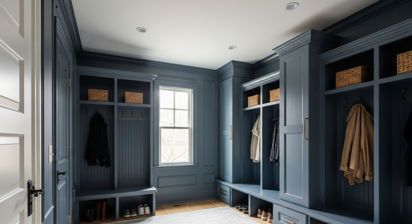
The One Moody Paint Color Westfield Designers Are Secretly Hoarding for Mudrooms
