


This isn't a shy, retiring neutral. Bakelite Gold carries a Light Reflectance Value (LRV) of 24. It absorbs a significant amount of the light that hits it, giving the color a dense, grounding visual weight. The pigment profile relies heavily on mustard gold and yellow-ochre, anchored by distinct warm brown undertones. In the dead of a Midwestern summer—specifically when studying the high-overhead, vibrant sunlight of Indianapolis, Indiana—that warm brown base is critical. The intense UV exposure and dry, warm air of July and August pull the yellow forward. Without those grounding brown undertones, the color would risk flashing acidic. Instead, it reads as an organic, sunbaked architectural feature.
To fully harness a color this potent, you need a highly disciplined coatings strategy. Let's explore a design study of a Case Study Modern home in Indianapolis, leaning into exposed steel beams, anodized aluminum, and polished concrete, to see how this color operates within a broader architectural system.
The Coordinating Palette Strategy
When dealing with a dominant yellow-ochre, the surrounding colors must either provide crisp architectural framing or bridge the gap to the outdoors. Here is the exact palette I specify to bring Bakelite Gold into perfect equilibrium:
Book Your Upcoming Paint Project
Craftsman Painter is now scheduling premium transformations. Secure your spot and elevate your property value.
Get an Estimate- Tier 1 (Trim/Anchor Neutral): Sherwin-Williams Greek Villa SW 7551
- Application: Baseboards, window casings, interior door frames, and ceiling planes. Opt for a durable Satin or Semi-Gloss finish on the trim to create a crisp, slightly reflective boundary against the matte walls. This creamy off-white softens the harshness of industrial steel framing without fighting the warmth of the ochre.
- Tier 2 (Mid-Tone Bridge): Sherwin-Williams Svelte Sage SW 6164
- Application: Transitional hallways, secondary bedrooms, and bathroom walls. Use an Eggshell or Matte finish. This muted, earthy green pulls the lush summer foliage visible through the floor-to-ceiling glass directly into the interior, acting as a visual cooling mechanism against the heat of the gold.
- Tier 3 (Contrast/Accent): Sherwin-Williams Cascades SW 7623
- Application: Custom millwork, flat-panel kitchen cabinetry, or a monolithic kitchen island. A low-sheen Urethane Enamel works best here. This deep, moody teal-blue provides a sharp, necessary contrast to the Bakelite Gold, grounding the sightlines and adding a layer of sophisticated depth.

Controlling Light and Sheen in a Modern Layout
Walk through a typical mid-century layout in this region, particularly one inspired by the California Case Study House Program, and you immediately confront the challenge of glass. Floor-to-ceiling glass panes turn the home into a lightbox during an Indianapolis summer.
When applying Bakelite Gold to expansive drywall spans adjacent to these massive windows, sheen selection dictates the success of the room. I heavily advocate for a dead-flat or matte finish. If you introduce an eggshell or satin on these walls, the intense summer daylight will bounce off the resin in the paint, creating a harsh glare that washes out the rich ochre pigment. A flat finish absorbs the light, allowing the mustard and brown undertones to render beautifully, softening the hard edges of the surrounding polished concrete floor slabs and exposed steel beams.

The architectural trim work requires a different approach. By applying Greek Villa in a satin finish to the baseboards and window casings, we create a subtle, tactile boundary. The slight sheen differential between the creamy white trim and the matte gold walls establishes a structural hierarchy that the eye instantly understands.

As the sun arcs across the Midwestern sky, the color temperature of the room shifts dramatically. In direct sunlight, Bakelite Gold flares into a vibrant, energetic mustard. On the adjacent shadowed walls, those warm brown undertones take over, shifting the paint into a deep, comforting leather-like hue. This dynamic color shifting is exactly why high-quality, complex pigments are worth the investment.
Anchoring the Industrial Edges
In the kitchen zones of these modern, open-concept spaces, the visual weight of the ochre walls needs a counterweight. This is where Cascades comes into play.

Applying a deep, blue-green teal to flat-panel cabinetry against a backdrop of concrete and steel introduces a sleek, functional elegance. The cool darkness of Cascades cuts right through the dry warmth of Bakelite Gold. From a coatings perspective, utilizing a waterborne alkyd or urethane enamel on these cabinets ensures a factory-like finish that stands up to heavy daily use while retaining a luxurious, low-sheen profile.
We apply a similar logic in the private spaces, using Svelte Sage to bridge the transition from the vibrant public areas to the quiet retreats.

Using Svelte Sage in a bathroom or wet room context instantly connects the interior architecture to the vibrant green summer foliage outside. It provides a visual resting place for the eye, ensuring the transition from the heavy ochre living spaces feels intentional and resolved.
Color design in high-end architecture is never about picking a shade simply because it looks good on a swatch. It requires a rigorous understanding of how light, sheen, and undertones interact with the physical materials of the space. When you respect the chemistry of a color like Bakelite Gold and support it with the right surrounding palette, you stop fighting the architecture and start enhancing it.
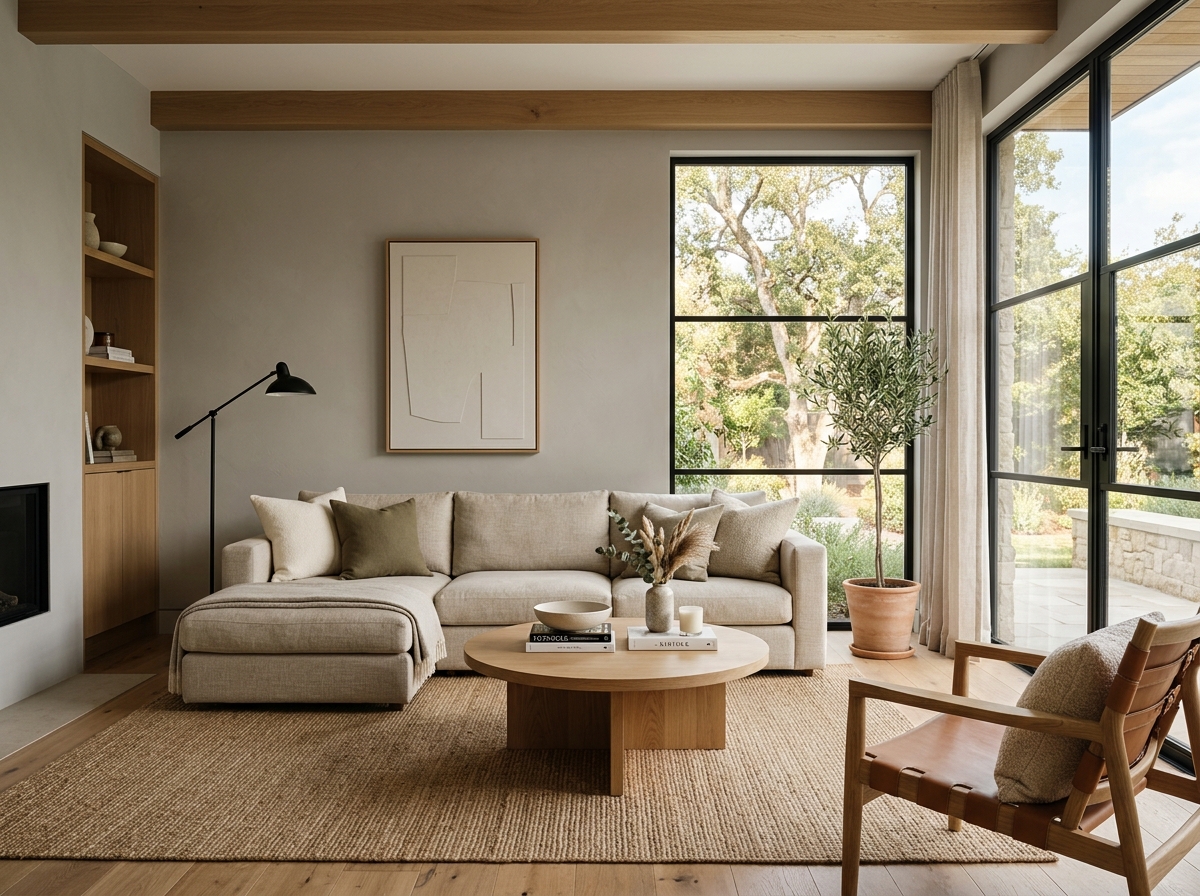 After
After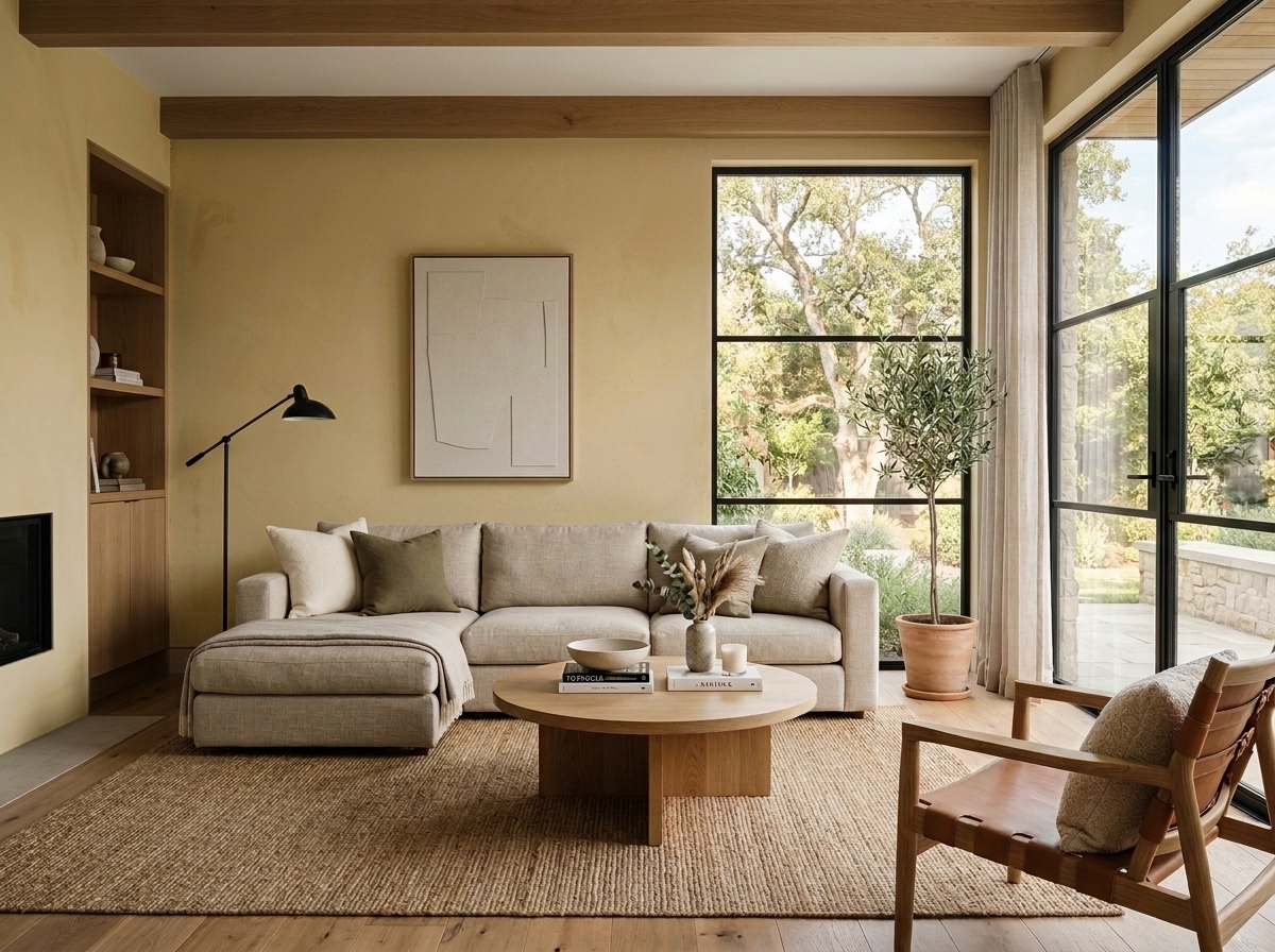 Before
Visualize Your Space with Color Studio AI
Planning a project? Skip the paint chip guesswork. Use our Color Studio AI to instantly visualize these paint colors on your own walls, or take advantage of our aligned contractor pricing matching current Sherwin-Williams retail promotions.
Help Others Find Professional Color Insights
Share this story directly to your networks or copy the link to share with friends.