



Enter Benjamin Moore Pebble Beach 1597.
Sitting comfortably at a Light Reflectance Value (LRV) of 45.41, Pebble Beach is a distinct, mid-tone cool gray driven heavily by a blue undertone. Because it sits just under the halfway mark of the LRV scale, it has enough density to absorb the intense, dry, warm air and bright light of a summer afternoon without losing its structural identity. The blue undertone acts as a thermal counterbalance to the heat of the season. When that warm summer sunlight bounces off exterior greenery and pushes through the glass, it hits Pebble Beach and neutralizes, leaving a crisp, sophisticated hue that holds its ground beautifully on interior walls.
The Coordinating Palette: Grounding Pebble Beach
To make a cool blue-gray work within a warm, coastal Spanish-inspired architectural style—which relies heavily on heavy timbers, plaster, and arched geometry—the supporting coatings must bridge the gap between cool pigment and warm, natural materials. Here is the strict architectural palette to achieve that balance:
Book Your Upcoming Paint Project
Craftsman Painter is now scheduling premium transformations. Secure your spot and elevate your property value.
Get an Estimate- Tier 1 (Trim/Anchor Neutral): Benjamin Moore Chantilly Lace OC-65 Apply this exceptionally clean, undertone-free white in a premium semi-gloss or satin enamel on all baseboards, interior doors, and arched window casings. It provides a sharp, clinical edge that defines the structural lines against the softer wall color.
- Tier 2 (Mid-Tone Bridge): Benjamin Moore Cedar Key OC-16 Use this warm, greige tone in a flat or matte finish on ceiling planes between exposed structural beams, or in adjacent transition spaces like entryways and open corridors. It warms up the overall palette without clashing with the blue notes of Pebble Beach.
- Tier 3 (Contrast/Accent): Benjamin Moore Kendall Charcoal HC-166 Deploy this deep, rich charcoal in a robust cabinet-grade satin finish on heavy millwork, flat-panel built-ins, and wrought-iron interior details. It creates the necessary weight to anchor the visual field.

Framing the Architecture in Central Indiana
Let's explore a design study of how this palette behaves in a hypothetical layout adapted for the Indianapolis region, utilizing the robust materials of Spanish Mediterranean design. This style depends on heavy textures—hand-applied stucco, wrought-iron, and neutral gray flagstones. The trick is applying a smooth, modern paint film in a way that respects those raw materials.
When you coat a primary living space in Pebble Beach, the application method matters. A high-quality matte acrylic finish will absorb the ambient light, allowing the blue-gray to feel like a modern plaster rather than a standard drywall coating.

Where the matte walls meet the floor, the transition requires precision. Chantilly Lace on the baseboards introduces a rigid, highly reflective boundary. Because Indianapolis summers deliver such a high volume of direct sunlight through deep arched window recesses, that semi-gloss white trim acts as a reflector, bouncing clean, untinted light back up onto the cool gray walls. This interaction prevents the blue undertones from dragging the room into a sterile, cold territory.
The Dynamics of Shifting Daylight
Color is rarely static. With an LRV of 45.41, Pebble Beach is highly responsive to the shifting angles of the sun throughout the day.

In rooms facing east or west, the color split on adjacent walls is striking. The wall receiving direct, unadulterated summer sunlight will push lighter, revealing the silvery-blue aspects of the pigment. The adjoining wall, sitting in its own shadow, will fall back into a deeper, moodier slate gray. This gradient effect is exactly why professional painters favor mid-tone colors over ultra-light pastels or harsh darks; they highlight the architectural geometry of the home simply through shadow and light.
Anchoring with Charcoal and Oak
To keep the cool blue-gray from feeling unmoored, we rely on heavy visual anchors. The dark exposed oak structural ceiling beams common in Mediterranean design do a lot of the heavy lifting. But for the lower half of the room, paint provides the necessary gravity.

Applying Kendall Charcoal to cabinetry or built-in elements introduces a deep, muddy warmth that grounds the airy quality of Pebble Beach. Kendall Charcoal is a fantastic formulation because its green-brown undertones contrast sharply with the blue-gray walls, instantly pulling the eye downward. When sprayed in a durable satin finish, it mimics the visual density of wrought-iron, seamlessly tying into the metal accents found throughout the space.
Transitional Warmth in Private Spaces
For bathrooms and transition zones, relying strictly on gray can feel a bit clinical. This is where Cedar Key comes into play as our bridging neutral.

By carrying Pebble Beach into a washroom setting, perhaps framing a dark oak vanity and neutral gray flagstone tile, the color feels remarkably spa-like. The blue undertone implies cleanliness and water. If Cedar Key is applied to the ceiling above, its subtle greige warmth reflects downward, softening the cool light and making the space vastly more flattering for skin tones in the mirror.
Mastering a color like Pebble Beach requires more than just rolling it onto a wall and hoping for the best. It demands a deliberate approach to sheen levels, an understanding of regional sunlight, and a strict, disciplined coordinating palette to bring the underlying architecture to life. Treat your paint as an engineered building material, and your space will always feel intentionally designed.
Featured Color Palette

Benjamin Moore Pebble Beach (1597) — Featured Craftsman Painter color selection.

Benjamin Moore Chantilly Lace (OC-65) — Featured Craftsman Painter color selection.

Benjamin Moore Cedar Key (OC-16) — Featured Craftsman Painter color selection.

Benjamin Moore Kendall Charcoal (HC-166) — Featured Craftsman Painter color selection.
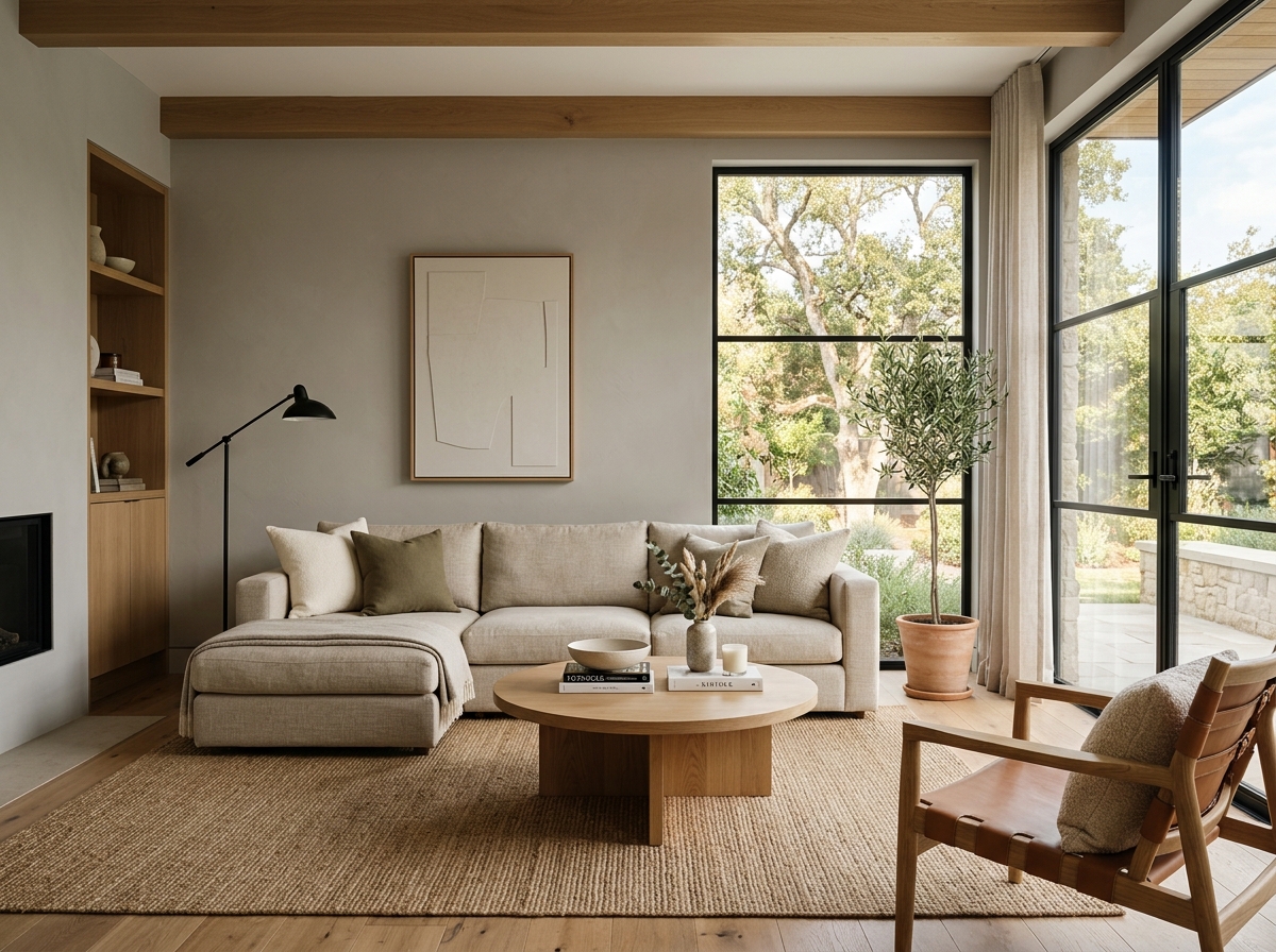 After
After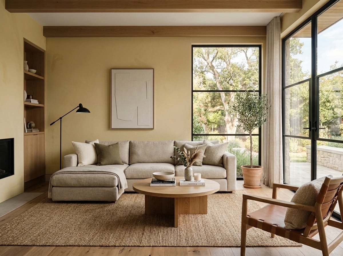 Before
Visualize Your Space with Color Studio AI
Planning a project? Skip the paint chip guesswork. Use our Color Studio AI to instantly visualize these paint colors on your own walls, or take advantage of our aligned contractor pricing matching current Sherwin-Williams retail promotions.
Help Others Find Professional Color Insights
Share this story directly to your networks or copy the link to share with friends.