
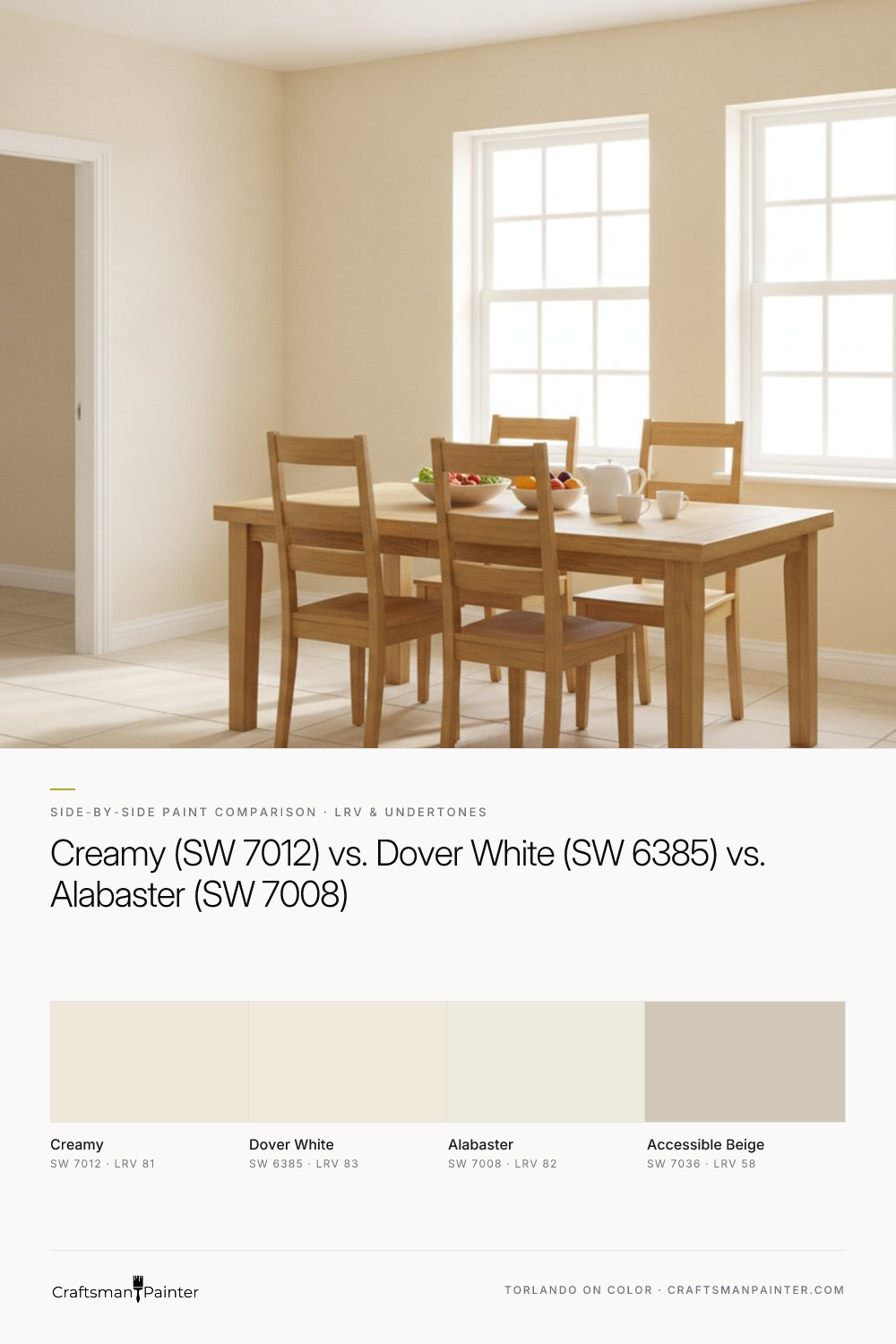


LRV and Perceived Brightness on Full Walls
Real-paint peel-and-stick samples ship via Samplize. Craftsman Painter may earn a small commission on sample orders at no extra cost to you.
Light Reflectance Value (LRV) is a critical metric, indicating the percentage of visible light a color reflects. A higher LRV means a brighter, more light-bouncing surface. Sherwin-Williams Creamy (SW 7012) has an LRV of 81. Alabaster (SW 7008) follows closely with an LRV of 82. Dover White (SW 6385) registers the highest at an LRV of 83. On paper, these numbers appear very close, and in isolation, any of these would be considered a bright, light-reflecting color. However, when applied to full walls and viewed side-by-side in varying light conditions, these minor differences become perceptible.
Dover White, with its LRV of 83, will consistently feel the brightest and most expansive of the three. It offers a clean, soft warmth that still holds a significant degree of luminosity. Alabaster, at LRV 82, provides a slightly softer diffusion of light, feeling equally bright but with a touch more groundedness due to its nuanced undertones. Creamy, with an LRV of 81, will present as the deepest and most saturated of the three. It still reflects ample light, preventing a room from feeling dim, but its inherent creaminess is more apparent, offering a cozy warmth rather than stark brightness. The choice here depends on the desired level of perceived spaciousness versus an enveloping, softer feel. All three are excellent choices for making a room feel larger and brighter than a mid-tone color, but Dover White provides the most direct lift.
Undertone Behavior in Varying Light and with 2700K Bulbs
The true character of these colors emerges when considering their undertones in different lighting environments. This is where subtle distinctions become significant.
Sherwin-Williams Creamy (SW 7012) carries a distinct soft warm cream-yellow undertone. In a north-facing room, where light is cooler and often muted, Creamy maintains its warmth without turning stark. The yellow-cream comes forward as a comforting, gentle presence, preventing the cool light from making the space feel cold. In a south-facing room, bathed in abundant, warm natural light, Creamy's inherent warmth is amplified, creating a truly inviting and sun-kissed glow. With 2700K evening bulbs, which emit a warm, yellowish light, Creamy will appear even more saturated in its cream-yellow quality, fostering a very traditional, cozy, and enveloping ambiance.
Sherwin-Williams Dover White (SW 6385) is a slightly cleaner cream compared to Creamy, with a more restrained yellow undertone, leaning towards a muted off-white. In north-facing rooms, Dover White holds its warmth effectively, appearing as a soft, inviting off-white without succumbing to any perceived grayness. It offers warmth without the overt creaminess of SW 7012. In south-facing rooms, it presents as a bright, crisp warm white, where its subtle warmth is evident but less pronounced than Creamy's. Under 2700K bulbs, Dover White will feel warm and inviting, providing a gentle glow, but with less saturated yellow than Creamy, resulting in a slightly fresher warm off-white.
Sherwin-Williams Alabaster (SW 7008) is renowned as a soft, warm white with subtle beige/greige undertones, making it exceptionally versatile. In north-facing rooms, Alabaster performs beautifully, maintaining its soft warmth without ever appearing cold or stark. The beige undertone grounds it, preventing it from feeling washed out. In south-facing rooms, Alabaster transforms into a luminous, elegant warm white that feels expansive yet soft. With 2700K evening bulbs, Alabaster's subtle warmth is enhanced, appearing as a very soft, creamy white, but crucially, its character is not dominated by yellow; rather, it's a balanced, sophisticated warmth.
When testing these colors, it is crucial to understand Josef Albers' principle of simultaneous contrast. Placing paint swatches directly on an existing painted wall, especially one with a strong color, will cause your eye to perceive the new color differently due to the influence of the surrounding color. To accurately assess undertones, always isolate your real-paint peel-and-stick samples against a true white background, such as white trim or a large sheet of white paper. This allows you to see the color's true character without distortion.
Which Shade Wins Against Warm Oak Floors, White Marble/Quartz, or Cabinetry?
The success of a paint color often hinges on its harmony with the fixed elements within a room. Understanding how these creams interact with materials like warm oak, white marble, or cabinetry is essential for a cohesive design.
For warm oak floors, which typically carry golden or reddish-brown tones, all three contenders can work, but with different effects:
- Creamy (SW 7012) is a natural complement to warm oak. Its distinct cream-yellow undertone often harmonizes beautifully with the golden hues in oak, creating a rich, cohesive, and traditional environment. It enhances the wood's warmth without creating a stark contrast, resulting in an enveloping feel.
- Dover White (SW 6385) also works well, providing a slightly brighter and cleaner contrast than Creamy while still maintaining a warm relationship with the oak. It offers a bit more distinction from the wood, presenting a fresh yet warm backdrop that doesn't compete.
- Alabaster (SW 7008) is an excellent choice for a more subdued, contemporary warmth. Its subtle beige/greige undertones prevent it from looking stark against oak, offering a sophisticated pairing that feels updated and refined without any coldness. It's a versatile choice that grounds the space while allowing the oak to shine.
When considering white marble or quartz, which often feature cooler gray or blue-veined whites, the selection becomes more critical:
- Creamy (SW 7012) can be challenging. Its pronounced yellow-cream might clash with the cooler, crisp whites of many marbles or quartz, potentially making the stone appear dingy or the paint overly yellow. It's best used only if the stone itself has distinct warm, creamy veins.
- Dover White (SW 6385) is a safer bet than Creamy. Its slightly cleaner warmth is less likely to fight with cooler whites, but careful testing is still required. It can introduce warmth without overwhelming the cool elements, creating a balanced, soft contrast.
- Alabaster (SW 7008) is often the preferred choice here. Its subtle beige/greige undertone allows it to harmonize with both warm and cool elements. It provides a soft, warm contrast to white marble or quartz without introducing an obvious yellow, creating a refined and sophisticated look that feels intentional and balanced.
For cabinetry, consider the existing finish. If cabinetry is a bright, cool white, all three paint colors will offer a warm contrast. Creamy will provide the most dramatic warmth. Alabaster would offer the most subtle, sophisticated transition, especially if you're aiming for a layered, soft white aesthetic. For coordinating trim or accents, Sherwin-Williams Accessible Beige (SW 7036, LRV 58) can provide a deeper, grounded warmth that ties in beautifully with these creamy tones, offering a cohesive, layered look.
Clear Decision Rules for Picking the Winner + Sheen/Prep Recommendations
Making the final selection requires distilling these observations into actionable guidance:
- Choose Sherwin-Williams Creamy (SW 7012) if: You desire a distinctly soft, comforting, and traditional cream that leans into a gentle yellow warmth without being garish. You have warmer fixed elements, such as golden oak, and want to fully embrace and amplify that warmth. You prioritize a cozy, inviting, and enveloping atmosphere. Explore how Creamy performs in your space by visiting the Color Studio.
- Choose Sherwin-Williams Dover White (SW 6385) if: You are seeking a warm off-white that is notably brighter and slightly cleaner than Creamy, with a less overt yellow presence. You need a warm backdrop that feels fresh and inviting, offering a good balance between warmth and luminosity without feeling too deep or too stark.
- Choose Sherwin-Williams Alabaster (SW 7008) if: You seek a versatile, sophisticated warm white with subtle beige/greige undertones. You want a color that can harmonize gracefully with both warm and cool fixed elements, providing a soft, luminous quality without any strong yellow. Alabaster is often the safest and most popular choice for a modern, understated warmth that feels current and balanced.
Sheen Recommendations: For walls in low-traffic areas, Sherwin-Williams Cashmere Low Lustre or Emerald Interior Matte provides a soft, elegant finish that helps conceal minor wall imperfections. For high-traffic areas, bathrooms, and kitchens, Sherwin-Williams Duration Home in Matte or Satin offers enhanced scrubbability and moisture resistance. For baseboards, doors, and cabinetry, Sherwin-Williams Emerald Urethane Trim Enamel in Satin or Semi-Gloss delivers exceptional durability, flow, and leveling for a professional, long-lasting finish.
Preparation Guidance: Proper surface preparation is paramount for achieving a premium finish. For drywall, aim for at least Level 2: Standard (Occupied Home) preparation, ensuring all joints are taped, feathered, and sanded smooth. For a truly luxury finish, especially on new construction or when aiming for perfectly smooth walls, Level 3: Premium (Luxury Finish) involves skim-coating and sanding the entire surface to a uniform texture. For wood surfaces like trim, doors, and cabinets, thorough cleaning, de-glossing, sanding, and application of a high-quality primer are non-negotiable steps to ensure optimal adhesion and a flawless final coat. Skipping these steps compromises the integrity and appearance of even the best paint. If you find yourself needing further personalized guidance, consider a 1-on-1 Color Consultation to ensure your selections perfectly suit your unique home and vision.
Frequently Asked Questions
What is the primary difference between Sherwin-Williams Creamy, Dover White, and Alabaster?
The main difference lies in their undertones and perceived warmth. Creamy (SW 7012) has a distinct soft cream-yellow undertone, making it the most overtly 'creamy.' Dover White (SW 6385) is a slightly cleaner, brighter warm off-white with less pronounced yellow. Alabaster (SW 7008) is a soft warm white with subtle beige/greige undertones, making it highly versatile and less yellow than the others.
Which Sherwin-Williams warm white is best for north-facing rooms?
For north-facing rooms, where light is cooler, Alabaster (SW 7008) is an excellent choice as its subtle beige/greige undertones maintain warmth without turning cold or stark. Dover White (SW 6385) also performs well, holding its warmth. Creamy (SW 7012) will appear warm and comforting, but its yellow-cream may be more pronounced than desired if you prefer a more subdued warmth.
How do Creamy, Dover White, and Alabaster compare in brightness (LRV)?
Dover White (SW 6385) has the highest LRV at 83, making it the brightest and most light-reflecting. Alabaster (SW 7008) is very close with an LRV of 82. Creamy (SW 7012) has an LRV of 81, making it the deepest and most saturated of the three, reflecting slightly less light but still providing ample brightness for a room.
Can Sherwin-Williams Creamy (SW 7012) be used with white trim or cool-toned marble?
While Creamy (SW 7012) can provide a warm contrast to white trim, its distinct yellow-cream undertone can sometimes clash with very cool-toned white trim or marble, potentially making the trim/marble appear stark or the paint overly yellow. For cool-toned marble, Alabaster (SW 7008) is generally a more harmonious choice due to its balanced beige/greige undertones, offering warmth without a strong yellow bias. Careful testing is always recommended.
The Accidental Pink: A Color Story on Finding the Perfect White
The Craftsman’s Review of Natural Linen (SW 9109): The Timeless, Effortless Neutral
